Difference between revisions of "Project Groups"
| (92 intermediate revisions by 27 users not shown) | |||
| Line 41: | Line 41: | ||
|- | |- | ||
|| | || | ||
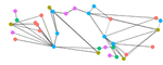
| − | [[ | + | [[file:Group1.gif|150px|link=https://wiki.smu.edu.sg/1617t3isss608g1/Introduction]] |
|| | || | ||
'''Understanding traffic patterns using network graph visualisations''' | '''Understanding traffic patterns using network graph visualisations''' | ||
| Line 51: | Line 51: | ||
|| | || | ||
| − | *[[ | + | *[[Introduction|Report]] |
| + | * [https://wiki.smu.edu.sg/1617t3isss608g1/App_%26_Deliverables Application] | ||
| + | * [[Poster]] | ||
| Line 61: | Line 63: | ||
|- | |- | ||
|| | || | ||
| − | [[ADA_Overview|Group 2 - Team ADA]] | + | <div style="text-align:center;">[[ADA_Overview|Group 2 - Team ADA]] |
| + | |||
| + | |||
| + | [[File:ADA MiniTitle.jpg|150px]]</div> | ||
|| | || | ||
| − | ''' | + | '''Analysis of Rise in Global Temperatures and its Causes Through Interactive Visualizations''' |
Climate change and global warming are material and contemporary issues that are gaining traction from countries all over the world. Global citizens of all ages and economic backgrounds are faced with unwanted effects of climate change today. As the buzz around global warming continues to increase, this contemporary issue has incited many relevant visualisations. Through this project, we analyse the key contributors to climate change namely: Fossil fuel consumption, adoption/rejection of renewable energy, electricity consumption, deforestation rate, and greenhouse gas emissions. The residual impact of these factors to facilitate the rise of global temperature has been captured for 86 countries around the world. | Climate change and global warming are material and contemporary issues that are gaining traction from countries all over the world. Global citizens of all ages and economic backgrounds are faced with unwanted effects of climate change today. As the buzz around global warming continues to increase, this contemporary issue has incited many relevant visualisations. Through this project, we analyse the key contributors to climate change namely: Fossil fuel consumption, adoption/rejection of renewable energy, electricity consumption, deforestation rate, and greenhouse gas emissions. The residual impact of these factors to facilitate the rise of global temperature has been captured for 86 countries around the world. | ||
| Line 69: | Line 74: | ||
While most contemporary visualisations focus on individual environmental hazards such as increased rates of carbon emissions or the rapid rise in temperature, our analysis attempts to connect the dots to better understand the cause-and-effect nature of global warming. Through our visualisations, we depict the causal effect between the factors which contribute to greenhouse gas emissions and the resulting impact on increase in temperature from the year 1990 to 2012. Furthermore, we attempt to forecast the aforementioned causal effects and the net rise in temperature for ten subsequent years to better understand the variation in each factor over time. | While most contemporary visualisations focus on individual environmental hazards such as increased rates of carbon emissions or the rapid rise in temperature, our analysis attempts to connect the dots to better understand the cause-and-effect nature of global warming. Through our visualisations, we depict the causal effect between the factors which contribute to greenhouse gas emissions and the resulting impact on increase in temperature from the year 1990 to 2012. Furthermore, we attempt to forecast the aforementioned causal effects and the net rise in temperature for ten subsequent years to better understand the variation in each factor over time. | ||
|| | || | ||
| − | *[[ | + | *[[ADA_Proposal|Proposal]] |
| + | *[[ADA_ProjectDeliverables|Report]] | ||
| + | *[https://angad-sr.shinyapps.io/isss608-group_2-grit/ Application] | ||
| + | *[[ADA_Poster|Poster]] | ||
|| | || | ||
| Line 78: | Line 86: | ||
|- | |- | ||
|| | || | ||
| − | [[ | + | [[S-MALL Overview|Group 3: Team S-MALL]] |
|| | || | ||
| − | '''Smart | + | '''Turning Concrete Malls into Smart Malls (S-MALL): A web-based analytics application for visualizing and mapping in-mall customer journeys and shopping behaviours''' |
| + | |||
| + | With growing popularity of e-commerce and online shopping, traditional brick & mortar retail malls are facing stiff challenge and need to reinvent itself and compete with these new “online” channels. As part of the Smart-Nation drive and transformation, retail malls can leverage on this digital transformation journey to find its own unique value preposition with its physical and “offline” presence. With new technologies and connected era like IoT, shoppers are leaving their digital footprints and trackable just like on-line customers. | ||
| − | + | Retail malls have data such as presence and movement via Wi-Fi access point with customers’ mobile devices, traditional transaction data gathered from daily operations and customers profile data obtained from loyalty programs. The opportunity is to discover patterns and relationship within the data and offer deeper insights, formulate marketing strategies for retail stores and better experience for their customers. This project aims to design and develop a web-based application that provides such analytical visualization. It is developed using open-source R Shiny framework and several R packages such as ggplot2, chorddiag, hexbin, sunburstR, highcharter, arules, visNetwork . | |
| − | |||
| − | |||
| − | |||
| − | |||
| − | |||
| − | |||
| − | |||
| + | The motivation and objectives will be discussed followed by detailed discussion of the principles, approach and data visualization techniques that are used. Using actual data from a well-known shopping mall, we will demonstrate the functionality of the application in visualizing and discovering the patterns such as peak hour, busy area, movement and customers behavior associated with their profile and transactions. Finally, we will conclude by providing some insights and potential recommendations for their mall operations and strategy. | ||
|| | || | ||
| − | *[[ | + | *[[S-MALL Overview|Report]] |
| − | *[[ | + | *[[S-MALL Application|Application]] |
| − | + | *[[S-MALL Poster|Poster]] | |
| − | *[[ | ||
|| | || | ||
* CHEN Yun-Chen | * CHEN Yun-Chen | ||
* CHIAM Zhan Peng | * CHIAM Zhan Peng | ||
* ZHENG Bijun | * ZHENG Bijun | ||
| + | |||
| + | |- | ||
| + | || | ||
| + | [[Image:group_4_title.jpg|172px|center]] | ||
| + | || | ||
| + | '''Exploring and Visualizing Spatio-Temporal Patterns of Self-Inflicted Deaths in India from 2001-2012 using R''' | ||
| + | <br/> | ||
| + | India covers around 17.8% of world population, about 800,000 people commit suicide worldwide every year, and out of this 17% are Indian residents. This is a huge number especially for a developing nation like India it can hamper its growth. As the world is moving towards Smart Nations, India being one of them being enrolled into it, there is high need to educate the people on the consequences of such an act.<br /> | ||
| + | |||
| + | From our analysis, we will try to find out the patterns and various factors that lie behind such an action that becomes vital to one’s life. This will help the government officials and NGOs to identify and understand the potential victim and help the society to overcome this situation. This will help them plan different programs to run at different levels in order to enable them to fight the situation in a better way.<br /> | ||
| + | |||
| + | Using R markdown involving various packages of R, we created some good visuals which will give a clear picture to the people using it. This data visualization will not be complete if we cannot compare various factors, hence, R shiny is used to build interactive and meaningful dashboard.<br /> | ||
| + | |||
| + | || | ||
| + | |||
| + | *[[Group 4| Proposal]] | ||
| + | *[[Group 4 - Poster|Poster]] | ||
| + | *[[Group 4 - Report|Report]] | ||
| + | *[[Group 4 - Application|Application]] | ||
| + | |||
| + | || | ||
| + | |||
| + | * Akanksha Mittal | ||
| + | * Sanghavy Balamourougane | ||
| + | * Sivagamy Balamourougane | ||
|- | |- | ||
|| | || | ||
| − | [[File:Tfm UR.jpg| | + | [[File:Tfm UR.jpg|170px|frameless]] |
|| | || | ||
| − | '''Why did the Migrant cross the | + | '''Why did the Migrant cross the road?'''<br> |
| − | ''' | + | '''Gaining insights from an online visual analytics tool by integrating international flow data and open global data''' |
As a phenomenon, migration is not new, and people have been moving from place to place since the dawn of time. Migration could be either permanent or temporal. The causes of migration are varied, ranging from social, political, to economic reasons. Theories of migration tend to focus on push-pull factors of source and destination countries. However, any migration flow is both a product of these factors as well as the relevant immigration policies of regulating cross border flows. Given all these factors, it is difficult to study the determinants of migration. Currently, attempts at visualising migration flows are more descriptive than analytic, focusing on the flows (particularly on the type) rather than the reasons for the flows. Examples range from general migration data, to refugees, and even human trafficking flows. There have also been attempts to visualize migration using proxies, such as tax return data and remittance data. We developed an analytical framework to explore determinants of migration i.e. how the attributes of source and destination countries are related to in and out migration rates of these countries . Using R/Shiny and other packages, we attempted to integrate bilateral migration flow data with data describing the characteristics of both source and destination countries, drawing data from the World Bank, the Polity IV dataset, and measures from the Hofstede’s Cultural Dimension Theory. This culminated in the design of an analytical dashboard that allows users to perform exploratory data analysis to aid policy and academic research on migration. | As a phenomenon, migration is not new, and people have been moving from place to place since the dawn of time. Migration could be either permanent or temporal. The causes of migration are varied, ranging from social, political, to economic reasons. Theories of migration tend to focus on push-pull factors of source and destination countries. However, any migration flow is both a product of these factors as well as the relevant immigration policies of regulating cross border flows. Given all these factors, it is difficult to study the determinants of migration. Currently, attempts at visualising migration flows are more descriptive than analytic, focusing on the flows (particularly on the type) rather than the reasons for the flows. Examples range from general migration data, to refugees, and even human trafficking flows. There have also been attempts to visualize migration using proxies, such as tax return data and remittance data. We developed an analytical framework to explore determinants of migration i.e. how the attributes of source and destination countries are related to in and out migration rates of these countries . Using R/Shiny and other packages, we attempted to integrate bilateral migration flow data with data describing the characteristics of both source and destination countries, drawing data from the World Bank, the Polity IV dataset, and measures from the Hofstede’s Cultural Dimension Theory. This culminated in the design of an analytical dashboard that allows users to perform exploratory data analysis to aid policy and academic research on migration. | ||
|| | || | ||
| − | *[[ | + | *[[ISSS608_2016-17_T3_Assign__Group5_Immigration_Proposal|Proposal]] |
| − | *[[ | + | *[[ISSS608_2016-17_T3_Assign_Group5_Immigration_Poster|Poster]] |
| − | *[[ | + | *[[ISSS608_2016-17_T3_Group5_Immigration_Application|Application]] |
| − | *[[ | + | *[[Immigration|Report]] |
|| | || | ||
| Line 127: | Line 155: | ||
[[Group 7 Overview|Group 7 - Trench-coat Detectives]] | [[Group 7 Overview|Group 7 - Trench-coat Detectives]] | ||
|| | || | ||
| − | ''' | + | '''Building Geospatial Analysis Application for Uncovering Patterns and Detecting Anomalies from Vehicle Movement Data''' |
Geo-spatial analysis is a subject of growing interest owing to numerous reasons - but a clear driver is data availability and data accessibility. The rise of the sensors and IOT era has made data capture by independent organizations and bodies plausible and this improves accessibility to movement data which was earlier limited to usage by government bodies and leading researchers. | Geo-spatial analysis is a subject of growing interest owing to numerous reasons - but a clear driver is data availability and data accessibility. The rise of the sensors and IOT era has made data capture by independent organizations and bodies plausible and this improves accessibility to movement data which was earlier limited to usage by government bodies and leading researchers. | ||
| Line 137: | Line 165: | ||
The interactive dashboards have been developed to accommodate the analysis of other sources of movement related data to retain reusability of dashboards and extend its usage for other purposes where deemed suitable. Future works can include incorporating speed related elements in analysis. | The interactive dashboards have been developed to accommodate the analysis of other sources of movement related data to retain reusability of dashboards and extend its usage for other purposes where deemed suitable. Future works can include incorporating speed related elements in analysis. | ||
|| | || | ||
| − | *[[ | + | *[[Trenchcoat Detectives|Proposal]] |
| − | *[[ | + | *[[Poster Group7|Poster]] |
| − | *[[ | + | *[https://geospatial-analysis-vehicle-movement-2017.shinyapps.io/geospatial_movement_analysis/ Application] |
| + | *[[Report Group7|Report]] | ||
|| | || | ||
| Line 147: | Line 176: | ||
|- | |- | ||
| − | |||
| − | |||
| − | |||
| − | |||
| − | |||
| − | |||
| − | |||
| − | |||
| − | |||
| − | |||
| − | |||
| − | |||
| − | |||
| − | |||
| − | |||
|| | || | ||
[[File:HAPPY.jpg|120px]] | [[File:HAPPY.jpg|120px]] | ||
| − | [[ISSS608_2016_17T3_Group6|Group6]] | + | <center>[[ISSS608_2016_17T3_Group6|Group6]]</center> |
|| | || | ||
| − | '''World Happiness | + | '''Visualizing and Analysing High-dimensional Spatio-temporal World Happiness Data in an Integrated Online System''' |
In philosophy, happiness refers to the Greek concept of eudaimonia, and reflects the good life, or flourishing, rather than simply an emotion. In addition, numerous factor could affect mental happiness which would largely influence people's overall well-being especially in today's high-stressed world, therefore, careful investigation and analysis is meaningful. | In philosophy, happiness refers to the Greek concept of eudaimonia, and reflects the good life, or flourishing, rather than simply an emotion. In addition, numerous factor could affect mental happiness which would largely influence people's overall well-being especially in today's high-stressed world, therefore, careful investigation and analysis is meaningful. | ||
| Line 187: | Line 201: | ||
|- | |- | ||
|| | || | ||
| − | [[File: | + | [[File:China-map-Magnifier-logo-300x230pix.jpg|130px|frameless]] |
|| | || | ||
'''Performance Decomposition of China Listed Firms''' | '''Performance Decomposition of China Listed Firms''' | ||
| Line 193: | Line 207: | ||
Since initiating market reforms in 1978, China has shifted from a centrally-planned to a market-based economy and has experienced rapid economic and social development. With a population of 1.3 billion, China is the second largest economy and is increasingly playing an important and influential role in development and in the global economy. China has been the largest contributor to world growth since the global financial crisis of 2008. An increasing number of foreign investors are looking for opportunities to invest in China. Therefore, understanding the performance of China listed firms becomes very essential. This project identifies the need of developing an interactive dashboard to display the performance of China listed firms, which will be very helpful in understanding how these companies of different industries have developed over the past 12 years. | Since initiating market reforms in 1978, China has shifted from a centrally-planned to a market-based economy and has experienced rapid economic and social development. With a population of 1.3 billion, China is the second largest economy and is increasingly playing an important and influential role in development and in the global economy. China has been the largest contributor to world growth since the global financial crisis of 2008. An increasing number of foreign investors are looking for opportunities to invest in China. Therefore, understanding the performance of China listed firms becomes very essential. This project identifies the need of developing an interactive dashboard to display the performance of China listed firms, which will be very helpful in understanding how these companies of different industries have developed over the past 12 years. | ||
| − | To develop a comprehensive display of the performance of China listed firms, four parts are covered in our application. The first part is an interactive tree map, which shows 4 layers from industry to province to city. The tree map provides an overview of listed | + | To develop a comprehensive display of the performance of China listed firms, four parts are covered in our application. The first part is an interactive tree map, which shows 4 layers from industry to province to city. The tree map provides an overview of listed firms’ distribution in terms of total assets and profits in a top-down method. The second part is a geo_facet line graph which is linked to the tree map by click action. The geo_facet map compares the yearly revenue performance from 2003-2015 of each province by industry. The third part is scatter plot, which is also linked to the tree map by click action. The scatter plot shows each stock performance in terms of earning and cash flow based on the selected province, which provides a more granular view of the stock’s performance. The forth part is a spark table, which is an information dashboard design. This spark table is a way that displays all the important indicators of each stock so that the investors have a pipeline to observe the data in a more detailed manner. |
| + | |||
|| | || | ||
| − | *[[ | + | *[[ISSS608_2016_17T3_Group11_Proposal|Proposal]] |
| − | *[[ | + | *[[ISSS608_2016_17T3_Group11_Poster|Poster]] |
| − | *[ | + | *[[ISSS608_2016_17T3_Group11_Application|Application]] |
| − | *[[ | + | *[[ISSS608_2016_17T3_Group11_Project_Report|Report]] |
|| | || | ||
* Wei Yunna | * Wei Yunna | ||
| Line 207: | Line 222: | ||
|- | |- | ||
|| | || | ||
| − | [[File: | + | [[File:Crowdfunding purple hands.png|150px]] |
| − | |||
| − | |||
| − | |||
| − | |||
| − | |||
| − | |||
| − | |||
| − | |||
| − | |||
| − | |||
| − | |||
| − | |||
| − | |||
| − | |||
| − | |||
| − | |||
| − | |||
| − | |||
[[VisualizeR_Overview|Group 10 VisualizeR]] | [[VisualizeR_Overview|Group 10 VisualizeR]] | ||
|| | || | ||
| Line 238: | Line 235: | ||
|| | || | ||
| − | |||
*[[VisualizeR_Proposal|Proposal]] | *[[VisualizeR_Proposal|Proposal]] | ||
*[[VisualizeR_Poster|Poster]] | *[[VisualizeR_Poster|Poster]] | ||
| − | *[[ | + | *[[visualizeR_Application|Application]] |
*[[VisualizeR_Report|Report]] | *[[VisualizeR_Report|Report]] | ||
|| | || | ||
| Line 250: | Line 246: | ||
|- | |- | ||
|| | || | ||
| − | [[ | + | [[Image:SG Grid.png|100px|center|ISSS608_2016_17T3_Group12_Proposal]] |
| − | |||
| − | |||
| − | |||
| − | |||
| − | |||
| − | | | ||
| − | |||
| − | |||
| − | |||
| − | |||
| − | |||
| − | |||
| − | |||
| − | |||
| − | |||
| − | |||
| − | |||
| − | |||
|| | || | ||
'''R Application to Project Singapore’s Historical Rainfall Data''' | '''R Application to Project Singapore’s Historical Rainfall Data''' | ||
| Line 279: | Line 257: | ||
*[[ISSS608_2016_17T3_Group12_Proposal|Proposal]] | *[[ISSS608_2016_17T3_Group12_Proposal|Proposal]] | ||
*[[ISSS608_2016_17T3_Group12_Poster|Poster]] | *[[ISSS608_2016_17T3_Group12_Poster|Poster]] | ||
| − | |||
*[[ISSS608_2016_17T3_Group12_Report|Report]] | *[[ISSS608_2016_17T3_Group12_Report|Report]] | ||
|| | || | ||
| Line 288: | Line 265: | ||
|- | |- | ||
|| | || | ||
| − | [[File: | + | <center>[[File:Pandemic.jpg|100px|center|link=https://wiki.smu.edu.sg/1617t3isss608g1/ISSS608_2016-17T3_Group15_Report]]</center> |
| − | |||
| − | |||
| − | |||
| − | |||
| − | |||
| − | |||
| − | |||
| − | + | <center>[[ISSS608_2016-17T3_Group15_Report|Group 15]]</center> | |
| − | |||
| − | |||
| − | |||
|| | || | ||
| − | |||
| − | |||
| − | |||
| − | |||
| − | |||
| − | |||
| − | + | '''PandemViz: An interactive analytics tool for understanding pandemic outbreaks through data visualisation''' | |
| − | |||
| − | + | A pandemic is an epidemic or outbreak of infectious disease that spreads rapidly not only to many people, but across countries. The unprecedented mobility of people and food over the last 30 years has seen a steady increase in the frequency and diversity of disease outbreaks. Singapore, as a small city state, with the highest population density in the world and one of the highest air passenger traffic, is particularly vulnerable. There are reasons to remain optimistic, as insights from data have the potential to offer a critical line of preparedness needed through early identification, rapid effective response, and containment of disease outbreaks. To leverage on this increasing availability of data, we will need appropriate and affordable data exploratory, visualisation and analysis tool. | |
| − | + | In view of this, our project aims to develop an interactive visual analytics tool, PandemViz, using R Shiny and R data visualization packages such as calendar heatmap and trellis plot. PandemViz will be useful for understanding pandemic outbreaks through data visualisation. In our development, R programming will be used to analyse a synthetic dataset (i.e. computer- and human-generated data) relating to a major disease outbreak that spanned several cities across the world in 2009. In an actual disease outbreak scenario, PandemViz can potentially be used by health officials to analyse the hospitalisation data to understand the spread of the pandemic across countries so as to mount effective responses as part of overall efforts to contain the pandemic. | |
| − | + | This presentation consists of four main sections. First, the motivation and objectives of the project will be discussed. This is followed by a detailed discussion on the principles and concepts of key visualisation methods used. After which, the R packages used to develop the application and the user-interface will be discussed. Using the synthetic dataset, we will demonstrate how the functions of PandemViz can be used to detect the patterns and attribute distributions that characterize a pandemic spread. The efficacy of each of these visual analytics techniques will be discussed in detail. The presentation will conclude with a sharing of valuable insights gained through working on the project and potential application areas of our visualisation tool. We will also suggest possibilities for future work by combining hospital records with other data sources. | |
| − | |||
| − | |||
| − | |||
| − | |||
| − | |||
| − | |||
| − | |||
| − | |||
| − | |||
| − | |||
| − | |||
| − | |||
| − | |||
| − | |||
| − | |||
| − | |||
| − | |||
| − | |||
| − | |||
| − | |||
| − | |||
| − | |||
| − | |||
| − | |||
| − | |||
| − | |||
| − | |||
| − | |||
| − | |||
| − | |||
| − | |||
| − | |||
| − | |||
| − | |||
| − | |||
| − | |||
| − | |||
| − | |||
| − | |||
| − | |||
| − | |||
| − | |||
| − | |||
| − | |||
| − | |||
| − | |||
| − | |||
| − | |||
| − | |||
| − | |||
| − | |||
[[http://hcil2.cs.umd.edu/newvarepository/VAST%20Challenge%202010/challenges/MC2%20-%20Characterization%20of%20Pandemic%20Spread/ VAST Challenge 2010 - Characterisation of Pandemic Spread]] | [[http://hcil2.cs.umd.edu/newvarepository/VAST%20Challenge%202010/challenges/MC2%20-%20Characterization%20of%20Pandemic%20Spread/ VAST Challenge 2010 - Characterisation of Pandemic Spread]] | ||
| Line 383: | Line 292: | ||
* Huang Liwei | * Huang Liwei | ||
* Ngo Siew Hui | * Ngo Siew Hui | ||
| − | |||
| − | |||
| − | |||
| − | |||
| − | |||
| − | |||
| − | |||
| − | |||
| − | |||
| − | |||
| − | |||
| − | |||
| − | |||
| − | |||
| − | |||
| − | |||
| − | |||
| − | |||
| − | |||
| − | |||
| − | |||
| − | |||
| − | |||
| − | |||
| − | |||
|- | |- | ||
| Line 416: | Line 300: | ||
|| | || | ||
| − | '''The Indian Story''' | + | '''The Indian Story - Democratising government data with a web-based geo visual analytics tool''' |
| − | + | In this era of increasing openness, the importance of information created or held by the government has become impossible to deny. Government is one of the largest producers of information in many areas, such as business information, health data, geographic data, census data, and legal information. Allowing the public to access public information has become an important objective in many of the latest data.gov initiative of countries worldwide. | |
| + | Despite the increasing availability of government data, the use of these data by the public is often hampered by a general lack of appropriate and unaffordable data exploratory and analysis tool. This is particularly true if the data is geospatial and high-dimensional in nature. In view of this, our project aims to design and develop a geo visual analytics tool for data discovery from geographically reference statistical data. The application we developed is called CenViz. It is developed using R Shinny framework and several R data visualization packages such as tmpa, micromap and treemap. | ||
| + | This presentation consists of four sections.First, the motivation and objectives of the project will be discussed.This is followed by a detailed discussion on the principles and concepts of micromap. After which, the R packages used to develop the application and the user-interface designed will be discussed. Using the latest census data of India, we will demonstrate how the functions of CenViz can be used to detect the geospatial patterns and attribute distributions of literacy in the country. The presentation will conclude with a sharing of valuable insights gained through working on the project and potential application areas of CenViz. | ||
| Line 434: | Line 320: | ||
* Sandhya Vasudeva Rao | * Sandhya Vasudeva Rao | ||
| − | + | ||
|- | |- | ||
| Line 443: | Line 329: | ||
|| | || | ||
| − | ''' | + | '''shinyNET: A web-based flight data visualisation toolkit using R Shiny and ggraph''' |
| + | |||
| + | shinyNET is a web-based visual analytics tool that allows users to visualise flights data as a network graph. It is built by using R Shiny framework to integrate a collection of R packages for data wrangling, data tidying , data visualisation and graph analysis. With the responsive interfaces of shinyNET, users can choose to visualise the entire airlines systems or to visualise the network graph of a selected airlines system. It also allows users to compute network geometrics such as betweenness, closeness and to use these newly derived measures to enhance the data discovery process. All these analysis and visualisation are performed without having the users to type a single line of code. | ||
| + | In this presentation, we will first explain the motivation and objectives behind the design of shinyNET. This is followed by a detailed discussion on the approach, architecture, the R packages and the data visualisation methods used. Using the latest domestic flights data of India, we will then demonstrate how the functions of shinyNET can be used to discover the salient features of airlines systems in India. The presentation will conclude with a sharing of valuable insights gained through working on the project and potential application areas of shinnyNET. | ||
| − | |||
| − | |||
| − | |||
| − | |||
| − | |||
| − | |||
|| | || | ||
| − | *[[ | + | *[[ShinyNET|Proposal]] |
| − | *[[ | + | *[[ShinyNET_Poster|Poster]] |
| − | *[[ | + | *[[ShinyNET_Application|Application]] |
| + | *[[ShinyNET_Data_Prep_Report|Report]] | ||
|| | || | ||
| Line 473: | Line 357: | ||
'''Stock evaluation and portfolio decision''' | '''Stock evaluation and portfolio decision''' | ||
| + | |||
Stock is one of the common investment methods for HNWI (High Net Worth Investors). Traditionally, the visualization of different stocks is just line charts showing the price or the trend of the stock. However, with the development of visualization technologies, investors now may ask more for the stock graphs. This project tends to work out a visualization solution for stock investors by providing more analytical and interactive functions. | Stock is one of the common investment methods for HNWI (High Net Worth Investors). Traditionally, the visualization of different stocks is just line charts showing the price or the trend of the stock. However, with the development of visualization technologies, investors now may ask more for the stock graphs. This project tends to work out a visualization solution for stock investors by providing more analytical and interactive functions. | ||
| − | There are mainly three modules in our visualization application. The first module is about the | + | There are mainly three modules in our visualization application. The first module is about the fundamental analysis of the stock followed by the analysis of the correlation of stocks and the portfolio selection. With all these three modules together, investors may find it helpful for their stock analyzing. |
|| | || | ||
| − | |||
*[[ISSS608_2016_17 T2 Project Team 16_Proposal|Proposal]] | *[[ISSS608_2016_17 T2 Project Team 16_Proposal|Proposal]] | ||
*[[ISSS608_2016_17 T2 Project Team 16_Poster|Poster]] | *[[ISSS608_2016_17 T2 Project Team 16_Poster|Poster]] | ||
| Line 495: | Line 379: | ||
|| | || | ||
| − | <b>VRshiny</b>: An Application for <b>V</b>isualizing Association <b>R</b>ules with Network Diagram in <b>Shiny</b> | + | <b>VRshiny</b>: An Application for better business decision making - <b>V</b>isualizing Association <b>R</b>ules with Network Diagram in <b>Shiny</b> |
| + | |||
| + | <br>Association rule mining is a rule-based machine learning method which is meant to detect frequent patterns, correlations, associations, or causal structures from data sets found in various kinds of databases such as relational databases, transactional databases, and other forms of data repositories. arules is a robust association rule mining package of R. The richness of its functions is comparable to, if not more superior than the expensive commercial-of-the-shelves analytical toolkit such as SAS Enterprise Miner and IBM-SPSS Modeler. However, the usage of arules package tends to be confined within academic research. This is because the effective used of arules package required intermediate R programming skill which is not commonly available in the business analyst community. | ||
| − | <br> | + | <br>In view of this limitation, our project seeks to provide an user-interface to arules package by using R Shiny framework. The user-friendly interface design allows casual users to manage, explore, calibrate and visualise complex items mining and association rules mining models without having to type a single line of code. Besides providing user-friendly interface, our application also incorporates an interactive graph visualisation method to enhance the interpret-ability of the outputs of frequent itemsets mining and association rules mining algorithms. |
| + | |||
| + | <br>This presentation consists of five main sections. Firstly, the motivation and objectives of the project will be discussed. This is followed by a detailed discussion on the principles and concepts of association rule mining and the R packages used to perform association rules mining, the arules family of packages. Thirdly, the application and visualization design with respect to the improvements made to the arules visualization packages will be discussed. Following which, we will demonstrate the flexible use of our application with two different use cases. The presentation will conclude with a sharing of valuable insights gained through working on the project and potential application areas of our application. | ||
| − | |||
| − | |||
|| | || | ||
| + | |||
| + | * [[ISSS608_2016-17_T3_Group8_Arules_Introduction|Poster]] | ||
| + | * [[ISSS608_2016-17_T3_Group8_Arules_Project Proposal|Project Proposal]] | ||
| + | * [[ISSS608_2016-17_T3_Group8_Arules_Final Projrct|Final Report]] | ||
| + | * [[ISSS608_2016-17_T3_Group8_Arules_Application|Application]] | ||
| + | |||
| + | |||
|| | || | ||
| − | |||
* Bo Cao | * Bo Cao | ||
* Yuhui Zhou | * Yuhui Zhou | ||
| Line 511: | Line 403: | ||
|- | |- | ||
| − | | | + | |- |
| − | + | || | |
| + | [[File:Dubai-International-Cricket-Stadium.jpg|100px|center]] | ||
| + | || | ||
| − | + | ''' CricketViz: A visual analytics tool for discovering insights from Indian Premier League data ''' | |
| + | Since 2008, in May of each year the Indian Premier League (a series of 20 over cricket matches) is played across the major cricket stadiums in India. The competitive tournament lasts for about 1 month. Players are auctioned months ahead for the 8 to 12 teams which would participate in the mega cricketing event of the year. The auction for the players is a crucial time for each team member and owner. Like most auctions the team owners must select the best member which fit their team. The auction for the widely-viewed event can cost team owners as much as $12-$25 million each year. The project delves into the statistics of the game which would be useful to team owners in season 10 and beyond before the auction. The owners and management would be able to understand the player’s comparative performance among other key performance indicators. | ||
| − | + | || | |
| − | + | * [[CricketViz: A visual analytics tool for dicovering insights from Indian Premier League data|Final Report]] | |
| − | + | || | |
| − | |||
| − | |||
| − | |||
| − | |||
| − | |||
| − | |||
| − | |||
| − | |||
| − | |||
| − | |||
| − | |||
| − | | | ||
| − | |||
| − | |||
| − | |||
| − | |||
| − | |||
| − | |||
| − | |||
| − | |||
| − | |||
| − | + | * Rishi Tandon | |
| − | |||
| − | |||
| − | |||
| − | |||
| − | |||
| − | |||
| − | |||
| − | |||
| − | |||
| − | |||
| − | |||
| − | |||
| − | |||
| − | |||
| − | |||
| − | |||
| − | |||
| − | |||
| − | |||
| − | |||
| − | |||
| − | |||
| − | |||
| − | |||
| − | |||
| − | |||
| − | |||
| − | |||
| − | |||
| − | |||
| − | |||
| − | |||
| − | |||
| − | |||
| − | |||
| − | |||
| − | |||
| − | |||
| − | |||
| − | |||
| − | |||
| − | |||
| − | |||
| − | |||
| − | |||
| − | |||
| − | |||
| − | |||
| − | |||
| − | |||
| − | |||
| − | |||
| − | |||
| − | |||
| − | |||
| − | |||
| − | |||
| − | |||
| − | |||
| − | |||
| − | |||
| − | |||
| − | |||
| − | |||
| − | |||
| − | |||
| − | |||
| − | |||
| − | |||
| − | |||
| − | |||
| − | |||
| − | |||
| − | |||
| − | |||
| − | |||
| − | |||
| − | |||
| − | |||
| − | |||
| − | |||
| − | |||
| − | |||
| − | |||
| − | |||
| − | |||
| − | |||
| − | |||
| − | |||
| − | |||
| − | |||
| − | |||
| − | |||
| − | |||
| − | |||
| − | |||
| − | |||
| − | |||
| − | |||
| − | |||
| − | |||
| − | |||
| − | |||
| − | |||
| − | |||
| − | |||
| − | |||
| − | |||
| − | |||
| − | |||
| − | |||
| − | |||
| − | |||
| − | |||
| − | |||
| − | |||
| − | |||
| − | |||
| − | |||
| − | |||
| − | |||
|- | |- | ||
|} | |} | ||
Latest revision as of 22:39, 9 August 2017
 ISSS608 Visual Analytics and Applications
|
|
|
|
|
|
Project Groups
Please change Your Team name to your project topic and change student name to your own name
| Project Team | Project Title/Description | Project Artifacts | Project Member |
|---|---|---|---|
|
|
Understanding traffic patterns using network graph visualisations The project aims to illustrate the power of visual analytics in highlight patterns exhibited by vehicles when traversing through various traffic corridors. By linking the information captured in RFID tags when vehicles move through checkpoints, an interactive application is designed. This will help to unravel insights such as frequently travelled corridors, preferred routes amongst vehicles, traffic density, etc. The application will be primarily developed using R, and specifically the versatile ggraph package, which helps to develop powerful network visualisations. ggraph has been chosen as it is a recent release (Feb 2017), that exhibits the power of R and the ggplot architecture in incorporating network visualisations. Though ggplot tools have existed to visualise network patterns previously, the use of this package helps in making neater visualisations that help the user understand better. The motivation for this project stems from the traffic accumulation key problem found in most cities. Though the dataset pertains to a set of vehicles travelling through a wildlife preserve, the ideology can be applied to planning of roads and associated establishments. Urban planning needs to cater to robust planning of vehicle corridors to minimise disruptions in flow, and improve productivity. The interactive application helps the user understand linkages between various points in a predefined vicinity. The timestamp information of vehicle passages present in the data helps to understand various parameters such as traffic density, preferred corridors for vehicles and their speeds. The application devised here is also aimed to support the traffic authorities to identify what other alternative corridors might exist for reaching from Point A to point B. In addition, network measures such as the betweenness, the connectivity and closeness of various nodes, are also provided.
|
|
|
|
Analysis of Rise in Global Temperatures and its Causes Through Interactive Visualizations Climate change and global warming are material and contemporary issues that are gaining traction from countries all over the world. Global citizens of all ages and economic backgrounds are faced with unwanted effects of climate change today. As the buzz around global warming continues to increase, this contemporary issue has incited many relevant visualisations. Through this project, we analyse the key contributors to climate change namely: Fossil fuel consumption, adoption/rejection of renewable energy, electricity consumption, deforestation rate, and greenhouse gas emissions. The residual impact of these factors to facilitate the rise of global temperature has been captured for 86 countries around the world. While most contemporary visualisations focus on individual environmental hazards such as increased rates of carbon emissions or the rapid rise in temperature, our analysis attempts to connect the dots to better understand the cause-and-effect nature of global warming. Through our visualisations, we depict the causal effect between the factors which contribute to greenhouse gas emissions and the resulting impact on increase in temperature from the year 1990 to 2012. Furthermore, we attempt to forecast the aforementioned causal effects and the net rise in temperature for ten subsequent years to better understand the variation in each factor over time. |
| ||
|
Turning Concrete Malls into Smart Malls (S-MALL): A web-based analytics application for visualizing and mapping in-mall customer journeys and shopping behaviours With growing popularity of e-commerce and online shopping, traditional brick & mortar retail malls are facing stiff challenge and need to reinvent itself and compete with these new “online” channels. As part of the Smart-Nation drive and transformation, retail malls can leverage on this digital transformation journey to find its own unique value preposition with its physical and “offline” presence. With new technologies and connected era like IoT, shoppers are leaving their digital footprints and trackable just like on-line customers. Retail malls have data such as presence and movement via Wi-Fi access point with customers’ mobile devices, traditional transaction data gathered from daily operations and customers profile data obtained from loyalty programs. The opportunity is to discover patterns and relationship within the data and offer deeper insights, formulate marketing strategies for retail stores and better experience for their customers. This project aims to design and develop a web-based application that provides such analytical visualization. It is developed using open-source R Shiny framework and several R packages such as ggplot2, chorddiag, hexbin, sunburstR, highcharter, arules, visNetwork . The motivation and objectives will be discussed followed by detailed discussion of the principles, approach and data visualization techniques that are used. Using actual data from a well-known shopping mall, we will demonstrate the functionality of the application in visualizing and discovering the patterns such as peak hour, busy area, movement and customers behavior associated with their profile and transactions. Finally, we will conclude by providing some insights and potential recommendations for their mall operations and strategy. |
| ||
 |
Exploring and Visualizing Spatio-Temporal Patterns of Self-Inflicted Deaths in India from 2001-2012 using R
From our analysis, we will try to find out the patterns and various factors that lie behind such an action that becomes vital to one’s life. This will help the government officials and NGOs to identify and understand the potential victim and help the society to overcome this situation. This will help them plan different programs to run at different levels in order to enable them to fight the situation in a better way. Using R markdown involving various packages of R, we created some good visuals which will give a clear picture to the people using it. This data visualization will not be complete if we cannot compare various factors, hence, R shiny is used to build interactive and meaningful dashboard. |
| |
|
|
Why did the Migrant cross the road? As a phenomenon, migration is not new, and people have been moving from place to place since the dawn of time. Migration could be either permanent or temporal. The causes of migration are varied, ranging from social, political, to economic reasons. Theories of migration tend to focus on push-pull factors of source and destination countries. However, any migration flow is both a product of these factors as well as the relevant immigration policies of regulating cross border flows. Given all these factors, it is difficult to study the determinants of migration. Currently, attempts at visualising migration flows are more descriptive than analytic, focusing on the flows (particularly on the type) rather than the reasons for the flows. Examples range from general migration data, to refugees, and even human trafficking flows. There have also been attempts to visualize migration using proxies, such as tax return data and remittance data. We developed an analytical framework to explore determinants of migration i.e. how the attributes of source and destination countries are related to in and out migration rates of these countries . Using R/Shiny and other packages, we attempted to integrate bilateral migration flow data with data describing the characteristics of both source and destination countries, drawing data from the World Bank, the Polity IV dataset, and measures from the Hofstede’s Cultural Dimension Theory. This culminated in the design of an analytical dashboard that allows users to perform exploratory data analysis to aid policy and academic research on migration. |
| |
|
Building Geospatial Analysis Application for Uncovering Patterns and Detecting Anomalies from Vehicle Movement Data Geo-spatial analysis is a subject of growing interest owing to numerous reasons - but a clear driver is data availability and data accessibility. The rise of the sensors and IOT era has made data capture by independent organizations and bodies plausible and this improves accessibility to movement data which was earlier limited to usage by government bodies and leading researchers. Our study utilizes data from a Natural Preserve to explore vehicle movement patterns. The scope includes the analysis and visual representation of frequency related findings such as ‘peak and non-peak periods’ and route related findings such as ‘path navigation through the preserve’ with the aid of interactive dashboards. The primary framework used for analysis and visualization is rShiny. There are several packages in R that enable us to create a seamless interactive interface for connecting and exploring the data. We have incorporated calendar heat maps to understand the peak and non-peak cycles across months, day of the weeks and hour of the day. This has enabled us to plot all the movement data over time on a single view. The patterns and trends identified can be used to drill down for further exploration. The route taken by the vehicles was explored using Sunburst diagrams. This has been used to view a summary of the paths taken and understand the more popular paths. Common destinations and starting points can be easily identified and compared. The interactive dashboards have been developed to accommodate the analysis of other sources of movement related data to retain reusability of dashboards and extend its usage for other purposes where deemed suitable. Future works can include incorporating speed related elements in analysis. |
| ||
|
|
Visualizing and Analysing High-dimensional Spatio-temporal World Happiness Data in an Integrated Online System In philosophy, happiness refers to the Greek concept of eudaimonia, and reflects the good life, or flourishing, rather than simply an emotion. In addition, numerous factor could affect mental happiness which would largely influence people's overall well-being especially in today's high-stressed world, therefore, careful investigation and analysis is meaningful. According to the 2017 United Nation's World Happiness Report, Singapore is the happiest country in Asia. To add value to the data collected in World Happiness Report, which only provides plain text, R is used together with rShiny to interactively visualize 150+ countries’ happiness level and happiness related factors, including economy, health, family, freedom, trust and generosity etc. Moreover, this data vis could show details and insights of the selected dataset interactively according to different levels: global, region and individual country level. The application built for this project could enable different stakeholders gain more insights for global happiness levels and probably help the local governments of countries better understand the happiness level of their citizens in order to make their countries a happier places to live in. |
| |
|
|
Performance Decomposition of China Listed Firms Since initiating market reforms in 1978, China has shifted from a centrally-planned to a market-based economy and has experienced rapid economic and social development. With a population of 1.3 billion, China is the second largest economy and is increasingly playing an important and influential role in development and in the global economy. China has been the largest contributor to world growth since the global financial crisis of 2008. An increasing number of foreign investors are looking for opportunities to invest in China. Therefore, understanding the performance of China listed firms becomes very essential. This project identifies the need of developing an interactive dashboard to display the performance of China listed firms, which will be very helpful in understanding how these companies of different industries have developed over the past 12 years. To develop a comprehensive display of the performance of China listed firms, four parts are covered in our application. The first part is an interactive tree map, which shows 4 layers from industry to province to city. The tree map provides an overview of listed firms’ distribution in terms of total assets and profits in a top-down method. The second part is a geo_facet line graph which is linked to the tree map by click action. The geo_facet map compares the yearly revenue performance from 2003-2015 of each province by industry. The third part is scatter plot, which is also linked to the tree map by click action. The scatter plot shows each stock performance in terms of earning and cash flow based on the selected province, which provides a more granular view of the stock’s performance. The forth part is a spark table, which is an information dashboard design. This spark table is a way that displays all the important indicators of each stock so that the investors have a pipeline to observe the data in a more detailed manner.
|
| |
|
CROWD FUNDING – Visualizing and Analyzing with R Crowdfunding is the practice of using small amounts of capital from a relatively large number of individuals to fund a project or venture typically through the Internet. Crowdfunding makes use of the easy accessibility of vast networks of friends, family and colleagues through social media websites like Facebook, Twitter and LinkedIn to get the word out about a new business or campaign and attract investors. Mobile Apps are a popular growing medium along with the above mentioned social media websites for helping campaigns and projects to publicize and seek funding for their work. Campaigns can range anywhere from technology, business, nonprofit, political, charity, commercial, or financing for a startup. With the rise of such online platforms allowing people to easily create campaigns, crowdfunding has emerged as an area that is ripe for research. As an area of analysis, crowdfunding has largely featured literature that focused more on predicting the success/failure of campaigns. However, as a field of visualization, the data has relatively been left untapped; most visualizations that exist simply show the accuracy of these prediction algorithms. Through this project and application of R and its tools, we set a platform to explore the datasets gathered by the crowdfunding apps for understanding and visualizing patterns between the viewers and investors. The application sets the tone for performing exploratory data analysis (via choropleths and heatmaps and calendar maps) by way of communicating the age group that contributes most or the states that contribute highly on crowd funding projects. The application helps us find specific segments of users who show interest on specific category of project (Health/Environmental/ Technological/ Sports/Politics, etc.) that the app launches/publishes. It helps unleash the user behavior through sunburst charts for various regions/states and help us find the regions that indulge in cautious investing or impulsive funding. Usage of clustering algorithms (k means and parallel coordinates visualization) demonstrated in CFVAR help us segment the users in ways or methods that matter to individual users or corporations for their ongoing as well as upcoming projects. Both researchers of crowdfunding as well as people interested in starting their own campaigns can benefit from such tools as they can utilize these visualizations to make better sense of the data. Because of this emerging domain, the visualizations explored would just be the beginning of what can be an ever-increasing domain of research and analysis for this growing field. |
| ||
 |
R Application to Project Singapore’s Historical Rainfall Data
|
| |
 |
PandemViz: An interactive analytics tool for understanding pandemic outbreaks through data visualisation A pandemic is an epidemic or outbreak of infectious disease that spreads rapidly not only to many people, but across countries. The unprecedented mobility of people and food over the last 30 years has seen a steady increase in the frequency and diversity of disease outbreaks. Singapore, as a small city state, with the highest population density in the world and one of the highest air passenger traffic, is particularly vulnerable. There are reasons to remain optimistic, as insights from data have the potential to offer a critical line of preparedness needed through early identification, rapid effective response, and containment of disease outbreaks. To leverage on this increasing availability of data, we will need appropriate and affordable data exploratory, visualisation and analysis tool. In view of this, our project aims to develop an interactive visual analytics tool, PandemViz, using R Shiny and R data visualization packages such as calendar heatmap and trellis plot. PandemViz will be useful for understanding pandemic outbreaks through data visualisation. In our development, R programming will be used to analyse a synthetic dataset (i.e. computer- and human-generated data) relating to a major disease outbreak that spanned several cities across the world in 2009. In an actual disease outbreak scenario, PandemViz can potentially be used by health officials to analyse the hospitalisation data to understand the spread of the pandemic across countries so as to mount effective responses as part of overall efforts to contain the pandemic. This presentation consists of four main sections. First, the motivation and objectives of the project will be discussed. This is followed by a detailed discussion on the principles and concepts of key visualisation methods used. After which, the R packages used to develop the application and the user-interface will be discussed. Using the synthetic dataset, we will demonstrate how the functions of PandemViz can be used to detect the patterns and attribute distributions that characterize a pandemic spread. The efficacy of each of these visual analytics techniques will be discussed in detail. The presentation will conclude with a sharing of valuable insights gained through working on the project and potential application areas of our visualisation tool. We will also suggest possibilities for future work by combining hospital records with other data sources. |
| |
 |
The Indian Story - Democratising government data with a web-based geo visual analytics tool In this era of increasing openness, the importance of information created or held by the government has become impossible to deny. Government is one of the largest producers of information in many areas, such as business information, health data, geographic data, census data, and legal information. Allowing the public to access public information has become an important objective in many of the latest data.gov initiative of countries worldwide. Despite the increasing availability of government data, the use of these data by the public is often hampered by a general lack of appropriate and unaffordable data exploratory and analysis tool. This is particularly true if the data is geospatial and high-dimensional in nature. In view of this, our project aims to design and develop a geo visual analytics tool for data discovery from geographically reference statistical data. The application we developed is called CenViz. It is developed using R Shinny framework and several R data visualization packages such as tmpa, micromap and treemap. This presentation consists of four sections.First, the motivation and objectives of the project will be discussed.This is followed by a detailed discussion on the principles and concepts of micromap. After which, the R packages used to develop the application and the user-interface designed will be discussed. Using the latest census data of India, we will demonstrate how the functions of CenViz can be used to detect the geospatial patterns and attribute distributions of literacy in the country. The presentation will conclude with a sharing of valuable insights gained through working on the project and potential application areas of CenViz.
|
| |
 |
shinyNET: A web-based flight data visualisation toolkit using R Shiny and ggraph shinyNET is a web-based visual analytics tool that allows users to visualise flights data as a network graph. It is built by using R Shiny framework to integrate a collection of R packages for data wrangling, data tidying , data visualisation and graph analysis. With the responsive interfaces of shinyNET, users can choose to visualise the entire airlines systems or to visualise the network graph of a selected airlines system. It also allows users to compute network geometrics such as betweenness, closeness and to use these newly derived measures to enhance the data discovery process. All these analysis and visualisation are performed without having the users to type a single line of code. In this presentation, we will first explain the motivation and objectives behind the design of shinyNET. This is followed by a detailed discussion on the approach, architecture, the R packages and the data visualisation methods used. Using the latest domestic flights data of India, we will then demonstrate how the functions of shinyNET can be used to discover the salient features of airlines systems in India. The presentation will conclude with a sharing of valuable insights gained through working on the project and potential application areas of shinnyNET.
|
| |
 |
Stock evaluation and portfolio decision Stock is one of the common investment methods for HNWI (High Net Worth Investors). Traditionally, the visualization of different stocks is just line charts showing the price or the trend of the stock. However, with the development of visualization technologies, investors now may ask more for the stock graphs. This project tends to work out a visualization solution for stock investors by providing more analytical and interactive functions. There are mainly three modules in our visualization application. The first module is about the fundamental analysis of the stock followed by the analysis of the correlation of stocks and the portfolio selection. With all these three modules together, investors may find it helpful for their stock analyzing. |
| |
|
|
VRshiny: An Application for better business decision making - Visualizing Association Rules with Network Diagram in Shiny
|
|
|
 |
CricketViz: A visual analytics tool for discovering insights from Indian Premier League data Since 2008, in May of each year the Indian Premier League (a series of 20 over cricket matches) is played across the major cricket stadiums in India. The competitive tournament lasts for about 1 month. Players are auctioned months ahead for the 8 to 12 teams which would participate in the mega cricketing event of the year. The auction for the players is a crucial time for each team member and owner. Like most auctions the team owners must select the best member which fit their team. The auction for the widely-viewed event can cost team owners as much as $12-$25 million each year. The project delves into the statistics of the game which would be useful to team owners in season 10 and beyond before the auction. The owners and management would be able to understand the player’s comparative performance among other key performance indicators. |
|