ISSS608 2016 17 T2 Project Team 16 Report
|
|
|
|
|
Contents
1.Motivation
Traditionally, visualization of stocks are simple charts that doesn’t generate much insights, or complicated graphs that are impossible for non-professionals to understand. This project aims to provide a stock visualization solution that embed analytical and interactive functions into a user-friendly interface. Results of portfolio selections can be compared to give more insights for investment.
2.Review and critic on past works
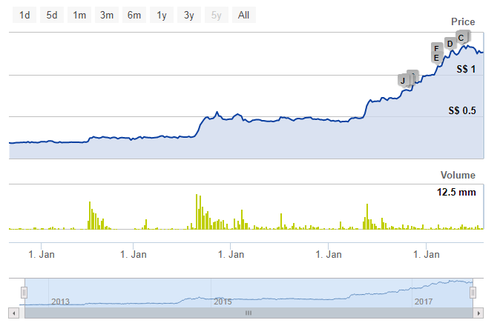
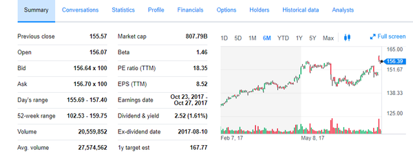
The two graphs are some traditional stock graphs that we have now on the website. The first one is from SGX and the second one is from Yahoo Fiance. There are several reviews and critics about these traditional graphs.
• The graphs showing the historical price of a stock is quite good and we can choose different time periods to see the stock price and the volume. However, the functions are limited because usually investors can only see this graph.
• The graphs all focus on specific stock but there’s no overview about the performance of different sectors and industries.
• Although we can see from both Yahoo Finance and SGX that they have some financials provided, they are not represented in the graphs and difficult for investors to read.
• Most of the websites do not have the forecast functions to predict the roughly future trend of a stock
• They do not provide further investing analysis such as how to select stock portfolios and what are the expected return of selected stocks.
3.Introduction
The application built mainly contain three modules. The first module is the basic analysis which tries to give an overview of the stock market about the industries and stock performance in S&P 500. The second module is the network analysis which investors can interact by choosing stocks with different correlations. The last one is the portfolio analysis which gives you the expected return of different stocks combinations.
4. Tools used
R shiny
5.Library used
Data cleaning: tidyverse, reshape2
Time series data preparation: tidyquant, TTR, timekit
Graph: treemap, d3treeR, igraph, ggraph, networkD3, plotly
Forecast: sweep
Design: shiny, shinydashboard
6.Data preparation
The data for the project is mainly get from the following function:
sp500<-tq_index("SP500") %>% tq_get(get = "stock.prices")
This uses the tq function in the tidyquant package to get the historical price of stocks in S&P 500 in the last 10 years. Tidyquant is an important package in terms of getting the financial data as well as transforming the time series data into the traditional data frame for further data analytics.
7.Basic analysis
Background
For the basic overview analysis, it is meant for investors to first have a general view about the industries of the stock market and then dive into specific stock gradually. After that, the app also provides a forecast function to give a roughly predict about the stock price trend in the future. There mainly four functions under this module which are treemap, ratio comparison, historical price and forecast.
Treemap
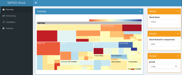
By definition, Treemaps display hierarchical (tree-structured) data as a set of nested rectangles. Here the treepmap is structured under the hierarchy from sector of stocks to industries to specific stocks in S&P 500. The size of the rectangle represents the market size of each company and the color represents the price change percent compared by different time periods. Apparently, we can see some sectors have dark blue in the graph which represent the price decreased a lot in this sector. Then we can drill down to see which stock decreased the most in this sector. Similarly, we can start from the blue color to see which stock price increased the most. Then we can pick out some stocks we are interested for further analysis.
Ratio comparison
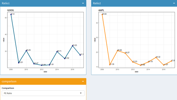
For the ratio comparison, we can input two stocks that we are interested to see their financial performance in the past few years. There are variety of ratios that we can select, namely PE ratio, current ratio, gross margin percent, revenue, asset turnover, financial leverage and payables period. These ratios cover different financial areas and hopes to give investors more knowledge about the stock companies performance in the past.
Historical price
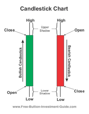
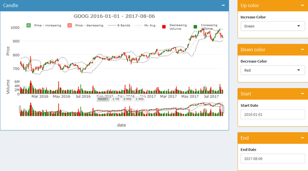
The historical price use candlestick graph to represent the historical price of a specific stock.
We can see from the graph that there are four parts in a candlestick: high, close, open and low. High means the highest price of the stock and low means the lowest price. The color represents the increase or decrease of the stock. If the stock price increases, then the color is in green and the upper bound is the closing price and lower bound is the opening price. On the other hand, red represents the price goes down and the upper bound represents the opening price and lower bound is the closing price.
In the historical price part, we can see clearly the historical price of a specific stock. We can input the stock symbol to change the stock and the starting date or end date to change the period. We also customize the color choice and investors can choose their preferred color for price going up and down based their own habits or culture.
Forecast
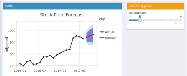
In the forecast part, we did a stock price forecast using the ARIMA model. ARIMA stands for autoregressive integrated moving average which is particularly for forecasting in time series data. The model used the monthly stock price starting from 2016-01-01 as the training data and predict the stock price from 2017-08-01. The dark blue area represents that the stock price is in 80% confidence level to fall into that area and the light blue area represents 95% confidence level. The larger the area is, it means the uncertainty and risky of the stock. So from the forecast graph, we can have a general idea about the future trend of this stock price as well as the uncertainty and risky.
8.Network analysis
Why network
1. Consistency: Network is more likely to be consistent over time.
2. How important the node is?
• Degree centrality: How many people can this person reach directly.
• Betweenness centrality: How likely is this person to be the most direct route between two people in the network?
• Closeness centrality: How fast can this person reach everyone in the network.
• Eigenvector centrality: How well is this person connected to other well-connected people?
3. Pattern: A clique in a graph is a set of pairwise adjacent vertices
Stock network
• A clique in a graph is a set of pairwise adjacent vertices
• Eigenvector centrality: how well is this stock connected to stocks that are negatively connected with other stocks.
• Community detection: Select from different community
Network analysis
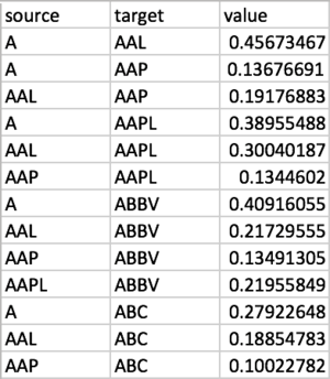
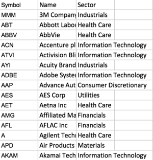
For the network analysis, we first calculate daily return, and user cor() to build correlation matrix. Transform the matrix into the format of link table. Links:
Nodes table can be found directly on the internet. Nodes:
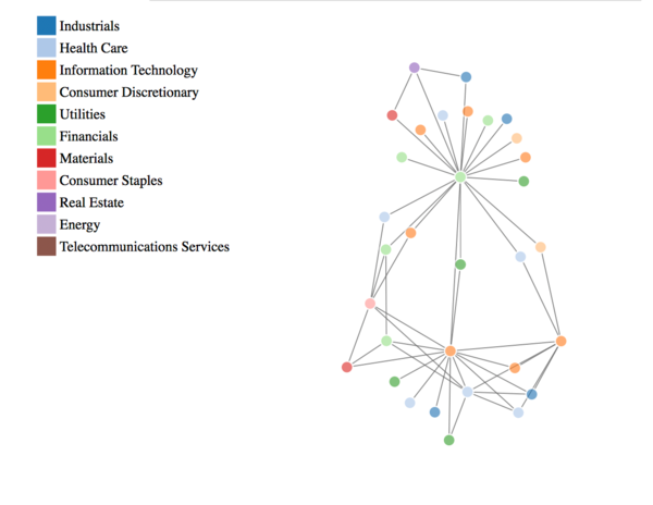
Then we use companies as vertices, and their correlations as edges.
There are several centrality metrics that we can make use of to measure importance of nodes. The idea of complete graph or clique can help to identify patterns in graphs. Eigenvector centrality measures how well is this stock connected to stocks that are negatively connected with other stocks. This is what we are looking for.
Following the rule of diversification in portfolio management, we can generate graphs that have negative correlations, and find cliques to invest in. As a basket of stocks that have pairwise negative correlation can be good to construct a well-diversified portfolio.
We can also generate graphs with positive correlations, and apply community detection. Investing in different communities could also be a way for portfolio diversification.
Users can adjust the correlation to see different networks, and hover mouse over to see the stock code.
9.Portfolio analysis
Concept
Portfolio return is the monetary return experienced by a holder of a portfolio. Portfolio returns can be calculated on a daily or long-term basis to serve as a method of assessing a particular investment strategy. Here, we use the monthly portfolio return to analyse. The right combination of stocks, bonds and cash can allow a portfolio to grow with much less risk and volatility than a portfolio that is invested completely in stocks. Diversification works partly because when one asset class is performing poorly, another is usually doing well. In this way, our application can evaluate either one single portfolio by analysing its returns and growth or multiple portfolios customized by the users.
Application
In this process, we aim to analyse the performance of financial assets and portfolios. Customizing portfolio can be chosen in different percentage of stocks by users. For example, if a user wants to invest $10,000 to a portfolio – “50% GOOG, 25% DBS, 25% DIA”, after inputting the percentage and stock names, the application will return this graph to the user.
In this graph, we can find it shows an above-zero trend meaning positive returns. The bar chart shows the return of this portfolio by each month. This is a satisfying trend, but users may want to see how the $10,000 initial investment is growing.
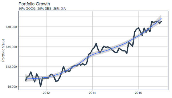
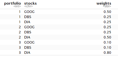
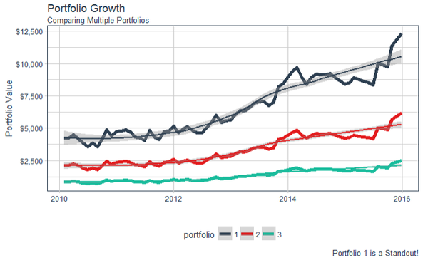
This graph is more visualized in the portfolio performance. It shows the portfolio value changed from 2011 to 2017. Users may be attracted by the positive trend of this portfolio, but what if the user want to compare different customizing portfolio? In this application, it can realize the comparison of portfolio growth among multiple portfolio. For example, a user wants to invest a portfolio of three stocks – “GOOG”, “DBS” and “DIA”, but he does not know what proportion of each stocks. He can input different combinations of proportion in this application.
This is the three kinds of portfolio made by the user. We can compare the portfolio growth of different weights.
Portfolio 1 shows the best growth in multiple portfolios, which can provide a recommendation for the user. Apparently, this graph only shows three customizing portfolios, but it may not be the best portfolio. In this condition, we choose to calculate portfolio optimization of the specific stocks.
10.Future work
• Technically, the app is not that stable and some functions may not work very well sometimes. Becasue there may be some crash of the graphs, currently the applicatiopn is divided into two parts. The first one is the basic analysis and forecast. The second one is correlation and porfolio analysis. We can try to fix these unstable problems in the future.
• The reaction time for some graphs are long and we can work on improving the response time
• The visualization design still needs improving. Some places are not quite clear to show their features.
• In the future, we can still add more functions to the app to enrich the user experience for investors
11.Installation guide
Software:
R: https://cran.r-project.org/bin/windows/base/
Rstudio: https://www.rstudio.com/
Package:
• tidyverse: The 'tidyverse' is a set of packages that work in harmony because they share common data representations and 'API' design. This package is designed to make it easy to install and load multiple 'tidyverse' packages in a single step. Learn more about the 'tidyverse' at <https://github.com/hadley/tidyverse>.
• tidyquant: The tidyquant package is focused on retrieving, manipulating, and scaling financial data analysis in the easiest way possible.
• tidygraph: 'tidygraph' provides an approach to manipulate these two virtual data frames using the API defined in the 'dplyr' package, as well as provides tidy interfaces to a lot of common graph algorithms.
• plotly: Easily translate 'ggplot2' graphs to an interactive web-based version and/or create custom web-based visualizations directly from R. Once uploaded to a 'plotly' account, 'plotly' graphs (and the data behind them) can be viewed and modified in a web browser.
• d3treeR: 'd3treeR' is the primary function for creating interactive d3.js treemaps from various data types in R
• networkD3: Creates 'D3' 'JavaScript' network, tree, dendrogram, and Sankey graphs from 'R'.
• igraph: Routines for simple graphs and network analysis. It can handle large graphs very well and provides functions for generating random and regular graphs, graph visualization, centrality methods and much more.
• quandmod: Specify, build, trade, and analyse quantitative financial trading strategies.
• PortfolioAnalytics: Portfolio optimization and analysis routines and graphics.
• shiny: Makes it incredibly easy to build interactive web applications with R. Automatic ``reactive binding between inputs and outputs and extensive prebuilt widgets make it possible to build beautiful, responsive, and powerful applications with minimal effort.
• shinydashboard: Create dashboards with 'Shiny'. This package provides a theme on top of 'Shiny', making it easy to create attractive dashboards.
12.User guide
Step1:
Start from the treemap and see the stock price change in different industries. The box on the right whose name is “period” represents the time compared with the stock price yesterday. Investors can select to see 1 day, 1 week or 1 month differences
Step2:
Investors then can input two stocks that they are interested on the box showing stock1 and stock2 on the right. Then we can the ratio comparison graph appears. We can also change the ratio that we are interested from the drill down box.
Step3:
Then we can have a look at the specific stock historical price on the graph at the bottom. Investors can choose any stock they are interested and change the time interval on the right.
Step4:
Then investors can change the graph to see other modules by clicking forecast on the left panel.
Step5:
Until now, investors should have chosen some stocks that they are interested. Then we can click “correlation” on the left panel to see the correlation between stocks. Investors can change the correlation figures to filter different stocks.
Step 6:
Portfolio return shows the monthly return of a portfolio which includes multiple stocks with different weights. The trend line shows the mean of returns. Above-zero trend line shows a positive returns and below-zero trend line is opposite.
The three input modules are three stocks that investors want to combine in a portfolio. You can change any three kinds of stocks in there, but you prefer to input the stocks which have negative correlations in network analysis.
Step7:
Portfolio growth is more visualized in the portfolio performance. It shows the portfolio value growth from 2011 to 2017.
The three input modules on the right match the stocks above. Investors can change different weights to find the better portfolio growth and make an investment!
12.Main references
http://www.business-science.io/blog/index.html
https://christophergandrud.github.io/networkD3/
https://cran.r-project.org/web/packages/tidyquant/vignettes/TQ05-performance-analysis-with-tidyquant.html

