ADA Proposal
Analysis of Rise in Global Temperatures and its Causes Through Interactive Visualizations
|
|
|
|
|
|
Project Overview
Climate change and global warming are material and contemporary issues that are gaining traction from countries all over the world. Global citizens of all ages and economic backgrounds are faced with unwanted effects of climate change today. As the buzz around global warming continues to increase, this contemporary issue has incited many relevant visualisations. Through this project, we analyse the key contributors to climate change namely: Fossil fuel consumption, adoption/rejection of renewable energy, electricity consumption, deforestation rate, and greenhouse gas emissions. The residual impact of these factors to facilitate the rise of global temperature has been captured for 86 countries around the world.
While most contemporary visualisations focus on individual environmental hazards such as increased rates of carbon emissions or the rapid rise in temperature, our analysis attempts to connect the dots to better understand the cause-and-effect nature of global warming. Through our visualisations, we depict the causal effect between the factors which contribute to greenhouse gas emissions and the resulting impact on increase in temperature from the year 1990 to 2012. Furthermore, we attempt to forecast the aforementioned causal effects and the net rise in temperature for ten subsequent years to better understand the variation in each factor over time.
Project Scope
|
Influencers of Global Warming
- Electricity Consumption
- Forest Cover - Fossil Fuel Consumption - Population - Renewable Energy Adoption |
|
Harmful Emissions
- Total Greenhouse Gas Emissions |
|
Effects of Global Warming
- Temperature |
Critique of Relevant Prior Work
While most contemporary visualisations focus on individual environmental hazards such as increased rates of carbon emissions or the rapid rise in temperature, our project attempts to connect the dots to better understand the cause-and-effect nature of global warming. For example, a visualisation by the Guardian effectively shows the estimated rate of carbon emissions for each country based on their current rate of emissions.
As carbon emissions are the direct cause of increasing temperatures, some visualisations focus purely on the rise in global temperature and the yearly trends of increase in temperature from 1850-2016.
Another example of a country-specific visualisation by Carbon Footprints of Nations attempts to highlight the environmental footprints of nations for a specific time-period. Such geolocation analysis is important to highlight the regions that are major contributors of global warming.
Description of Dataset
|
|
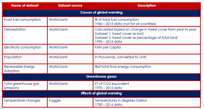
Our analysis will focus on 1990 – 2012 as these are the common years available across all chosen datasets.
Visualisation Plan
|
|
Expected Technical Challenges
Data Preparation
- Agglomeration of country-specific and yearly trends data for each of the aforementioned proponents and consequences of global warming;
- Our approach: Based on intensive research for appropriate data sources, we have collected yearly data on each subject based on different geolocations (countries or other well-defined regional sections).
Data Consolidation
- Merging all recorded data sources into one super table which will serve as an analytical sandbox for creating analysis models and visualisations;
- Our approach: Before data consolidation, we will prepare a sample table with required fields that will be needed for our analytical models and corresponding visualisations. This table will serve as our blueprint to create the consolidated data table.
Interactive visualisations
- Creating interactive storyboards that provide a multi-factor overview of the cause-and-effect of global warming and also allow the targeted audience to filter and zoom on-demand;
- Our approach:Creating a wireframe/storyboard of our ideal dashboard which will be used as a blueprint to prepare the final output.
Project Execution Plan
|
|

