ADA ProjectDeliverables
Analysis of Rise in Global Temperatures and its Causes Through Interactive Visualizations
|
|
|
|
|
|
Motivation
Climate change and global warming are material and contemporary issues that are gaining traction from countries all over the world. Global citizens of all ages and economic backgrounds are faced with unwanted effects of climate change today. As the buzz around global warming continues to increase, this contemporary issue has incited many relevant visualisations. Through this project, we analyse the key contributors to climate change namely: Fossil fuel consumption, adoption/rejection of renewable energy, electricity consumption, deforestation rate, and greenhouse gas emissions. The residual impact of these factors to facilitate the rise of global temperature has been captured for 86 countries around the world.
While most contemporary visualisations focus on individual environmental hazards such as increased rates of carbon emissions or the rapid rise in temperature, our analysis attempts to connect the dots to better understand the cause-and-effect nature of global warming. Through our visualisations, we depict the causal effect between the factors which contribute to greenhouse gas emissions and the resulting impact on increase in temperature from the year 1990 to 2012. Furthermore, we attempt to forecast the aforementioned causal effects and the net rise in temperature for ten subsequent years to better understand the variation in each factor over time.
Review and Critique of Prior Work
While most contemporary visualisations focus on individual environmental hazards such as increased rates of carbon emissions or the rapid rise in temperature, our project attempts to connect the dots to better understand the cause-and-effect nature of global warming. For example, a visualisation by the Guardian effectively shows the estimated rate of carbon emissions for each country based on their current rate of emissions.
As carbon emissions are the direct cause of increasing temperatures, some visualisations focus purely on the rise in global temperature and the yearly trends of increase in temperature from 1850-2016.
Another example of a country-specific visualisation by Carbon Footprints of Nations attempts to highlight the environmental footprints of nations for a specific time-period. Such geolocation analysis is important to highlight the regions that are major contributors of global warming.
Data Cleaning, Preparation and Modeling
Datasets for each of the following 7 factors were collected from either the World Bank indicators database or Kaggle:
- Electricity Consumption
- Forest cover
- Fossil fuel
- Greenhouse gas emissions
- Population
- Renewable energy consumption
- Temperature (taken from Kaggle/Berkeley Earth)
While there were many steps involved in the data cleaning and preparation process including transposing of data table, changing of variable types, changing column names, etc. the three key steps/challenges in the process were:
1. Data Cleaning for the Temperature Data Table:
While the temperature data table we had was very detailed, containing monthly temperature readings for every city in each country, the year column was not standardized. Some of the year formats were DD-MM-YYYY, some DD/MM/YYYY, and some of the rows swapped the order of the days and years to YYYY-MM-DD and YYYY/MM/DD. Because the data we had procured from the world bank repository only had annual values, we needed one aggregated value for each country, but to do this we had to extract just the year from the date column.
The first step we did was to replace all the slashes with dashes so that the only difference left between the rows was the order of the day month and year. Next, we split the column based on dashes into three columns using the data frame split function. The maximum value from the three columns were extracted as the Years for each row (as this would be the largest 4-digit integer), the extracted values were then used to aggregate a value for each location for each year.
2. Extracting Common Countries and Time-Periods (Years):
While the years were easy to filter for all data tables as it required simple a subset/column dropping script to be run, for the countries, we had to do a few more steps. For each of the data tables, we extracted a vector list of the country names and then found the intersection of the lists to prepare a list of complete country names that appeared in all data sets. We also excluded aggregated region values, e.g. “World”, “EU countries”, “Non EU countries”, “Arab World”, etc.
All data tables were then filtered to ensure that the same 86 countries were retained across all tables.
3. Time-Series Forecasting:
Forecasting was performed for 10 years for all data sets in the project. This step involved ensuring that the data tables followed the same format – year as one column, followed by one column for each of the countries.
This was then converted to an XTS object (extensible time series). This object was then sent to the forecast() function in R’s forecast package to forecast values for the subsequent 10 years. These values were then appended to the original data tables to ensure that each variable had a table with values from 1990 – 2022.
4. Data Consolidation:
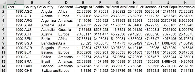
All the data tables were then combined into one final consolidated data table to create our visualizations.
Design Framework
1. Interface:
In this section, the dashboard containing the visualizations will be described. The dashboard is laid out in separate tabs. The dataset we have turned into visualizations has 3 levels:
- Level 1: Global level
- Level 2: Continent level
- Level 3: Country level
As can be seen in Figure 1, separate tabs have been made use of for each visualization, for a better user interface. By having separate tabs, the user need not scroll up and down and can instead toggle freely between tabs containing visualizations. Maximum screen space has been given to the visualizations. Each tab has a ‘year slider’ which allows users to visualize the data based on the year they are curious to find out about. In addition to the year slider, each tab provides a set of options that the user can switch between for comparison. Parallel coordinates plots can be used to simultaneously analyse data distribution across all variables - Temperature, Electricity consumption, Forest Cover, Fossil fuel consumption, Greenhouse gas emissions, Population and Renewable energy adoption.
The dashboard comprises of Interactive plots that were developed such that users may gain insight on patterns, trends and relationship between different causes, greenhouse gas emissions and temperature over time. The purpose of this dashboard is to provide an application interface which facilitates an interactive analysis of the rise in global temperatures and its potential influencers which include Electricity Consumption, Forest Cover, Fossil Fuel Consumption, Population and Renewable Energy Adoption. Users are encouraged to interact with dynamic visualizations contained in this application and analytically determine the potential influencers and effects of global warming at any geographical level such as continent or country. Some potential areas of exploration are:
- Global overview of changes in temperature using a Chloropleth world map
- Continental analysis of change in temperature trends from 1990 to 2022 using the Geofacet plot
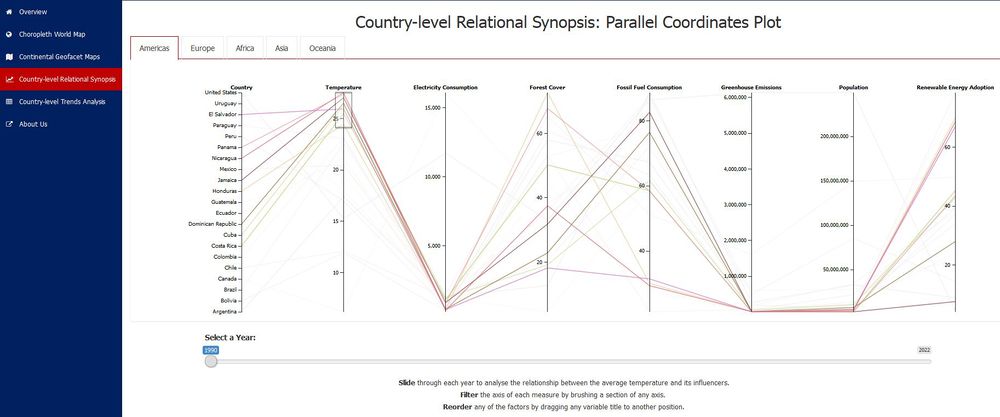
- Country-level overview of the relationship between Average temperature and its influencers using a Parallel Coordinates Plot
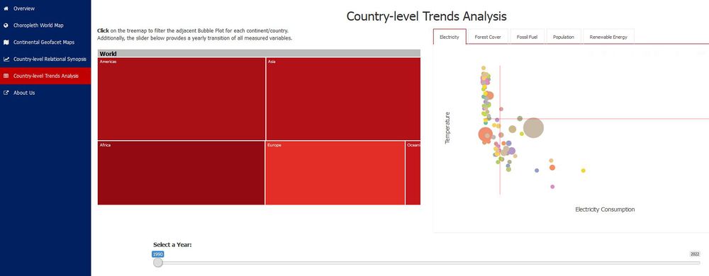
- Interactive Treemap and reactive Bubble plots to deterministically analyse the relationship with between Average temperature of a country and its influencer over a 22-year time period
2. Analytical Visualizations:
The tabs contain visualizations based on hierarchy. The first visualization created is the Choropleth World Map which portrays the temperatures across the world.
2.1. Choropleth World Map:
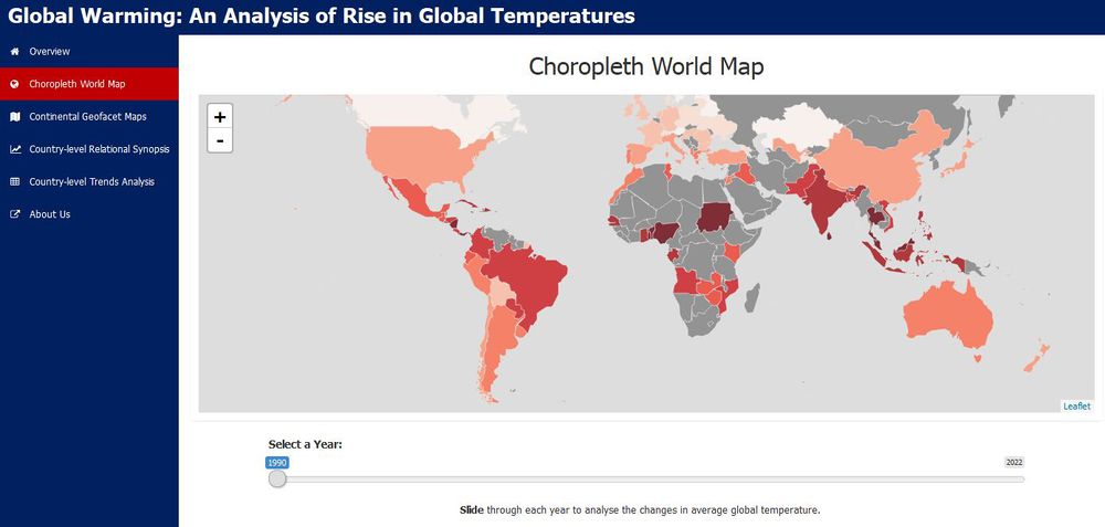
A choropleth world map is used to depict temperatures worldwide on a yearly basis. Darker colours represent countries with higher temperatures as compared to countries with lighter coloured countries in this map. The map above shows average temperatures for 86 countries in 1990. While this visualization allows a quick overview of countries facing high/low temperatures, it does not show the trend in changing temperatures over the years.
Features of the Choropleth world map:
- Heat map of the world showing average annual temperature for all of the countries for each year
- The colours here represent the range temperature in degrees Celsius
- The countries that are grey here are countries that are not in the current scope of this application
- By clicking on each country, we can see the name of each country and the average temperature for the chosen year
- Using the slider at the bottom, we can drag it across to see how temperatures have changed for the countries over time
- Gives us an overall view of temperatures for each year for the world as a whole
2.2. Geofacet Maps:
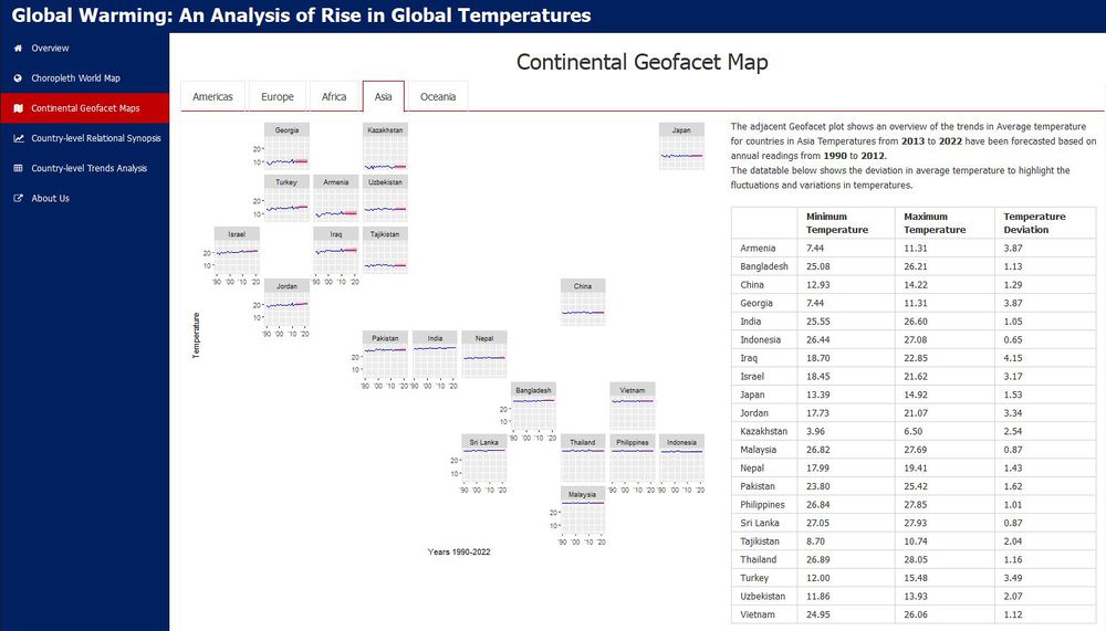
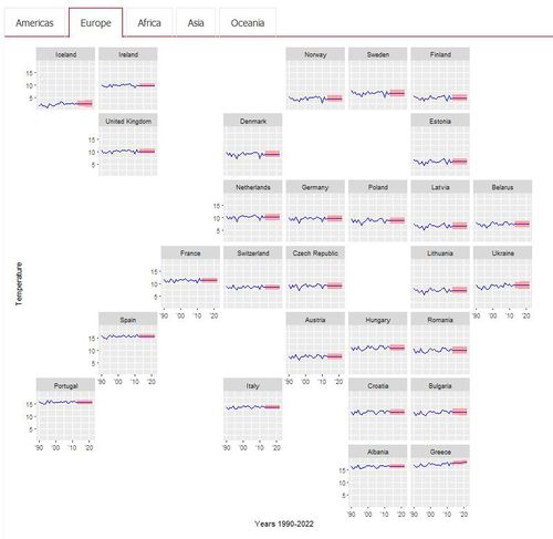
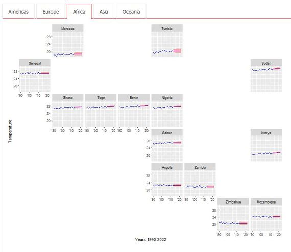
An alternative visualization using R’s latest Geofacet package has been made use of to portray continent level analysis. For each continent, this package plots countries in their respective geographical positions and also shows trends in changing temperatures over the years. With this visualisation we have taken the concept of geographical representation of temperature data to a new level using R’s relatively new geofacet package.
Features of the Geofacet maps:
- Each of the faceted plots are spatially placed in a grid in locations respective to the actual geographic locations of each country on a world map
- The lines represent the change in temperature over the years
- From 1990 to 2012, which is the first part of the blue line, shows the actual temperature values
- The envelope represents forecasted temperature values with 95% confidence interval for the subsequent 10 years for each country
- Next to each of the geofacet maps, a data table is shown which highlights further information on temperature values for each country with the minimum and maximum temperature. The purpose of the table is to show the variation of temperatures over time in the temperature deviation column
- This dashboard allows us to gain insight into the change in temperatures for countries in a continent relative to each other
2.3. Parallel Coordinates Plot:
A parallel plot to perform country level analysis by consolidating all factors in one visualization. This chart allows all for comparison of all values in one view. The plot facilitates interactive highlighting to visually analyze and compare variables. The user is provided with additional functionality of being able to drag variables and re-arrange them in the order they prefer.
Features of the Geofacet maps:
- Each factor mapped to countries with a line
- The ability to highlight a subset of one of the variable axes, for example, highlighting countries with high temperature to see if any trends can be seen across the other variables
- Use of a slider at the bottom to see how the values for countries changed over time
- The benefit of this visualisation is the ability to see all the variables in one place, determining any trends/relationships can be seen across variables
- The ability to highlight certain areas of the axes mean that we can focus on our key areas of concern.
2.4. Treemap & Bubble Plot:
This tab in the dashboard portrays two visualizations along each other to show country-level analysis. The tree map plot on the left represents average annual temperature in a geographically hierarchical manner. Once we click on a continent we can see the different temperatures across the countries in the continent. On the right, is the bubble plot representing four different factors.
Features of the Geofacet maps:
- On the x axis we have our influencers, these tabs across the top allow you to change the x axis based on your area of interest
- The y axis represents temperature across all graphs
- The size of each bubble represents the emissions for each of the countries
- The colour of each bubble represents the country itself
The main advantage of this dashboard is the ability to visually see the relationship between the influencers, the emission, and our effect, which is temperature – this was the key aim in building this app. This also helps to set us aside from other visualisations out there, while you drill down further into the actual temperature of the country, you can also quickly get an idea of where that country lies in terms of the consumption/usage of the influencers and their emissions.
Demonstration: Sample Use Cases
The purpose of this section is to provide important demonstrative examples of the usage of this application. There are many possible use cases depending on the areas of interest/concerns of the targeted audience. However, some important sample use cases for this application are as follows.
1. Comparison of Europe and Africa using Geofacet Maps:
Rising temperatures are seen for countries worldwide even though the rate of change is geographically inconsistent. For example, for some countries in Africa, the increase in temperature is more rapid than for countries in Europe.
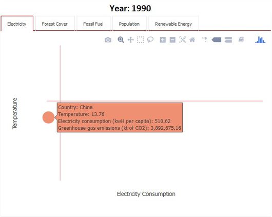
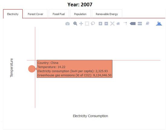
2. Country-level analysis for China using Bubble Plot
Developing countries such as China has a consistent increase in consumption of electricity and fossil fuels. China has also seen an exponential increase in greenhouse gas emissions (currently the largest contributor to greenhouse gases)
3. Drawing relationships between variables in Asian Countries
Countries in the continent of Asia have high temperatures but low electricity consumption, comparatively high renewable energy adoption. The user is provided with additional functionality of being able to drag variables and re-arrange them in the order they prefer.
Discussion
Climate change has many aspects to it, rise in sea level, melting ice caps, erratic rainfall, but the one factor everyone thinks of is “rise in temperatures”. This is the focus of our application. When we look at existing visualisations related to global warming, be it static visualisations or interactive, we find focus on individual environmental hazards such as increased rates of carbon emissions or the rapid rise in temperature, our analysis attempts to connect the dots to better understand the cause-and-effect nature of global warming. Through our visualisations, we depict the causal effect between the factors which contribute to greenhouse gas emissions and the resulting impact on increase in temperature from the year 1990 to 2012. Furthermore, we attempt to forecast the causal effects and the net rise in temperature for ten subsequent years to better understand the variation in each factor over time.
Our application that we have named as GRIT (Global Rise in Temperature) is a consolidated application that allow us to map this rise in temperature to its causes and observe patterns on world, continent, and country level.
The main advantage of this dashboard is the ability to visually see the relationship between the influencers, the emission, and our effect, which is temperature – this was the key aim in building this app. This also helps to set us aside from other visualizations, while you drill down further into the actual temperature of the country, you can also quickly get an idea of where that country lies in terms of the consumption/usage of the influencers and their emissions.
Future Scope
1. Additional Functions:
With the foundation of the application been created, following is a list of additional functions that can be added:
- Adding in more countries
- Adding in more years for improving forecasting results and more up to date actual data
- The app can be extended to a city/state level. While the city level data was available for the temperature dataset, it was not available for the world bank data sets at this time
- What if analysis in the context of different eco-friendly strategies that countries are beginning to implement to combat the impact of global warming
- Increase interactivity across the tabs in the application to allow more seamless application experience
- Allowing users to upload their own datasets in the future would allow them to consider other influencer/emission/output factors for exploration
- Along with forecasting we would also like to create a prediction model that draws relationships between the influencers and the corresponding effect on temperature individually
2. Real World Use Cases
In the context of the complete application including the future functionalities, the application can be used by:
- Climate/temperature analysts as this is a growing concern anyway
- It can be used for educating people about environmental awareness, especially the global warming naysayers
- This can be used by governments to plan their environment budgets based on forecasted values
Installation Guide
1. Explore the Live Application:
As an end user of the application, you can explore the GRIT application to perform your own analysis of the rise in global temperatures.
Click here to explore the live application.
2. Installation Process:
2.1. System Requirements
Your local system should have R Studio installed. Due to the packages used in this application, the minimum version for RStudio is 'Version 1.0.143'.
Click here to download the latest version of RStudio.
2.2. Download the Source Code
For R enthusiasts and fellow-coders who are interested in downloading the source code of the application, all relevant code files for the GRIT application are available on GitHub.
Click here to view and download the application code files.
After downloading the source files, open the app.R file in RStudio to explore the source code. Click the Run App button to run the application on your local machine.
3. Deployment Process
After downloading the Source files as explained in the previous section, you can host the R Shiny application on your own server. A free server to host this application is provided by shinyapps.io. Steps to deploy the application on shinyapps.io are as follows:
- Visit Shiny Apps and sign up for a free account, which allows you to host up to 5 applications.
- Based on the personal token and secret number provided by Shiny Apps after signing up, the application can then be deployed to your server.
- In Rstudio, execute the following code snippet:
install.packages('devtools')
devtools::install_github('rstudio/shinyapps')
devtools::install_github('rstudio/rsconnect')
library(shinyapps)
library(rsconnect)
rsconnect::setAccountInfo(name="Your account name", token="Your Personal Token", secret="Your Secret Number")
- Click on the Publish icon in RStudio to upload and deploy the application to the Shiny Apps Server.
- After entering an appropriate name for your application, the GRIT application will be deployed and hosted to your Shiny Apps server.
User Guide
Please refer to the User Guide file below for a brief overview on how to use the GRIT application:
References
- Fossil fuel energy consumption (% of total)
- Forest area (sq. km)
- Electric power consumption (kWh per capita)
- Renewable energy consumption (% of total final energy consumption)
- Population, total
- Total greenhouse gas emissions (kt of CO2 equivalent)
- Climate Change: Earth Surface Temperature Data
- Stack overflow: How do I name the row names column in r
- Removing rows with missing values
- Stack overflow: Reshape three column data frame to matrix (long to wide format)
- Stack overflow: R-finding unmatched column names of data frames
- Stack overflow: Split a column of a data frame to multiple columns
- Stack overflow: Aggregate a dataframe on a given column and display another column
- Stack overflow: Remove white space from a data frame column and add path
- Stack overflow: How to remove specific special characters in R
- Concatenating 2 text columns in a data.frame
- Stack overflow: Add space between two letters in a string in R
- ISO 3166 Countries with Regional Codes
- How to do VLOOKUP in R
- Stack overflow: R: Counting the number of matches between multiple data frames
- Geofacet
- Interactive Parallel Coordinates
- Interactive Treemap


