Turning Concrete Malls into Smart Malls (S-MALL):
A web-based analytics application for visualizing and mapping in-mall customer journeys and shopping behaviours
Team S-MALL: Chen Yun-Chen | Chiam Zhan Peng | Zheng Bijun
APPLICATION OVERVIEW
APPLICATION DESCRIPTION
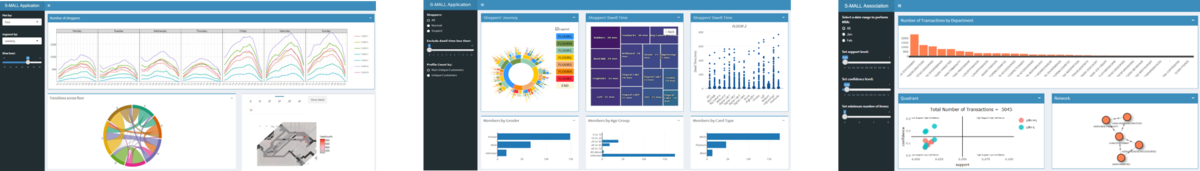
Part1: Movement Analysis
| Visualization
|
Methodology & Technique
|
Usage
|
|
|
- Chart type: Line chart & trellis plot
- R Package: ggplot2, plotly
- Interactivity: Use selectInput to control plot and segment by different timelevels, eg. Date, day of week, and hour
|
- Line chart without trellis (segment=None) can be used to analyze the daily/weekly/hourly pattern of footfalls.
- Trellis plot can be used to detect the cycling pattern over time.
|
|
|
- Chart type: Chord diagram
- R Package: chorddiag
- Interactivity: Set specific datetime using selectIput and sliderInput to view the traffic transfer across floors.
Hover to each floor to see the destination of its outflow traffics.
|
- Analyze traffic flow across floor for specific datetime selection
|
|
|
- Chart type: Hexagonal binning map
- R Package: hexbin, ggplot2, plotly
- Key parameter setting: number of bins is set to 50
- Interactivity: Set specific datetime using selectIput and sliderInput to view the traffic density on each floor.
Click on specific hexbin to investigate members identity.
|
- Analyze traffic density of floors for specific datetime selection
- Drill down to shoppers’ identity based on interested density area
|
Part2: Member Analysis
| Visualization
|
Methodology & Technique
|
Usage
|
|
|
- Chart type: Sunburst diagram
- R Package: sunburstR
- Interactivity: Set radio button to view the journey of different member segments.
Set minimum dwell time using sliderInput to exclude passing-by floors.
Hover to see the path and relevant statistics.
|
- Investigate popular shopping path of members based on floors.
|
|
|
- Chart type: Treemap
- R Package: treemap, highCharter
- Interactivity: Set radio button to view the journey of different member segments.
Click on floor level to drill down to store level.
|
- Analyze members’ average dwell time on each floor and store.
|
|
|
- Chart type: Boxplot
- R Package: plotly
- Key parameter setting: number of bins is set to 50
- Interactivity: Click on the treemap to get the relevant boxplot for selected floor.
|
- Analyze dwell time distribution of each store based on floor selection on treemap.
|
|
|
- Chart type: Bar chart
- R Package: plotly
- Interactivity: Select on the boxplot distribution to view the demographic of interested members.
Set the ‘profile count by’ parameter to decide the y-axis of bar plots.
|
- Analyze members’ profile based on selection of their dwell time distribution. For example, we may analyze the high time spender of a specific store to see if they are of similar demographic.
|
Part3: Association Anlaysis
| Visualization
|
Methodology & Technique
|
Usage
|
|
|
- Chart type: Bar chart
- R Package: ggplot2, plotly
- Interactivity: Set date range using radio button to see the plot of different months.
|
- Investigate popular shopping path of members based on floors.
|
|
|
- Chart type: Scatter plot
- R Package: arules, ggplot2, plotly
- Interactivity: Set date range using radio button to generate association rules based on different month’s transactions.
Set parameters (support/confidence/min items) to generate valid associations rules and render plot.
Hover over the bar to fade out non-relevant rules in the quadrant.
Hover over the network to fade out non-relevant rules in the quadrant.
|
- Analyze the competitive position of different rules based on set parameters.
|
|
|
- Chart type: Network
- R Package: visNetwork
- Interactivity: Set date range using radio button to plot rules of different months.
Set parameters (support/confidence/min items) to generate valid associations rules and render plot.
|
- Visualize the associations among departments.
|
R Packages for Analytics & Visualization: ggplot2, plotly, sunburstR, hexbin, treemap, highCharter, arules, visNetwork
References