ISSS608 2016-17 T3 Group5 Immigration Application
 Group 5 - Why Did the Migrant Cross the Road?
|
|
|
|
|
|
|
|
Contents
Dashboard
To ensure better interactivity and efficiency in coding, we chose flexdashboard over alternatives like the basic shiny package and the shiny dashboard due to its effective way in organising code and its relatively simpler syntax in dealing with reactive functions, inputs and outputs. Above all, flexdashboard allows seamless integration with RMarkdown and provides a clean interface to work with, especially with a team of multiple coders.
In the extraction, cleaning and general manipulation of data we used tidyverse, tidygraph, readxl, igraph and WDI. This helped us tremendously in aggregating and joining data that came from different sources as well as changing the format of the data to the correct type so that they could be visualized by the respective plots.
Our dashboard link: https://davidten.shinyapps.io/migrationanalytics2/ Press F11 to maximize browser for optimal viewing
User Guide and Design Logic
Visualization

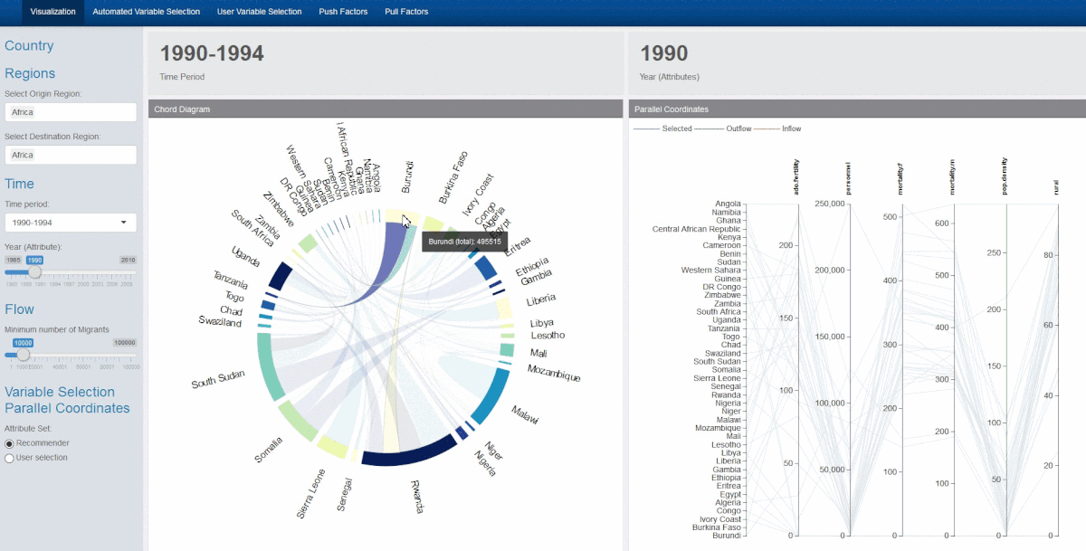
Introduction Our main visualization tools are a chord diagram and parallel coordinates plot, placed size by size. A sidebar to the left allows the user to filter the data as desired:
- Region of Origin
- Region of Destination
- Time Period of the Chord Diagram Migration Flow
- Year of the Attributes on the Parallel Coordinates Plot
- Flow : minimum cutoff for flow of migrants
- Toggle between recommended or user selected variables (Parallel Coordinates)
Aside from user the side bar, further interactivity is possible :
- Hovering over the chords will display the migrant flow between the countries connected by the chord
- Clicking on a country on the chord diagram will filter the display of the parallel coordinates plot, showing the selected, destination and origin countries
- Brushing the parallel coordinates plot will dim the excluded lines for improved clarity
- Variables on the parallel coordinates plot can be reoriented or rearranged as desired
Since there are a large number of country variables, the variables displayed by the parallel coordinates are dynamic and can be updated by varying the recommendation parameters or by selecting different user inputs. A clustered heatmap is displayed to the user to aid his variable selection.
Chord Diagram
After exploring circlize and other visualisation packages, we settled on chorddiag due to its relative simplicity - as long as we fed it data in an adjacency matrix format it could display the chord diagram visualisations with ease.

Given that it is an R wrapper on top of d3.js code, it provides beautiful and interactive graphics for e.g. the automatic adjustment and realignment of country names every time the data set is updated with a new set of countries, and when the country of interested is selected through hovering the cursor, the non-selected flows conveniently fade into the background allowing the user to explore the migrant flows interactively. It also allowed us to pass data through reactive functions to other parts of the app, so that we can connect say the clicking of a country of the chord diagram with the selection of country attributes in our parallel coordinates plot (described below). However, the chorddiag package has its downsides as well, as it is an experimental package still undergoing development. One functionality problem we discovered was that when we added more and more countries to plot, the names started to overlap and were difficult to differentiate, much less identify. We implemented a workaround where we calculated the number of countries being displayed, and change the font size of the chord diagram text accordingly so that the text is still legible even when many countries appear.
View this link for more details.


Parallel Coordinates Plot
We chose the parcoords package to represent Parallel coordinates with the same considerations in mind – that it is an R wrapper over d3.js code which allowed for powerful interactivity. This package is even more flexible than chorddiag as the developer left a backdoor entry into his code via Javascript. A variable called tasks will take in text written in Javascript and execute them after the initial plot is displayed. This offers maximum flexibility but it requires an understanding of Javascript. Features we implemented include the following:

1) changing of colours of the lines of the parallel coordinate plot that correspond with the countries being selected – blue for selected country, red for source countries of the selected country, and green for destination countries of the selected country.
2) The selection and brushing of the y-axes of the parallel coordinate plot, which was extremely useful when too many countries were represented at the same time.
3) The shifting of the y-axes through clicking and dragging as it allows users to better position attributes that they are interested in comparing side by side when necessary.
4) The flipping of the axis when you double click on them allowing the exploration of data in cases where users might be more interested in comparing low scores rather than high scores for e.g. the Hofstede cultural dimensions data where low and high scores represent dichotomous polarities rather than a continuous measure such as GDP. We chose to limit the user to 9 variables due to space constraint issues. Moreover, this has implications further on when we performed the partial regression analysis, as too many variables in the multivariate linear regression will only add error and reduce the meaningfulness of the statistical model.
5) Fading the excluded lines instead of the default setting of hiding them. This had to implemented in Javascript. We chose to fade instead of hide so that the remaining structure of the data would still be visible to the user if required.
6) Rotating the y axis labels so that they are vertical. This was done to avoid overlapping labels. Due to our layout the variables on the parallel coordinates are quite close and will be updated dynamically so the chances of collision are high. To avoid this the label are rotated. This had to be implemented in Javascript as well.

Variable selection recommended system

In order to help users select important variables, we decided upon the Boruta package. Named after a pine forest deity from Slavic mythology – Boruta is a feature selection algorithm that uses the Random Forest classifier to discover which factors are important . After selecting net migration as the Y value, the package creates shadow variables – or copies – of all the variables in the dataset to add randomness to the data. Next the random forest classifier is applied on the extended dataset and a feature importance measure (Mean Decrease Accuracy) is used to evaluate which feature is more important. Features with a higher Z-score than its shadow feature are deemed important and unimportant features are removed at every iteration. The algorithm stops when all features are either confirmed or rejected.
After performing performed 99 iterations, the Boruta algorithm confirmed 41 attributes as important to migration flows: CO2 emissions, GDP (Current US$), GDP per capita (Current US$), Adolescent fertility rate (births per 1,000 women ages 15-19), Old age dependency ratio (% of working-age population) and 36 others. 28 attributes confirmed unimportant: net FDI and FDI inflows (BoP, Current US$), GDP per capita growth (annual %), Age dependency ratio (% of working-age population) and 23 others.
As 41 variables are still too many to use, the set of attributes were further refined through a multivariate linear regression model and the most statistically significant attributes were chosen for visualisation on the parallel coordinates plot. The final set is as follows:
Level of institutionalised democracy, Executive Recruitment competitiveness, Adolescent fertility rate (births per 1,000 women ages 15-19), No. of military personnel, total fertility rate, female mortality rate, male mortality rate, population density, size of rural population.
This set is used as a default setting for a user adjustable selection in the application.
However, here we note that the way in which these variables are filtered through the second layer (i.e. the linear regression) only uses statistically significant variables and does not consider the context in which the variables are chosen. The user is advised to rely on his or her own understanding of the data in terms of which variables to select. That being said, as a device designed to guide and facilitate exploration, we feel that this second layer has served its intended purpose.
The data tables are presented using the DT package as they allow for users to highlight through selection and reorder the variables according to their various importance measures or statistical measures, which is useful especially when the user needs to note which variable has already been selected.
Customised user selection of variables

In the case the user does not which to use our Boruta-curated attributes, we created an extra tab allowing the user to choose their own set of variables instead. Here, we used the heatmaply package to create a 2-dimensional unsupervised hierarchical cluster which grouped the most similar country attributes together. This provides a visually intuitive guide to facilitate user selection of the attributes they are interested in exploring. A default set has been created for the user to play around with. The benefit of using the heatmaply package is that it is build upon the plotly package, which allows for users to interactively engage with the heatmap through zooming, panning and most importantly, toggle the spike lines so that the user can see clearly which of the many attributes correspond with which cluster. We also all implemented some code that allow the users to interactively add and drop parts of the data set and see which attributes are clustered together when the data set changes.

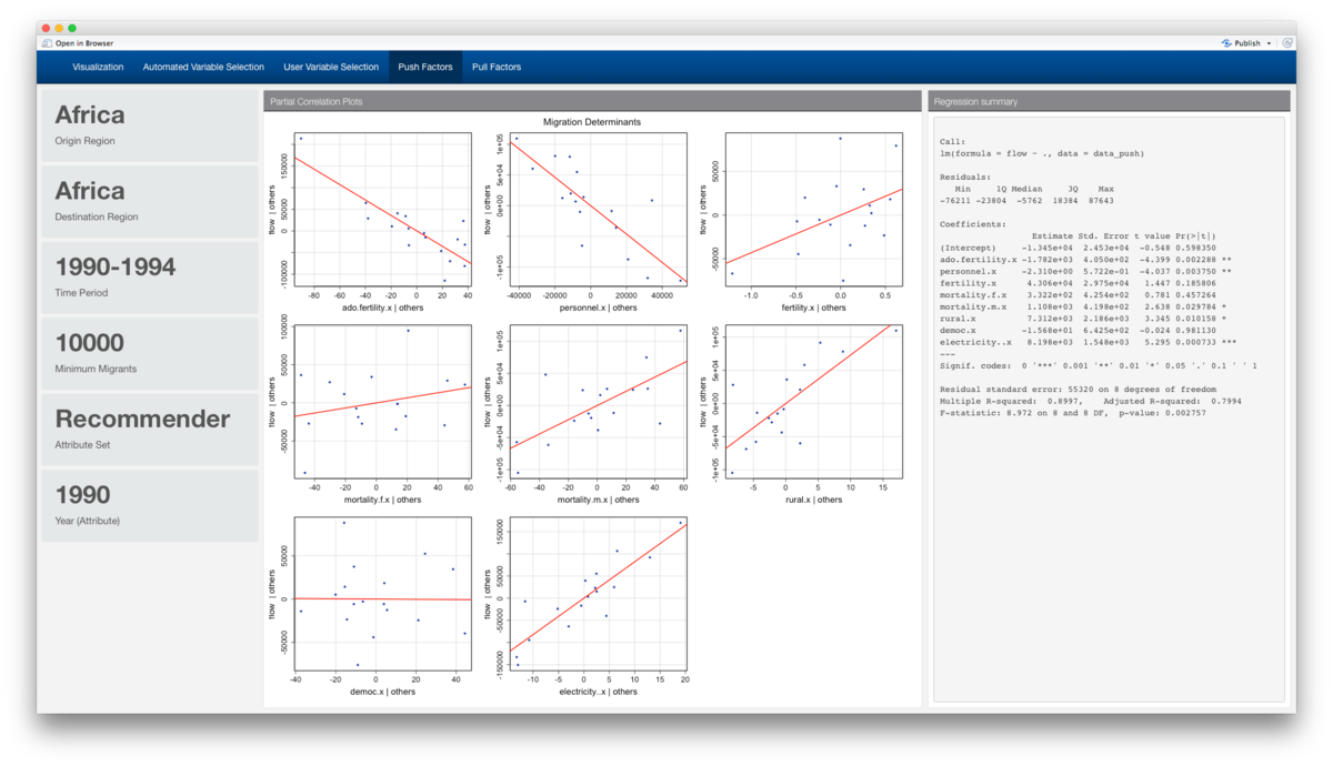
Evaluation of Push and Pull Factors
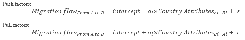
Finally, the variable selection (be it through the recommended system or customized user selection) is run through the partial correlation plots provided by the car package. With migration flows on the Y axis, each plot shows the user the effect of each variable on migration volume when all the other variables in the set are controlled for. Push and pull factors are calculated with the following formula:

The linear regression results are also displayed on a column next to the partial correlation plots.


Demonstration - Sample test cases
Based on these test cases using the Recommender curated attribute set, we see that there is a globally preference for migration towards countries with more democratic institutions, less military personnel, and more urbanisation i.e. less rural populations, and higher population density. While higher adolescent pregnancies are push factors, a higher overall fertility rate seems to be a pull factor. Strangely enough, migration trends favour countries with less competitive selection mechanism for the chief executive.
When we added electricity to the attribute set, we perceive a stark difference in the slopes of the curves. This was done relatively painlessly as the regression analysis dynamically updates when we added the extra variable into the set, allowing for users to test for the influence of moderating or mediating variables.