ISSS608 2016-17 T1 Assign2 Ong Han Ying - Approach Data Presentation
|
|
|
|
|
|
|
|
|
|
|
|
|
|
|
|
|
|
|
|
| CONTENT |
|---|
|
_____6.2: Data Presentation for Visual Analysis |
6.2: Data Presentation for Visual Analysis
Prior to deciding the graphic display to visualize the analysis, it is important (but often forgotten) to study the type of the data types again in the raw data table; and prepare the data such that it is easier for analysis later. This is important because, for any visual analysis that one has chosen, it is supported by the data behind the graphic.
In this assignment, an overview of the data that is likely to be presented on the visual, as below;
6.2.1: Round Number for Degree of Precision
For all datatypes, we will report the numerical values with round number (especially the survey results), eg: 50% - to avoid communicating a false degree of precision. This is important because many of the surveys represent only a fraction of the group of interest, hence; there is the possibility of errors when we are making inference on a population. Therefore, to report numbers with higher precision such as 12.34%, may communicate a false degree of precision to the audience.
6.2.2: Analyzing Categorical Data
From the 1st set of dataset, "Survey_Result"; the categorical data are identified as blow;
- GENDER
- DOMAIN
- PHD
- UNIVERSITY
- UOC_POSITION
- USERWIKI
The above fields are already recoded under the section of 5.4.1.2: Consistency of Data, and they are ready to be displayed on visual graphs. Therefore, no further work is required.
Categorical data are found in the second dataset of "Survey_QN_Master". Actual questions from the online survey are found under the field name of "Qn_Details". It was observed that the questions may be too lengthy to be displayed on the visual graph. Therefore, the questions can be shortened, and yet; not lose the meaning of it. This is completed under the section of 5.5.1: Rephrasing the Survey Questions.
6.2.3: Analysing Interval Data
Next, we identified that there are 2 interval data of "Age" and "Year of Experience" in the data set of "Survey Results". For ease of comparison, we will be creating bins for them, as below;
| Version 1: Tableau (Automated Binning) | Version 2: Tableau (Automated Binning - Formatting the "Age") |
|---|---|
|
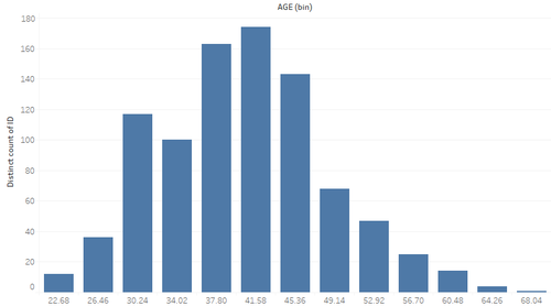
Even though it is normally distributed (The shape), however; We can see that it is difficult to compare the age with 2 decimal places. |
With formatting and rounding to a whole number, it is still difficult to compare across the bins of the age. Intuitively, human tends to select/think in multiple or 5 or 10. Thus, this makes the reader more difficult in doing any selection. |
Since automate binning in tableau is not doing a good job, we will then create a manual binning instead. The details on how to derive the bin can be found in 5.5.2: Creating Manual Binning.
| Version 3: Tableau (With 5 Bins) | Version 4: Tableau (With 5 Equal Bins) |
|---|---|
|
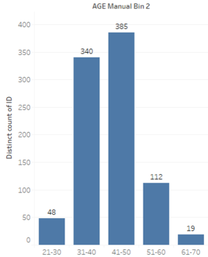
Intuitively, we tend to set equal size interval so as to show a fair distribution. It is common to use the scale of "<=30", "31-40", "41-50", "51-60", ">60". However, with this scaling ; it is noticed that to the reader, it may not be clear on what is the age range of the respondents for "<=30" & ">60". This might be misleading that there are much younger or older participants. Thus, an improvement can be done with "equal size interval". |
With age range of 23 to 69, we can set equal size interval using the scale of "20-30", "31-40", "41-50", "51-60", "61-70". Even through the graphic looks the same as previous, however; we can see clearly that the age range of the respondent fall between 20 to 70 this time round. |
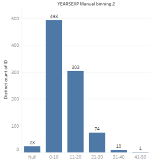
With this, we will also be using Tableau (With 5 Equal Bins) for the field of "Year of Experience". The results as below;
6.2.4: Computing Survey Results - Using Frequency Tables
The next, and most importantly; we will need to present the results of the survey by computing the total frequency of each of the responses. All the survey results will be designed with a frequency table, and this will help the users to see the distribution of results directly. As mentioned in 5.2.1: Common Mistake 1 - Using Arithmetic Mean, we will intentionally avoid using "average" so that the reader is able to focus on the distribution, the real story; instead on the "summary", basing on "average".
To support the creation of this frequency table, we will need to
- Add in a new column field of #ID into the dataset of "Survey Results".With the added #ID field, we are able to pivot the dataset, such as to compute the total frequency of each response.
This is completed in 5.5.3: Adding #ID to the Survey Result's Dataset - Join the dataset of "Survey Master", and "Survey Results" together; so that the category & the question can be displayed on the table, with its results. This is completed in 5.5.4: Joining Survey Results' Table and Survey Master's Table
- In order to select the indicators to meet the objective, we have to group the category of the survey questions by the measurement indicator. As such, we need to create a new table and join this new table with the survey master table. This is completed in 5.5.5: Creating an "Indicator_Master" and Joining the Tables
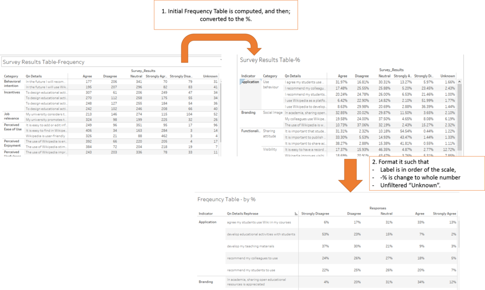
Based on the results of the survey, the first iteration to generate a frequency table; as below;
As we can see, using a table to present the results is not ideal because it is difficult to make comparison across the row and column. This will be replaced with visual in section 6.3: Visualization Graphical and Tools.


