ISSS608 2016-17 T1 Assign2 Ong Han Ying - Approach Selection of Visuals and Tools
|
|
|
|
|
|
|
|
|
|
|
|
|
|
|
|
|
|
|
|
| CONTENT |
|---|
|
_____6.3: Visualization Graphical and Tools |
6.3: Visualization Graphical and Tools
In this section, we will attempt to place the variables onto different types of visual, and select the most suitable graphic to visualize them.
6.3.1: Commonly Used Graphics for High-Dimensional Data
From the previous section, we have transformed our data such that our analysis of
- Profile - will be based on categorical data display only
- Survey Results/ Responses - will be based on a visual graphics of a frequency table.
We have identified commonly used graphics for Multivariate data display, and selected those that might be suitable for our analysis, as below;
| Type of Graph | Profile of Respondents | Survey Results | Rationale |
|---|---|---|---|
| Trellis Display | Suitable for categorical & continuous data display | ||
| Ternary Diagram | Only suitable for 3 continuous data display | ||
| Glyphs | Only suitable for more than 3 continuous data | ||
| Parallel Coordinates | Only suitable for multiple continuous data | ||
| Heatmap | Suitable for tables and differentiate them by scale | ||
| Table Lens | More suitable with multiple continuous data display | ||
| Tableplots | More suitable with multiple continuous data display | ||
| Mosaic Plots | Suitable for categorical data display | ||
| Parallel Sets | Suitable for categorical data display | ||
| Tree Map | Suitable for categorical data display | ||
| Divergent Bar Chart | Suitable for categorical data display for likert scale |
6.3.2: Visualization Software Available for Selected Graphics
With the selected graphic, we also highlight the relevant software that is able to produce the graphical work, as below;
| Graphic/ Feature Required | Tableau | JMP | Parallel Set[Java] | Mondrian | Marcofocus-Treemap |
|---|---|---|---|---|---|
| Trellis Display | |||||
| Mosaic Plots | |||||
| Parallel Sets | |||||
| Tree Map | |||||
| Divergent Bar Chart | |||||
| Heatmap | |||||
| Ease of Putting into a single dashboard |
With the above, we will be using Tableau to build our dashboard mainly, and attempt to explore the merits of parallel sets. In all, there are 3 types of information that we will like to visualize;
- Personal Profile & Registered User
- Teaching Profile
- Survey Responses / Results
6.3.3: Initial Visualization on Selected Graphics in Tableau
6.3.3.1: Personal Profile & Registered User
The categorical variables that are included here are
- Gender
- Age Bin (Manual)
- Registered User
The possible displays as below;
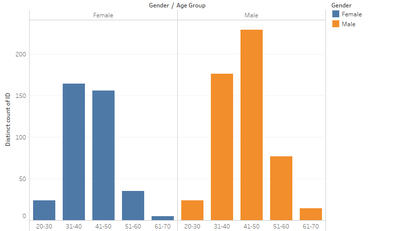
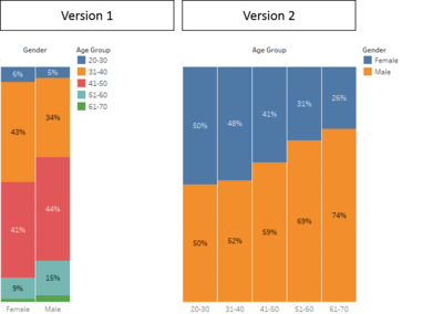
| Trellis Display / Barchart | Mosaic Plots |
|---|---|
| Unable to see the % by total clearly. Thus,unable to have an overview of the % by Total. | With an overview for selection. Version 1 is too colorful and harder to relate, therefore, version 2 is preferred. |
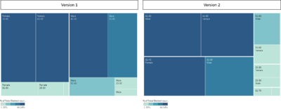
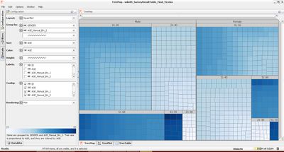
| Tree Map (Version 1 - Tableau) | Tree Map (Version 2 - Macrofocus) |
|---|---|
| Difficult to visualize, and hard to differentiate the squares. | This version of the treemap is clean and simple. It is easier to visualize. |
Parallel Set has been attempted, and the link as provided;
And a snapshot of it, as below;
- Note: This is currently not available in Tableau. Therefore, we are not able to consider it in the dashboard.
Conclusion: In all, Mosaic Plots (Version 2) is selected because:
- It is simple and clean, with simple color scheme of 2 color only.
- It is easier for human to browse from left to right (with increasing scale), instead of from up to down.
- It does not take as much space, as compared to a Tree Map.
- It is available in Tableau
- While Tree Map produced in Macro Focus is clean and simple, but it takes up a significant space on a dashboard and the layout is not available in tableau.
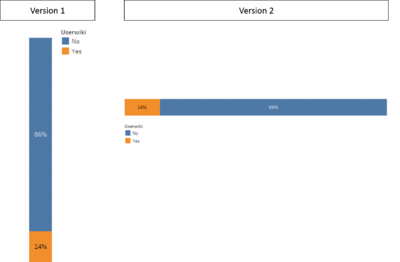
Using a similar concept, we will plot the registered user as below;
Register User:A single variable , therefore; the following graphic (version 2) is selected because it is easier for human to read from left to right, as below;
6.3.3.2: Teaching Profile
The categorical variables that are included are
- DOMAIN
- PHD
- YEARSEXP_Manual_binning_2
- UNIVERSITY
- UOC POSITION
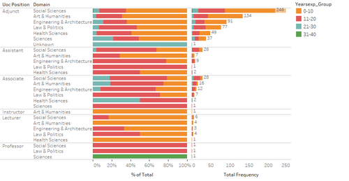
In this aspect, the most important information here will be "DOMAIN", "UOC POSITION" & "YEARSEXP_Manual_binning_2".Since there are at least 3 catagorial variables that we need to visualize, we will use a duet display as below;
This is selected because it is able to display both proportional and Frequency neatly. Frequency should be display so that we are able to if representative of sub-group have sufficient sample size to draw any conclusion.
6.3.3.3: Survey Results
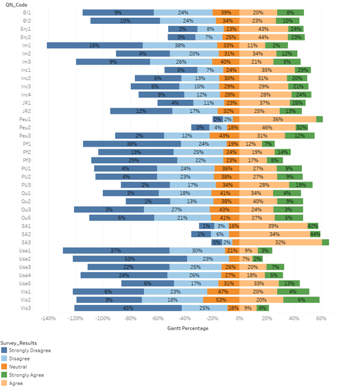
Last but not least, the survey results are recommended to be displayed on a Likert Scale. This option is taken with reference to this Research Paper: "Plotting Likert and Other Rating Scales", and with consultation from the Professor of the course.
The display as below;
A straight line is formed after "neutral" (0%), so as to guide the users to focus on the results that show positive of "Agree", and "Strongly Agree".
With these selections, we will then move on to design the dashboards to meet the different objective.

