ISSS608 2016-17 T1 Assign2 Ong Han Ying - Approach General Improvement
|
|
|
|
|
|
|
|
|
|
|
|
|
|
|
|
|
|
|
|
| CONTENT |
|---|
|
6.5: General Improvements |
6.5: General Improvements
This section highlights the general improvement that is commonly applied to the visualization for most of the visualizations of the dashboard, in greater details. This is also aligned with the overall strategy of the approach as per Section 6.0: Overview; where iteration is expected, and room of improvements is expected to be highlighted, and modified.
Below will highlight these improvements in greater details, for both representation of visual / graphic charts & interactive tools selected.
6.5.1: Visual / Graphics Selection
6.5.1.1: Divergent Chart
To meet objective 1, all the 3 dashboards for the 3 key stakeholders will be using a divergent chart, as shown in 6.6.1: Vers#1 - Teaching Staffs, 6.6.2: Vers#2 - IT Manager , and 6.6.3: Vers#3 - Wikimedia. As such, the display of the divergent chart is important.
Thus, from the first version of the divergent chart, which is skewed to the left, we have improved the design of the divergent chart, with the following;
6.5.1.2: Teaching Profile
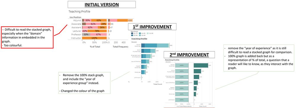
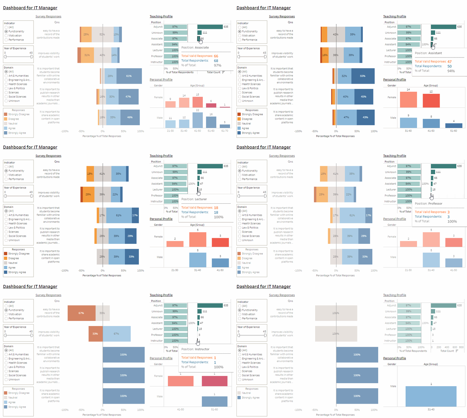
To meet objective 1 & 2, all the 4 dashboards for the 3 key stakeholders will have a subsection within the dashboard, that shows the teaching profile; as shown in 6.6.1: Vers#1 - Teaching Staffs, 6.6.2: Vers#2 - IT Manager ,6.6.3: Vers#3 - Wikimedia, and 6.6.4: Vers#4 - Research Paper. The teaching profile as it provides a further insight in the teaching background of the participants.
Note:
1.For version 1 (Teaching Staff), 3 (Wikimedia) & 4 (Research Paper); "Domain" is displayed in the graph while "Position" is set as a filter.
- For both stakeholder, to know the proportion and statistics of "domain" are more important that "Position" because it helps them in their decision making, and per aligned with the research paper (for version #4)
- Setting "Position" as a filter allow the stakeholder to provide further insight if they want to zoom into the analysis for further details. However, the stakeholders will not be as keen on the % and/or the statistics of this variable.
2.For version 2 (IT Manager); "Position" is displayed in the graph while "Doman" is set as a filter.
- For the IT Manager, to know the proportion and statistics of "Position" are more important that "Domain" because it helps them to identify if resources can be allocated to them.
- Setting "Domain" as a filter allow the stakeholder to provide further insight if they want to zoom into the analysis for further details. However, the stakeholders will not be as keen on the % and/or the statistics of this variable.
Below shows how the graphic for the teaching profile has improved over the different versions;
6.5.1.3: Personal Profile
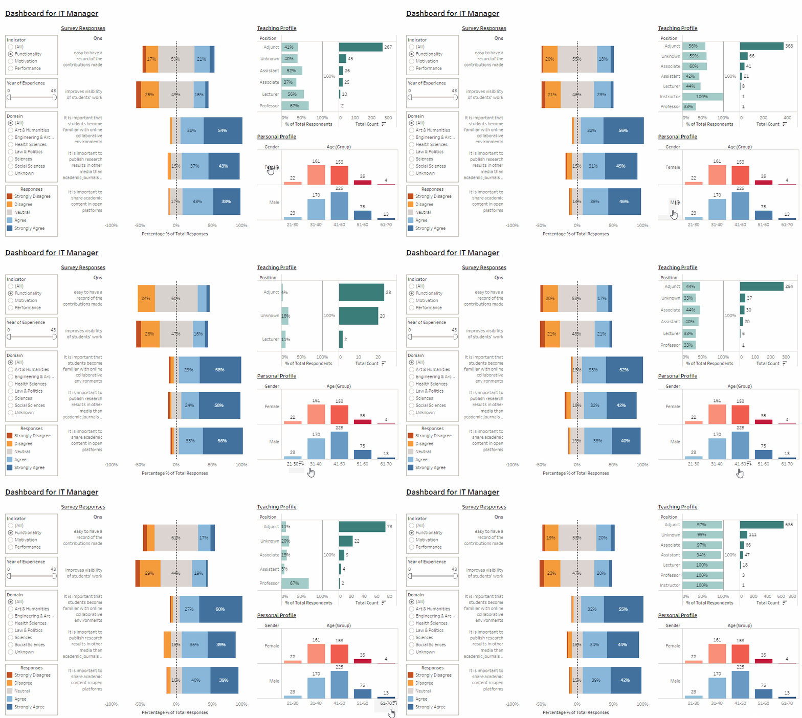
To meet objective 1 & 2, all the 3 (out of 4) dashboards for the 3 key stakeholders will have a subsection within the dashboard, that shows the personal profile; as shown in 6.6.2: Vers#2 - IT Manager ,6.6.3: Vers#3 - Wikimedia, and 6.6.4: Vers#4 - Research Paper. The personal profile as it provides a further insight on the background of the participants.
Note:
- This is not included in #vers1-Teaching Staff because knowing the age group and gender will not help in the staff's decision making, since they are more keen in how Wikipedia has been used, and less on the user's profile itself.
Below shows how the graphic for the personal's profile has improved over the different versions;
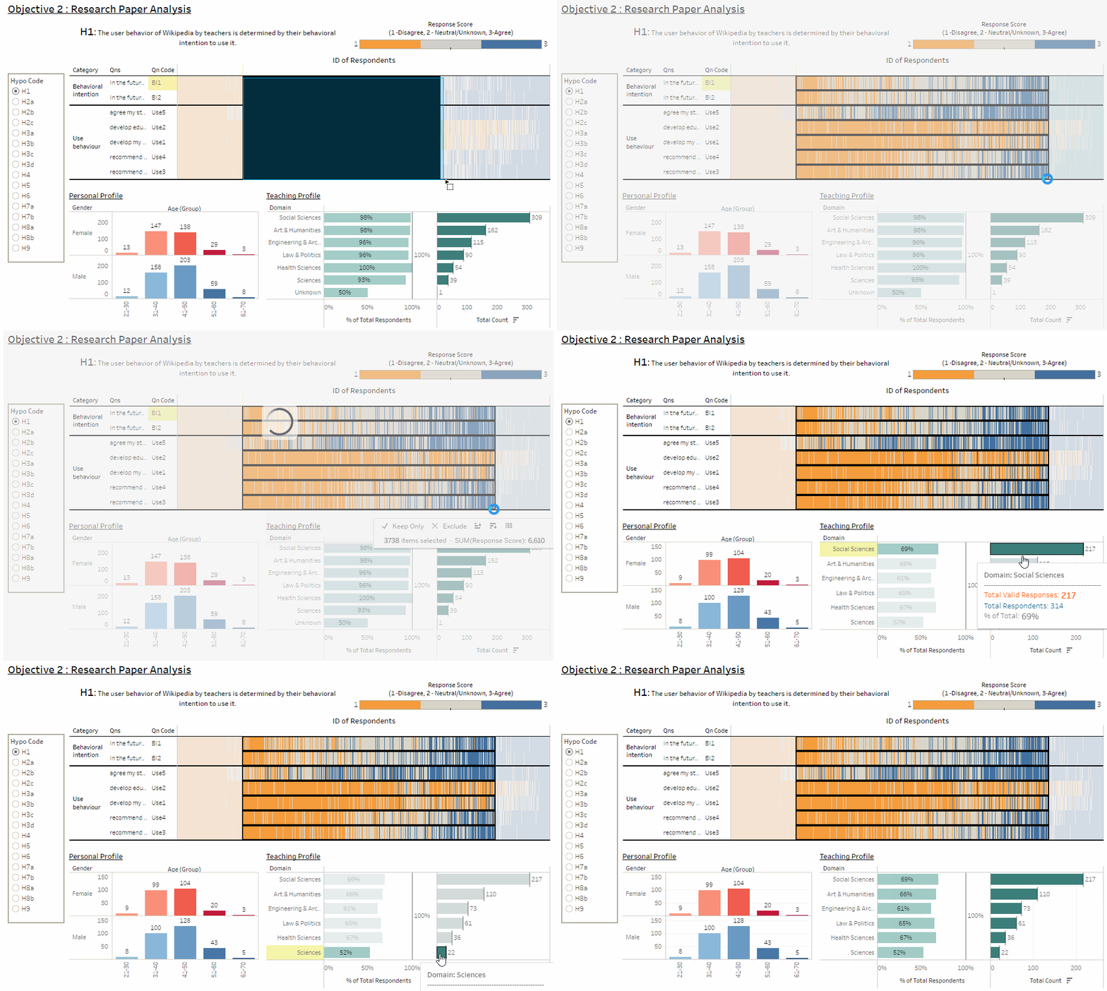
6.5.1.4: Heatmap
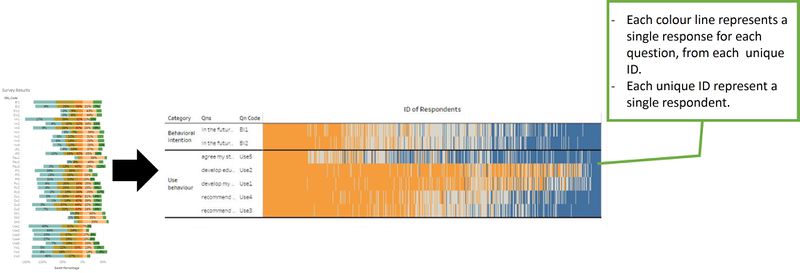
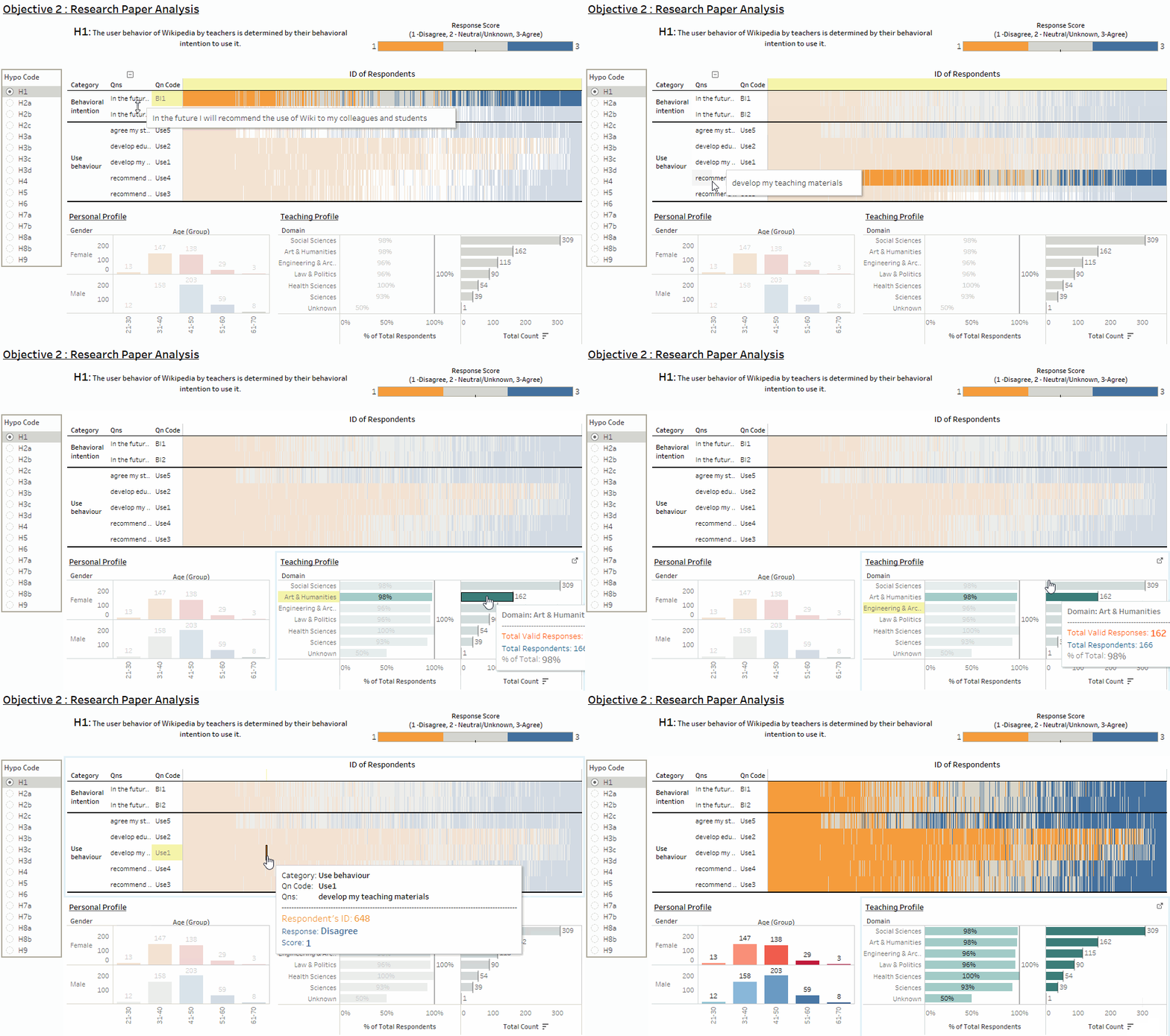
With reference to Section 6.6.4: Research Paper Review , the divergent chart is replaced with a heatmap, where all of the respondents (X AXIS) are plotted against its responses (Y AXIS), based on each of the questions.
At the first glance, it may be difficult to appreciate the objective of this graph, since it looks like a "mess of colours and lines" only. However, this graph is powerful in highlighting the polarity of each of the survey questions by the each of the respondent, which each unique ID will represent 1 respondent only.
This graphic is selected because; 1.it is easy to identify visually on the different color vertically, with
- blue representing "Agree" & "Strongly Agree",
- orange to represent "Disagree" and "Strongly Disagree", and
- "grey" to represent "Neutral" and "Unknown" responses.
2.It is able to compress all ~770 (UOC only, and after data cleaning) respondents' response into a single chart 3.A darker black line is drawn in between each of the category will help to compare the responses between each of the category easier, with interaction.
For further details on the objective of the graph, please refer to Section 6.6.4: Research Paper Review.
The transformation of the graph, as shown below;
6.5.2: Interactive Tools Selection
Without interactivity, we are unable to unearth much of the in-depth insight of the analysis. From this section onwards, we will highlight and feature on the key improvement we have done in our dashboard, so as to improve the overall interactivity of all the dashboards;
6.5.2.1: Improvement in Interactivity Functions
6.5.2.1.1: Replaced Selection with Hovering
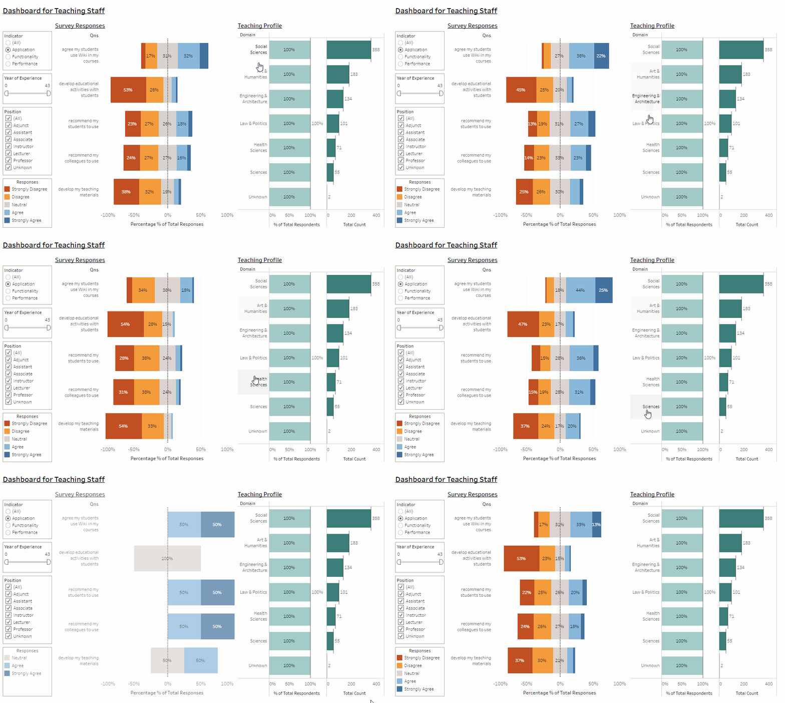
We identified that it takes lesser effort to "hover" over the variable (and read the results on the divergent chart) as compared to "selection". Therefore, we will introduce "hovering" on Teaching Profile, as below;
6.5.2.1.2: Replaced the Filtering Type
Next, we have also identified that;
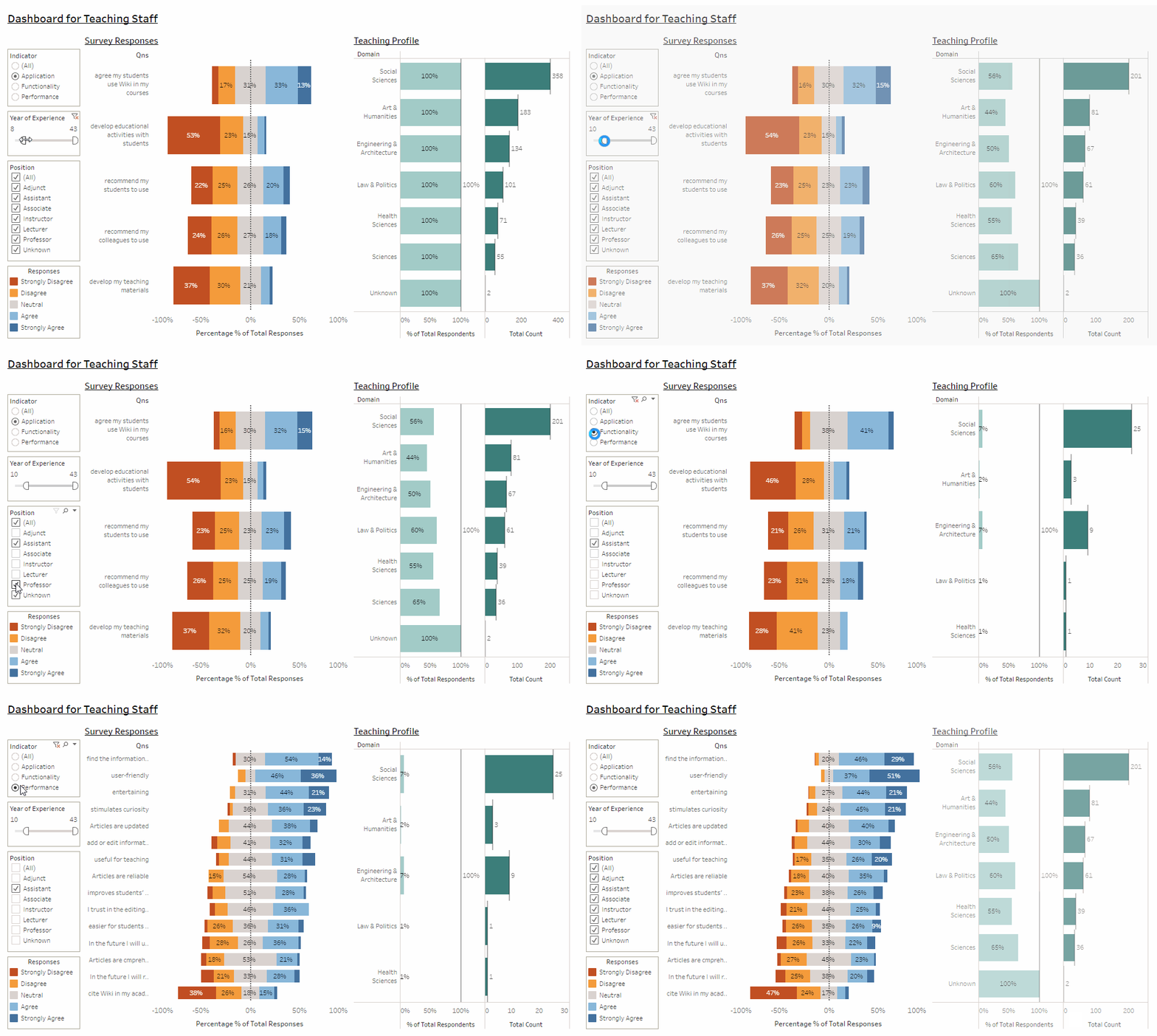
- Indicators: Restrict to select at least 1 of the selection, so that (1) results will always be displayed, (2) avoid overcrowding of the display (Except if the reader decided to have an "overview", but selecting all.
- Year of Experience: A range is allowed instead, so that we do not restrict how the reader want to define the age range
- Position/ Domain: Multiple Selection is allowed, so that the reader is able to select more than 1 position/domain; especially if they are thinking ahead of what's relevant to them only.
The improvement in the filter as illustrated below;
6.5.2.1.3: Mouseover and Tooltips
Due to space constraint on the graph, we will introduce mouse-over and tooltips, to display more information, as below;
6.5.2.2: Improvement in Interactivity in Teaching Profile - Divergent Graph
With the above, an illustration of how to interact with the "Teaching Profile", and the Survey Results, as below;
Note: as shown in the image below; a "tooltip" is introduced so as to provide additional information to the analysis.
6.5.2.3: Improvement in Interactivity in Personal Profile - Trellis Graph and Bar Chart
There are 2 improvements in this area;
- Version1(Teaching Staff), 2(IT Manager) & 4 (Research Paper), has a trellis graph to support the interactivity with the survey results, through hovering.
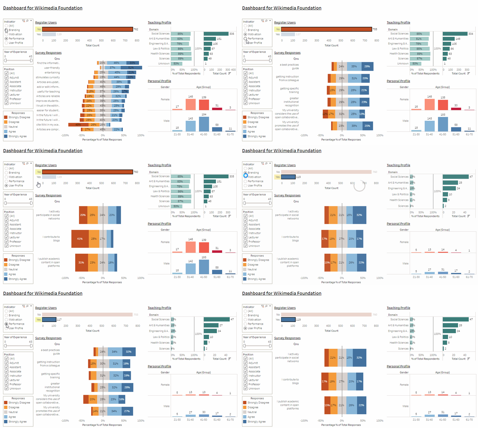
- Version3(Wikimedia) has an additional bar chart of "Register User", to allow the reader to select either option (of registered vs non-registered), and "freeze" the other graphs so that the mouse can hover over to read the analysis.
Both examples as below;
6.5.2.3.1: Hovering over the variables
Here, we hover over the variables in the trellis graph, to display the difficult survey results, as below;
6.5.2.3.2: Highlighting & Freezing the Graph
On the other hand, here; we select "Registered User", and "freeze" the other graphs for analysis;
6.5.2.4: Improvement in Interactivity in Heatmap
Last but not least, here; we will show how the heatmap helps in the interactivity of the dashboard, to unearth more analysis;
Firstly, we can easily spot those IDs with difference responses across the questions (as per selected by the hypothesis) easily,
Next, we can also easily spot those ID with the same responses across the questions (Same solid color) easily;


