ISSS608 2016-17 T1 Assign2 Ong Han Ying - Approach Obj1 TeachingStaffs
|
|
|
|
|
|
|
|
|
|
|
|
|
|
|
|
|
|
|
|
6.6: Visualization of Graphics on Layout
With the selection of graphics, we will then attempt to input the graphics onto the layout, customized for each of the key types of stakeholder. Then, we will seek to identify major and minor improvements from here, before finalizing our dashboard - and create a story based on it.
6.6.1: Objective 1 - #Version 1: The Teaching Staffs
A recap of the 'initial questions; of the Teaching Staff, as below;
- What are the general areas of application of Wikipedia as a teaching tool? [Application]
- How do the users use the application? [Functionality]
- What is the general feedbacks on Wikipedia’s performance as a teaching tool? [Performance]
6.6.1.1: Selection of Variables
The following variables are selected and deemed relevant, to answer the questions from the teaching staff.
6.6.1.2: Initial Layout - with Selected Variables
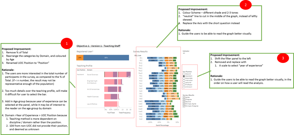
A print screen of the initial dashboard for the teaching staff as below;
This is also available here : Link to Objective 1: #Version 1 - Teaching Staff
6.6.1.3: Proposed Area of Improvement
The areas of improvement are identified as below;
For further details in the changes, please refer to
- Improvement in Divergent Chart: Section 6.5.1.1: Divergent Chart
6.6.1.4: Improved Layout of Dashboard for #Version 1: The Teaching Staffs
A printscreen of the dashboard as below;
6.6.1.5: Further Improvement on Layout of Dashboard for #Version 1: The Teaching Staffs
With interaction with the dashboard, further improvement is observed. Thus, further modifications are done to the dashboard, as below;
1.Survey Results:
- A reference line at 0%, to guide visually on the "neutral" point
- Darker shade of blue is selected for "Agree", so as to balance up the darker tone with "Disagree".
- Fixed the X-Axis scale from -1 (-100%) to 1 (100%)
2.Overall:
- Fixed the height of all the 3 graphs so that the graph's height will not be adjusted based on the selection.
- Adjust the axis so as to remove the "white space" within the layout container of the graph.
The improved visualization as below;
With further interaction with the dashboard, another round of improvements has been further identified, as below;
1.Survey Results:
- Reduce the color intensity of the divergent chart so that the overall dashboard does not look overwhelmed with color.
2.Teaching Profile:
- Remove the "Age Group" in the "Teaching Profile" Chart -> it does not help in the analysis as it is quite tedious to click within the bar.
- Reader will be keener that based on the selection, what is the % of the actual population of the position; that has shown the selected response. ::* A divergent chart is introduced back again, to help with providing such information, upon a filter or selection.
- Introduce Tooltips - Added in additional information in the "Tooltips" of "Teaching Profile", to display information such as "Total Valid Response', "Total Respondents", and "% of Total".
3.Overall Interactivity:
- Added in "Hover" function & "Select" function to increase the interactivity between the "survey results" and "teaching profile"
For further details in the changes, please refer to
- Improvement in Divergent Chart: Section 6.5.1.1: Divergent Chart
- Improvement in Teaching Profile - Divergent Chart: Section 6.5.1.2: Teaching Profile
- Improvement in Interactivity of Dashboard - General Functions: Section 6.5.2.1: Improvement in Interactivity Functions
- Improvement in Interactivity of Dashboard - Teaching Profile: Section 6.5.2.2: Improvement in Interactivity in Teaching Profile - Divergent Graph
6.6.1.6: Final Version for #Version 1: The Teaching Staffs
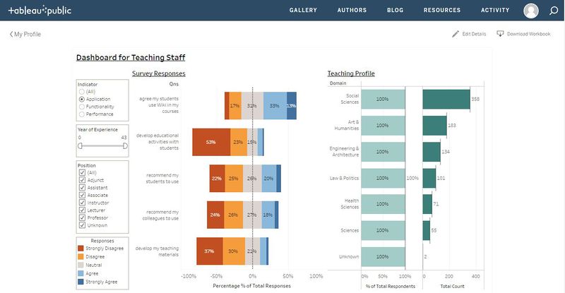
The final version of visualization for the teaching staff, as illustrated below;
This final version of the dashboard can be found in the following link; Objective 1 : Version 1 - Dashboard for the Teaching Staff


