ISSS608 2018-19 T1 Assign Tan Le Wen Angelina Task 2: Citizen Science Air Quality
|
|
|
|
|
|
|
|
Task 2 Visualisations and Insights
Contents
The Sensors of Sofia City
In the previous task, we focused on the measurements from the Air Quality Stations. However for this task, we focus on the measurements from the sensors that were placed around the city to record the concentrations. There are 361 unique sensors within Sofia City, and they are supposed to return one concentration value for PM 10 and PM2.5 each per hour.
The Distribution of Sensors within Sofia City
The image below shows the distribution of sensors across the city centre of Sofia City. It can be seen that most of the sensors are found right smack in the heart of the city centre. Based on the zoomed in image on the right, we can infer that the city centre is highly populated as we can see a lot of small roads. Within the city centre where the population is high, the sensors are well-distributed. However, as we move further away from Sofia’s city centre, the number of sensors decrease.
Sofia’s city centre is also located at the foot of a mountain, hence it is more prone to having high levels of pollution. We will examine the topography of Sofia City, and how this contributes to the level of pollution in the next task.
Having so many sensors sounds like a good way to keep track of the concentration levels, but are they always working properly?
Performance of Sensors
Incorrect Readings of Sensors
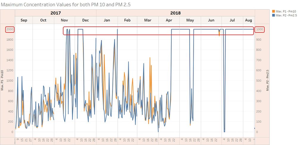
The measurements are only as good as the sensors – which means that if the sensors are faulty, we would not be able to get meaningful results as well. The image below shows that the sensors are not working perfectly all the time.
The maximum value for each sensor was plotted, and the above image is the result. The maximum concentration value for PM 10 is 2000μg/m3, and 1000μg/m3 for PM 2.5. These values are highly unlikely to be actual readings, as these values are seen repeatedly across the year. Moreover, if the concentrations were to reach such an alarming level, we would probably be dead by now.
Missing Values of Sensors
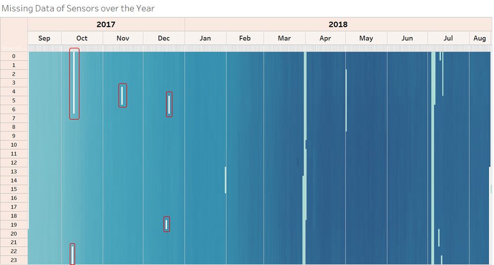
To plot this heat map, ‘distinct number of geohash’ was plotted by the hour. Since our assumption is that one unique geohash corresponds to one unique sensor. From this heat map, there are two insights that can be drawn:
- those areas that are circled in red are missing values. However, as the year went by, the issue with missing data also disappeared for 2018
- there is an increase of colour intensity as we go from Sep 2017 to Aug 2018. This means that there is a gradual increase number of distinct sensors, which brings me to my next section.
Increasing Number of Sensors
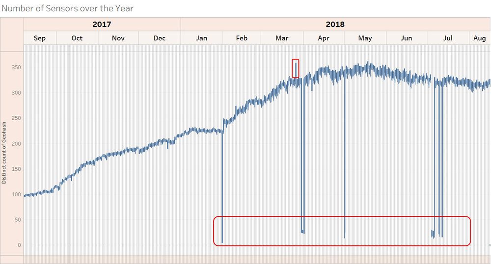
There is a gradual increase in number of sensors over the year. There are some anomalies, such as the spike on 26th March 2018, 12PM. There are 30 more distinct sensors that were being deployed just for that hourly reading. Another anomaly is the dip in sensors. Some of the sensors may not be working on those days, which may affect the average concentration readings.


