ISSS608 2018-19 T1 Assign Tan Le Wen Angelina Task 1: Official Air Quality
|
|
|
|
|
|
|
|
Task 1 Visualisations and Insights
Contents
The Air Quality Stations of Sofia City
Locations, locations, locations.
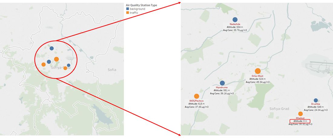
Before we dive deeper into the insights of this task, let me introduce to you the location of the Air Quality Stations of Sofia City:
- Nadezhda
- Hipodruma
- Druzhba
- IAOS/Pavlovo
- Orlov Most
- Mladost
As highlighted in the image above, the altitude of Mladost given is 0m, which does not make sense. This city is at about 590m high of altitude. Even if Mladost was taken to be ground level (reference point), it is not possible that the other 5 stations that are half a kilometre tall. I have confirmed this with Ivan Paspaldzhiev from Denkstatt Bulgaria (Owner of EEA Dataset), where he indicated that the 0 value for Mladost is wrong; it should be around the same range as the other stations.
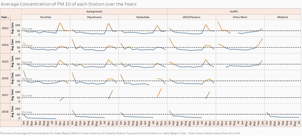
Don't let this image fool you: not all 6 stations were used across the years. The air station at Orlov Most was discontinued from 2016 onwards, and Mladost was introduced in 2018, as shown in the table below.
Why was Orlov Most discontinued, one might ask? In the following section, we will explore this very question.
Anomalies in PM 10 Concentrations Readings
There are two kinds of air quality stations:
- Stations that track PM 10 concentration of Background
- Stations that track PM 10 concentration of Traffic
From the chart, it can be seen that the stations at Nadezhda, Hipodruma and Druzhba (background) are fairly consistent. In fact, station at Pavlovo shows similar trends as compared to the trends shown for the Background stations, despite it being a station to track Traffic pollution. The readings are from station at Orlov Most are not consistent with the readings of Pavlovo. This could be the reason why readings stopped after 2016 and a new traffic station (Mladost) was being built. In 2018, readings from Mladost stations were taken, and so far, the readings are consistent with the trends from the other 4 stations.
Now, enough said about the Air Quality Stations. Let’s move on to analysing what these Air Quality Stations are built for in the first place: Concentration of Pollution, which in this case, PM 10.
It’s all about the PM 10 Concentrations
The EEA dataset comes with two different types of readings: Daily concentration readings, and hourly concentration readings. we will first start by looking at the concentrations yearly, followed by monthly, then daily, and last but not least, hourly. The hourly concentration readings only start late 2017 and through 2018, hence the hourly readings will only display readings from those periods.
Yearly Readings
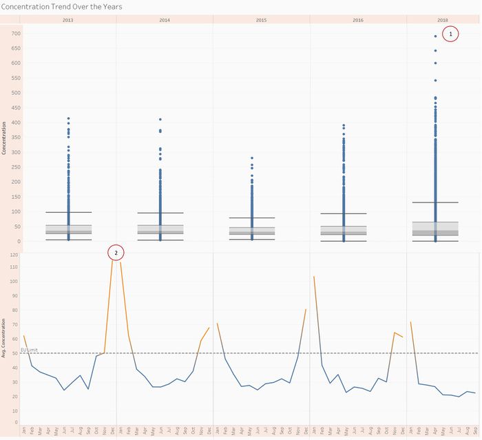
The image below shows the year-on-year readings of PM 10 concentration in both boxplot and line graph. For yearly readings, I have excluded 2017 as it only contains the last few months, and it will not be a good indication of the average of the entire 2017.
Point 1: This is the maximum reading that was recorded in the dataset. However, when we compare with the average values as shown in the line graph below, this maximum point is not reflected.
Point 2: These are some really high averages at 2013 year end to 2014 beginning of year, but their respective boxplot distributions are relatively comparative with the other years. This means though those months had very high averages, the readings are not as extreme as some readings shown in 2018.
Over the years, the average value that is above the EU limit of 50 μg/m3 has been decreasing, which is a good sign. This can be considered as a short term trend, but in the long run, the values have to drop to below the EU limit of 50 μg/m3 for a couple of years to be considered as a long term trend.
Monthly Readings
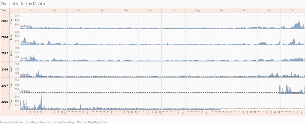
This image shows all of the readings over the years by month. Please take note that this is not the average readings, but all individual readings that were being recorded.
From this, it is clear that certain months have much higher readings as compared to other months. November, December, January and February have higher readings as compared to remaining months. Since Sofia City is located in the North Hemisphere, these months correspond to the colder seasons, Winter.
Winter is coming? Winter is indeed coming for 2018.
Seasonally Readings
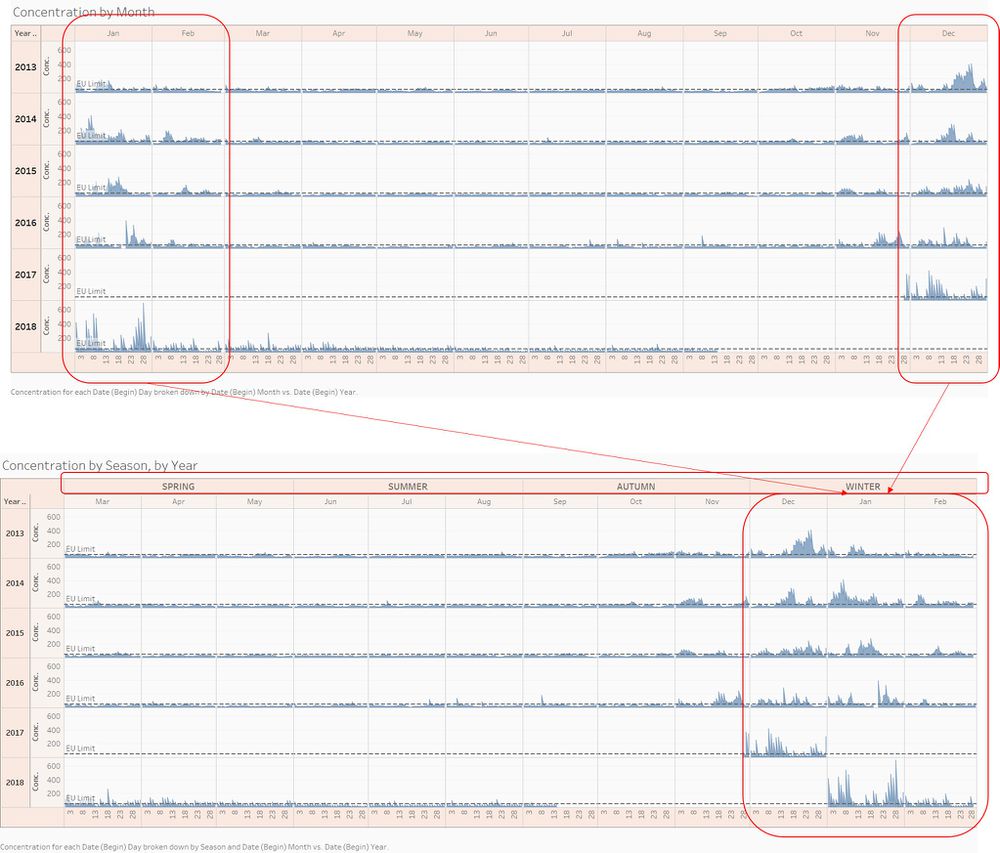
The months are being grouped according to Seasons as follows:
SPRING: March, April, May
SUMMER: June, July, August
AUTUMN: September, October, November
WINTER: December, January, February
From the above images, it is clear that it is during Winter where the concentrations hit the roof. In general, cold air sinks. And since PM 10 particles are large, the particles will just remain at ground level. The environment factors will be discussed in Task 3.
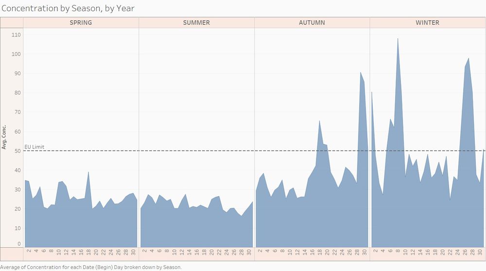
The following image show the average concentration readings by season. This is just to reinforce that as the season becomes colder, the concentration will correspondingly increase.
Pablo Picasso once said “The purpose of art is washing the dust of daily life off our souls.” Now, let’s take a look at the dust of PM10 by daily readings.
Daily Readings
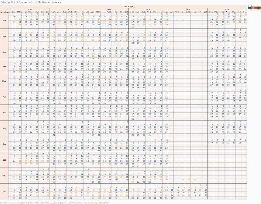
What better way to have an overview of daily readings then using a calendar? The calendar below shows the average readings of each day of each year. Any readings smaller than the EU limit would be blue, anything else would be shades of red. The intensity of red corresponds to the intensity of concentration.
Same old conclusions can be drawn here as well, the winter months have average readings that are higher, as compared to Spring and Summer.
Hickery dickery dock, the mouse went up the clock. Time to see what is it like hourly in Sofia City.
Hourly Readings
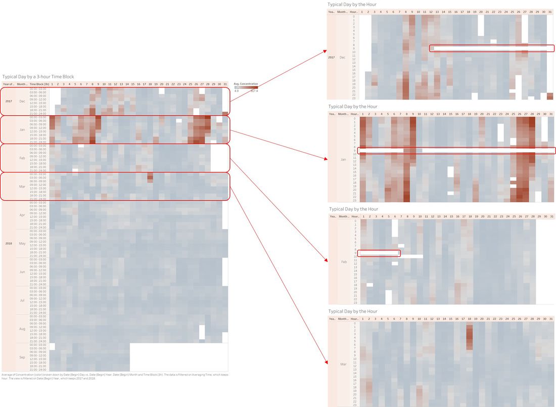
Since only 2017 and 2018 have hourly data, the images here will only consist of those two years. The image below shows the breakdown of a day into 3 hour block, and those months that have higher average readings will be broken down into by hour.
There are some anomalies here: there are quite a number of zero readings for every 9th hour for every day in December, January and February, which are circled in red. This seems to be more like a technical error instead of random error due to the consistency. Subsequently the error is corrected and readings can be found for the following months.
One insight that can be made here is that for Winter months, there seem to be two peaks during in a day where the concentration goes over 50 μg/m3: (1) in the wee hours of the morning, and (2) when the sun starts to go down. The following image give a better picture:
This image shows that during the colder hours of the day, the concentration is generally higher. The measurements of traffic pollution is higher than that for background. Bulgaria is known to be driving some of the oldest cars, hence less efficient.
