ISSS608 2018-19 T1 Assign Tan Le Wen Angelina Task 2: Citizen Science Air Quality
|
|
|
|
|
|
|
|
Task 2 Visualisations and Insights
The Sensors of Sofia City
In the previous task, we focused on the measurements from the Air Quality Stations. However for this task, we focus on the measurements from the sensors that were placed around the city to record the concentrations. There are 361 unique sensors within Sofia City, and they are supposed to return one concentration value for PM 10 and PM2.5 each per hour.
The Distribution of Sensors within Sofia City
The image below shows the distribution of sensors across the city centre of Sofia City. It can be seen that most of the sensors are found right smack in the heart of the city centre. Based on the zoomed in image on the right, we can infer that the city centre is highly populated as we can see a lot of small roads. Within the city centre where the population is high, the sensors are well-distributed. However, as we move further away from Sofia’s city centre, the number of sensors decrease.
Sofia’s city centre is also located at the foot of a mountain, hence it is more prone to having high levels of pollution. We will examine the topography of Sofia City, and how this contributes to the level of pollution in the next task.
Having so many sensors sounds like a good way to keep track of the concentration levels, but are they always working properly?
Performance of Sensors
Incorrect Readings of Sensors
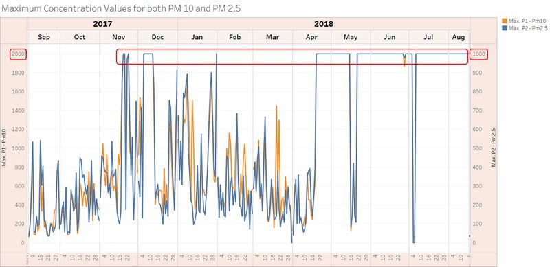
The measurements are only as good as the sensors – which means that if the sensors are faulty, we would not be able to get meaningful results as well. The image below shows that the sensors are not working perfectly all the time.
The maximum value for each sensor was plotted, and the above image is the result. The maximum concentration value for PM 10 is 2000μg/m3, and 1000μg/m3 for PM 2.5. These values are highly unlikely to be actual readings, as these values are seen repeatedly across the year. Moreover, if the concentrations were to reach such an alarming level, we would probably be dead by now.
Missing Values of Sensors
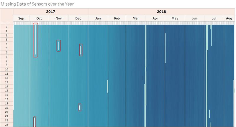
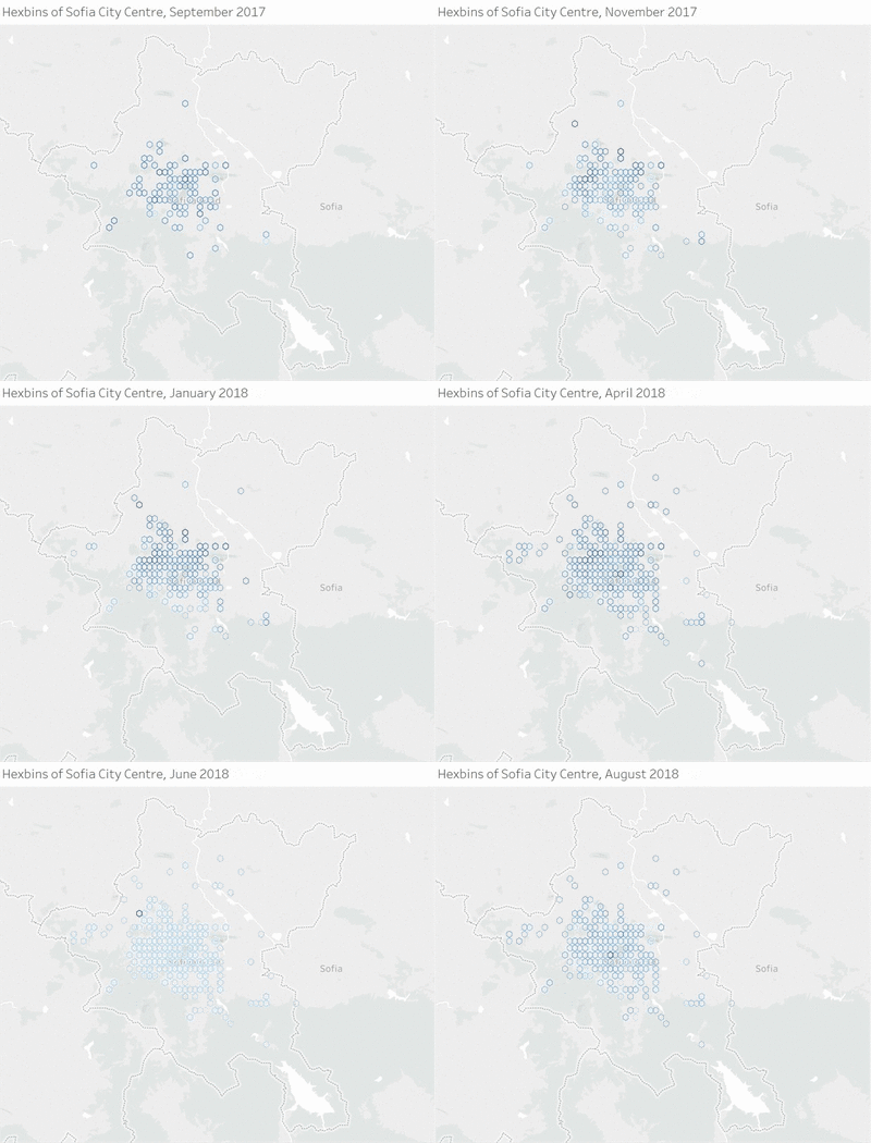
To plot this heat map, ‘distinct number of geohash’ was plotted by the hour. Since our assumption is that one unique geohash corresponds to one unique sensor. From this heat map, there are two insights that can be drawn:
- those areas that are circled in red are missing values. However, as the year went by, the issue with missing data also disappeared for 2018
- there is an increase of colour intensity as we go from Sep 2017 to Aug 2018. This means that there is a gradual increase number of distinct sensors, which brings me to my next section.
Increasing Number of Sensors
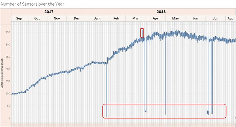
There is a gradual increase in number of sensors over the year. There are some anomalies, such as the spike on 26th March 2018, 12PM. There are 30 more distinct sensors that were being deployed just for that hourly reading. Another anomaly is the dip in sensors. Some of the sensors may not be working on those days, which may affect the average concentration readings.
PM2.5 and PM10, where art thou?
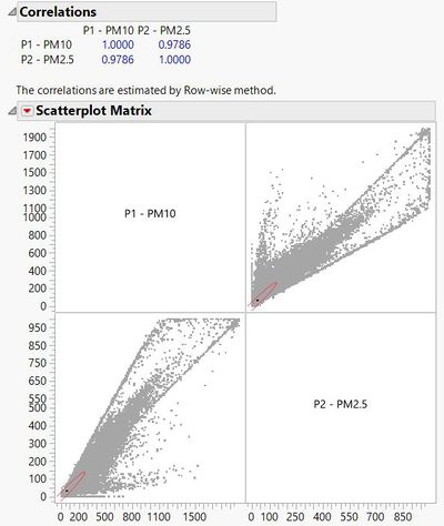
From the covariance graph below, PM 2.5 and PM 10 are highly correlated, with a correlation factor of 0.97. Hence, I will focus on exploring PM 10 instead of both since the results for both concentrations would also be similar as well.
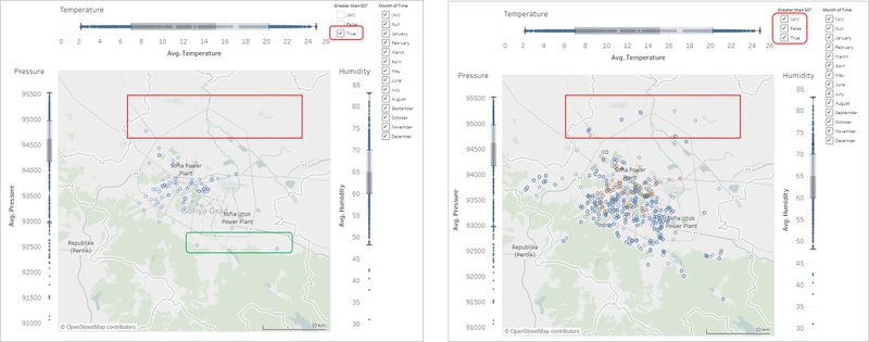
To visualise the part of the city with higher concentrations of PM 10, a dashboard is created. From this, it can be seen that the higher concentrations are found within the city centre, and not the outskirts of the city. There are a couple of factors that we will look into in Task 3 to explain the cause of this phenomena. There are some high concentration readings found at the foot of the mountain, which is highlighted in green. This could be due to transboundary pollution, where the particles came from elsewhere instead of Sofia City.
Similar results were found for PM2.5 as well.
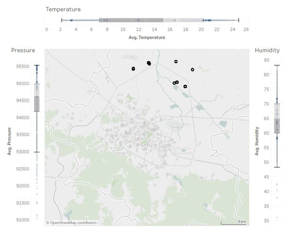
Based on the selection made in the following image, the concentrations at the outskirts of Sofia City have the following characteristics:
- Pressure: the pressure recorded are of the higher values, which could indicate that the altitude of the locations of the sensors are lower (the higher the altitude, the lower the pressure).
- Temperature: most of the points fall on the upper 25%, which means those locations are warmer than the most of the other locations.
- Humidity: the range falls nicely in the 2nd and 3rd quantiles, which signifies that humidity may not have a strong correlation with the severity of pollution.
Time Dependence of Pollution
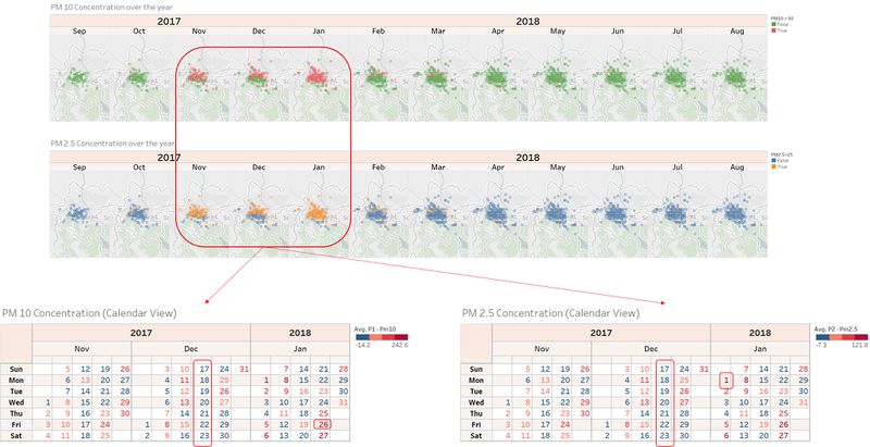
Based on our findings in Task 1 using the Air Quality Stations, we concluded that during the colder seasons the concentrations would be higher. The results of the sensors should also concur with this conclusion, which is proven in the above image. However, one interesting fact is that during one week of December the concentration was well below the EU limit of 50 μg/m3. This could be due to climate factor, such as higher temperature for that particular week. 1, 26 and 27 January 2018 have really high records of concentrations for both PM 2.5 and PM 10. 1st of January has the highest record for PM 2.5 of 121.8 μg/m3, and 26th January holds the record for Pm 10 of 242.6 μg/m3. The pollution at the outskirt of the city only happens seasonally - and you've guessed it - during the colder months. One interesting point to note is that during the warmer months, the pollution at the city centre hardly hit the EU limit of 50 μg/m3. Hence this suggest a strong correlation of the concentration level with temperature of the city. We will delve deeper into this in Task 3.
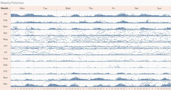
The following image shows every single concentration made over the week in the entire year. In Task 1, it was shown that there are two peaks of pollution in a day: one in the early morning, and one after the sun set. This is seen again with the sensors' dataset. The concentration levels are have two peaks in a day. The peaks are much more predefined during the colder seasons as compared to that for the warmer seasons. It is interesting to note that the concentration in April and May seems erratic, which could be due to the switching from Spring to Summer. The readings for June to September seems to be fairly low and stable.
