ISSS608 2016-17 T1 Assign2 CHIA Yong Jian - Visualisations
Jump to navigation
Jump to search
|
|
|
|
|
|
|
4.1 Assessment of appropriate visualisations charts and tools
The multivariate data, including the calculated ratios, are continuous data, over a time period from 2010-2016. Given the nature of the data, the following visualisations are explored:
| Visualization | Pros | Cons |
|---|---|---|
| Radar Chart / Cobweb | Visually easy to read and compare across data rows | Does not lend itself to provide detailed information if a viewer needs it, hence requires supplement visualizations if needed to view more data in detail. It is not easy to view changes in data over a time series. Depending on software, will need to standardise the data as well, and might be tricky with negative values in data. |
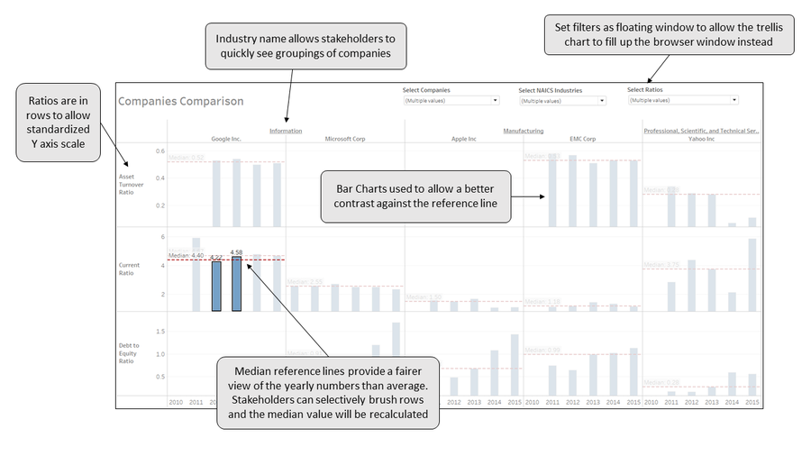
| Trellis/Small Multiples | Allows easy comparison of data across rows and columns. Lends itself to displaying time series data well. | Can be visually confusing if too many indicators selected |
| Parallel Coordinates | Allow exploration of relationships across all data rows | Visually more challenging and confusing to decipher. It is not easy to view changes in data over a time series. Depending on software, will need to standardise the data as well, and might be tricky with negative values in data. |
For this assignment, based on the above reasoning, a trellis chart will be used to make company comparisons across indicators, with a key consideration on its ability to display the years of data at the same time.
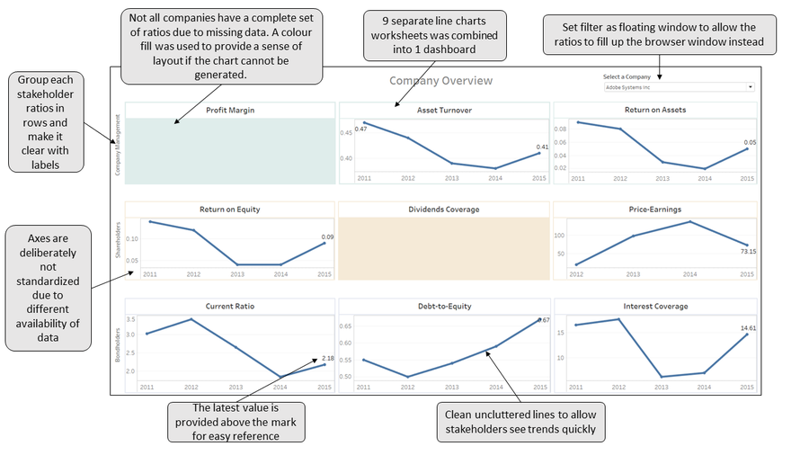
Separately, the tried-and-tested basic line charts will be used for purpose of reviewing ratios for a single company.
4.2 Prototyping, Refining and Interactivity
The following explanations describe the thinking and decision process behind each dashboard element:
4.2.1 Company Overview Dashboard (Line Chart)

4.2.2 Company Comparison Dashboard (Trellis Chart)

4.3 Final Visualizations
The final visualisations built in Tableau can be accessed via the links in the following table:
| Company Overview | Company Comparison |
|---|---|
 |
 |