ANLY482 AY2016-17 T1 Group5 - Data Exploration
| Data Cleaning | Data Exploration | Storyboard | Data Manipulation | Dashboard | Insights |
For data exploration, the team used Tableau to create preliminary visualization to understand the data better. The primary goal in data exploration process is to retrieve meaningful information regarding the data that is useful in the business context of the project. This includes sales performance, number of orders ordered and popular products analysis. Using Tableau allows us to retrieve information using the filter functions efficiently and effectively. This step is crucial before we jump into developing visualizations before understand the type of results we should be looking out for.
Contents
Monthly Sales
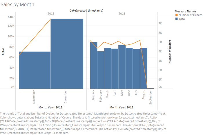
From this visualization, the sales performance on December 2015 performs considerably much better as compared to the rest of the months. Also, in August 2016, there the number of orders seem to peaked but the sales amount did not increase as much as expected. As the team only received the data in early September, there are only a few data entries in that month, therefore explaining the height of the bar for September 2016.
Monthly Order Quantity
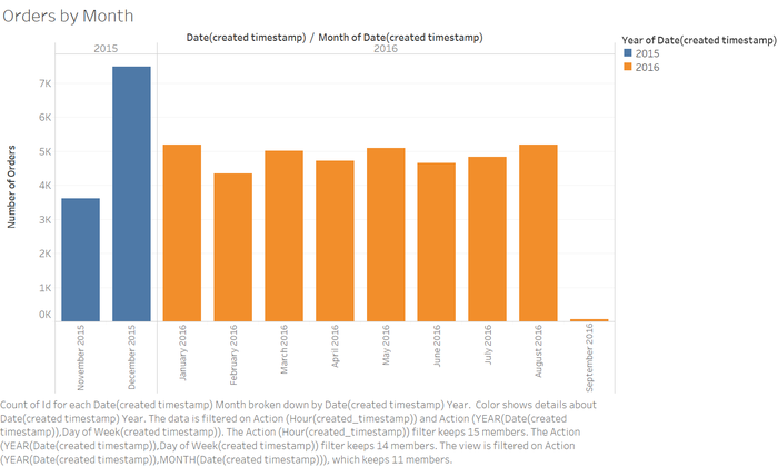
Similarly to the first visualization, we can see that December 2015 is the best performing month in the history of this outlet.
Sales by Day of Week
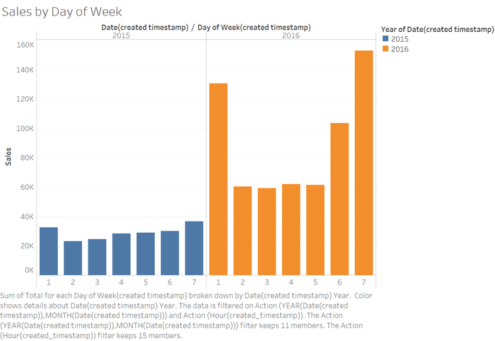
Note: 1 refers to Sundays, 2 refers to Monday and so on.
As expected, the weekend performs better as compared to the rest of the week.
Order Quantity by Day of Week
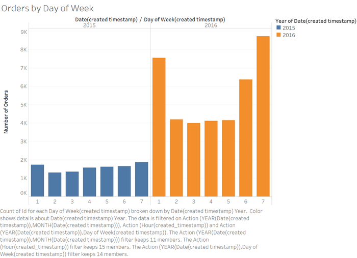
Similar to the previous visualization, the top 3 best performing days in 2016 are Friday, Saturday and Sunday in order.
Sales by Hour of the Day
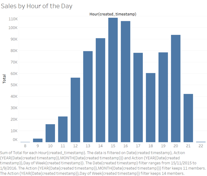
From this graph, we see that the highest performing hour of the day is from 3pm to 4pm. This tells the user that the peak period is during those times of the day. This information can help the manager of the outlet to create special promotions at the hour in order to attract more customers.
Number of times an item is ordered
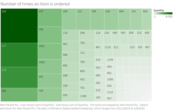
From this graph, we can clearly see the most popular item which is item 102. This information is useful as the managers of the outlet can utilize this knowledge in creating marketing campaigns such as bundle deals or set meals that include this item.
Category Popularity
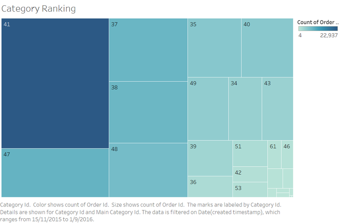
In this graph, the most popular category of items is Category 41. In this graph, the most popular category of items is Category 41. The manager of the outlet can use this information in deciding which items to advertise more or spend more time and effort in marketing it to the customers. Similarly, for the least popular categories, the manager might consider removing the category from the menu itself to reduce costs.
