ANLY482 AY2016-17 T1 Group5 - Storyboard
| Data Cleaning | Data Exploration | Storyboard | Data Manipulation | Dashboard | Insights |
Contents
Sales Performance Analysis
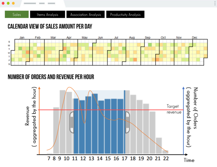
The purpose of this page is to allow the user to view sales across time. The user will be able to compare the sales performance of the outlet between the months and years. On the Calendar View, each square represents the total revenue for each day and the color ranges will give an overview of the performance across months. If it is green, it is performing above the target sales for the month, and red if it is performing below the target.
There will also be a reference line on the bar/line chart to indicate target sales each day so that the user is able to quickly measure the performance of the outlet for the day.
With the use of cross-filter function, the user is able to zoom-in into a particular day of the month and see the sales performance of the day itself. This gives flexibility for the user to explore the data and gain more insight.
Item Association Analysis
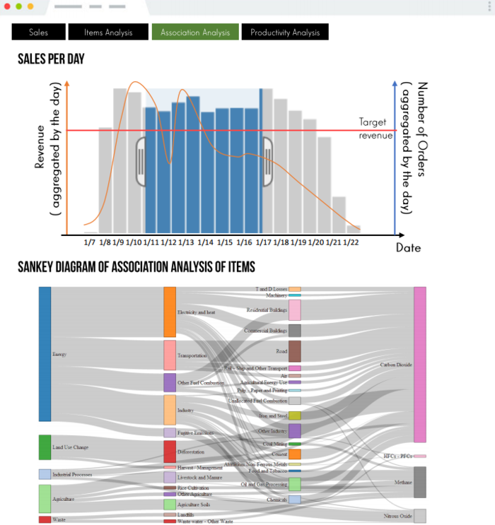
The purpose of this page is to see what items the customer normally purchase together. The bar/line chart above allows users to first have an overview of sales performance as well as number of orders ordered of each day for the selected month. The Sankey diagram will then show the associated items being ordered according to the range of dates selected using cross-filter on the first graph. The user will then be able to identify the most popular combination of items being ordered for a selected period of time. This information can help the user in deciding promotional bundle or discount to increase the customer return rate or attract more new customers.
Item Popularity Analysis
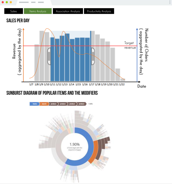
The purpose of this page is to allow the user to view sales of the different product to see which are the most popular item and modifier. The user will be able see what are the popular item across different time. On the bar chart, the bar will show the number of orders and the line will show the revenue aggregated by the day.
With the use of cross-filter function, the user identify could quickly identify the most popular item and modifier across different time. With this insight, the user can make better marketing decision and identify the products that are constantly rank among the lower tier and consider removing the item from the menu to prevent extra cost incurred from making the product and minimize food wastage.
Productivity Analysis
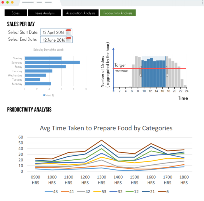
The purpose of this page is to allow the user to view the preparation time of the different categories of items over the course of the day for the selected date range. The line graph allows the user to see the time taken to prepare the items in the various category at different time of the day. With the use of cross-filter function, the user is able to zoom-in into a particular day of the week or a range of hours to gain more insight.
Understanding this data will allow business owners to identify when there is a spike in the time taken to prepare the dish at a certain time period, and hence might consider improving productivity through increasing human resource or increase kitchen equipment.
