ANLY482 AY2016-17 T1 Group5 - Insights
| Data Cleaning | Data Exploration | Storyboard | Data Manipulation | Dashboard | Insights |
In this section, we will be describing some of the insights from December 2015 that are gained from looking at the dashboard.
Contents
Sales Performance
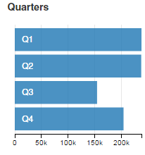
From the above charts we can see that December is the best performing month. From the calendar chart it shows that December is the only month where the daily sales hit the target in this scenario which is $2000 as all of the square has the blue shade. December is also the month where most of the highest daily income were recorded as there is the most number of square with darkest blue shade.
From the bar chart we could see that the difference in the sales generated by Q4 compared to the other quarters is not very huge even when the data we have for Q4 was only from 15 November till 31 December 2015. When the dataset is full, we can definitely conclude that Q4 would be the best performing quarter.
Top Combination of Categories
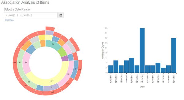
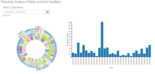
Since December 2015 was the best performing month and the cafe’s marketing department wants to create a new promotions for the next month in hopes to increase sales. Using the date-range-picker, we select December 2015 sales data in the Association Analysis Dashboard.
From the sunburst chart, we see that from the inner radius, category 37 has the largest number of orders. From there, we see what items are commonly ordered with category 37. It’s category in order to attract more customers. It seems that most customers that order items from category 37 also order items from category 38. The management can decide to create set menus for items from category 37 and category 38.
Preparation Time During Peak vs Non-Peak Period
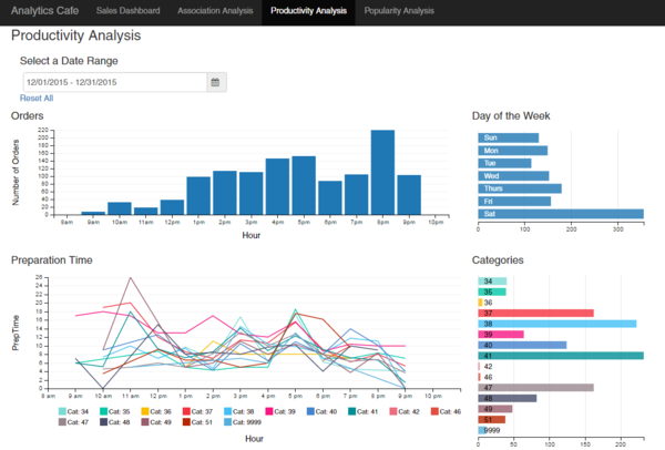
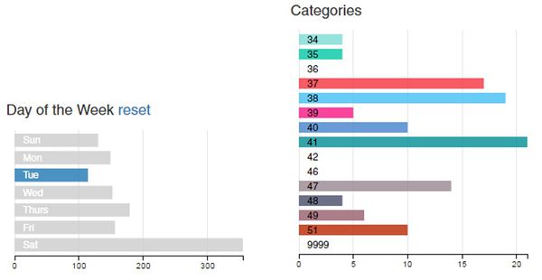
As December is the best performing month, the cafe’s operation department want to know if there are sufficient manpower to serves its customer. From the bar chart, we can see that the cafe is most crowded during dinner time and from the day of the week row chart we could see that Saturday is the busiest day of the week. More manpower will be required to ensure the productivity is not negatively affected.
The user can see that during the peak period, the preparation time decrease however, during non-peak periods, the preparation time is much higher than during the peak period. This could be an issue to look into as the kitchen might either be not performing at its most efficient during that period or there may be a lack of resources during the non-peak period.
Also, by looking at the categories row chart, the user can identify which categories are the most popular and add the resources or make adjustment accordingly. For example, there is no or low number of order for certain category on Tuesday, the management can decide to not sell the items in that category or reduce the quantity to reduce cost and wastage.
Top Modifier for Best-Seller Item Parent
Another way of using the dashboard for insights is that the user may identify certain item modifiers that are commonly ordered and have promotions or special discounts to increase the number of orders for that item and hence in turn increase sales performance overall.
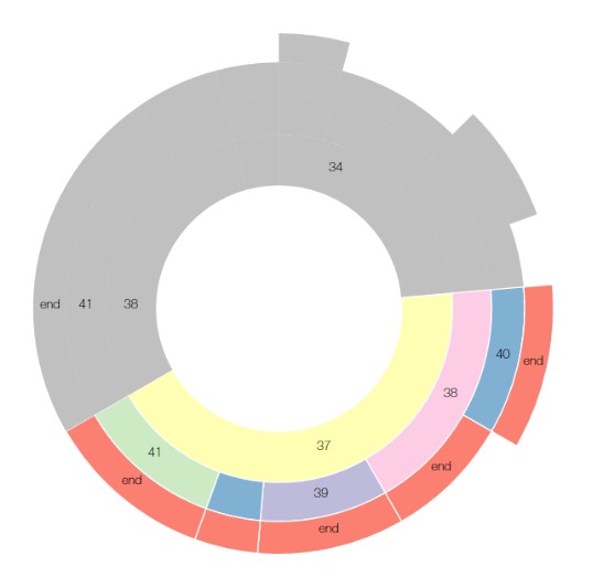
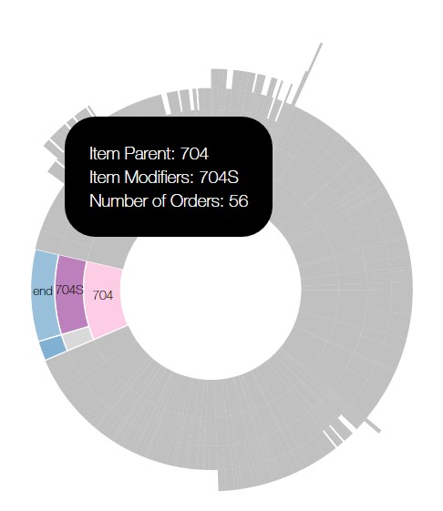
After filtering the data for the month of December 2015, we can see the following chart.
From the sunburst chart, we can see that the most popular item parent being ordered is item 704 and the most popular item modifier option being ordered is 704s. This type of information can help the management to decide whether to promote that item with special discounts when ordered as opposed to the less popular modifier of 704D.
