ANLY482 AY2016-17 T1 Group5 - Dashboard
| Data Cleaning | Data Exploration | Storyboard | Data Manipulation | Dashboard | Insights |
Link to our Dashboard
Contents
Sales Dashboard
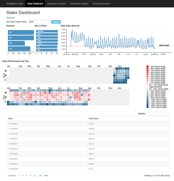
In the sales dashboard, there are 4 charts and 1 table to provide insights on sales data. The dashboard also has the function of cross-filter implemented to link the charts together.
The Quarters row-chart gives an overview of the total sales for each quarter of the year. From this chart alone, it shows at Q3 is the lowest performing quarter. This is not surprising as the data that we used only contains data up to September. We can also see that Q1 and Q2 have similar sales performance.
The Day of Week row-chart shows the number of days of data is present in our dataset. E.g there are 42 Sundays in the entire dataset. The main purpose of this chart is to allow the user to select a particular day to filter the data accordingly.
The Daily Sales Line chart shows the total sales collected for each day. This chart allows the user to zoom in into a specific time period to have a clearer view of the data. In this instance, we can see from the graph that the sales from November to December 2015 performs significantly better than the other months in 2016.
The Daily Sales Performance by Year Calendar Chart allows users to view the sales performance of each day of a year quickly. The color of each square represents how well/bad the sales performance is when compared to a target value. In our dashboard, we set the default target value of $2000. The user can change the target by entering the value to the textbox under set daily target value and click submit. The calendar view shade will be updated according to the target. For example, squares with shades of blue shows that the sales performance of the day is higher than $2000. The intensity shows how much higher the sales performance of the particular day was. Likewise, shades of red represents sales performance below the target.
Association Analysis
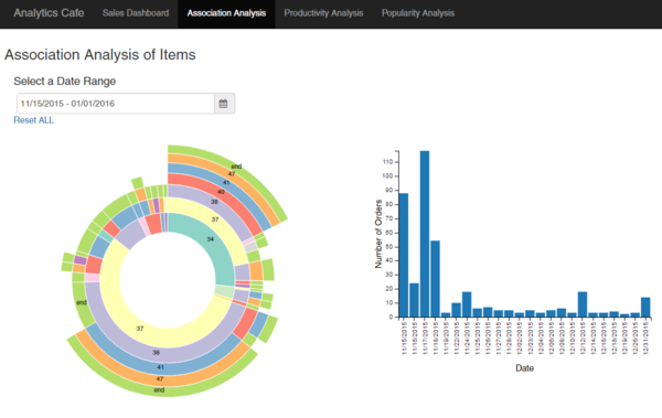
In the Association Analysis Dashboard, users are able to explore the association of different items from the menu. The association analysis in our case is conducted between categories.
From the sunburst chart, users will be able to see which categories of items are often ordered together. For example between 15 November 2015 and 1 January 2016, items from category 37 is often ordered with items from category 38, 41 and 47. This information allows the management to create set menus that include items from the 4 categories to attract customers and hence increase sales.
From the bar chart, the users will be able to see the number of orders per day. Using the cross-filter function, users will be able to select days that he/she is interested in zooming into to get a more precise analysis of the orders ordered on the selected days.
Productivity Analysis
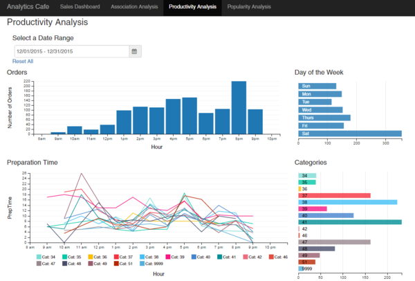
In the Productivity Analysis Dashboard, the user will be able to identify gain insight on whether the number of orders will impact the preparation time. The bar chart for Orders shows the number of order at different hour of the day. For example, in the month of December 2015, we can see that the peak period for the store is 8pm which make sense since it is dinner time.
The row chart for Day of the Week shows the accumulated number of items ordered for the specific day of the week. We can see that the day with the most number of order is Saturday followed by Thursday. Weekends usually have a higher amount of crowd but in from this chart we can see that the sales for Friday and Sunday are not performing as well. In fact, the sales for Saturday is more than double compared to the sales for the other days. This information allows the management to future investigate the reason behind this result.
The line chart for Preparation time shows the preparation time of the order for different category at different hour of the day. This can be used to identify if more orders would increase or decrease the time taken to prepare the order. The row chart for Categories is to show which category is the most popular. It is useful to help understand which categories has the longest preparation time to identify which type of resources such as equipment or manpower that should be added.
Popularity Item and Modifiers Analysis
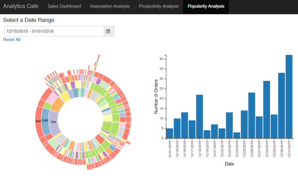
In the Popularity Analysis of Items and their Modifiers Dashboard, users will be able to gain insights on the most popular types of modifiers for the item parents. The innermost arcs of the sunburst chart represents all item parents ordered for the selected date range. In this case, from 15 December to 1 January, the most popular combination for item parent 704 is the modifier 704S.
Similar to the Association Analysis Dashboard, the barchart on the right shows the number of orders per day. Users can select on the dates to zoom into the popular items and their modifiers analysis at specific dates.
