Jarvis R

From Analytics Practicum
Jump to navigation Jump to search

Click here to return to AY16/17 T2 Group List

Jarvis.png

HOME


PROJECT PROPOSAL


PROJECT FINDINGS


PROJECT MANAGEMENT


DOCUMENTATION


ABOUT US

Articles Videos R

Our sponsor has indicated during one of our meetings that they have an interest in linking Facebook posts’ performance to staff responsible for the creation of the respective content. Using an application from R called Shiny and Sparkline, we can design out a dashboard that can be assessed easily both online and offline.

Mock excel pivot.png
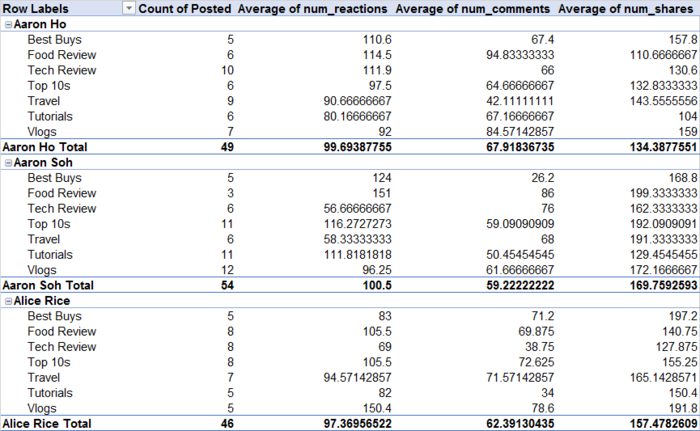
Microsoft Excel Pivot Table – the basis of creating our R shiny dashboard application (Mock up)


R is a free software environment for statistical computing and graphics, which makes it suitable for our sponsor’s usage, to help churn large amounts of data analysis. R Shiny is a web application framework for R which helps to create interactive web applications for analyses done on R previously. Sparkline is a very small line chart to present the general shape of the variation in some measurement. The benefits of using sparklines are that they are small enough to be embedded in text, or several sparklines may be grouped together as elements of a small multiple. While a normal chart is designed to show as much data as possible, and is set apart from the main body of text, sparklines are intended to be succinct, memorable, and located where they are discussed. This allow multiple visual analysis to be displayed in a compact space. It is very useful in aiding the user (usually a manager) to obtain a quick and general understanding of the situation.

Mock r shiny.png
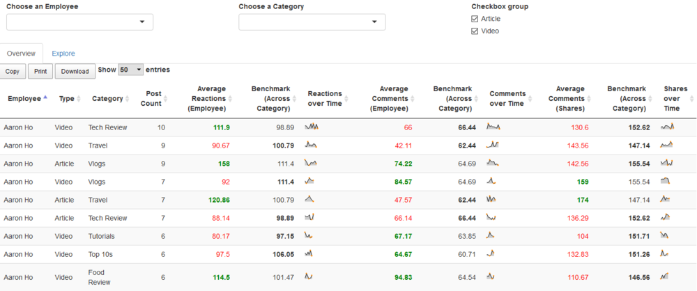
R shiny dashboard interface with Sparkline

Comparing the same analysis shown on both Excel and R Shiny, on R Shiny we can plot a comparative value of a certain individual to all the data points in that specific category. With the aid of conditional formatting (Green for above benchmark and Red for below benchmark), this allows the user to quickly make sense of the data without doing additional calculation to determine the sign of the comparison – that is, whether the value is smaller or bigger than the given benchmark. Furthermore, while the average could convey whether the certain individuals are performing better than their peers, it could be attributable to the success of a specific post or spread out over many. As such sparklines are useful to display the distribution of the statistics, thereby giving a holistic view of a staff’s performance. Copy, Print and Download functions are also added to enable users to extract the needed data to carry out further analysis. This could be made more useful, should this model have to ability to scrape live data and update the values accordingly. However, as the scope of our project only contains the static data sponsored, we have not added this capability, but which could be something our sponsors consider moving forward. In all, the application we have developed is largely a proof of concept at this point in time. Our sponsors will be able to add increased functionality and integration.