Analysis of User and Merchant Dropoff for Sugar App Finals
| Mid-Term | Finals |
|---|
| Funnel Plot Analysis | Time Series Analysis | Geospatial Analysis |
|---|
Contents
Abstract
The ability to provide un-bias and accurate assessment of the performance of its merchants plays an important role in the success of a deals discovery mobile application business. Unfortunately, the rank and identify the “best” of everything approach commonly used by business analyst is far from satisfactory. In order to overcome this problem, a practice research study has been conducted to demonstrate the potential use of funnel plot, a visual analytics method to assess and identify meaningful variation when we compare performance among entities in a group, to discover actionable insights and knowledge from real world business performance data.
Using a location-based mobile deals application (app) in Singapore as a case study, this presentation aims to share with you our journey through this research process and the lessons learnt. The presentation starts with an overview of the motivation and challenges faces by a data analyst especially with relation to comparing the performance of merchant with varies sample size. This is followed by a review of relevant literatures of funnel plot. Next, the mobile deals app case study will be introduced. A detail discussion on the implementation of the funnel plot using the mobile deals app data will be presented. This is followed by a comprehensive discussion on the analysis results obtained and interesting insights gained from the analysis results. Last but not least, the extensibility of the funnel plot to other businesses and organization and future research direction will also be discussed.
| Business Motivations and Objectives |
Redemption rate will be used as the performance indicator since the only channel for generating revenue is via upsell. This is the main factor of merchant attrition as merchants with little to zero uptake will perceive the application as a waste of time and choose to drop off. Since our client is in a two-sided market, a high attrition rate of merchants may result in users also ceasing usage.
For our client, there is a strong need to retain and attract merchants who are performing well and to improve or perhaps eliminate merchants who are not. Hence, this practical research aims to explore and demonstrate the effectiveness of using funnel plots to analyze merchant performance.
Review of Existing Work
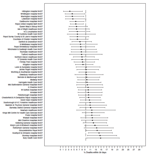
In the field of medical research, ‘league tables’ such as caterpillar plots have been widely utilised to visualize the ranking according to a performance indicator. Figure 1 shows a league table of hospitals based on mortality following a fractured hip [3].
The critical flaw with caterpillar plots as seen below is the inability to take sample size into consideration when ranking results. Inadequate sample sizes with wide ranges of results often make it difficult and unwise to rank results; results that can lead to inaccurate interpretations and false decisions. [4] Thus, there is a strong need to seek out alternative charts that can give a more comprehensive and accurate analysis.
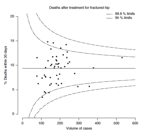
Funnel plots are a form of scatterplot in which observed area rates are plotted against area populations. Control limits, which are computed similarly to confidence limits are then overlaid on the scatter plot. The control limits represent the expected variation in rates assuming that the only source of variation is stochastic. The funnel shape is generated due to the smaller expected variability in larger populations. When many points fall outside the funnel, the plot can be described as “over-dispersed” and it can be said that the process is not in control or the model does not fit the data well.
As seen in the above chart, it is the same data that is presented above but however, this plots the observed mortality rate against the sample size. While a researcher may be quick to suggest hospitals who lie below the average mortality rate in Figure 1 as ‘under-performing’, the funnel plot in Figure 2 shows that no hospital lies outside the 99.8% limits. Thus, there is no basis for indicating any hospitals who are under-performing or over-performing since they mostly lie within the 95% limits.
Funnel plots has been prevalent in medical research [6,7] but few and between in the area of retail analytics. Its usage in analyzing and interpreting merchant’s redemption behaviour could bring about important business insights that retail businesses could utilise. For example, merchants who have been identified as under-performing can potentially be cut loose from the application. Subsequently, more effort and resources can be invested into retaining outperforming merchants and even recruit merchants of a similar nature in the future.
Methodology
The picture above shows the data transformation process which we have undertaken for our research study. For this research study, two years’ worth of data from 2014 and 2015 will be utilised.
Firstly, SequelPro was used to extract the data from our client’s database. The database consists of our client’s orders, branch, brand and item data which we will be using in our analysis. Using SAS JMP Pro, these tables were joined together to form a more comprehensive dataset which we will be using for our analyses. Following that, the raw data provided by our client had several errors that needed a high level of data cleansing. This includes cleaning out invalid merchants and orders, correcting geographical coordinates and merchant details. In addition, there were several confounding factors that could affect our analysis such free items that were given out during campaigns.
Next, we filtered for the relevant data which we needed for our analysis (e.g. localized orders and merchants). This is important because the scope of the project has been defined by our client, specific to the Singapore context. In order to add more dimensions to our data for better analysis, we recoded selected columns in our dataset. This will be explained further below in-depth. Lastly, we loaded our data into the JMP server to conduct our funnel plot analysis.
Data preparation albeit being a time-consuming and tedious task, is extremely important. It allows more accurate, easier and better interpretation of the data. High-quality data is essential for having an accurate and reliable analysis of the results. Data cleansing and transformation are two key areas which we have invested a lot of our time and effort into during this research study.
After data cleansing as what was mentioned above, we conducted exploratory analysis. We discovered two main groups of merchants that are prevalent on our client’s app - Lifestyle/Retail merchants and F&B merchants. Both groups exhibit very different user behaviour which will be analysed further.
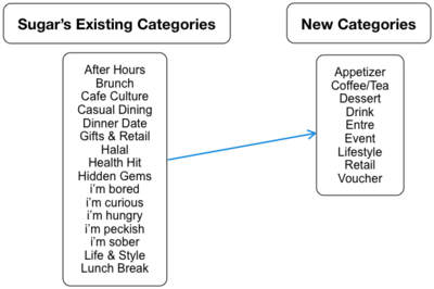
In addition to reconfiguring our client’s current categorization system which have a large area of overlap between item categories, there is also a need to delve deeper by splitting the item categories into more narrow and specific ones. This way, our client is able to gain a deeper insight of what items are more popular during specific timings of the day.
The time-stamped data provided will enable us to discover greater insights and knowledge about users’ behaviour. Hence, there is a need to examine the time-frames where there is high traffic in number of orders. Therefore, we have classified the paid orders into the following broad categories: Breakfast, Lunch, Tea Break, Dinner, Chill and Miscellaneous.
| Initial Data Exploration and Analysis |
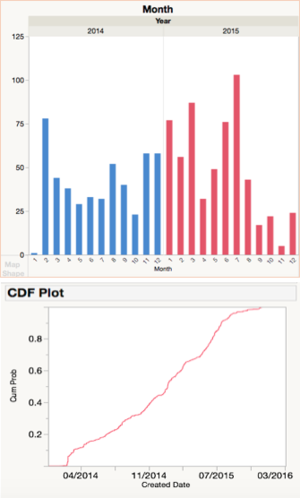
We conducted initial data analysis using Exploratory Data Analysis (EDA) to gain general insights about merchants and their order behaviour. Our client’s merchant growth experienced several notable spikes over the past 2 years. For example, during the beta phase in February 2014, our client is trying to bring merchants on board before its official launch in July. There is also a noticeable spike in July 2015 which is probably due to our client’s Great Singapore Sale campaign which main focus was user acquisition.
Examining the graph above, we can see that the cumulative growth in number of merchants have slowly been tapering off. Currently, our client has 835 merchants compared to a total of 6,860 establishments in the food & beverage (F&B) services industry [8]. Our client’s merchant pool only constitutes 12.2% of the industry and this means great room for potential in acquiring more merchants.
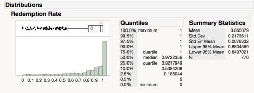
Redemption rate is a key factor when it comes to merchant attrition. Merchants generally only earn revenue via upsell when customers come in to redeem their orders. As the nature of the orders are fairly small (e.g. a cup of coffee), the business model stands to guarantee a certain amount of upsell for merchants at a relatively low cost. Hence, many merchants with low redemption rates are likely to drop off the application after awhile due to i) lack of revenue and ii) perceived opportunity cost.
There is a wide distribution of redemption rates that is prominently right-skewed. However, in order to analyze the merchant’s performance accurately, a funnel plot will be utilised to capture each merchant’s volume of orders in addition to volume of redemptions.
| Funnel Plot |
JMP Pro will be used to perform exploratory analysis and funnel plot analysis. SAS JMP Pro is an analytical software that is able to handle large volumes of data efficiently, which is imperative since our client's data is too large to be handled by other software such as Microsoft Excel. Even though the funnel plot is not a built-in feature, Matthew Wolfe [9] has created a plugin add-in that is accessible via JMP’s user community.
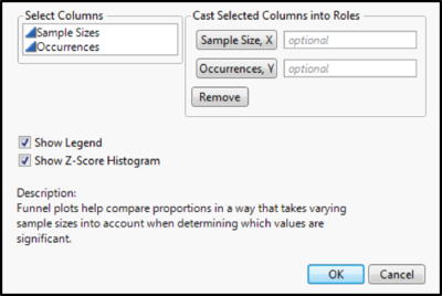
A dataset that contains occurrences and sample sizes will be used to execute the analysis. After launching the funnel plot plug-in, one will need to assign Sample Size and Occurrences to their respective roles.
The funnel plot control limits are set at 95% and 99.8%. These correspond conceptually to the 2-sigma limits often used in health services research and to the 3-sigma limits commonly used in process control. [10] Outlying merchants outside of the 99.8% limits will be segregated into two groups - star merchants (performing better than expected) and laggard merchants (performing worse than expected). Merchants who are within the control limits follow a stochastic trend and will not be analysed.
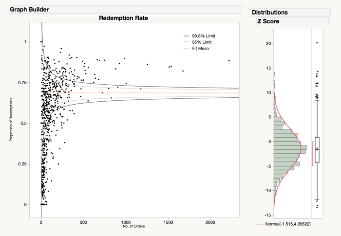
Funnel plots calculate the boundaries of expected variation based on the mean and standard error, but the mean as a measure of center and standard errors as measures of confidence around the mean, are statistics that assume a normal (bell-shaped) distribution. [4] The Z-score histogram dictates whether the data points follow a normal distribution. Thus, a normal distribution is needed for a funnel plot analysis.
Case Study on Our Client's Merchant Performance
The graph above shows the proportion of redemption rate out of paid orders in Singapore from 2014 to 2015, mapped by merchants. From the funnel plot analysis, we identified a total of 321 merchants who fell outside the limits of 99.8% confidence.
In order to establish which merchants are star merchants (performing better than expected) and which are laggard merchants (performing worse than expected), we have used SAS JMP’s brush tool to select data points that fall outside the 99.8% limits. Merchants that fall above the upper 99.8% limit are identified as star merchants and those that fall above the lower 99.8% limit are denoted as laggard merchants.
There are 80 merchants (10.4%) who we classified as star merchants and 241 merchants (31.3%) who are laggard merchants. Restating the fact that approximately 40% of merchants lie outside the control limits, there is substantial overdispersion.
Overdispersion is a common phenomenon that occurs with large sample sizes and often occur when control limits are very close to each other. This results in the identification of an abnormally large amount of data points, signaling special cause variation [4]. Thus, we can conclude that the model does not fit well. There may be additional factors that may result in a wide variation between merchants which researchers can seek to identify using exploratory analysis.
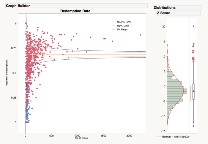
SAS JMP has an interactive data exploratory feature which enables the user to add and drag the plot indicator to get more insights. Here, we have decided to colour-code the data points to provide a bigger picture. During our data preparation, we have categorized merchants into two main groups – F&B merchants and Lifestyle/Retail merchants. The lifestyle and retail merchants are grouped together because they both exhibit similar redemption rate behaviour which we identified through our initial data analysis.
By colour coding the types of merchants, we are able to see that merchant type is a strong factor of redemption rate. The funnel plot shows that Lifestyle and Retail merchants mostly lie outside of the control limits and are classified as laggard merchants. In comparison, the majority of F&B merchants lie within the control limits and constitutes almost all of the star merchants. We can deduce that majority of star merchants are F&B merchants and majority of laggard merchants are in fact, retail and lifestyle merchants.
A funnel plot is constructed again to analyze the merchants within star merchants. Compared to the funnel plot for all merchants, breaking down into two diverse groups of merchants seem to provide a better model fit. From the graph above, we can see that Maki-San is the most popular merchant, followed by Munch Saladsmith & Rotisserie.
Overall, star merchants have a redemption rate of approximately 97.5% to 100%. Being that there is only a small margin of 2.5% difference between the worst performance and the best performance amongst star merchants, there is no need for immediate action to rectify this problem.
From the graph below, the funnel plot indicates that the top performing merchants in the laggard merchants group are Bangkok Jam and Siam Kitchen. They have a redemption rate of approximately 90%. Compared to star merchants, their performance be classified as sub-par performance. In comparison, they are not performing as badly as what the earliest funnel plot depicted them to be.
In contrast, merchants who were performing the worst were identified as Skinlab, En Motion and SK Catering. They experience a redemption rate of between 5% to 30%, which constitutes a wide margin difference compared to the top performing merchants. Our client should focus on this group to improve their performance and identify important factors that may affect redemption rate.
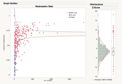
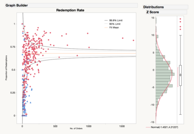
In addition, we also utilised JMP’s local data filter to analyze the temporal trends during 2014 and 2015 respectively. From the graphs above, the funnel plots show a consistent trend throughout the two years where F&B merchants experience a higher redemption rate as compared to Lifestyle/Retail merchants.
| Setting Benchmarks For Merchant Performance |
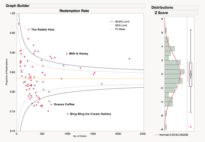
A funnel plot is constructed again to analyze the merchants within star merchants. Compared to the funnel plot for all merchants, breaking down into two diverse groups of merchants seem to provide a better model fit.
From the graph above, we can see that Maki-San is the most popular merchant, followed by Milk & Honey. In addition, a more interesting insight is that all star merchants are essentially F&B merchants, which is consistent with our earlier finding that F&B merchants are more popular than Lifestyle/Retail merchants.
Overall, star merchants have a redemption rate of approximately 75% to 97.5%. There is a large margin difference between merchants who lie above the upper 99.8% limit and those who lie below the lower 99.8% limit. The latter merchants are not performing as well as what was depicted earlier there is a large room for further improvement.
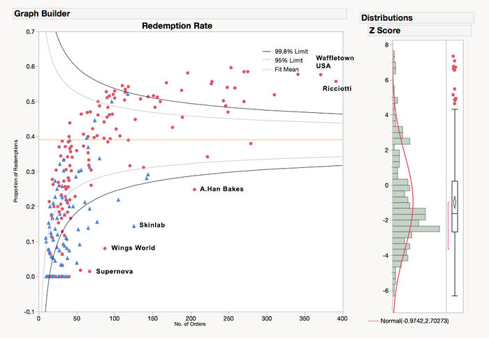
From the graph below, the funnel plot indicates that the top performing merchants in the laggard merchants group are Ricciotti and Waffletown USA. They have a redemption rate of approximately 60%. Compared to star merchants, their performance can be classified as sub-par. However, in comparison to their fellow laggard merchants, they are not performing as badly as what was depicted earlier.
In contrast, merchants who were performing the worst were identified as Skinlab, Wings World and Supernova. They experience a redemption rate of between 2% to 15%, which constitutes a wide margin difference compared to the top performing merchants who have a redemption rate of 50% and above. Our sponsor should focus on this group to improve their performance and identify important factors that may affect redemption rate.
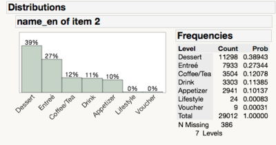
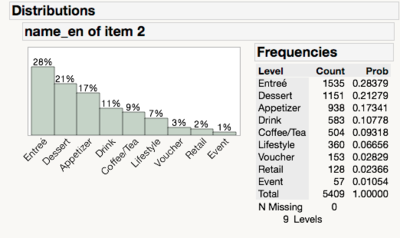
Left: Star Merchants, Right: Laggard Merchants
For the star merchants, Dessert and Entreé seem to be the most popular categories - constituting 66% of total redemptions. However, for laggard merchants, Dessert and Entreé which are also its most popular categories, comprises only approximately half of its redemptions. In addition, star merchants’ redemptions seem to be dominated by a few select categories such as Coffee/Tea, Drink and Appetizer whereas there is a wider variety of other categories for laggard merchants.
Laggard merchants have a more uniform distribution across Lifestyle, Voucher, Retail and Event categories. This may be a main indicator of why laggard merchants have a much lower redemption rate in comparison to star merchants. From our discussion with Sugar’s founder and employees, F&B merchants are perceived to be the main source of revenue for Sugar and other merchants have a much lower popularity in comparison. Our results confirms Sugar’s beliefs in establishing that redemption rates are much higher for F&B merchants than Retail/Lifestyle merchants.
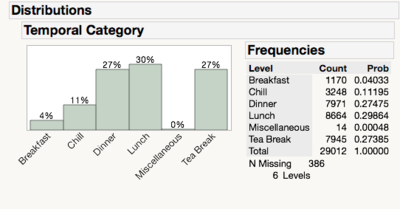
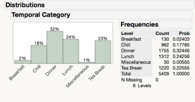
Left: Star Merchants, Right: Laggard Merchants
In conjunction with our earlier findings, dinner and lunch are considered the most popular time-frames for redemptions, followed by tea-break. While breaking down into both groups of merchants, this finding is congruent with our results but to varying degrees. Star merchants experience similar level of redemptions for both dinner and lunch whereas laggard merchants have a higher influx of redemptions during dinner-time. This insinuates that users are more willing to redeem their items during lunch-time perhaps due to convenience and proximity to their offices/school. This may also mean that users may be enticed to seek out new merchants during lunch-time. By delving deeper into the product category itself, we will be able to get more insights that may explain redemption behaviour.
Left: Star Merchants, Right: Laggard Merchants
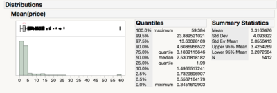
The results is the opposite of what we expected. Comparing both Star Merchants and Laggard Merchants, the former seems to contain much cheaper items in comparison to the latter. However, the distribution for Laggard Merchants is heavily skewed by expensive items (i.e. 90% of its items cost $4.60 and less). At the 90% percentile, Star Merchants’ redemptions are still relatively cheaper (i.e. $3.55 vs. $4.60).
| What This Study Adds |
Funnel plots act as an alternative way to visualize and represent data on redemption rates of different merchants. They allow quick identification of outlying merchants which can then be analysed further to derive underlying reasons for their performance. Our client is able to classify these merchants into two groups – over-performing merchants (star) and under-performing merchants (laggard). The funnel plot provides clarity for our client to set benchmarks for each individual merchant. These merchants can compare themselves to other merchants and improve their performance further via underlying factors. These factors that are associated with merchant performance can be extrapolated and utilised in future business development where our client can seek out merchants that fulfill these criteria to improve their bottom line.
The overdispersion issue as seen earlier is an interesting observation. There is a significantly large group of data points falling outside the control limits. This highlights one of the most useful aspects of the funnel plot - analyzing underlying factors that have contributed to the model’s fit. We are able to see that the redemption rate may be affected by variables such as merchant category and item category. This gives us an opportunity to conduct exploratory analysis to gain a better understanding from the user’s perspective.
| Implications for Our Client and Business Development |
Our client is able to identify which merchants are performing well and which are not. By setting targets and providing merchants with the comparison between their own performance and other merchants, they may be more motivated to improve their own performance. The business insights we have derived from in-depth exploratory analysis gives us a bigger picture of what attracts users and what is effective to drive redemption rate.
To reach their targets, actions can be taken by our client or merchants to improve their own performance. Since items that are bought at a cheaper price are more likely to be redeemed, our client can consider lowering the base price of each item to attract more redemptions. For future business development, the team may want to look into focusing on F&B merchants - more specifically merchants that offer entrée and dessert items since they have been proven popular. This has been backed up by the fact that dinner and lunch items are the most popular (i.e. entrée items), followed by tea-break items (i.e. dessert items).
Conclusion
Funnel plots have been largely underutilized in retail analysis. Due to its prevalence in health surveillance to detect anomalies, it may prove itself to be a useful tool for retail businesses. Sales intelligence is an important part of any business – to help drive performance by providing key insights about merchants and consumers.
For merchants, setting benchmarks and targets for them is key to improving their individual performance. By calibrating their performance versus other merchants in the same group, we are able to see a bigger picture of whose performance is not optimal. For over-performing merchants, our client can invest more resources to retain them and focus on similar merchants when embarking on merchant acquisition in the future. For under-performing merchants, recommendations can be pushed out to them to improve their performance further.
Overdispersion, which is a common phenomenon in funnel plots, presents a strong need for further investigation via exploratory analysis. Through in-depth analysis, important factors that affect the model fit of the funnel plot can be highlighted. We are able to highlight what exactly affects user behaviour and subsequently, redemption rate. Thus, tailored recommendations can then be pushed out accordingly to these insights.
Although funnel plots appear a useful technique for investigating performance for redemptions, it is important to take note that data points falling outside the control limits do not imply bad performance in itself. It proposes a case of further exploration in investigate why these merchants are not performing well or why there is a significant overdispersion in the model. For future work, other metrics may be considered in evaluating merchant performance such as revenue. Item categories may be broken down further to give further insights into specific items (e.g. waffles, ice-cream) under each item category.
Acknowledgements
We thank Prof Kam Tin Seong (Associate Professor of Information Systems; Senior Advisor, SIS) for his insight and guidance throughout this project. We also like to thank our client for graciously providing us with access to his database and staff resources. Lastly, we would like to thank Matthew Wolfe for creating the funnel plot add-in for SAS JMP software.
References
[1] The Connected Consumer Survey 2014/2015. (2015). Retrieved from https://www.consumerbarometer.com/en/graph-builder/?question=M1&filter=country:united_states,china,hong_kong_sar,korea,malaysia,singapore,australia
[2] Rochet, J. C., & Tirole, J. (2004). Two-sided markets: an overview (Vol. 258). IDEI working paper.
[3] Spiegelhalter, D. (2004). Funnel plots for comparing institutional performance. Statistics In Medicine, Statist. Med. 2005; 24:1185–1202.
[4] Few, S., & Rowell, K. (2013). Variation and Its Discontents (Funnel Plots for Fair Comparisons). Perceptual Edge. Retrieved from https://www.perceptualedge.com/articles/visual_business_intelligence/variation_and_its_discontents.pdf
[5] Woodall DH: The Use of Control Charts in Health-Care and Public-Health Surveillance. J Qual Technol 2006, 38(2):89-104.
[6] Benneyan JC, Lloyd RC, Plsek PE: Statistical process control as a tool for research and healthcare improvement. Qual Saf Health Care 2003, 12:458-464.
[7] Mohammed M A. Using statistical process control to improve the quality of health care. Qual Saf Health Care 200413243–245.245
[8] Singstat.gov.sg. (2016). Statistics Singapore - Services Survey Series 2014 - Food and Beverage Services. Retrieved from http://www.singstat.gov.sg/statistics/visualising-data/storyboards/sss-food-and-beverage-services/
[9] Wolfe, M. (2016). Funnel Plot Add-In | JMP User. Community.jmp.com. Retrieved from https://community.jmp.com/docs/DOC-7635
[10] C. Dover, D., & P Schopflocher, D. (2011). Using funnel plots in public health surveillance. Population Health Metrics.
