ANLY482 AY2017-18 T2 Group15 Data Visualization Platforms
Jump to navigation
Jump to search
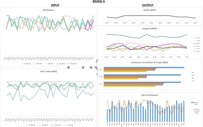
Figure 3: Brand Dashboard in Excel
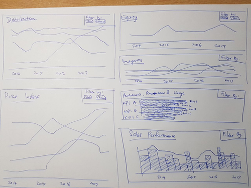
Figure 4: Dashboard Design Sketch
The team created this dashboard on two platforms which it feels will better suit its client’s needs: Qlik Sense and Tableau.

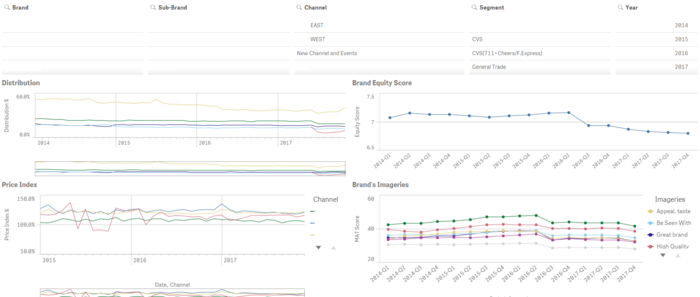
Figure 5: Brand's Dashboard in Qlik Sense
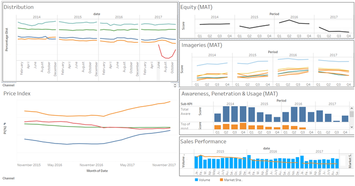
Figure 6: Brand's Dashboard in Tableau
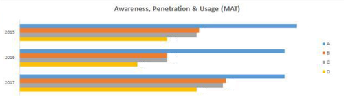
Figure 7: Client’s Original APU Graph (Yearly)
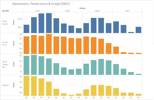
Figure 8: Revised APU Graph in Tableau (Quarterly)
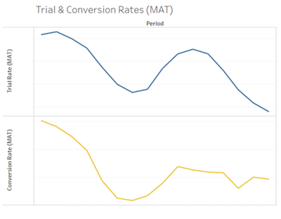
Figure 9: Brand’s Trial and Conversion Rates in Tableau
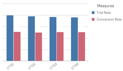
Figure 10: Brand’s Trial and Conversion Rates in Qlik
DATA VISUALIZATION PLATFORMS USED
- Using the data which had been reformatted into Flat Table format, dashboards were created using two data visualization platforms - Qlik Sense and Tableau. These platforms were chosen as they were suitable for the client's needs.
- All charts presented in this wikipage have been created using randomised substitute data to protect our client's confidentiality.
THE CURRENT DASHBOARD

- Figure 3 is a snapshot of the client’s current dashboard for one of its main product brands, which was generated using their original data structure.
- This dashboard is split into two graph segments, namely the input graphs and the output graphs. The two input graphs on the left are of pre-sales data and include the distribution of brands across the various distribution channels, and the prices of their products across those channels. The four output graphs on the right are of post-sales data and include the equity and imageries of the brand as provided by customers, the awareness, penetration and usage of the brand among customers, and the sales performance plotted against the sales volume.
- This method of data visualization may not be ideal for several reasons.
- As the data was neither in Relational nor Flat Table format, it is not possible to automatically load the files into visualization platforms requires the data to be input manually, which takes unnecessary time and effort.
- The resulting visualizations are highly static and lack filter options, making it difficult for users to slice and dice, to view a specific segment of data – a function which is readily available in other visualization platforms.
- Monthly addition of new data into the dashboard will be a time-consuming process due to the manual input method required.
- This method of data visualization may not be ideal for several reasons.
- To address the three issues above, our team has first converted the client data into the Flat Table format which will be easily loaded onto alternative visualization platforms, then replicated our client’s dashboard as seen in Figure 3 onto other platforms more suited to our client’s needs. To improve the flexibility and adaptability of the final visualization, we will prioritize features which support the seamless addition and integration of new data into existing visualizations.
- The amended design of the dashboard in Figure 4 includes a filter to allow customization in the data displayed. It will also be dynamic and interactive, allowing data segments such as date, visualization colours, and graph selections to be changed with a few simple clicks.


QLIK
|
TABLEAU
|
QLIK DASHBOARD

- The Qlik dashboard shown above showcases an improvement in design and aesthetics as compared to the Excel platform. Similarly, the incorporation of filters is an upgrade to the original dashboard. Furthermore, for Qlik Sense, through data associations in its data loading process, filter selections can be applied across all datasets for synchronised changes in all the charts.
TABLEAU DASHBOARD

- Unlike in Qlik, the Tableau sheets can be combined into a single dashboard and resized to fit the user’s screen, which was a request specifically made by the client. Dashboard creation and customization is also simpler due to Tableau’s drag-and-drop-based format, which is more intuitive than Qlik.
- One simple but very effective example of Tableau’s unique functions is the expansion of the date field. Given that the data is in the correct format, the user can easily choose the specific time frame to display data. For example, Yearly data can be expanded to Quarterly, or Monthly and so on, with a single click, as shown below. This is a function absent in Excel and Qlik.
ADDITIONAL CLIENT REQUESTS
- In addition to the graphs in our client’s current dashboard, they have also requested for specific adaptations to the Yearly Awareness, Penetration and Usage (APU) graph to be created, shown below.

- Firstly, the client requested for the above yearly graph to be done in quarterly format. This was done in Tableau, shown in Fig. 10 below.

- Secondly, the client requested for two new ratios to be plotted: the Trial Rate and the Conversion Rate, explained in the table below
| Trial rate | Conversion rate |
|---|---|
| The rate at which customers aware of Brand A go on to try their products. Given by (Total Usage) / (Total Awareness). | The rate at which customers who try Brand A go on to become regular consumers. Given by (Regular Users) / (Total Usage). |

