IS428 AY2019-20T1 Assign Tommy Johnson Observation5
This section aims to answer the questions posed at the mini challenges
Q5) The data for this challenge can be analyzed either as a static collection or as a dynamic stream of data, as it would occur in a real emergency. Describe how you analyzed the data - as a static collection or a stream. How do you think this choice affected your analysis?
Currently, the analysis done is through the static collection of data. However, the approach that I took in designing the visualization ensures the possibility of analysis through stream collection of data. The time based layout is amenable to constant streaming.
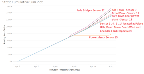
One example would be the Cumulative Sum Plot which is designed for real time process monitoring. The plot are effective in detecting early shifts in trend of noisy data, something ideally suited to emergency response based on partially uncertain and noisy data.
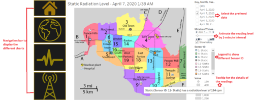
Another example would be the Map chart that can be played through animation. This is also suitable for real time monitoring and provide a greater aesthetic and easy readability of the data. Hence, it gives users to respond to emergency more quickly with little effort in understanding the situation.


