IS428 AY2019-20T1 Assign Tommy Johnson Observation
This section aims to answer the questions posed at the mini challenges
Visualize radiation measurements over time from both static and mobile sensors
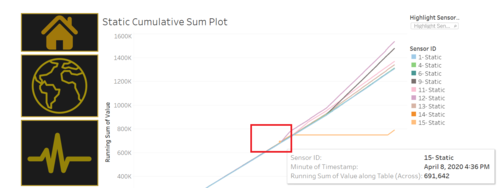
Looking at the cumulative sum chart, I notice that before 8 April 2020 at around 4:30 PM , all the static sensors have similar readings. It then spiked up for the rest of the days with Sensor 12 being the highest reading level. I suspect that the first quake around this time. Hence, it explains the spike up of all the sensors.
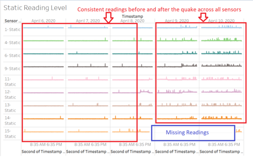
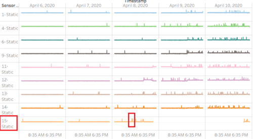
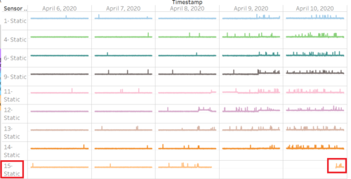
This is further supported by the log scale chart which shows a similar pattern. However, sensor 15 has missing readings level between the end of the day on 8 April to late at night on 10 April. This is something we need to pay attention to.
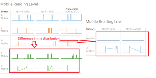
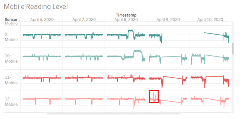
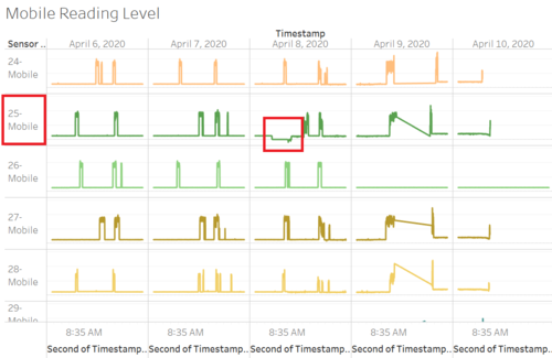
As for mobile sensors, I notice that there is much fluctuations and background noises between each other. This means it is not really consistent and it may be a question as to how their readings may be reliable enough for the government to consider and take actions.Further details will be explained at a later part
I found out that the highest readings level for static sensor comes from sensor 15-Static at 1,238 cpm on 8 April 2020 at 10:20 AM
The lowest reading level for static sensor comes from sensor 15 - Static at 112 cpm on 10 April 2020 at 8:45 PM
The highest readings level for mobile sensor comes from sensor 12-Mobile at 57,449 cpm on 9 April 2020 at 2:43 PM
The lowest reading level for mobile sensor comes from sensor 25-Mobile at 0 cpm across both 8 April 2020 AT 8:47 pm

