ISSS608 2018-19 T1 Assign Goh I Vy Task 3
|
|
|
|
|
|
What factors are causing these alarming level of air pollution?
Air pollution is worse during winter. From the calendar charts that was plotted for both Official Air Quality and Citizen Science Air Quality, it was observed that the air quality deteriotes significantly during Winter (November to February). Why is that so? Is it directly due to temperature? However as discussed in Task 2 especially in Week 4 Jan 2018, it does not seems that temperature directly influences the air quality.
Contents
Data Wrangling
Topography Data and Citizen Science Air Quality Data
The Topography Data which consists of Longitude, Latitude and Elevation data is joint into the Citizen Science Air Quality Data by doing the following steps.
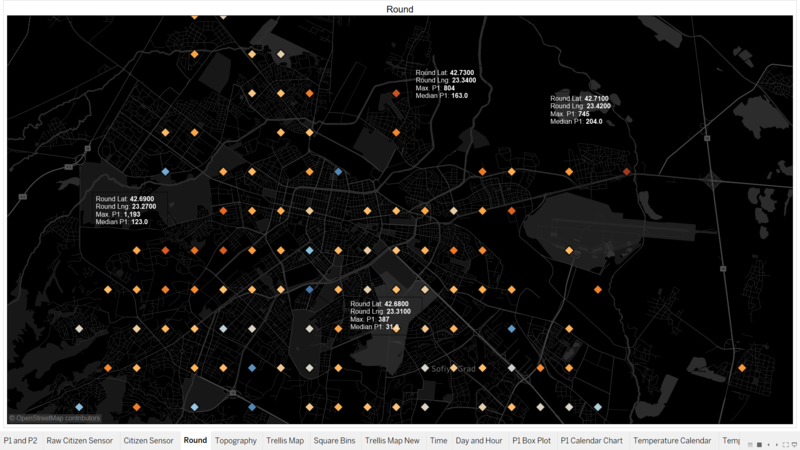
- ROUND() function is used to create new calculated field for Longitude and Latitude. The values are round up to 2 decimal points.
- Postal code of Sofia City [1] is used be able to plot a choropleth map to aid in visualization. ROUND() function is used as well to create rounded up values to 2 decimal points.
- The dataset of Topography Data is joint with the Postal Code created dataset by using JMP.
- Tableau is then used to Full Outer join the Postal and Topo Round dataset with the Citizen Science Air dataset.
The topography is mapped to be able to visualize the effect of elevation on the P1 concentration.
Meteorology Data and Official Air Quality Data
The Meteorology Data which consists of Temperature, Humidity, Pressure, Wind Speed and Precipitation data is joint into the Official Air Quality Data by doing the following steps.
- The Meteorology’s date data was created as mentioned in the Overview
- JMP is then used to join the Meteo dataset with the Official Air Quality dataset by matching the dates.
Temperature Inversion in Winter
What is a temperature inversion? It is a confluence of natural phenomena that exacerbates air pollution in winter. Overcast weather, in particular, tends to trap the pollution beneath the cloud where the warm air acts as a lid, covering air pollutants. Air temperature usually falls along with increased elevation. But sometimes during the night, and more often during cold nights, there is a warm layer of air between the layers of cooler air. This is called temperature inversion. Thefore, the warm layer prevents the air below it passing through, hence pollutants from household heating, vehicle exhaust and other industrial pollutants circulates near the surface. A city located in a valley and close to a mountain is more liable to experience temperature inversion. The cold air is denser and heavier; therefore it often slides down the mountain slope and ends up in a valley, leaving the warm air above. [2]
Sofia a Valley
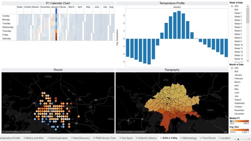
From the image above, it can be seen that the Week 4 air quality is worse at areas at a lower elevation compare to area that are at higher elevation. From Task 2, it was observed that the concentration increases from Thursday 12am to Sunday 11am before it starts to drop. From the interactive dashboard at Air Quality in Week 4, it was noted that temperature is the lowest on Thursday and slowly increase as the week go.
From Task 2 also, it was noted that the most "Hot Spot" areas are residential area. It could be due to the decrease in temperature, more heating is needed, which causes the P1 concentration to increase. However, as due to the temperature inversion, where the air pollutants are trapped by the warm air above, the P1 concentration builds up until Sunday before it disperse.
As such the behaviour of temperature inversion is evident, especially in Week 4 of Jan 2018.
Link for Interactive Dashboard
What does the Official stations says?
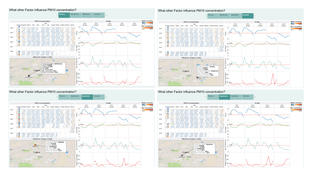
So far, the discussion on temperature have been about the air quality measurements from the Citizen Science Air data. What about the Official Air Quality dataset? Would there be any evidence of temperature inversion behaviour? Taking IAOS/Pavlovo (will be referred to as Pavlovo), Hipodruma, Nadezhda and Druzhba for comparison, as both Air Monitoring Station are at the region where "Hot Spots" identified from the Citizen Science Data. Orlov Most and Mladost will not be used for comparison due to the data collected is not the same. January is used as a basis to compare between the Years, as it seems to be when the air quality is the worst.
From the images above the following observation can be noted;
- It was noted in Task 1 that Nadezhda have an overall lower concentration of PM10 compare to the rest of the Air Monitoring Station.
- The altitude of the Air Monitoring Station does not seem to have an obvious of an impact to the overall PM10 concentration compare to in Citizen Science Air. Pavlovo which is of a higher altitude seems have a higher median concentration compare to the rest of the stations.
- However, it is also noted that Pavlovo is a traffic type Air Monitoring Station while the other three are background type.
- There could be a difference in terms of the positioning of the sensors or the method of collecting data is different.
- Air pollutant from traffic could also be the main reason for the high concentration of PM10.
- Pavlovo and Hipodruma which is at close proximity to each other exhibits the same PM10 concentration. It is also noted that both stations are at the same vicinity with the "Hot Spots" identified at Task 2.
- Nadezhda and Druzhba appears to be exhibits the similar PM10 concentration profile as well.
- Temperature does not seems to have any obvious influence on the PM10 concentration, except for in Jan 2016, where the spike in the concentration seems to be due to a dip in temperature.
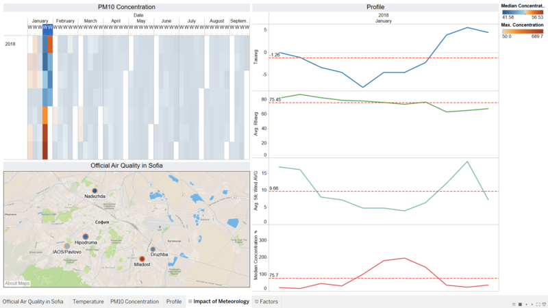
From the Citizen Science Air data, it was stipulated that an temperature inversion occured on Week 4 on Jan 2018. A zoom into the meteorology profile of the Sofia City on Week 4 is done. It can be noted that the Air Monitoring Station too exhibit the same behaviour, where PM10 concentration is highest at Nadezhda and Mladost. Interestingly, Pavlovo PM10 concentration is also high, but is not observed at Hipodruma, perhaps it is due to the different type of Air Monitoring Station.
Focusing on Meteorology data, the PM10 concentration exhibits rise in concentration when then Wind Speed decreases. This is inline with the Temperature Inversion phenomena. As mentioned above, due to the warm air which traps the air pollution nearer to the surface area, a rise in PM10 concentration can be observed. The decrease in Wind Speed at the same time only causes the rise in the concentration, as there is not sufficient wind speed to dissipate the air pollution away. This can be seen from the image below where when the Wind Speed increase, the PM10 concentration decreases.
The Human Factor
There are many sources of air pollutant such as from household heating, vehicle exhaust and other industrial pollutants circulates near the surface. From Task 2, it was identified several "Hot Spots", and it was identified that these "Hot Spots" are at residential areas that are at close proximity to main roads, highway, train tracks and power plant.
An interactive dashboard is constructed to allow comparison of Air Quality between these identified areas with area that are of better quality.
Link for Interactive Dashboard
| Location | Description |
|---|---|
| Outskirt Residential Area |
|
| Power Plant at Vicinity |
|
| Along the Highway |
|
| Sofia City Center |
|
Banner image credit to: AFP News Agency
