ISSS608 2018-19 T1 Assign Goh I Vy Task 1
|
|
|
|
|
|
Official Air Quality
"Hold your breath if you visit Bulgaria" quote Danny Hakim, from The New York Times. On 15th Oct 2013, The New York Times published an article titled Bulgaria’s Air Is Dirtiest in Europe, Study Finds, Followed by Poland. A 2011 report from the United Nations found that Bulgaria, along with Armenia and Romania, “lead the world in deaths from outdoor air pollution.” [1]
What is a typical day like in Sofia? Have there been any changes since October 2013?
Contents
An Overview of the Air Quality in Sofia
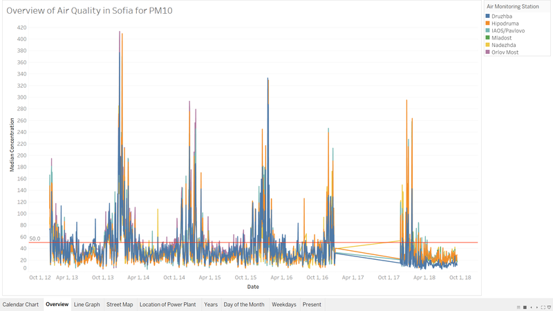
From the Official Air Monitoring Station dataset, an overview of the air quality in Sofia from Jan 2013 to Sep 2018 can be visualize from the graph above. The EU limit value for PM10 is 50μg/m3 as denoted in the red line across the graph. A clear trend that can be observed is that the PM10 concentration peaks drastically towards the end of the year compared to other time period, which is the winter period in Sofia. In addition, this trend can be observed for each of the Air Monitoring Station in Sofia. It is noted that there are no data for most of the months in year 2017.
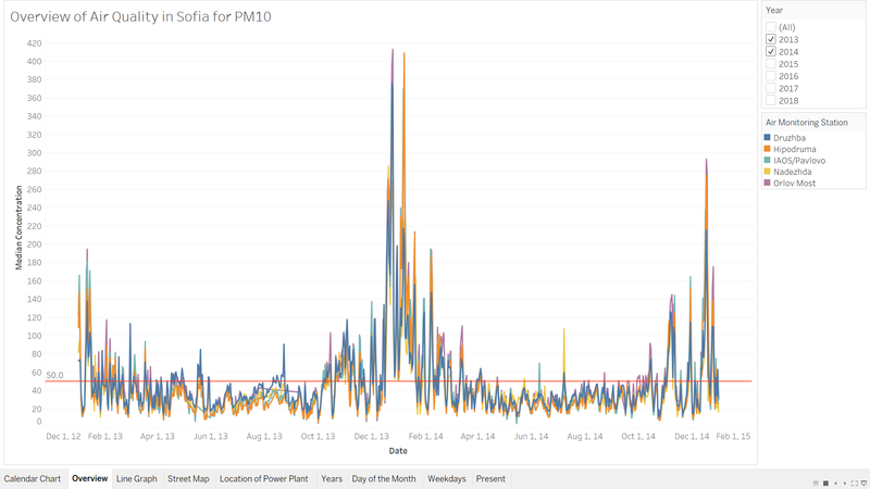
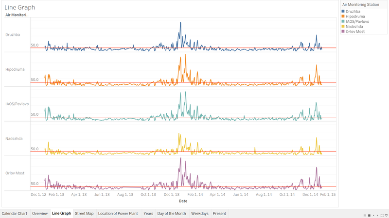
From the line graph, it can also be observed that trend seems to be consistently above average for the time period Oct 2013 to Apr 2014. A quick filter for year 2013 and 2014 is applied to allow further zoom-in into the trend. As can be seen from the line graph above, the trend, the air quality in Sofia in Dec 2013 to Jan 2014 is consistently above the EU limit value of 50μg/m3.
It can also be seen that there are two peaks in the trend, which are prominent from Hipodruma, IAOS/Pavlovo, Nadezha and Orlov Most. The Druzhba Air Monitoring Station also captured one out of the two peaks. There are two interesting observation that can be noted.
- Firstly, it can be observed that the peak at Nadezha recorded a lower value compare to the rest of the Air Monitoring Stations. Why is it lower at Nadezha? Is it due to the location of the Air Monitoring Station? Are the other Air Monitoring Station closer to each other?
- Secondly, the first peak observed is on 24th/25th December 2013 and the second peak is on 7th January 2014. Is there any significance due to the date, as 24th and 25th December is the eve of Christmas and Christmas Day respectively? What about 7th January 2014? Are these peak the prominent across time?
A Typical Day in Sofia
Link for Interactive Dashboard
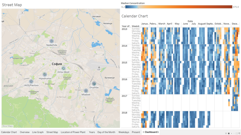
An interactive dashboard was constructed to aid in visualizing a typical day in Sofia. The location of the Air Monitoring Station is plotted on a street map to allow us to gauge the proximity of each stations. Each station can be use to filter the calendar chart on the right, which maps out the median concentration of PM10 daily. The center of the diverging colour is set at 50µg/m3, which is the EU’s limit value for PM10. From the street map with the Air Monitoring Stations’ location, it can be seen that Nadezhda station is further up north of Sofia Center, where София on the map represents the city center (postal code 1000) [2]. Orlove Most and Hipodruma is at a closer proximity to the Sofia Center. IAOS/Pavlova is further South West and Mladost and Druzhba are at the South East of the Sofia Center.
From the line graph above, in 2013 to 2014, it can be observed that Orlove Most and Hipodruma which is closer to Sofia Center recorded a higher median concentration of PM10 with a maximum of 413.2 µg/m3, and 409.4µg/m3 respectively. Followed by Druzhba, IAOS/Pavlova and Nadezhda, with a maximum of 376.9 µg/m3, 373.2µg/m3 and 285.4µg/m3 respectively. Mladost Air Monitoring Station only commenced operation in 2018, therefore no records from 2013 to 2017. Does this means that the closer the Air Monitoring Station is to Sofia Center, the worse the air quality is?
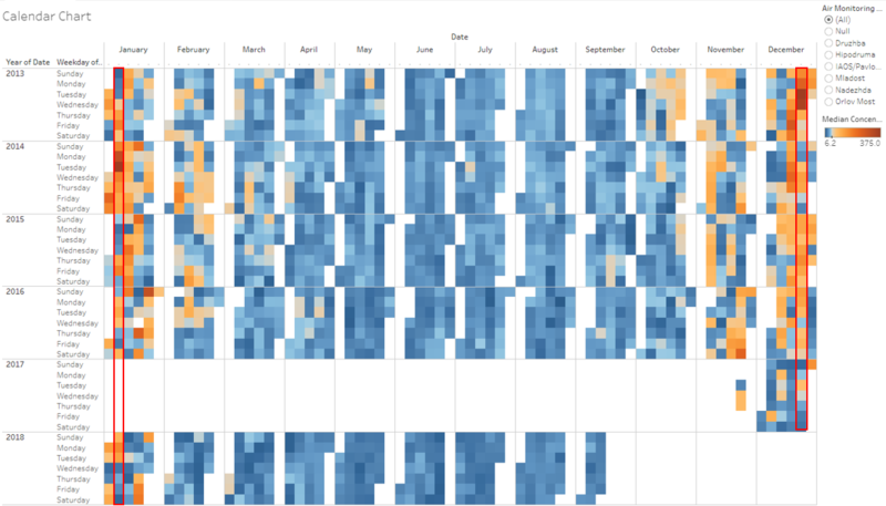
A quick glance at the Calendar Chart shows that across each year for all Air Monitoring Station, Dec 2013 to Jan 2014 does indeed have the highest concentration of PM10, as can be seen by the darker colour intensity. It can also be observed that across the years, for the Week 52 (Christmas period) and the Week 2 (approximately 7th January) for other years is not significantly different from the rest of the weeks. For example, in Dec 2014, Week 51 have darker intensity compare to Week 52 and in Dec 2015, Week 51, Week 52 and Week 53 seems to be at similar intensity. In addition, Week 3 in Jan 2015 seems to be of greater severity compare to Week 2, where more days of the week is in the orange region of the colour spectrum. As such, the two peaks observed from Dec 2013 to Jan 2014 is not trend across the years.
From the Calendar Chart, it can also be observed that the time period where air quality starts to deteriote seems to begin later each year. In 2013, the air quality deterioted from Oct 2013 onwards and only seems to improve in Mar 2014. In 2014 and 2015, the air quality only starts to deteriote end of October and by February, Sofia seems to be experiencing more good days in February comparing to in Feb 2014. Fast forward to 2018, Feb 2018 seems to be mostly good days. Have air quality in Sofia really improved?
Is this Real World? Is this Just A Fantasy?
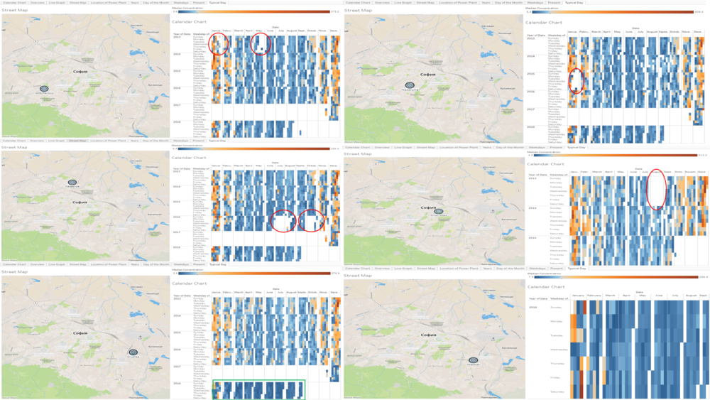
By leveraging on the interactive dashboard, a snapshot of each Air Monitoring Station with the corresponding Calendar Chart are put together to visualize any anomalies in the data.
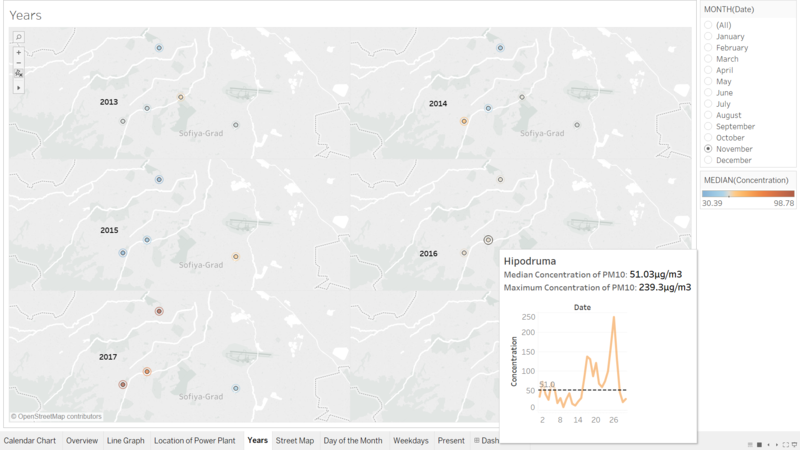
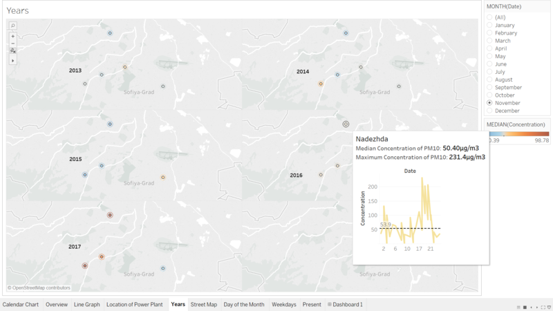
From the image above, just by eye-balling, it can be seen there are several blank spots, as denoted in the Red Circles in the Calendar Chart for each of the individual Air Monitoring Station. The missing data from the different station may affect the overall median concentration reflected in the Calendar Chart from "A Typical Day in Sofia". Missing data could cause the air quality to appear better than reality. Especially for Hipodruma in 2015, a chunk of data in January appears to be missing. Nonetheless, as majority of the data that is missing are between May to September, where the air quality is relatively good, hence is not in the scope of this investigation. One interesting observation from this exercise is noted in the Green Box. The air quality at Druzhba seems to be of darker blue intensity in 2018 compare to the rest of the year. From the interactive Trellis Map, there are few anomolies that could be spotted. For example, in the month of November 2016, the tooltip shows that the Median Concentration and Maximum Concentration reflected corresponds to the line graph in the tool tip for Hipodruma. However, for Nadezha, the Median Concentration reflected does not correspond to the line graph in the tool tip.
A quick view of the data comparing Hipodruma and Nadezha reveals the following observation.
- The data from Hipodruma have only 30 rows. Data collected are at one timestamp per day for each day in Nov 2016.
- The data from Nadezha have a total of 128 rows. From the snapshot of the data, a few observation can be made.
- There are dates with no data collected.
- There are some dates with multiple timestamp ~ hourly data.
- The hourly data are not consistent for every hour throughout the day.
With these inconsistency in data collection across the different Air Monitoring Station, the data collected from 2013 to 2016 may not reflect the true air quality in Sofia. Link for Interactive Dashboard
The Past and The Present
An interactive Trellis Map is created, faceted by Years to investigate how the Median Concentration of PM10 changes throughout the year for each Air Monitoring Station. In addition, the Maximum Concentration of PM10 can be visualized by the outer ring of the circle. As the cursor hovers around at each of the Air Monitoring Station, a line graph is display to enable us to visualize the air quality trend captured at the Air Monitoring Station.
A few points to bear in mind about the trellis map.
- The data collected are from Jan 2013 to Sep 2018.
- There are no data collected from Jan 2017 to 27th Nov 2017. There are only 3 days worth of data in Nov 2017, and may not be representative for the month of November.
- Orlov Most ceased to collect data in Oct 2015 (last data recorded on 1st Oct 2015).
- The data collected for Mladost only commenced in Jan 2018.
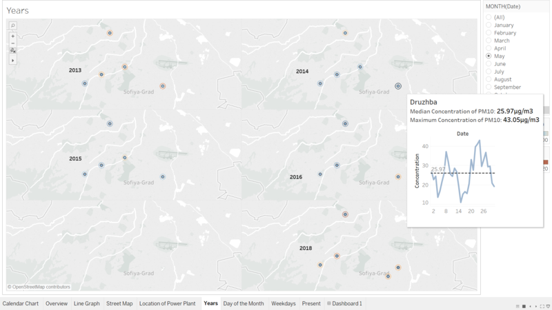
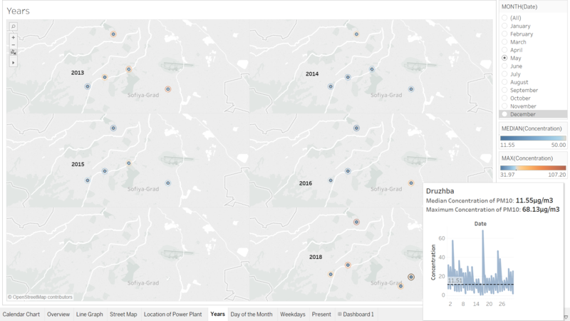
From the Calendar Chart in section "Is this Real World? Is this Just a Fantasy?", it was noted that in Druzhba, 2018 seems to be of a better air quality. From the Trellis Map, it can be seen that although the Median Concentration of PM10 is lower throughout the Month, it is not necessary the same for Maximum Concentration of PM10. From the Trellis Map below, taking a snapsot of the trend line in 2014 and 2018 in May for Druzhba, it can be seen that the Maximum Concentration in 2018 is higher compare to in 2014, even though the Median Concentration in 2018 is half of the Median Concentration in 2014.
From the line graph, it can also be observed that the line graph in 2014 is significantly more sparse compare to the line graph in 2018. This is due to the fact that in 2018, the Air Monitoring Station started to record an hourly reading instead of a daily reading. As such, there is more points in the graph. This also could explain why there are higher Maximum Concentration in 2018 compare to 2014, as the spike in concentration is registered as an individual point, whereas in 2014, the data may have already been averaged across 24hours instead.
Banner image credit to: AFP News Agency
