ISSS608 2018-19 T1 Assign Goh I Vy Task 2
|
|
|
|
|
|
Citizen Science Air Quality
"From dust to OPEN DATA". Air Bulgaria encourages and offers their fellow citizen the means to measure the air quality in Sofia. It could be installed at home, in office, a villa or with friends and relatives. The project was adopted from Luftdaten.info, a project to draw everyone’s attention to the chronic air pollution problems in their city and the chronic reluctance of authorities to take measures to solve the problem. [1]
Contents
Citizen Science Sensors
The Citizen Science Air Quality Data consists of the following information [2], [3]
- P1, which is PM10 concentration, μg/m3
- P2, which is PM2.5 concentration, μg/m3
- Temperature in ºC
- Humidity in %
- Pressure in hPa (hectorPascal)
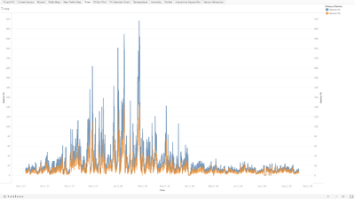
In the Citizen Science Air Quality Data, the sensors captured both PM10 (denoted as P1) and PM2.5 (denoted as P2) concentration data. From the line graph below, it can be observed that P2 concentration tend to be half of P1 concentration. To standardize with the Official Air Quality data, P1 concentration data will be used for further analysis.
Where are these Citizen Science Sensors?
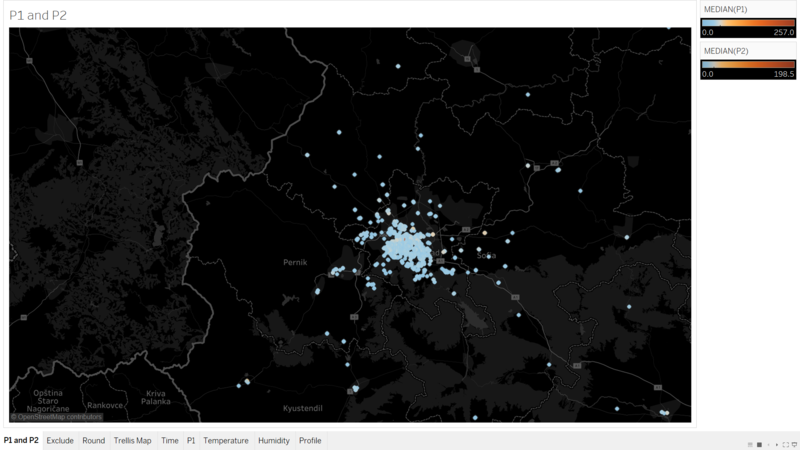
The Citizen Science project is dedicated to the fine dust measurement with the Citizen Science project luftdaten.info. Thousands of people around the world install self-built sensors on the outside their home. Luftdaten.info generates a continuously updated particular matter map from the transmitted data. Fine dust becomes visible. [4] The sensor’s longitute and latitude is mapped in Tableau to get an idea how widespread are these sensors. From the map below, it can be observed that the coverage of sensors is concentrated in Sofia City itself. Nonetheless, there are data points from the Citizen Science Air Quality Measurement that is not required and can be excluded.
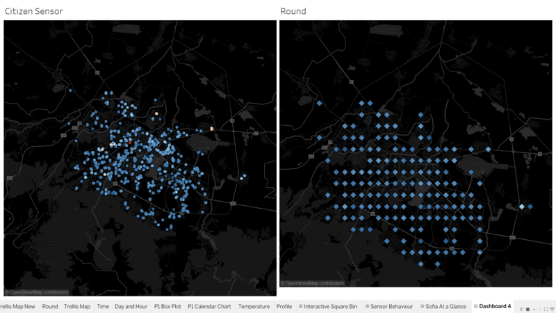
With the remaining data point (only sensors that are in Sofia City), it can be observed that there are data point that overlapped one another. As this will hinder visualization of the Citizen Science Air Quality, the data is aggregated into a polygon region instead, in this case, square bins are selected. The latitude and longitude values are converted into square bins by rounding off the coordinates using the ROUND() calculation. The image below shows the before and after snapshot of the Citizen Science Air Quality in Sofia City.
The Square Bin on the map provides a better visualization on where are the Citizen Science Sensors. It can be seen that the coverage of the sensors is concentrated at Sofia City’s center. Focusing on Sofia City’s center, the Citizen Science Sensors are well distributed.
Nonetheless, there are some municipality in Sofia which are not installed with the Citizen Science Sensors, mainly at the edge of Sofia. It would be interesting to investigate where are these locations that does not have Citizen Science Sensors installed. Why are they not installed? Are there at parks, industrial areas or residential areas?
DIY Sensors? How reliable are they?
The Citizen Science Sensors are essentially a "Do-It-Yourself" sensors. Air Bulgaria provides a sets of instructions for assembling and installing the air quaility sensor. A pre-programmed firmware is also provided for installation. Once it is set up, citizen are able to register their sensor, login on to their wifi and start monitoring the air quality within their premise of interest. [5] As such, unlike the Official Air Quality measurements measured by official Air Monitoring Station, these sensors are not subjected to proper preventive maintenance and calibration. As such, they may not be working properly at all time.
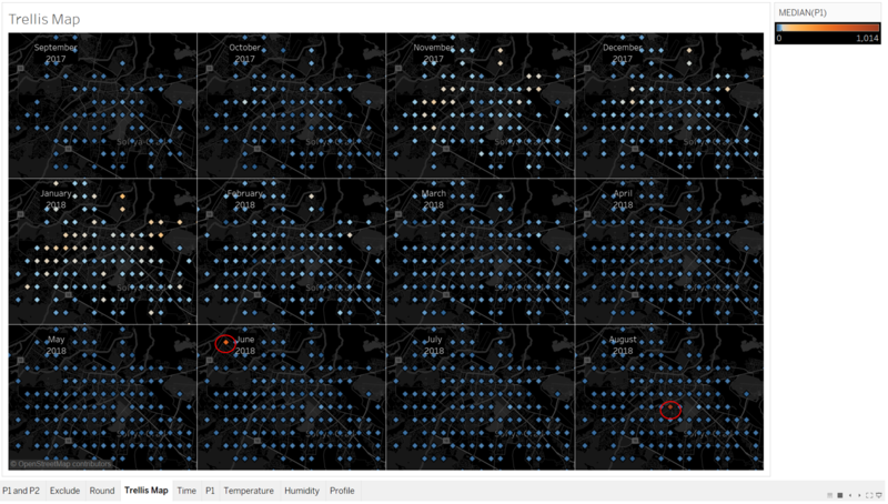
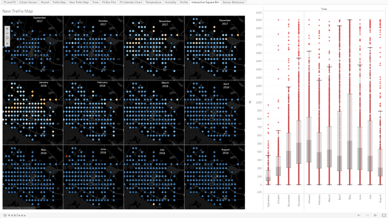
A Trellis Map, faceted by Month in chronological order (Sep 2017 to Aug 2018) is plotted to aid in data exploration. From the image above, it can be observed that there are two square bins that stands out. In Jun 2018 and in Aug 2018. From the Official Air Quality data, it was noted that the PM10 concentration follows a seasonal time series, where it peaks during winter. However, June through August is actually summer in Sofia.
The Trellis Map shows aggregated data, as such it is reflecting a Median Concentration of PM10 for several data points aggregated (Square Bin Data) together. Therefore, by making use of the non-aggregated data (Citizen Sensor Data), with a box plot in an interactive dashboard, further investigation can be carried out.
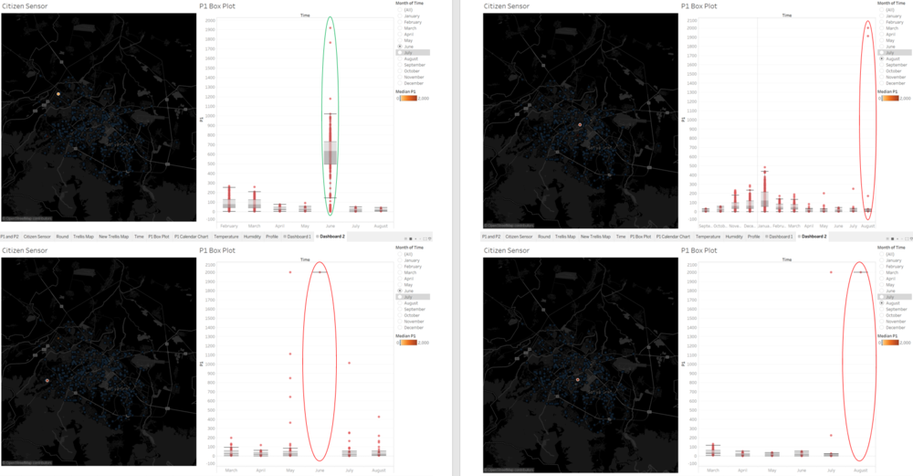
From the image above, the following can be observed;
- In Jun 2018, the data from the sensor observed from data exploration could be a genuine spike in PM10 concentration. The box plot reveals that in June, the concentration of PM10 appears to be on a higher end.
- A second point (which was not reflected from the aggregated data) can be observed in Jun 2018. Unlike the first point, the box plot for the second point reveals that there are no other data recorded besides 2000μg/m3, which is an indication that the sensor could be faulty.
- In Aug 2018, it can be seen that there are actually two points that are showing the tell-tale signs that the sensor could be faulty, where it recorded that the P1 concentration is mainly at 2000μg/m3. In addition to that, it is also unusually high compare to the rest of the months.
Therefore, these sensors could be faulty and are not recording the actual air quality measurements. These data will be excluded. A new Trellis Map is plotted for subsequent analysis.
Citizen Science Air Quality Measurement
How does the Citizen Science Air Quality in Sofia fare? Does the concentration of PM10 changes with season? Are there any "Peak Hour" behaviour in the air quality?
Air Quality Across Time
A Calendar Chart is plotted using P1 Median Concentration to visualize the Air Quality in Sofia as captured by the Citizen Science Sensors. It can be observed that the air quality deteriotes in November till February, which is the Winter season in Sofia. This is in line with the observation from the Official Air Quality data. However, is this because due to temperature drop in winter? Or are there other factors? What about "Peak Hours"? Are there any differences at different timing of the day? An interactive dashboard is built to explore the relationship between season, time and temperature. Link for Interactive Dashboard
On an overall, the following observation can be noted;
- There are obvious "Peak Hours" that can be seen across the time of a day. Usually in the very early of the morning between 3am to 7am, and again in the evening from 5pm to 8pm.
- The temperature profile in a day also follows a normal distribution throughout the year. Temperature peaks during the middle of the day, which is as expected, as temperature drop at night.
Does this mean that PM10 is directly influenced by temperature?
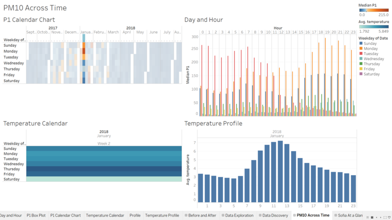
From the image above Week 2 of Jan 2018 was selected to explore the relationship between season, time and temperature, as there is an obvious spike in P1 concentration. The P1 concentration is inversely related to the Temperature Profile. Where a dip in P1 concentration can be observed during the middle of the day. However, what is interesting to note is that temperature, does not directly impacts the P1 concentration. In Week 2, Saturday have the lowest average in temperature of 1.8ºC, but the Median Concentration on Saturday is only 14 μg/m3.
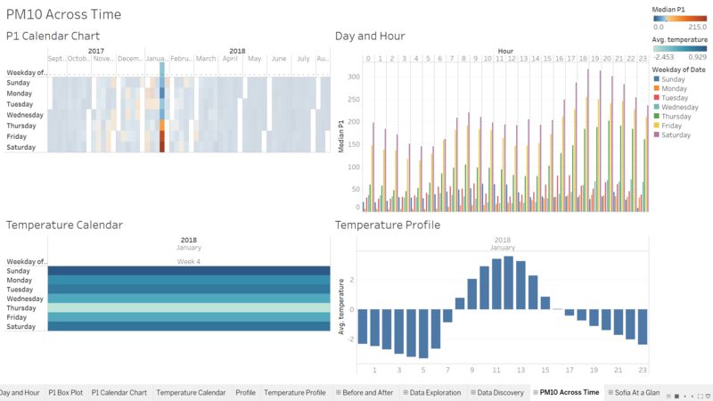
However, in Week 4 which is the lowest average temperature in Sofia in Jan 2018, the P1 concentration profile across the Day and Hour does not have an obvious peak (or dips in the middle of the day). Instead, it can be observed that the P1 concentration steadily increases as the day goes. In fact, it increased from Thursday 12am to Sunday 11am before it starts to drop. As such, temperature alone does not influence the P1 concentration. There are other factors that are also causing the P1 concentration to spike.
Air Quality Across Sofia
The newly plotted Trellis Map (with excluded faulty sensor data point), is used to investigate the air quality in Sofia City and to aid in answering a few question. Is air pollution a concern across Sofia City? Are there a specific location where the air quality is prominently unhealthy?
From the Trellis Map there are few observation that can be made;
- From Nov 2017 to Feb 2018, during the Winter season in Sofia, it can be seen that there are prominent "Hot Spots" that are already in the orange region (more than 50μg/m3) since the beginning of winter.
- January consists of the most "Hot Spots" across Sofia, where it seems to spread across Sofia Center. It can also be noted that the intensity of blue (away from Sofia Center) is lighter as well compare to other months.
- Interestingly, comparing November and December, the "Hot Spots" are more spread out in November. However, from the box plot, it can be observed that December have a higher concentration compare to in November.
- A curious observation is that, although the Trellis Map does not show any particular "Hot Spots" from April to May, the box plot reveals that the PM10 concentration appears to be sparsely distributed at a high concentration.
- In June and July it can also be observed that there is a particular point that have a darker intensity compare to other points in Sofia. The point in June was discussed earlier but was ruled out as a faulty sensor. Further investigation on the point is required.
- Finally, there are increasingly more sensors since September 2017. Which indicates that the Citizen of Sofia City are becoming more aware of this initiatives and playing a part in saving Sofia.
Where are these "Hot Spots"?
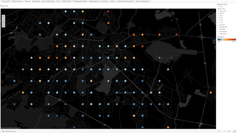
To identify these "Hot Spots", the Square Bin on the map are used to enable visualization of the location. As January appears to be the month with the widest coverage of "Hot Spots", the map is filtered January.
From the image above, the following observation are noted;
- The higher intensity points which appears North of Sofia City are surrounded by roads or train tracks. These points appears to be outskirt residential area.
- A row of these points on the North East of Sofia City are along the main highway going in and out of Sofia City. To also note that these points are close to Sofia International Airport as well.
- On the West of Sofia City, two rows of data point that are in the orange region appears to be close to main road as well. It was also discovered that there is a plant at that area. [6] It is possible that due to the plant in operation at that period causes a widespread of area that have high concentration of PM10.
Investigating Outliers (again!)
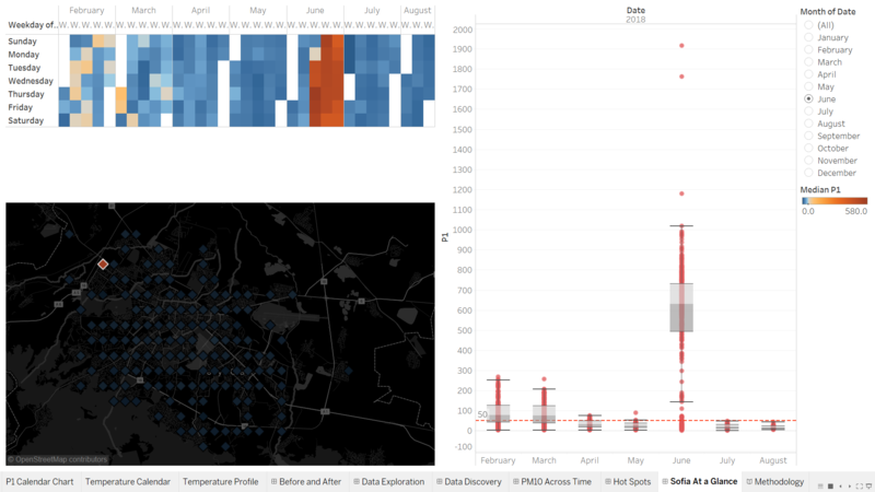
As mention above, it was observed that there are anamolies in April and May’s box plot and the suspicious looking points in June and July. By making use of the interactive dashboard using Citizen Sensor data which provides the capability to pinpoint to the specific location. Dashboard for Methodology. The point is to be filter to June to allow us to revisit the PM10 concentration profile and consider if this point should be excluded.
From the image above, it can be seen that only in the month of June that it appears to be a "Hot Spot", whereas the rest of the year, the P1 concentration appear to be at the lower end, even during winter, it is not as high as other locations. As such, it could be a faulty sensor that occured in June.
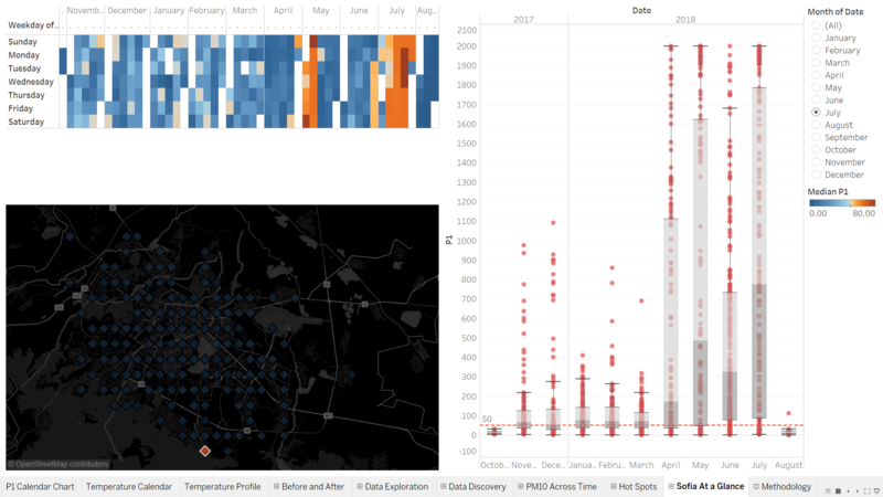
Interestingly, this location does not seem to be an anamoly. From the image above, it can be seen that the point does have significantly high concentration of P1 during winter as well. In fact, the point is consistently high from April to July. In the above section, it was observed that the box plot from April to May apprears to be at a high concentration. From the interactive dashboard, it was also discovered that the data was mainly contributed by this point as well.
