ISSS608 2016-17 T3 Assign ONG GUAN JIE JASON Observations & Insights
|
|
|
|
|
|
|
Observations & Insights
This section aims to use the dashboard described in the previous section to reveal some interesting observations and insights with regards to the questions that were raised for this mini challenge.
Contents
Question 1: Characterizing the Monitors' Performance and Operation
Monitors' Performance
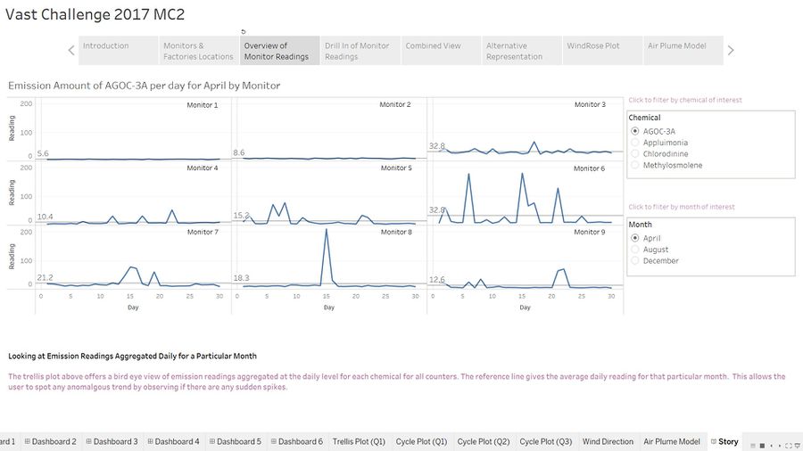
There are a total of 9 monitors installed in the vicinity of the four factories. The trellis plot allows us to observe the performance of the monitors at a high level.
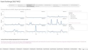
Fig 1.1 shows a trellis plot capturing emission readings of the chemical AGOC-3A for the month of April. Immediately we can deduce that monitors 1 and 2 are working normally because emission readings are very close to the average line. Similarly, monitors 4 - 6 should be working as intended because fluctuations about the average line seem normal.
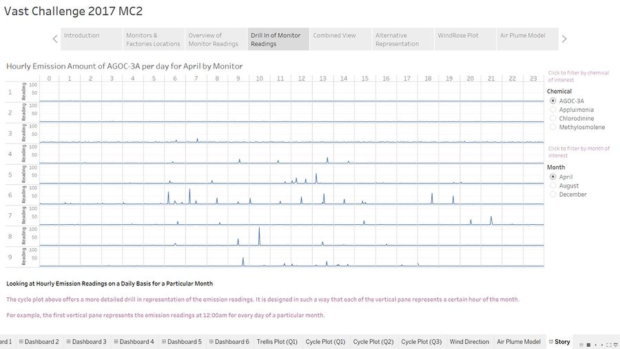
We can verify the findings above by performing a drill-in analysis of the trellis plot which brings us to the cycle plot illustrated in Fig 1.2. We can see that emission readings are relatively flat for monitors 1 and 2 whereas fluctuations are regular for monitors 4 - 6 which lends further credence to the earlier findings.
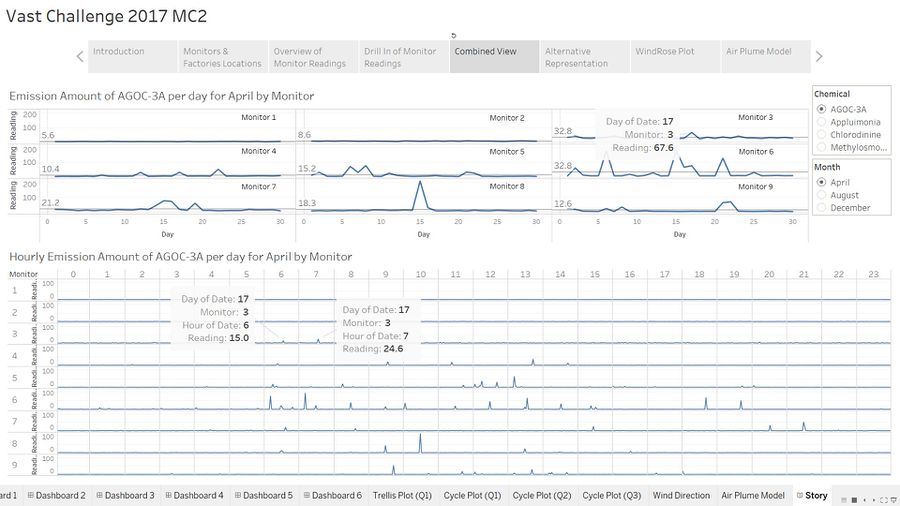
The combined view of the dashboard allows us to perform both level of analysis easily at the same time.
Unexpected Behavior
Scenarios whereby monitors are exhibiting unexpected behavior could be instances of sudden spikes in readings happening erratically during the month. Fig 1.3 shows an illustration of this. The trellis plot above shows that there is a sudden spike in emission readings for chemical AGOC-3A on day 17 for the month of april. The cycle plot below allows a deeper understanding of what is happening and we can see that there were two occurrences of abnormally high readings captured at 06:00 and 07:00 on the 17th April.
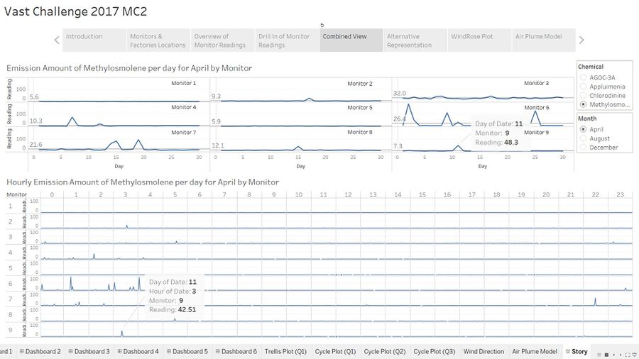
Another clearer example can be seen in Fig 1.4. We can see that there is only one instance of abnormally high reading for chemical Methylosmolene captured by both graphs on the 11th of April at 03:00. This is unexpected because the graph depicts a relatively smooth trend for the rest of the month.
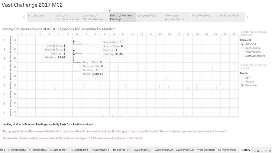
However, there will also be blurred scenarios and are not so easily to discern unlike the above examples. For example. Fig 1.5 shows that emission readings for chemical AGOC-A are relatively flat and stable for monitors 1,2 and 3. However for each of them, there is one occurrence of abnormally high reading detected. Is this a simple case of faulty monitors? The cycle plot suggests otherwise. This anomalous event actually occurred at the same timing, 06:00 on 5th December for all monitors. Is it possible that all 3 monitors who are within close proximity to each other were faulty at the same time or is there some other underlying reason?
Question 2: Patterns of Chemicals' Releases
Detected Chemicals
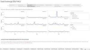
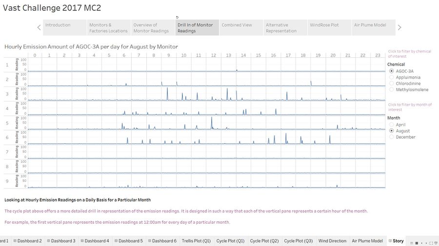
We can leverage on the trellis plot to have a quick overview which chemicals are being detected by which monitors. Fig 1.6 shows a representation of the detection of chemical AGOC-3A across the 3 months.
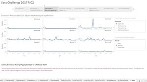
Monitors 3-7 and 9 are able to detect AGOC-3A fairly well. Monitors 3 and 6 were picking up a highest concentration for April at an average of 32.8ppm daily. Monitor 3 continued to pick up the highest concentration at 51.6ppm for August but monitor 4 picked up a higher concetration at 60.3ppm for December.
Similarly for Appluimonia, monitors 3 and 4 were picking up a higher concentration of this chemical compared to the other monitors across these 3 months. Monitors 5-9 were able to detect a considerably but lesser concentration as well.
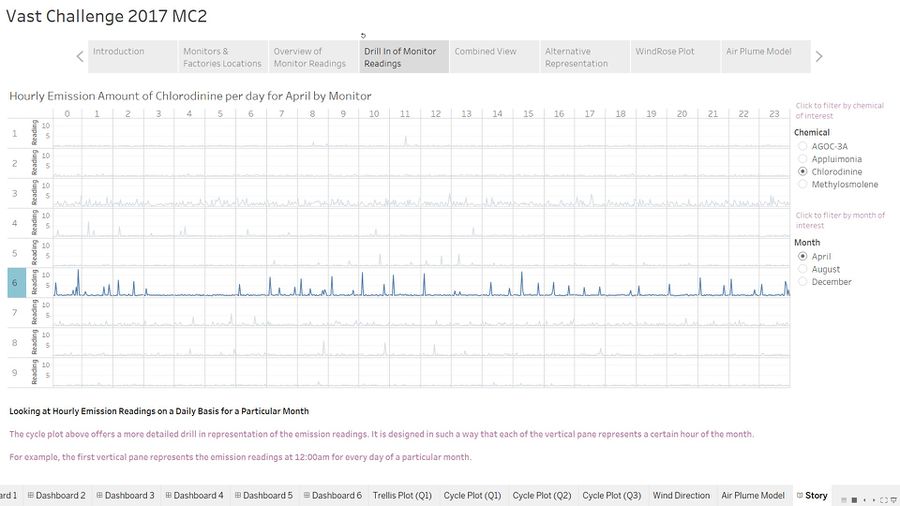
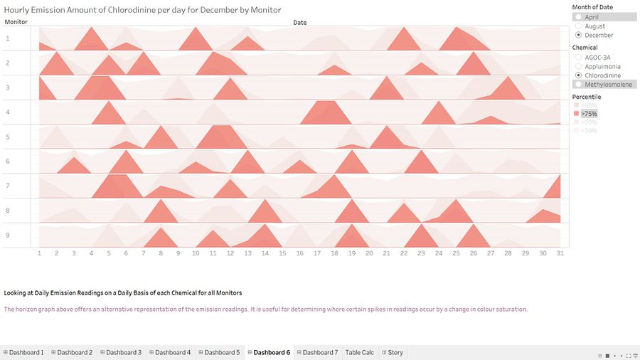
For Chlorodinine, all monitors except for 1 were able to detect a considerable amount of this chemical. Monitor 3 continued to pick up the highest concentration for all months.
Monitors 3,6 and 7 were able to detect Methylosmolene at a much higher concentration compared to others for April. But at the later months, monitors 4 and 5 were starting to pick up a substantial amount of this chemical as well with the former detecting the highest concentration out of all monitors during December.
Release Patterns
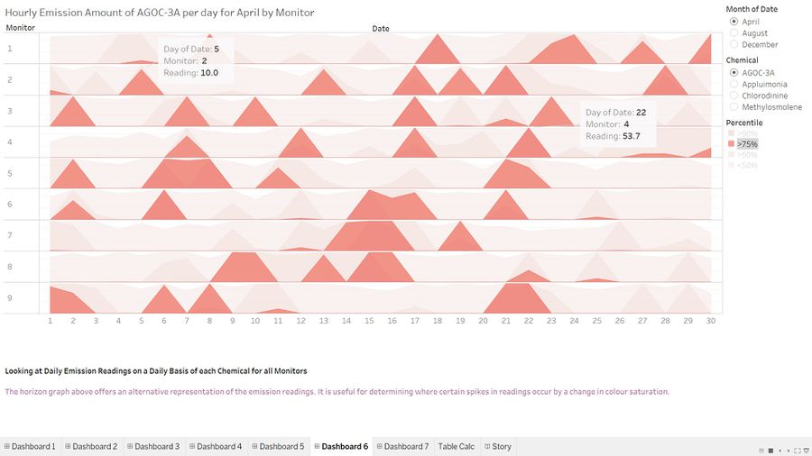
The cycle plot and horizon graph are used to observe the time patterns in the release of the different chemicals.
- AGOC-3A
This chemical is released typically between 06:00 to 22:00 based on the 3 months of data. Also, the level of activity is higher between the 5th to 22nd of each month.
- Appluimonia
This chemical is being released constantly throughout the month and exhibits the same trend for all 3 months. Moreover, the release of this chemical has increased dramatically during the month of December with almost all the monitors registering an increase compared to the previous two months.
- Chlorodinine
Similar to the previous chemical, Chlorodinine is also being released constantly throughout the 3 months of data. The release of this chemical typically spikes near the start and approaching the end of the month. Also, the level of concentration detected by monitor 4 has increased dramatically from April to December.
- Methylosmolene
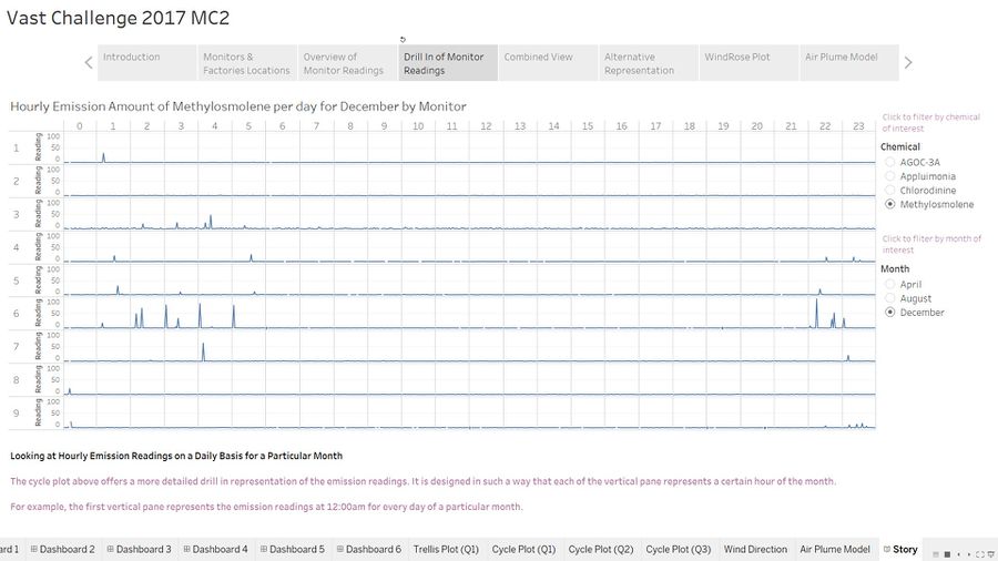
This chemical's release pattern is typically between 22:00 and 06:00 based on the 3 months of data. This is coincidentally the opposite pattern of AGOC-3A which suggests that both chemicals may share a relationship with one another.
Question 3: Factories Responsible for Chemical Releases
The way the dashboard can be used to trace the release of the pollutants to the polluters is to look for spikes in the monitors readings via the cycle plot then set the filters for the air plume model to the corresponding day and hour. After that, we observe if the polygons contain any factories in their trajectories. This could be a possible indication that the factory is responsible for releasing that pollutant. The tip of the polygon represents the direction the wind is coming from and the flat edge represents the stream of wind detected by the monitor. The angle parameter is used to adjust the spread of the wind in certain ambiguous situations which will be further elaborated in the later part. By default, the spread is assumed to be 10 degrees. The map used for the air plume model is shown below.
Chemical Release Associated with each Factory
- AGOC-3A
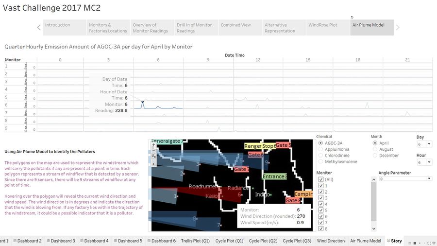
Roadrunner and Kasio were located very close to one another which makes it very difficult to discern whether there is only one actual factory releasing the chemical or both are releasing the chemicals. The dashboard has managed to pinpoint the potential culprits to both of these companies multiple times but due to their close proximity which is highlighted in Fig 2.1, it makes it very difficult to find cases to isolate one factory. On 6th April at 06:00, the wind was blowing from 270 degrees with a speed of 0.9m/s and monitor 6 captured a reading of 228.8ppm. However, the polygon we are interested in which is colored in red overlaps two factories in its trajectory therefore we are able to tell if one or both contributed to the pollution.
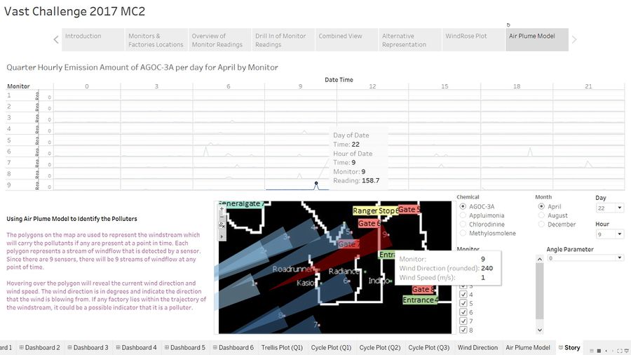
There is one particular instance illustrated in Fig 2.2 which manages to provide considerable evidence to lay charges on one of the factories. On the 22nd April at 09:00, the polygon overlaps only one factory in its trajectory which is subsequently captured by monitor 9. Therefore, we can be fairly positive Roadrunner is one of the factories releasing AGOC-3A.
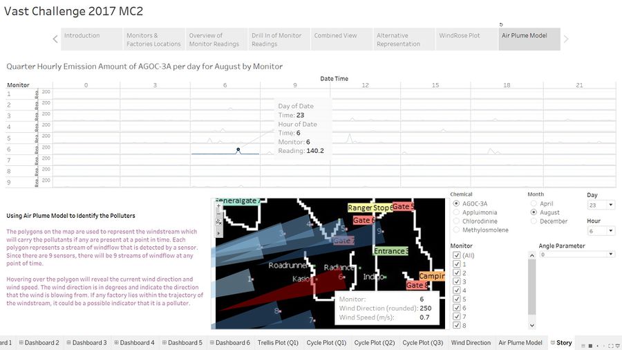
Another instance on the 23rd August at 06:00 shows evidence of Kasio releasing this chemical as well.
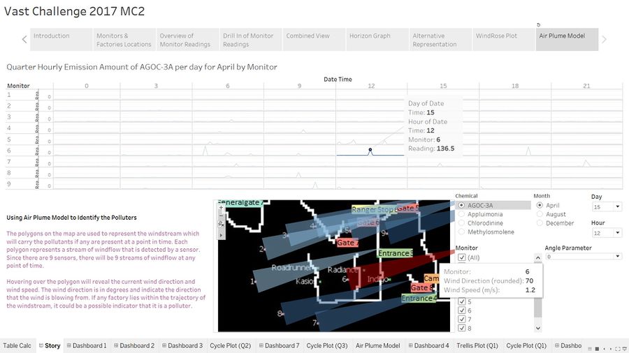
There is also considerable evidence suggest that Radiance is releasing this chemical too as evident on 15th April at 12:00.
- Appluimonia
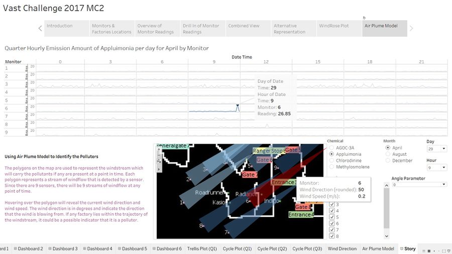
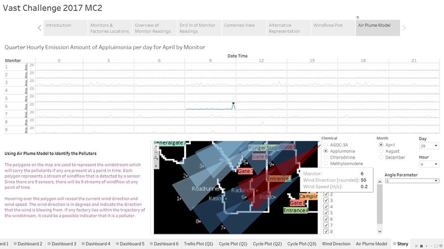
One of the highest level of concentration was captured on 29th April at 09:00. The reading was 26.85ppm which is highest for that month and wind speed was 0.2m/s. This suggests that Radiance is responsible for emitting this chemical since it is the only factory covered by the trajectory as shown in fig 2.4.
However, at this particular point of time, the trajectory of the polgyon is very close to both Radiance and Indigo. In fact, if we were to adjust the angle parameter to make the polygon has a larger spread, the two polygons will overlap and moreover owing to the low wind speed, it is very possible that chemicals emitted by Indigo may be carried by the polygon 6 hence Radiance is innocent.
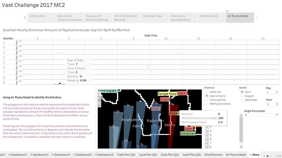
On the 7th April at 03:00, the reading was 6.96ppm and the polygon contained only Indigo in its trajectory hence this provides ample evidence that Indigo is one of the factories responsible for producing this chemical.
- Chlorodinine
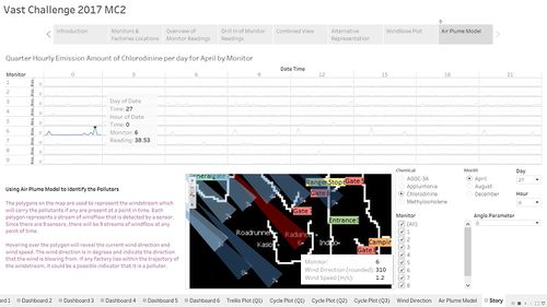
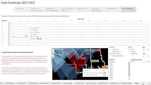
The highest concentration recorded on April fell on the 27th at 0:00. Using the default angle parameter of 0 degrees, we are not able to cover any factories in the polygon's trajectory. Hence, we need to adjust the angle parameter to justify the high reading. Once adjusted, the potential suspects are Roadrunner and Kasio as illustrated in Fig 2.7.
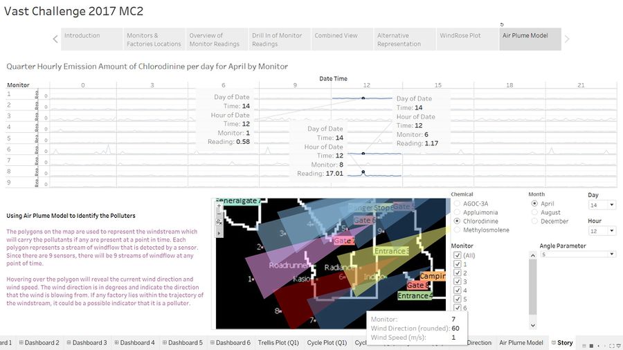
Fig 2.8 illustrates showcases one of the most powerful aspect of the air plume model in my opinion. The model shows the situation on the 14th April at 12:00. A high reading of 17.01 is captured by monitor 8. Setting the spread of the wind at an angle parameter of 5 degrees, we can see that polygon 8 represented by the red triangle contains Kasios and Radiance in its path. However, Radiance is cleared because if it is producing any chemical, polygon 6 represented by the yellow triangle which contains both Radiance and Indigo will have captured a high reading. Since both companies are cleared, we can be certain that Kasios is definitely emitting this chemical.
There's more to it. Polgyon 1 represented by the pink triangle which contains Roadrunner in it did not register a high reading at monitor 1 thus we can conclude that the company is in fact not emitting any of this chemical.
- Methylosmolene
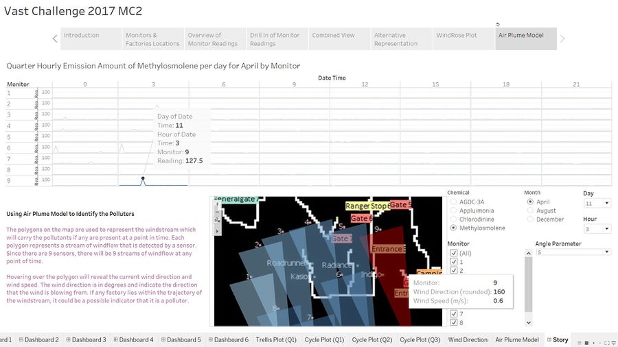
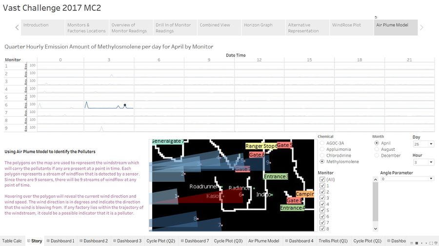
Tracing this pollutant back to its polluter is relatively simple. Fig 2.9 gives explicit evidence that Indigo is the factory emitting this chemical based on readings captured by monitor 9. The other polygons containing other factories in their trajectories did not register a substantial reading at the respective monitors. However, this is only a single instance whereby evidence points towards Indigo being a likely polluter of this chemical. In all of the other instances where spikes occur, it points towards Roadrunner and Kasios.
For instance, the figure below pinpoints Kasios as the likely polluter of this chemical.
Observed Patterns of Operation
Using the chemical emission level as a proxy for factory operations, Roadrunner, Kasios and Radiance seem to be operating more actively between 06:00 to 18:00 during April. However, their activity level shows an increasing trend for August and December which is evident from the increasing occurrences of a spike in readings.
Kasios on the other hand appears to also be operating more actively during the wee hours of the morning typically between 0:00 to 06:00 and this pattern is consistent for all 3 months.

