ISSS608 2016-17 T3 Assign ONG GUAN JIE JASON Data Visualization
|
|
|
|
|
|
|
Data Visualization
This is a brief description of the features of the interactive visualization that is implemented for this assignment. The interactive visualization can be accessed here: https://public.tableau.com/shared/WDJM68HY5?:display_count=yes
Contents
Home Dashboard
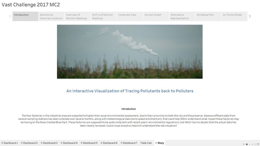
The homepage provides a brief overview of the assignment.
Monitors & Factories Location
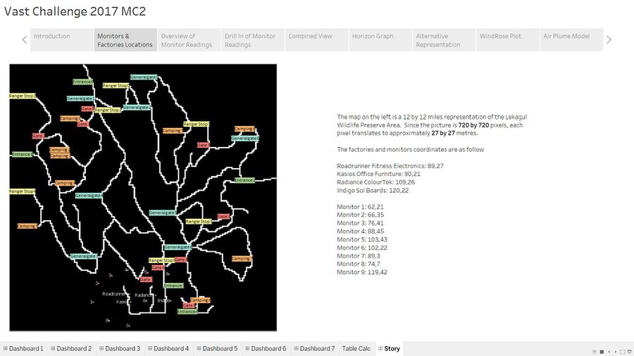
The map of the place of interest is featured here alongside with the coordinates of the factories and monitors.
Overview of Monitor Readings
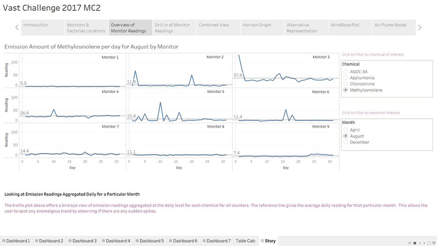
This portion features a trellis plot which is used as in initial tool for quick analysis to be done.
The interactive features are self explanatory. The trellis plot is plotted for a specific chemical for a particular month. The chemical and month filters allow the user to change these parameters.
Drill in of Monitor Readings
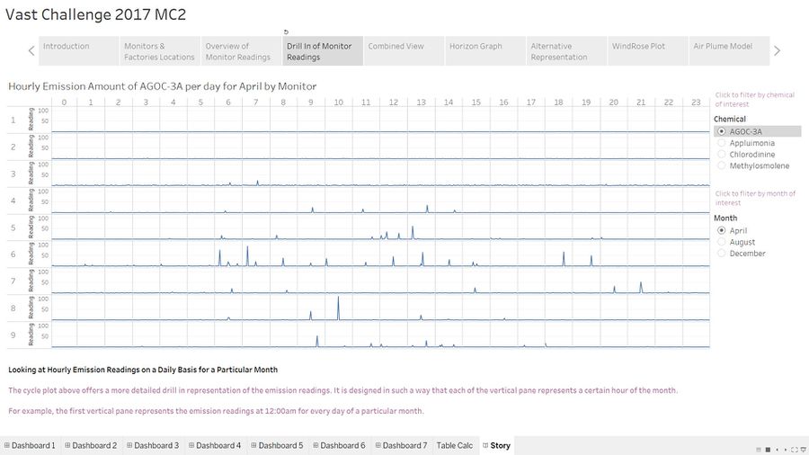
The previous section is on a high level analysis. Once it reveals something of interest, the cycle plot can be used to conduct a drill in analysis to gain further insights on what is happening.
The parameters can be changed the same way just like the trellis plot.
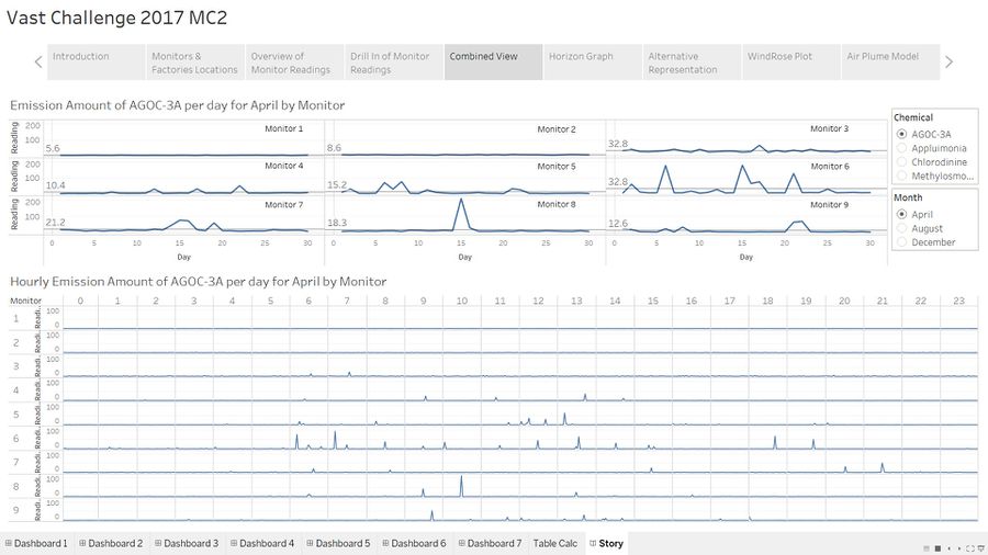
Combined View
The trellis plot and cycle plot are combined here to give the user a holistic view of the interaction between them.
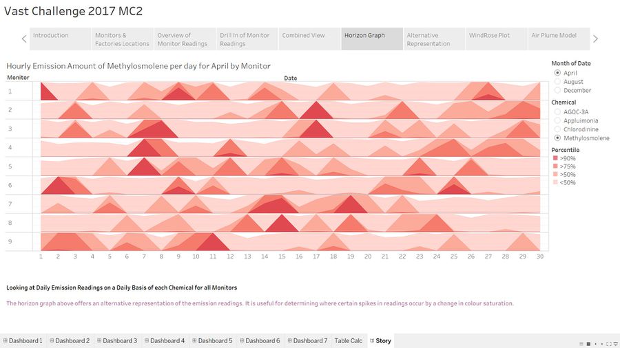
Horizon Graph
The horizon graph is an alternative visualization tool for the monitor readings. The fluctuations in readings are represented by the changes in colour saturation.
There is an additional percentile parameter here which allows the user to filter according to the different percentiles. For example, setting it at 90th percentile will filter the horizon graph to only display readings that exceed the reading at the 90th percentile for each monitor,
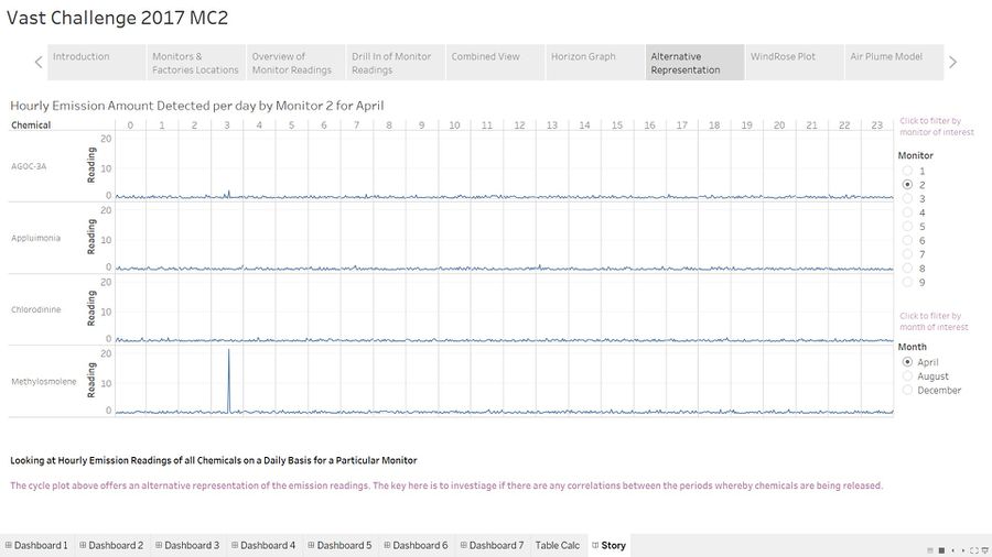
Alternative Representation
The previous cycle plot allows the user to have an overview of all the monitors at any point of time. This cycle plot allows the user to have an overview of all the chemicals for a particular chemical at any point of time. The goal here is to see if there are any relationship between chemicals.
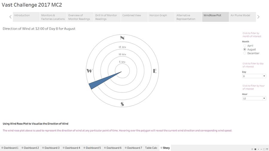
WindRose Plot
The windrose plot forms the fundamental of the air plume model in the next section. The wind direction is represented by a polygon which changes according to the parameters provided on the right. They are the month, day and hour.
Air Plume Model
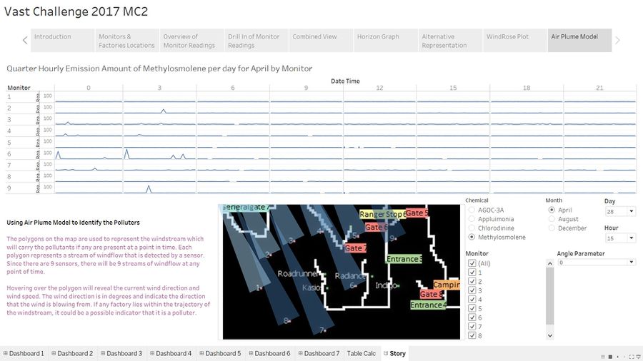
Lastly, this is the most important visualization to gain insights on how each pollutant is linked to the factories. Each polygon represents a stream of wind which is detected by a monitor at a point in time. There will be 9 polygons each facing the same direction at any one point in time. The tip of the polygon represents the direction the wind is coming from and the flat edge represents the stream of wind detected by the monitor. There are 3 additional parameters here which gives the user control over the chemical to display in the cycle plot, the number of polygons to display in the air plume model and the angle parameter to adjust the spread of the wind.

