OUR STORYBOARD
SELECTED VISUALIZATIONS
CHLOROPLETH
| Chart Chosen
|
Considerations
|
|
|
- A sunburst chart provides a quick overview on categorical consumption data.
- It allows our viewers to understand and compare proportions at a glance.
- Sunburst charts also show patterns across hierarchical regions and countries at a glance.
- We will place 2 sunburst charts of data from different years side by side so users can make comparisons on the change in patterns over the years.
|
|
|
- A sunburst chart provides an overview whereas the time series line chart allows the user to narrow down on a particular region or country. So it can be used together with the sunburst chart.
- The line chart will highlight the trends in absolute numbers and allow users to dynamically adjust the forecasted portion according to their own assumptions.
|
|
|
- A sunburst chart provides an overview whereas the time series line chart allows the user to narrow down on a particular region or country. So it can be used together with the sunburst chart.
- The line chart will highlight the trends in absolute numbers and allow users to dynamically adjust the forecasted portion according to their own assumptions.
|
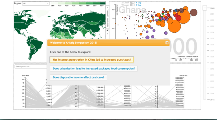
SCATTER PLOT
This section allows users to see the GDP, changes in GDP and the debt of each country, grouped together by regions and countries.
| Chart Selected
|
Considerations
|
|
|
- A treemap can convey our hierarchical data with 2 additional attributes via color and size, allowing us to dissect the relationship between the two.
- The size of each block represents the GDP, and we can allow the user to fill in the colors with other economic indicators - savings rate, capital market size to grasp patterns in the data.
|
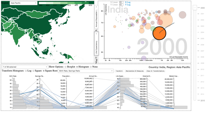
PARALLEL COORDINATES
This section allows users to see how human development indicators have changed over the years.
| Chart Selected
|
Considerations
|
|
|
- The motion charts will be animated according to time dimension and emphasise the growth of our 2 macro indicators relative to each other, and divulge patterns in their correlation
- A motion chart is able to display 4 different information simultaneously, using the 2 axes, size and colour.
- An animated chart will allow users to visually see how the change took place over the years.
|
FINAL REPORT
Here is the report


