Arisaig Progress

|
Home | Project Proposal | Project Management | Project Progress | Project Final Progress | Final Deliverable |
|---|
Research has been undertaken to:
1) Understand what factors are of interest in understanding consumption patterns
2) Determine what kind of visualizations are most ideal in displaying the change in trends over time
(1) Factors of Interest in Understanding Consumption Patterns
An article by Minakshi Trivedi [1] discussed analysis performed on changes in consumer behavior patterns of healthy food. The article mentioned that both aggregated and disaggregated data should be taken into account when looking into trends. The article quoted an example that the baby food market (aggregated data) in 2006 saw a fairly flat sales growth from 2005 to 2006 and only a 3.1% increase in 2007. However, when the data is disaggregated, it can be seen that in the same time period, the growth of organic baby food sales saw a 16.4% jump followed by a 21.6% jump in 2007.The increase in popularity did not spill over to potato chips or other snack foods, and was thus unobservable at the aggregate level. Therefore, for our project, we should not only look at overall consumption patterns, but also consumption patterns in smaller product categories.
The same article also found that spatial relationships (spatial correlation, spatial causality or spatial interaction) have a significant importance in the consumption patterns. From their findings, they observed that areas that are in the same cluster produce similar test results. What this means for us is that countries that are geographically close to each other may display similar trends in consumption patterns because “near things are more related than distant things”. There is likely to be more interaction between countries that are geographically close to each other, and hence they are more likely to influence one another. This is an interesting point and we will observe if there is indeed such a pattern shown in our visualizations.
The articles also discussed some demographic factors that were significant to consumption behavior. Interestingly, marriage rate was a significant factor in the consumption pattern of beer. Income and population density were also significant factors. Locations with higher income are associated with higher consumption, and for population density, as density increases, healthy consumption decreases. These findings might aid us in interpreting our findings in our project.
Worldwide trends have seen the changing attitude towards dietary habits, with respect to basic staples to packaged and fast food. [2] Changes to agricultural practices have increased food capacity and reduced seasonal dependence, resulting in considerable changed to food consumption patterns in developing countries.
A rise of almost 400kcal a day was observed globally (with some exceptions of negative growth in developing nations), and the shift of available consumption of calories to meat, sugar and vegetable oils. Also, urbanization has affected food consumption by changes in dietary behavior to favor the fast-food industry by providing quick access to cheap take-away meals. The major consequences from a nutrition perspective of urbanization are a profound shift towards higher food energy, more fats and oils and more animal protein from meat and dairy foods.
(2) Visualizations Displaying Change in Trends Over Time
In this research area, we have two goals, (1) visualization for changes over time and (2) previous visualization work for consumption pattern over time.
In the research for visualization over time, one of the most notable visualization is by Hans Rosling in “The best stats you’ve ever seen”. The representation made by Hans Rosling combined the use of visualization together with animations to bring forth the impact. Some of the graphs that were used are:
1. Stacked graph
2. Bubble graph
Through the use of animation, the research is able simplify the visualization to avoid clustering and overload the viewers. Additionally through the use of differentiation methods such as color coding, size differentiation, the research allow the user to focus easily on what that matters to them. The tools used in Hans Rosling research showed that it is not just enough to showcase the performance on yearly basis, it is also necessary to show the path of change i.e. from one point to another. This is because it allows for the use of other simpler techniques to derive information such as Line graph.
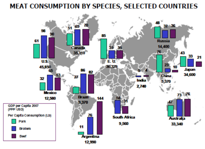
As for previous visualization work, one research is CME Group research on “Global Consumption, Production and Trade Patterns”. In this research, CME group made its case through the use of overlaying graphs one over another. Specifically, the research used bar charts over world map visualization.
There could be many criticisms for the visualization made in this article e.g. bad use of the world map. However, this research gives us the insight that such visualization could be used for displaying additional information for the major players around the world.
Some challenges we faced while collecting the data was that the data came from many different datasets. Although the datasets came from two main sources, the datasets had to be downloaded individually. We also had to toggle the settings to ensure that we obtain the right data needed for our project. The datasets were also available in many different currencies. We obtained data in constant prices so that we can make accurate comparisons on the changes that have happened over the years. For future implementation, we can allow users to toggle between fixed and floating currency for different kinds of analysis.
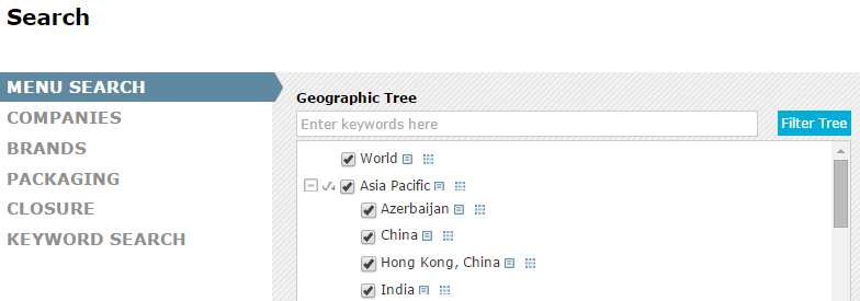
First, we have to find and select the specific dataset we are interested in, and check for all country data.
(1) Euromonitor Data
First, we have to find and select the specific dataset we are interested in, and check for all country data.
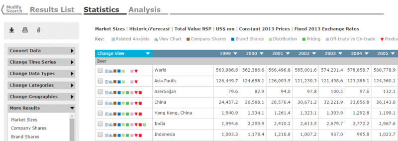
Next, we modify data to give us current prices in USD, and copy it into an excel document.
(2) World Bank Data
Copy data from World Bank Site into an excel sheet, manually clicking through each tab.
(3) Consolidation
The first step we took in preparing the data was to understand our dataset. We look at each of the categories of data we have and decide which ones are important to us and which are the ones we don’t need. There is a large number of missing data from the years before 2000. Using a dataset with large amounts of missing data will render our analysis inaccurate. Hence, we decided to focus on data after year 2000. There is still a large amount of data for us to use (30 years of data) so it is still sufficient for us to perform analysis and visualization on it.
Obtaining the data as separate datasets meant that a lot of work had to be done to combine the data into one file to work with. The different datasets also had different formatting of the data, so we first decided on a standardized format for our data file.
Next, as we are concerned in patterns across regions, we classify the countries according to regions. We use the regions defined by World Bank so as to ensure consistency. The GDP of the countries are also given in their local currency, so we have to convert all of them into a common currency (USD) so that we can perform comparisons.
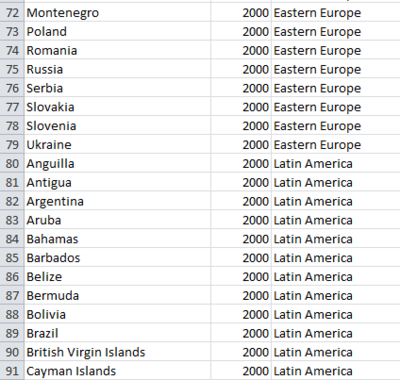
First, we have to prepare a comprehensive list matching each country to a region.
We then replicate the list 31 times over, each time iterating over each progressive year from 2000 to 2030.
With this, a vlookup is used for each column to its respective sheet for the value corresponding to the supplied year and country. Null values and dash placeholders are replaced with an empty string.
(4) Data dictionary
While consolidating the data, we also created a data dictionary to aid us in keeping track of our variables. The data dictionary will also make it easy for us to educate our client on the variables used and help them in understanding our data. Our data dictionary contains the name of the column (label) in the dataset, what the column represents, and details of the label. The details contain elaboration on the type of data it contains, as well as the units and currency that the data is in.
For our data exploration, utilising Tableau was optimal as it provided enough depth in its customisation of examined dimensions and measures while providing ease of use in quickly creating our charts on the fly.
Bubble charts were used they allowed for a time series comparison of three different variables at once: the 2 precise axes and a rough gauge of the 3rd via the size, and region-classifying each bubble via the color. The time dimension could be easily digested by animating the movement and sizes of the various bubbles.
These findings are not indicative of our final product, but rather, a step for us to identify patterns and then decide how best to represent it with our various custom-built d3 charts.
For our exploration, we noticed that China and US have very high values and this makes the data range too big, preventing us from observing the patterns in other countries. The high consumption values are likely to be due to the large market that China and US has. For our exploration, we try to identify opportunities for countries that are not usually mentioned.
5.1 Beer Overall, there seems to be growth opportunities for Beer as its consumption correlates with an increase in disposable income. Countries such as Brazil and Mexico have increased their Beer consumption dramatically with disposable income, and hence their smaller neighbours in the Latin American regions could be worth investing into as well since the trends seem to carry over. However, the Asia Pacific regions grow their Beer consumption at a much smaller rate with respect to disposable income, and Western Europe seems to be cutting back on Beer as well even if Disposable Income increases - these two regions would not be worth expansion into.
5.2 Oral Care
There is a clear correlation between increased disposable income and increased expenditure on Oral Care products. Only two outliers can be seen from this bubble chart: only Japan continues to increase its Oral expenditure as its disposable income decreases (its culture highly emphasising hygiene), and Brazil with its disportionate increased spending on Oral. Both markets would be highly desirable for investment in Oral products; Japan for its inelastic demand and Brazil for its disproportionate spend and growth.
5.3 Packaged Food
Packaged food consumption is clearly correlated to Urban Population growth, with Indonesia, India and Brazil making remarkable increases in their consumption of Packaged Food, while Western Europe is much less desirable for investment with mostly stagnant or negative appetite for Packaged Food.
When countries become increasingly affluent, they also eat out more and buy more takeaway food, which is more expensive than eating home cooked food. Countries like Brazil and Mexico are increasing their consumption of Packaged food rapidly, which makes them good countries to invest in. Japan has always consumed a lot of Packaged Food, and it is a safe market to invest in.
5.4 Fast Food Like Packaged Food, Fast Food consumption is tied to Urbanisation. Even already urbanised nations such as Australia, Canada, Brazil and Japan have seen explosive demand for Fast Food, while India steadily increases its consumption with its urban population.


