Difference between revisions of "Arisaig Final Deliverable"
Jump to navigation
Jump to search
Kr.tan.2011 (talk | contribs) |
Kr.tan.2011 (talk | contribs) |
||
| (5 intermediate revisions by the same user not shown) | |||
| Line 25: | Line 25: | ||
! style="width: 650px; background-color:#fee5d9"| <span style="color:#000000;">Chart Chosen</span> | ! style="width: 650px; background-color:#fee5d9"| <span style="color:#000000;">Chart Chosen</span> | ||
! style="width: 350px; background-color:#fee5d9"| <span style="color:#000000;">Considerations</span> | ! style="width: 350px; background-color:#fee5d9"| <span style="color:#000000;">Considerations</span> | ||
| − | |- valign="top" | + | |- valign="top"<br> |
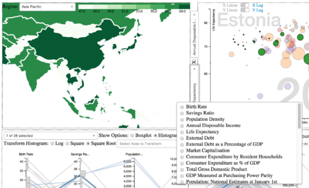
|[[File:Arisaig_Chloropleth1.png|450px|center]] | |[[File:Arisaig_Chloropleth1.png|450px|center]] | ||
| | | | ||
| Line 50: | Line 50: | ||
! style="width: 650px; background-color:#fee5d9"| <span style="color:#000000;">Chart Selected</span> | ! style="width: 650px; background-color:#fee5d9"| <span style="color:#000000;">Chart Selected</span> | ||
! style="width: 350px; background-color:#fee5d9"| <span style="color:#000000;">Considerations</span> | ! style="width: 350px; background-color:#fee5d9"| <span style="color:#000000;">Considerations</span> | ||
| − | |- valign="top" | + | |- valign="top"<br> |
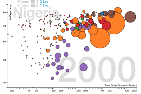
|[[File:Arisaig_Scatterplot1.png|450px|center]] | |[[File:Arisaig_Scatterplot1.png|450px|center]] | ||
| | | | ||
| − | * | + | * Provide a view of the distribution based on the bi-variante attributes |
| − | * | + | * Provide flexibility for comparison through the use of dynamic variables load |
| + | * Better data representation for logarithmic/linear scaling choice | ||
|- | |- | ||
| − | |- valign="top" | + | |- valign="top"<br> |
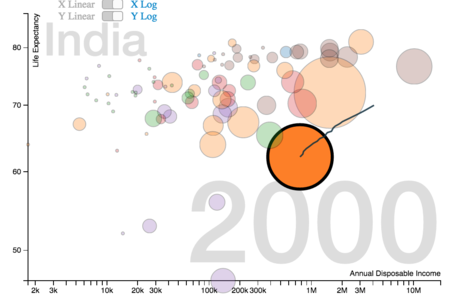
|[[File:Arisaig_Scatterplot2.png|450px|center]] | |[[File:Arisaig_Scatterplot2.png|450px|center]] | ||
| | | | ||
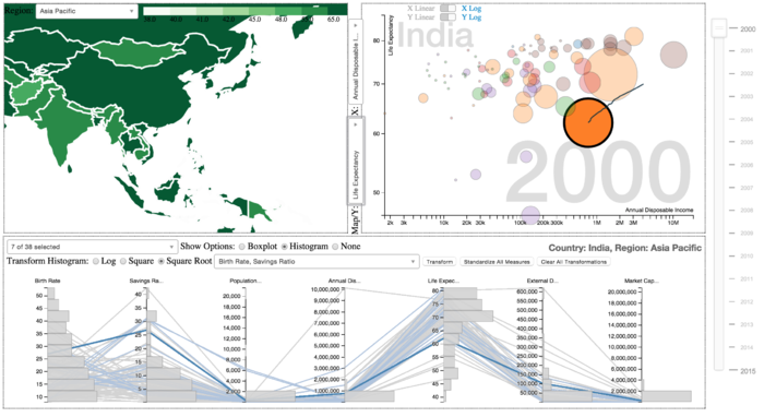
| − | * | + | * Provide trend visualisation by introducing trajectory line of the temporal data |
| − | |||
|- | |- | ||
|} | |} | ||
| Line 71: | Line 71: | ||
! style="width: 650px; background-color:#fee5d9"| <span style="color:#000000;">Chart Selected</span> | ! style="width: 650px; background-color:#fee5d9"| <span style="color:#000000;">Chart Selected</span> | ||
! style="width: 350px; background-color:#fee5d9"| <span style="color:#000000;">Considerations</span> | ! style="width: 350px; background-color:#fee5d9"| <span style="color:#000000;">Considerations</span> | ||
| − | |- valign="top" | + | |- valign="top"<br> |
| − | |||
| − | |||
| − | |||
| − | |||
| − | |||
| − | |||
| − | |||
|[[File:Arisaig_Parallelcoords2.png|600px|center]] | |[[File:Arisaig_Parallelcoords2.png|600px|center]] | ||
| | | | ||
| − | * | + | * Provide a multi-variant view of the countries |
| − | * | + | * Introduce dynamic feature by allowing free selection of axes that matter to the user |
| − | * | + | * Introduce animation to cater to representation temporal data |
|- | |- | ||
| − | |- valign="top" | + | |- valign="top"<br> |
|[[File:Arisaig_Parallelcoords3.png|600px|center]] | |[[File:Arisaig_Parallelcoords3.png|600px|center]] | ||
| | | | ||
| − | * | + | * Emphasis of the selected country as well as related countries (region) |
| − | * | + | * Setting varying intensity to cater to user selection |
| − | |||
|- | |- | ||
| − | |- valign="top" | + | |- valign="top"<br> |
|[[File:Arisaig_Parallelcoords4.png|600px|center]] | |[[File:Arisaig_Parallelcoords4.png|600px|center]] | ||
| | | | ||
| − | * | + | * Provide statistical insights like median, interquartile range & outliers |
| − | |||
| − | |||
|- | |- | ||
| − | |- valign="top" | + | |- valign="top"<br> |
|[[File:Arisaig_Parallelcoords.png|600px|center]] | |[[File:Arisaig_Parallelcoords.png|600px|center]] | ||
| | | | ||
| − | * | + | * Allow users to see the frequency distribution |
| − | |||
| − | |||
|- | |- | ||
|} | |} | ||
Latest revision as of 11:07, 18 April 2015

|
Home | Project Proposal | Project Management | Project Progress | Project Final Progress | Final Deliverable |
|---|
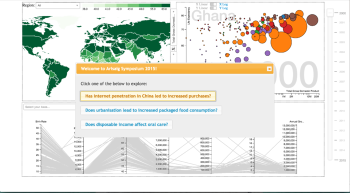
OUR STORYBOARD
SELECTED VISUALIZATIONS
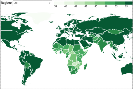
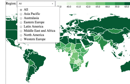
CHLOROPLETH
| Chart Chosen | Considerations |
|---|---|
| |
| |
|
SCATTER PLOT
| Chart Selected | Considerations |
|---|---|
| |
|
PARALLEL COORDINATES
| Chart Selected | Considerations |
|---|---|
| |
| |
| |
|
FINAL REPORT
Here is the report
