Difference between revisions of "Arisaig Final Deliverable"

From Analytics Practicum
Jump to navigation Jump to search
Line 25: Line 25:
 
! style="width: 650px; background-color:#fee5d9"| <span style="color:#000000;">Chart Chosen</span>
 
! style="width: 650px; background-color:#fee5d9"| <span style="color:#000000;">Chart Chosen</span>
 
! style="width: 350px; background-color:#fee5d9"| <span style="color:#000000;">Considerations</span>
 
! style="width: 350px; background-color:#fee5d9"| <span style="color:#000000;">Considerations</span>
|- valign="top" '''Sunburst Chart'''<br>
+
|- valign="top" '''Chloropleth'''<br>
 
|[[File:Arisaig_Chloropleth1.png|450px|center]]
 
|[[File:Arisaig_Chloropleth1.png|450px|center]]
 
|
 
|
* A sunburst chart provides a quick overview on categorical consumption data.
+
* Provide a map view to compare across the globe
* It allows our viewers to understand and compare proportions at a glance.
+
* Univariate representation of data
* Sunburst charts also show patterns across hierarchical regions and countries at a glance.
+
|- valign="top"<br>
* We will place 2 sunburst charts of data from different years side by side so users can make comparisons on the change in patterns over the years.
 
|- valign="top"'''Time Series Line Graph'''<br>
 
 
|[[File:Arisaig_Chloropleth2.png|450px|center]]
 
|[[File:Arisaig_Chloropleth2.png|450px|center]]
 
|
 
|
* A sunburst chart provides an overview whereas the time series line chart allows the user to narrow down on a particular region or country. So it can be used together with the sunburst chart.
+
* The functionality of selecting region allows the user to focus only on selected region for comparison
* The line chart will highlight the trends in absolute numbers and allow users to dynamically adjust the forecasted portion according to their own assumptions.
 
 
|-
 
|-
|- valign="top"'''Time Series Line Graph'''<br>
+
|- valign="top"<br>
 
|[[File:Arisaig_Map_Select.png|450px|center]]
 
|[[File:Arisaig_Map_Select.png|450px|center]]
 
|
 
|
* A sunburst chart provides an overview whereas the time series line chart allows the user to narrow down on a particular region or country. So it can be used together with the sunburst chart.
+
* Provide the flexibility for the user to see variable of interest
* The line chart will highlight the trends in absolute numbers and allow users to dynamically adjust the forecasted portion according to their own assumptions.
+
* Provide the flexibility for Arisaig to update variables based on dataset
 
|-
 
|-
 
|}
 
|}

Revision as of 10:08, 18 April 2015

Appannalogo.png Home Project Proposal Project Management Project Progress Project Final Progress Final Deliverable


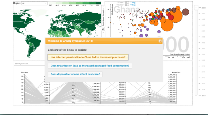
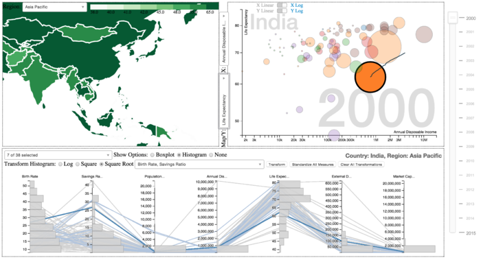
OUR STORYBOARD

Arisaig App Context.png

Arisaig Country Selected.png


SELECTED VISUALIZATIONS


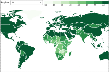
CHLOROPLETH


Chart Chosen Considerations
Arisaig Chloropleth1.png
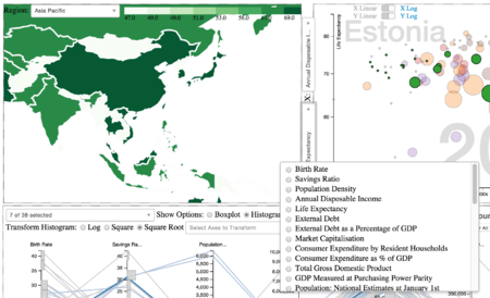
  • Provide a map view to compare across the globe
  • Univariate representation of data
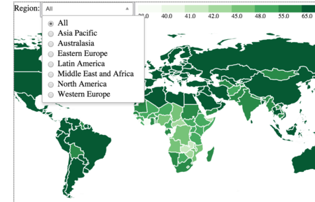
Arisaig Chloropleth2.png
  • The functionality of selecting region allows the user to focus only on selected region for comparison
Arisaig Map Select.png
  • Provide the flexibility for the user to see variable of interest
  • Provide the flexibility for Arisaig to update variables based on dataset


SCATTER PLOT


Chart Selected Considerations
Arisaig Scatterplot1.png
  • A treemap can convey our hierarchical data with 2 additional attributes via color and size, allowing us to dissect the relationship between the two.
  • The size of each block represents the GDP, and we can allow the user to fill in the colors with other economic indicators - savings rate, capital market size to grasp patterns in the data.
Arisaig Scatterplot2.png
  • A treemap can convey our hierarchical data with 2 additional attributes via color and size, allowing us to dissect the relationship between the two.
  • The size of each block represents the GDP, and we can allow the user to fill in the colors with other economic indicators - savings rate, capital market size to grasp patterns in the data.


PARALLEL COORDINATES


Chart Selected Considerations
Arisaig Parallelcoords1.png
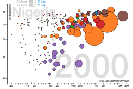
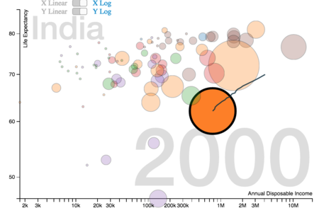
  • The motion charts will be animated according to time dimension and emphasise the growth of our 2 macro indicators relative to each other, and divulge patterns in their correlation
  • A motion chart is able to display 4 different information simultaneously, using the 2 axes, size and colour.
  • An animated chart will allow users to visually see how the change took place over the years.
Arisaig Parallelcoords2.png
  • The motion charts will be animated according to time dimension and emphasise the growth of our 2 macro indicators relative to each other, and divulge patterns in their correlation
  • A motion chart is able to display 4 different information simultaneously, using the 2 axes, size and colour.
  • An animated chart will allow users to visually see how the change took place over the years.
Arisaig Parallelcoords3.png
  • The motion charts will be animated according to time dimension and emphasise the growth of our 2 macro indicators relative to each other, and divulge patterns in their correlation
  • A motion chart is able to display 4 different information simultaneously, using the 2 axes, size and colour.
  • An animated chart will allow users to visually see how the change took place over the years.
Arisaig Parallelcoords4.png
  • The motion charts will be animated according to time dimension and emphasise the growth of our 2 macro indicators relative to each other, and divulge patterns in their correlation
  • A motion chart is able to display 4 different information simultaneously, using the 2 axes, size and colour.
  • An animated chart will allow users to visually see how the change took place over the years.
Arisaig Parallelcoords.png
  • The motion charts will be animated according to time dimension and emphasise the growth of our 2 macro indicators relative to each other, and divulge patterns in their correlation
  • A motion chart is able to display 4 different information simultaneously, using the 2 axes, size and colour.
  • An animated chart will allow users to visually see how the change took place over the years.


FINAL REPORT

Here is the report