Difference between revisions of "Arisaig Final Deliverable"
Jump to navigation
Jump to search
Kr.tan.2011 (talk | contribs) |
Kr.tan.2011 (talk | contribs) |
||
| Line 16: | Line 16: | ||
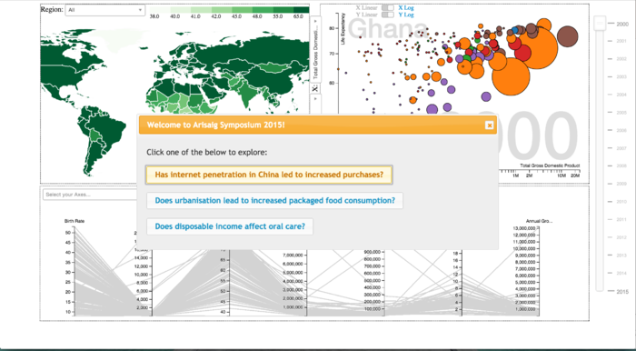
[[File:Arisaig_App_Context.png|700px]]<br><br> | [[File:Arisaig_App_Context.png|700px]]<br><br> | ||
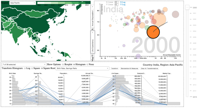
[[File:Arisaig_Country_Selected.png|700px]]<br> | [[File:Arisaig_Country_Selected.png|700px]]<br> | ||
| + | |||
| + | |||
| + | <div style="background: #fee5d9; padding: 5px; font-weight: bold; line-height: 1em; text-indent: 15px; border-left: #cb181d solid 32px; font-size: 20px"><font color="#333333">PROJECT </font> <font color="#cb181d"> METHODOLOGY</font></div><br> | ||
| + | <div style="background: #ffffff; padding: 5px; font-weight: bold; line-height: 1em; text-indent: 15px; border-bottom: #cb181d solid 2px; font-size: 20px"><font color="#333333">Consumer Consumption Patterns</font></div><br/> | ||
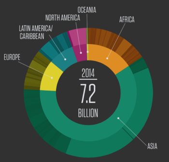
| + | This section allows users to understand how consumption patterns have changed over the years, and understand the patterns by regions and countries. <br/><br/> | ||
| + | |||
| + | {|style="border-collapse: separate; border-spacing: 0; border-width: 0px; border-style: solid; border-color: #000000; padding: 0; cellspacing="0" cellpadding="0" valign="top" border="0"" | ||
| + | |- | ||
| + | ! style="width: 650px; background-color:#fee5d9"| <span style="color:#000000;">Chart Chosen</span> | ||
| + | ! style="width: 350px; background-color:#fee5d9"| <span style="color:#000000;">Considerations</span> | ||
| + | |- valign="top" '''Sunburst Chart'''<br> | ||
| + | |[[File:Arisaig_Sunburst.png|350px|center]] | ||
| + | | | ||
| + | * A sunburst chart provides a quick overview on categorical consumption data. | ||
| + | * It allows our viewers to understand and compare proportions at a glance. | ||
| + | * Sunburst charts also show patterns across hierarchical regions and countries at a glance. | ||
| + | * We will place 2 sunburst charts of data from different years side by side so users can make comparisons on the change in patterns over the years. | ||
| + | |- valign="top"'''Time Series Line Graph'''<br> | ||
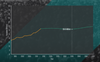
| + | |[[File:Arisaig_TimeSeries.png|350px|center]] | ||
| + | | | ||
| + | * A sunburst chart provides an overview whereas the time series line chart allows the user to narrow down on a particular region or country. So it can be used together with the sunburst chart. | ||
| + | * The line chart will highlight the trends in absolute numbers and allow users to dynamically adjust the forecasted portion according to their own assumptions. | ||
| + | |- | ||
| + | |} | ||
| + | <br/><br/> | ||
| + | |||
| + | <div style="background: #ffffff; padding: 5px; font-weight: bold; line-height: 1em; text-indent: 15px; border-bottom: #cb181d solid 2px; font-size: 20px"><font color="#333333">Economic Data</font></div><br/> | ||
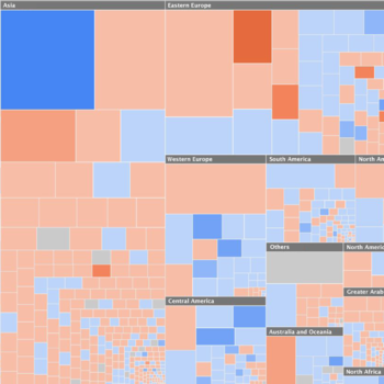
| + | This section allows users to see the GDP, changes in GDP and the debt of each country, grouped together by regions and countries. <br/><br/> | ||
| + | |||
| + | {|style="border-collapse: separate; border-spacing: 0; border-width: 0px; border-style: solid; border-color: #000000; padding: 0; cellspacing="0" cellpadding="0" valign="top" border="0"" | ||
| + | |- | ||
| + | ! style="width: 650px; background-color:#fee5d9"| <span style="color:#000000;">Treemap</span> | ||
| + | ! style="width: 350px; background-color:#fee5d9"| <span style="color:#000000;">Considerations</span> | ||
| + | |- valign="top" | ||
| + | |[[File:ArisaigTreeMap1.png|350px|center]] | ||
| + | | | ||
| + | * A treemap can convey our hierarchical data with 2 additional attributes via color and size, allowing us to dissect the relationship between the two. | ||
| + | * The size of each block represents the GDP, and we can allow the user to fill in the colors with other economic indicators - savings rate, capital market size to grasp patterns in the data. | ||
| + | |- | ||
| + | |} | ||
| + | <br/><br/> | ||
| + | |||
| + | <div style="background: #ffffff; padding: 5px; font-weight: bold; line-height: 1em; text-indent: 15px; border-bottom: #cb181d solid 2px; font-size: 20px"><font color="#333333">Human Development Data</font></div><br/> | ||
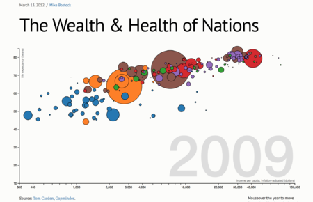
| + | This section allows users to see how human development indicators have changed over the years. <br/><br/> | ||
| + | |||
| + | {|style="border-collapse: separate; border-spacing: 0; border-width: 0px; border-style: solid; border-color: #000000; padding: 0; cellspacing="0" cellpadding="0" valign="top" border="0"" | ||
| + | |- | ||
| + | ! style="width: 650px; background-color:#fee5d9"| <span style="color:#000000;">Motion Charts</span> | ||
| + | ! style="width: 350px; background-color:#fee5d9"| <span style="color:#000000;">Considerations</span> | ||
| + | |- valign="top" | ||
| + | |[[File:Arisaig_MotionChart.png|450px|center]] | ||
| + | | | ||
| + | * The motion charts will be animated according to time dimension and emphasise the growth of our 2 macro indicators relative to each other, and divulge patterns in their correlation | ||
| + | * A motion chart is able to display 4 different information simultaneously, using the 2 axes, size and colour. | ||
| + | * An animated chart will allow users to visually see how the change took place over the years. | ||
| + | |- | ||
| + | |} | ||
| + | <br/><br/> | ||
| + | <br> | ||
| + | |||
| + | |||
<div style="background: #fee5d9; padding: 5px; font-weight: bold; line-height: 1em; text-indent: 15px; border-left: #cb181d solid 32px; font-size: 20px"><font color="#333333">FINAL</font> <font color="#cb181d"> REPORT</font></div> | <div style="background: #fee5d9; padding: 5px; font-weight: bold; line-height: 1em; text-indent: 15px; border-left: #cb181d solid 32px; font-size: 20px"><font color="#333333">FINAL</font> <font color="#cb181d"> REPORT</font></div> | ||
Revision as of 02:20, 18 April 2015

|
Home | Project Proposal | Project Management | Project Progress | Project Final Progress | Final Deliverable |
|---|
OUR STORYBOARD
PROJECT METHODOLOGY
Consumer Consumption Patterns
This section allows users to understand how consumption patterns have changed over the years, and understand the patterns by regions and countries.
| Chart Chosen | Considerations |
|---|---|
| |
|
Economic Data
This section allows users to see the GDP, changes in GDP and the debt of each country, grouped together by regions and countries.
| Treemap | Considerations |
|---|---|
|
Human Development Data
This section allows users to see how human development indicators have changed over the years.
| Motion Charts | Considerations |
|---|---|
|
FINAL REPORT
Here is the report
