AY1516 T2 Inpatient Meals Survey ProjectOverview

| Project Description | Data | Methodology |
|---|
Project Background
“Food is your medicine – hence let your medicine be your food”
Hippocrates, circa 400 BC
All patients have a right to safe, nutritious food. They expect their nutritional needs to be fulfilled during hospitalization. The state and kind of food provided to patients in hospitals have a direct impact on their health. Providing unhealthy and poor quality food can severely affect the quality of life of a patient.
Recent studies have shown that there has been a drop in the nutritional content of the food provided by hospitals nowadays. According to one study, 29% of previously well-nourished patients faced a decline in their nutritional content after being admitted to the hospital. Thus, food services should be given higher priority in hospitals and should be recognised as an important and integral part of a patient’s health and treatment.
National University Hospital (NUH) is one of the leading medical institutions in Singapore with around 50,000 inpatients and 600,000 outpatients. Sodexo is the esteemed provider of meals to the inpatients of NUH and is in charge of maintaining the standards of the meals for the patients. Lately, NUH has been placing great importance in the inpatients’ perceptions and satisfaction towards the meals that are provided in the hospital.
Sodexo is in charge of conducting surveys with the inpatients to gather feedback on the meals that are provided to them in the hospital. The purpose of the survey is also to gain insights on what factors are most important for the patients and recommendations that can be helpful in improving the services provided to them.
The surveys are conducted by well-trained interviewers who have been involved in hospital surveys; especially those who are familiar with NUH conduct face-to-face interviews with respondents at the various NUH wards. This may include patients only as per agreed with Sodexo. The survey uses Likert scale (5 or 7 point scale) rating for the attribute to make it easier for the patients to answer and also to restrict the range of feedback that the company receives. The patients are required to rate each attribute on their importance and satisfaction level with reference to the food provided to them.
The survey conducted can only be helpful to Sodexo if they gain useful and actionable insights on how they can improve the quality of meals provided and which are the main attributes that they should focus on. Since the survey captures qualitative data in the form of Likert scale ratings, the approach on analysing the feedback is different from the typical data analysis involving mean, median and mode.
Sodexo appointed Media Research Consultants, a Mediacorp Enterprise specializing in market research, for conducting and analyzing the NUH In-Patient Meals Audit Survey from 2015-2017. This project is sponsored by MRC Mediacorp. In this project, we are expected to present the results of the analysis of the surveys in the form of a web based application to help MRC Mediacorp. It will help them to understand which attributes are most important for the patients as they should provide more attention and resources to improving those attributes. Moreover, it will also help them to know which the attributes that the patients are unsatisfied with are and has room for improvement. The application needs to be reusable for analysing future surveys.
Research Work
Market research, psychometric tests and customer feedback studies commonly use Likert scale or other semantic differential scale for rating purposes. Survey data has a major impact in providing companies with directions on their strategies and performance. Thus, it is extremely important to interpret Likert scale properly. Measuring attitudes, feelings and personality traits can be difficult and ambiguous as it requires converting these qualities into quantitative numbers for data analysis. There have been many recent studies and experiment in measuring these qualities using Likert scale and how to analyze this data.
Likert scale, developed in 1932 by Rensis Likert, is a 5 or 7 point ordinal scale used to rate statements according to how users agree or disagree with them. The table below shows a commonly used Likert scale rating.
| 1 | 2 | 3 | 4 | 5 |
|---|---|---|---|---|
| Strongly Disagree | Disagree | Neutral | Agree | Somewhat Agree |
A common mistake by most people while analyzing Likert scale data is that they treat these ordinal ratings as continuous or discrete data by converting the rating into numbers and using the average of the numbers to do the analysis. That implies that there is some measure of distance between the rating values.
In an ordinal scale, responses can be rated or ranked but there is no measurable distance between the values. It doesn’t make sense to say that feeling neutral is three time that of the feeling of strong disagreement. It is also incorrect to assume that the differences between the ratings are necessarily equal.
Let’s look at an example to illustrate the shortcomings of using average of the responses. In case of a controversial survey question, most people are likely to either choose strongly disagree or strongly agree. In that case, if we use the mean to do the analysis, it will indicate that on average everyone chose neutral which is actually wrong. Thus, mean is a poor method of analyzing Likert scale data.
The most appropriate way of representing Likert scale data is in the form of a frequency table. This lets the users to see the distribution of the data on their own instead of influencing them with average numbers. The table below shows a representation of frequency of the rating of participants for a market survey of a product.
| Strongly Disagree | Disagree | Neutral | Agree | Somewhat Agree |
|---|---|---|---|---|
| 3(3%) | 60(60%) | 5(5%) | 2(2%) | 30(30%) |
The interpretation of the above results can be that most people think that the product is only somewhat important but there is large group that also thinks that the product is very important. Thus, the company should focus on allocating resources on the segment that thinks it’s important and not waste it on the segment that does not find it useful.
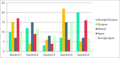
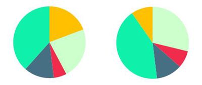
There has also be a lot of critiques on the ways of representing Likert scale data for visualization. Below are some examples of the representations and why they are recommended or not recommended for ordinal data representation.


The above illustration shows representation of Likert scale data using a bar graph. However, reading bar graphs can be confusing and difficult as that would involve one bar each for each rating for each question. Also, it would be difficult to compare the ratings across different questions especially if there are many questions.Pie charts for each factor do not communicate very well and are also difficult to interpret.
There are other representations as well like spider chart and waffle chart but they too are not easy to interpret and are not very efficient for comparison across different questions.
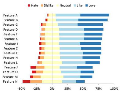
The most appropriate way of representation of Likert data is divergent stacked bar graph (as shown in the picture above). The data is represented in percentages of the total participants. The positive responses are plotted to the right of the base line and the negative responses are plotted to the left. The percentages of the middle scale value is broken into have and plotted on the left and right of the base line. The common base line helps to compare the responses for different questions. This graph is easy to interpret and useful for analysis of Likert scale data.
Project Scope
This project aims to provide an automated online dashboard to upload the data and provide the analysis needed on surveys conducted by Media Research Consultants for Sodexo. The project’s scope is to provide a better solution, which relates to the latest research done in the field of survey analysis.
We aim to target and achieve the following from the online dashboard:
- An analysis of the factors by importance and satisfaction, to understand which factors of the food are important and satisfying to the patients
- A service gap analysis to read between the lines and find out factors that have a significant gap when it comes to importance and satisfaction
- An analysis of the factors done by ward, to focus on improving factors according to the wards
- An analysis of the factors done by diet preferences or type
- An analysis of the factors done by patient type (payment status - private or subsidized)
