 VAST Challenge 2019 MC1: Crowdsourcing for Situational Awareness
Task 1: Analyse how neighborhoods should be prioritsed for response and find out which parts of the city are hardest hit
| Insights |
Visualization |
| 1.1 Analysis of damage reports by time and average damage on location
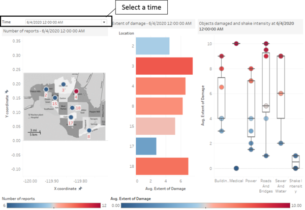
The damage reports are analysed at the time they are received. When reports are received, cities which have the the highest average damage will be looked into. The number of reports is indicated by the size of the circle marked on the map.
|
|
| 1.2 Analysis of damage reports by average damage of objects
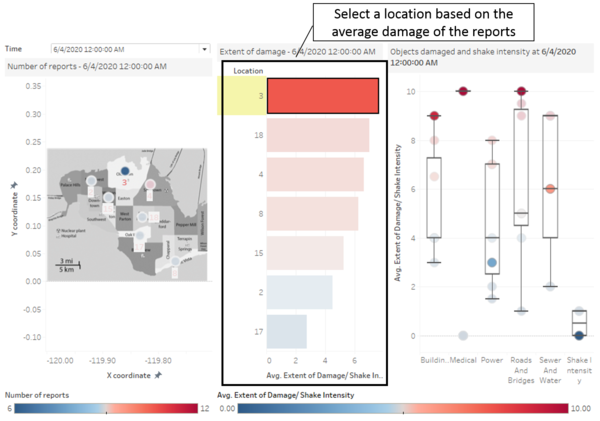
When a location is selected based on the average damage, the average damage of each object can then be seen in comparison to other location based on the point in time. For instance, location 3 is selected, and on the left, the damage on each item can be seen relative to other locations. As such, the respondents are able to see what they should prioritise for this location and if other location has worse damage than the current location. Looking at the breakdown of damage on location 3, the damage on sewer and water is not the highest at this point and there is another location (Location 4) there has worse damage on sewer and water facilities. Given that all these repair and respondents are from different departments of St. Himark, decisions on which department to send can also be made.
|
|
1.3 Analysis of Location with the hardest hit
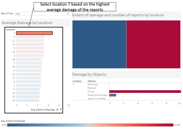
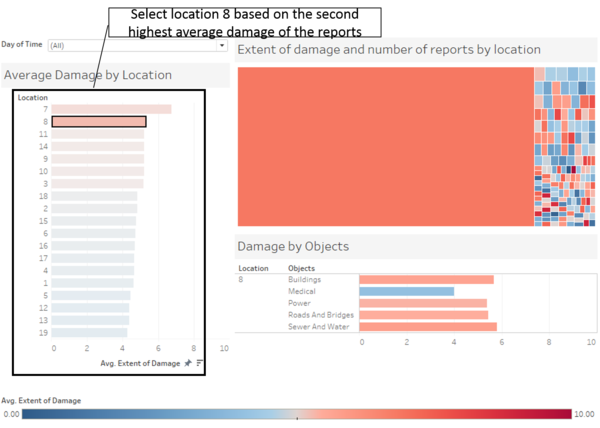
In this analysis, shake intensity is removed as we are focusing on the damage done to the cities. Based on the average damage of all the damage reports, we can see that location 7 has the highest average damage. However when looked in location 7, the root cause of the high average damage comes from the damage on the power. On the other hand, looking at location 8, which has the next highest damage, damages are inflicted on almost all infrastructures and facilities. Although location 7 has highest damaged on its power, the situation is probably not as critical as locations with damages on its infrastructures and facilities which can results in loss of lives. |
|
Task 2: Use visual analytics to show uncertainty in the data, compare the reliability of neighborhood reports and find out which neighborhoods are providing reliable reports.
In order to analyse the reliability of the report, a comparison with the earthquake shake map is done. Since the earthquake shake map on 6 April 2020 and 8 April 2020 are given, only damage reports in these 2 days will be looked into.
| Insights |
Visualization |
| 2.1 Comparison of damage reports on 6 April 2020
Firstly, looking at the earthquake shake map on 6 April (on the right), it looks like the earthquake has not hit the cities in St. Himark. This is aligned with the damage reports (on the left) where damages are low which are probably due to the shaking even though it is indicated as "not felt" in the earthquake shake map.
|
|
| 2.2 Comparison of damage reports on 8 April 2020
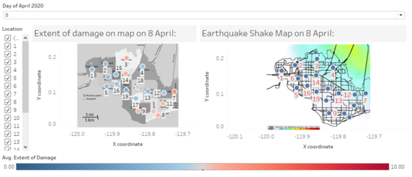
Looking at the damage reports and earthquake shake map on 8 April, the reports seem to show that location 3, 7, 8,9,10,11 and 14 are experiencing more damages than the rest of the locations based on the average damage. However, location such as location 4 and 12 which seem to have been hit by the earthquake in the shakemap do not seem to have much damages. Assuming that the Earthquake shake map is the most accurate, these locations does not seem to provide reliable reports. Nonetheless, when looked into location 4, the damage is highest on the medical facilities while location 12 has the highest damage on the power. This could just mean that these locations have strong infrastructure especially since location 4 has a nuclear plant which if destroyed can be disastrous.
|
|
In order to analyse the uncertainty of the report, each location is looked into to see if reports are consistent in the extent of damage and shake intensity.
| Insights |
Visualization |
| 2.3 Looking at the reports in each location
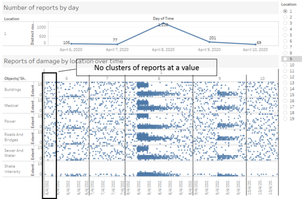
Each location is analysed individually where the dot represent each report received. As seen from the visual, most locations have similar visual as location 1 where the dots are scattered all over the place showing the uncertainty in the reports received where some reports show very high damage while others show very low damage on the same infrastructure and facilities. Shake intensity on the other is rather consistent across all locations where reports show consistent intensity.
|
|
Task 3: Examine how the conditions, uncertainty in and key changes have changed over time
How do conditions change over time? How does uncertainty in change over time? Describe the key changes you see. Limit your response to 500 words and 8 images.
| Insights |
Visualization |
| 3.1 Change in conditions over time
Similar to 2.3, each location is analysed individually where the dot represent each report received. From 6 April to 11 April, the uncertainty seems to be lesser on 8 and 9 April across all locations. The number of reports on these dates are a lot higher than the other dates. This is most probably when the major earthquake hits the cities in St. Himark. On 10th and 11th April, most cities have reports where the extent of damage are scattered around.
|
|
