IS428 AY2019-20T1 Assign Wendy Ng Sock Ling Tasks
|
|
|
|
|
Task 1: Analyse how neighborhoods should be prioritsed for response and find out which parts of the city are hardest hit
| Insights | Visualization |
|---|---|
| 1.1 Analysis of damage reports by time and average damage on location
|
|
| 1.2 Analysis of damage reports by average damage of objects
|
|
| 1.3 Analysis of Location with the hardest hit
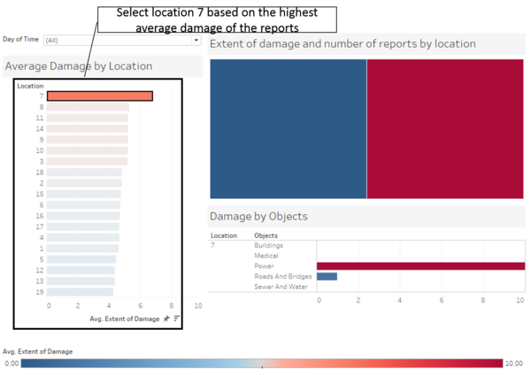
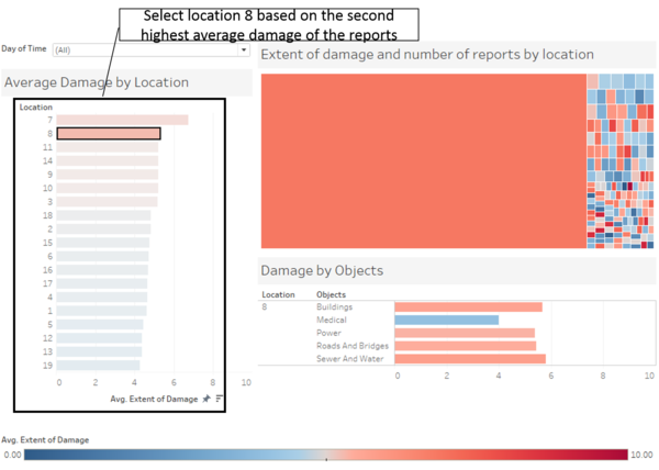
In this analysis, shake intensity is removed as we are focusing on the damage done to the cities. Based on the average damage of all the damage reports, we can see that location 7 has the highest average damage. However when looked in location 7, the root cause of the high average damage comes from the damage on the power. |
|
|
On the other hand, looking at location 8, which has the next highest damage, damages are inflicted on almost all infrastructures and facilities. Although location 7 has highest damaged on its power, the situation is probably not as critical as locations with damages on its infrastructures and facilities which can results in loss of lives. |
|
|
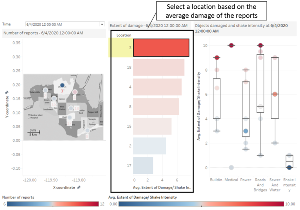
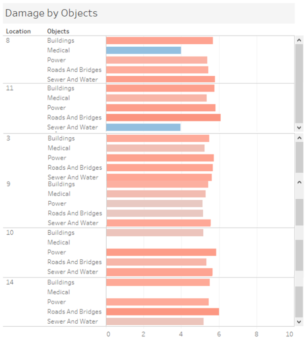
Looking at all the locations with total average damage of more than 5 (locations with red bar chart), only locations 3, 9, 10 and 14 have average damages above 5 on all 5 facilities/infrastructures. Looking at these 4 cities, going by the total average damage, location 14 has been hit the hardest. |
Task 2: Use visual analytics to show uncertainty in the data, compare the reliability of neighborhood reports and find out which neighborhoods are providing reliable reports.
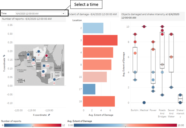
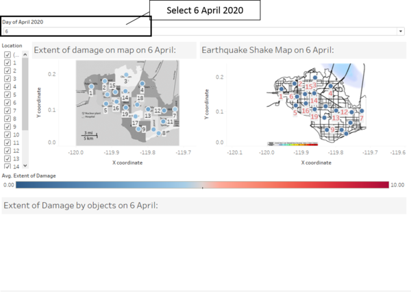
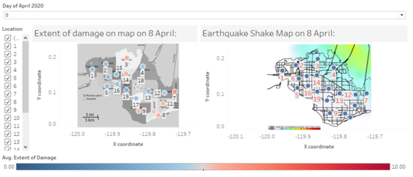
In order to analyse the reliability of the report, a comparison with the earthquake shake map is done. Since the earthquake shake map on 6 April 2020 and 8 April 2020 are given, only damage reports in these 2 days will be looked into. The day can be selected at the top under "Day of April 2020".
| Insights | Visualization |
|---|---|
| 2.1 Comparison of damage reports on 6 April 2020
|
|
|
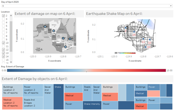
However, there are locations such as 2, 10, 12, 13 and 14 with average damage of more than 5 in their medical facilities apart from location 13 with average damage of more than 5 on its roads and bridges. These locations seem to be approximately same distance away from the area with slight shake intensity. Moreover, it might also imply that these medical facilities might be built with weaker infrastructure or that citizens there are in general more paranoid. Nonetheless, we cannot be sure if the data from damage report is factual as they are reports from citizens which might result in false alarm. With the assumption that the earthquake shake map is accurate, these locations do not seem to provide reliable reports. |
|
| 2.2 Comparison of damage reports on 8 April 2020
|
In order to analyse the uncertainty of the report, each location is looked into to see if reports are consistent in the extent of damage and shake intensity.
| Insights | Visualization |
|---|---|
| 2.3 Looking at the reports in each location
|
|
|
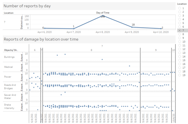
Shake intensity on the other is rather consistent across all locations where reports show relatively similar value for each timestamp. Using location 7 as another example, it can be seen that the damage reported do not defer by a lot. This location might have the most certain reports. |
|
|
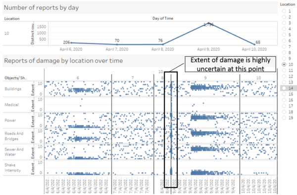
On the other hand, looking at location 10, the timestamp highlight in the box, it almost forms a vertical line showing that reports consist of damage from 0 to 10 which implies high uncertainty in the data at that point in time. |
Task 3: Examine how the conditions, uncertainty in and key changes have changed over time
How do conditions change over time? How does uncertainty in change over time? Describe the key changes you see. Limit your response to 500 words and 8 images.
| Insights | Visualization |
|---|---|
| 3.1 Change in conditions over time
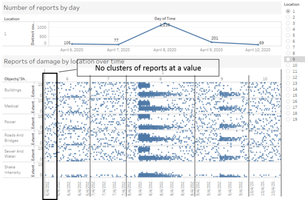
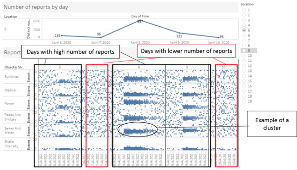
After looking through each location, the damage reports seem to suggest a small earthquake on 6th April and a major earthquake on 8 and 9 April. On 8 and 9 April, there is a surge in number of reports across all locations. After 8 April, the number of reports decreases with the exception of location 3 which increased. When the number of reports is high, there is generally a cluster around a value that indicates the damage. Hence, the data from these damage reports are less uncertain when there are more reports received. Take location 5 as an example, on 6, 8 and 9 April where the number of reports is relatively high, a cluster can be seen where the damages are below 5. On the other hand, on 7 and 10 April, with lesser number of reports on damage can have values on extreme end. After 9 April, reports in 10 April seem to be very scattered. This might be due to some repairs being carried out at certain areas of the cities resulting in only certain areas being repaired. Particularly, there are no clusters of reports at certain values. This seems to imply that the damages are repaired at areas where most people made a report. As for the shake intensity, it seems like it is generally below 5 throughout the 6 days of data with only the number of reports changing. |
