IS428 AY2019-20T1 Assign Wendy Ng Sock Ling Transformation
|
|
|
|
|
Contents
Transforming Data Given
The data given consists of the following fields:
- time: timestamp of incoming report/record, in the format YYYY-MM-DD hh:mm:ss
- location: id of neighborhood where person reporting is feeling the shaking and/or seeing the damage
- shake_intensity, sewer_and_water, power, roads_and_bridges, medical, buildings: reported categorical value of how violent the shaking was/how bad the damage was (0 - lowest, 10 - highest; missing data allowed)
A check on the data was done and the following are the fields with missing data which will be left as blank:
- Shake intensity: 12,144 missing data
- Buildings: 170 missing data
- Medical: 47,441 missing data
- Sewer_and_water: 171 missing data
The high number of missing data from medical is understandable as it is not found everywhere in a neighborhood and people might not be near any.
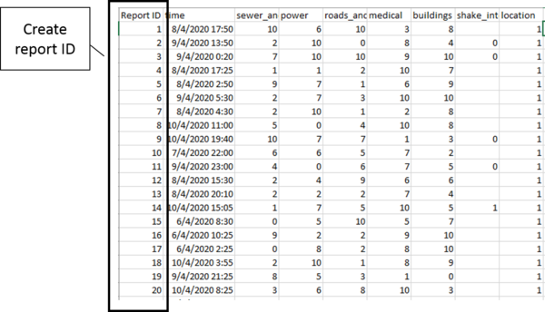
With the dataset given, the reports do not have an identifier. Hence, a Report ID column is created as seen below.
This file is then imported into tableau as a data source. Next, a pivot is done on the following columns in tableau:
- Buildings
- sewer_and_water
- power
- roads_and bridges
- medical
- shake_intensity
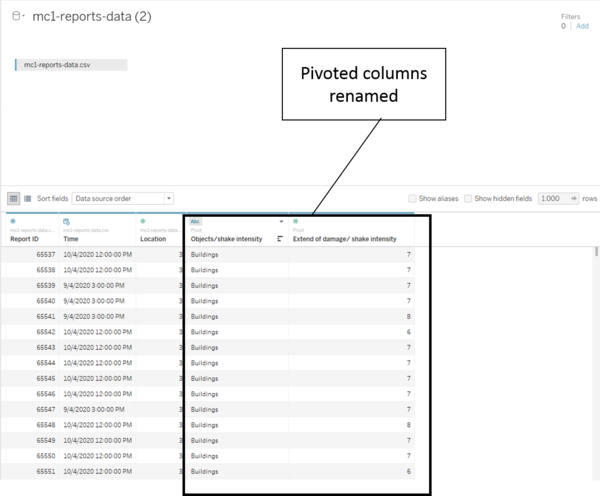
The following is the data with the columns above pivoted. The columns are then renamed as "Objects/shake intensity" and "Extend of damage/ shake intensity".
Creating An Aggregated Data Set
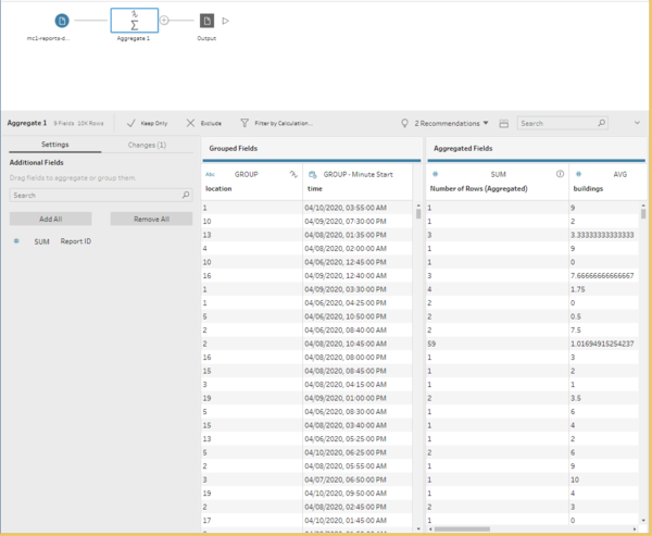
The aggregated data set is created for the ease of analysis done on the higher level where all reports for the timestamp and location are aggregated into one row. This data set is created using tableau prep where the given data is aggregated by location and time column as seen below. The following are the aggregated fields:
- Sum of the number of rows
- Average damage on the buildings
- Average damage on the medical facility
- Average damage on the power
- Average damage on the roads and bridges
- Average damage on the sewer and water
- Average shake intensity
The file is then saved as a csv output and imported into tableau as a data source. Next, a pivot is done on the following columns in tableau in the same way as the previous data set:
- Buildings
- Medical
- Power
- Roads and Bridges
- Sewer and Water
- Shake Intensity
The following is the data with the columns above pivoted. The columns are then renamed as "Objects/shake intensity" and "Extend of damage/ shake intensity".
Creating the Location Coordinates
This step is done with the help of Ryan Sleeper from Playfair Data. [1]
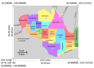
Firstly, it is necessary to obtain the longitude and latitude from Minicase 2 description document as seen below.
The following are the steps taken to create the coordinates for each location:
1) Create a new excel file with the columns "location", "X coordinate" and "Y coordinate" then insert the longitude and latitude from minicase 2.
2) Import this file into tableau as the data source with this sheet as the table. Change the X and Y coordinates to Longitude and Latitude respectively. Location should be a string
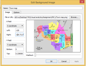
3) In tableau, Map > background images > Add Image, insert the town map file and key in the x and y coordinates as seen in the MC2 data description. Below is the image of a filled coordinates. At the options tab, check the boxes “Lock Aspect Ratio” and “Always Show Entire Image”. After which click on Maps > background maps and set it to none.
4) Put the X coordinate to the columns and Y coordinates to the rows.
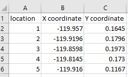
5) Manually get the average coordinates of 19 locations and key into the excel file created previously. In order to get the X and Y coordinates, right click the graph and annotate with points. The excel file should look something like the following.
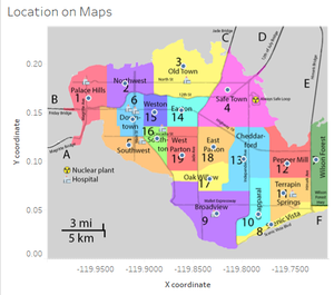
6) Refresh the data extract and perform a check to ensure locations are in the area it should be as below.
Putting the Data Sets Together
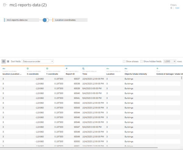
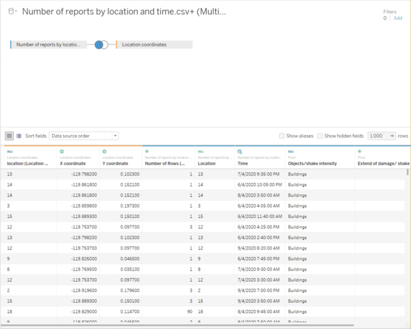
This step is combining transformed data set and the aggregated data set with the custom map created. Both data set will be left joined to the custom map created in order to get the coordinates of the locations. When joining the locations, ensure that both the “Location” in the “Location coordinates” are of the data type "string" to prevent error in joining. The X and Y coordinates should have the data type changed to Longitude and Latitude respectively if they are not already changed.
The following is the transformed data set with the location coordinates left joined to it.
The following is the aggregated data set with the location coordinates file left joined to it.
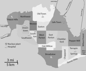
Creating Black and White Map
This map is used later on in the analysis for easier identification of location and more readability by removing the colours. This is done by putting the image "StHimarkLabeledMap" into powerpoint and changing the colour under the tab "format" to grayscale. Below is the map to be used in analysis later on.
