IS428 AY2019-20T1 Assign Wendy Ng Sock Ling Dashboard Design
|
|
|
|
|
| Description | Visualization |
|---|---|
| 1. Background and Navigation
|
|
| 2. Which neighbourhoods should be prioritised?
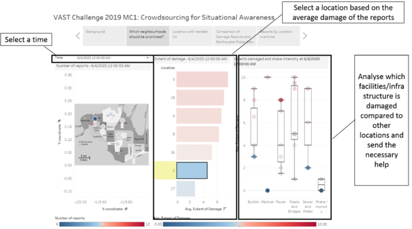
The bar chart in the middle shows the average extent of damage of all reports at the time selected for each location respectively. By selecting the location at any of the visuals, the location selected will be highlighted while all other locations are at the background to allow comparison. By hovering over circles that are not highlighted, the location can be viewed so as to enable responders to know which location is more damaged for the respective facility/infrastructure. For instance, in this picture the date and time "6/4/2020 12:00:00 AM" and location "2" are selected. As seen in the breakdown, although location 2 has the second lowest average damage based on the bar chart, it has the highest damage on power. Hence, the responders might consider sending St. Himark's power department to location 2. |
|
| 3. Location with hardest hit
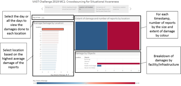
By clicking on an individual location, users can see the treemap with each box as the timestamp, the number of records as the size and the colour as the intensity of the damage. The colour changes from blue to red as the damage increases. The user can also see the breakdown of the damage by the facility/ infrastructure. This enables user to make a decision on whether the damage has more consequences for the location or it might just be a small damage. For instance, the location 7 is selected in the picture. Although 7 has the highest average damage based on the reports, the root cause is the damage to the power. Other locations could have damage to buildings or roads which have worse consequences as it might costs losses of lives as compared to damages on power. |
|
| 4. Comparison of damage reports and earthquake shake map
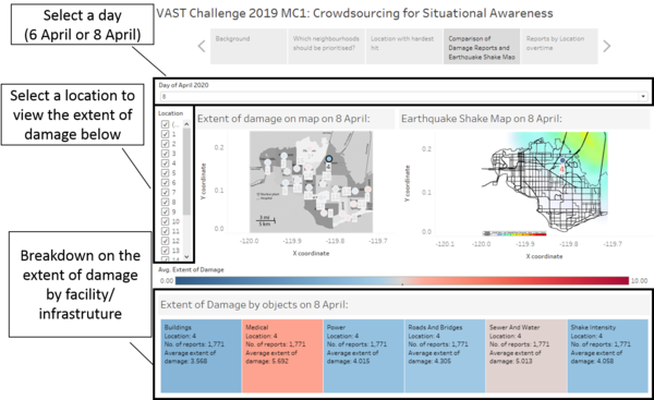
Firstly, user will have to select a date at "Day of April 2020". The damage on each location from the damage reports is shown on the left while the earthquake shake map is shown on the right. The extent of damage is coloured and changes from blue to red as the damage increases. This only applies for the visuals under "Extent of damage on map" and "Extent of damage by objects" and does not apply for "Earthquake Shake Map". Secondly, by clicking on the location, users will be able to see if that location appears in the area that is hit by the earthquake as shown on the earthquake shake map. Moreover, the breakdown of the damage can be seen below with information such as the number of report and the average damage/shake intensity. Lastly, with this dashboard, users will then be able to compare the damage reports by citizens and the earthquake shake map to see if the damage reports by citizens are reliable. |
|
| 5. Reports by location over time
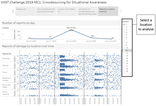
The user should first select a location on the right to analyse. The line graph will then show the number of reports received each day. Each dot in the visual below represents a report on damage/shake intensity. If the dots are clustered together, it shows that the citizens are reporting the same extent of damage/ shake intensity for the location and at that time. However, if the dots are vertically spread out, it shows that the citizens are reporting different extent of damage/ shake intensity. This results in uncertainty of the data as users will not know if the damage is serious or not. |
