IS428 AY2019-20T1 Assign Wendy Ng Sock Ling Tasks
|
|
|
|
|
|
Task 1: Analyse how neighborhoods should be prioritsed for response and find out which parts of the city are hardest hit
Emergency responders will base their initial response on the earthquake shake map. Use visual analytics to determine how their response should change based on damage reports from citizens on the ground. How would you prioritize neighborhoods for response? Which parts of the city are hardest hit? Limit your response to 1000 words and 10 images.
| Insights | Visualization |
|---|---|
| 1.1 Analysis of damage reports by time and average damage on location
|
|
| 1.2 Analysis of damage reports by average damage of objects
|
|
| 1.3 Analysis of Location with the hardest hit
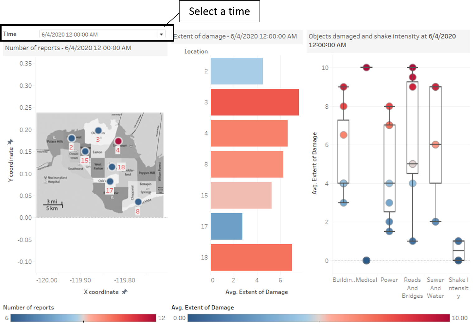
In this analysis, shake intensity is removed as we are focusing on the damage done to the cities. Based on the average damage of all the damage reports, we can see that location 7 has the highest average damage. However when looked in location 7, the root cause of the high average damage comes from the damage on the power. On the other hand, looking at location 8, which has the next highest damage, damages are inflicted on almost all infrastructures and facilities. Although location 7 has highest damaged on its power, the situation is probably not as critical as locations with damages on its infrastructures and facilities which can results in loss of lives. |
center |
Task 2: Use visual analytics to show uncertainty in the data, compare the reliability of neighborhood reports and find out which neighborhoods are providing reliable reports.
Use visual analytics to show uncertainty in the data. Compare the reliability of neighborhood reports. Which neighborhoods are providing reliable reports? Provide a rationale for your response. Limit your response to 1000 words and 10 images. and 8 April 2020 In order to analyse the reliability of the report, a comparison with the earthquake shake map is done. Since the earthquake shake map on 6 April 2020 and 8 April 2020 are given, only damage reports in these 2 days will be looked into.
| Insights | Visualization |
|---|---|
| 2.1 Comparison of damage reports on 6 April 2020
|
|
| 2.2 Comparison of damage reports on 8 April 2020
|
center |
Task 3: Examine how the conditions, uncertainty in and key changes have changed over time
How do conditions change over time? How does uncertainty in change over time? Describe the key changes you see. Limit your response to 500 words and 8 images.


