IS428 AY2019-20T1 Assign Wendy Ng Sock Ling Tasks
|
|
|
|
|
|
Task 1: Analyse how neighborhoods should be prioritsed for response and find out which parts of the city are hardest hit
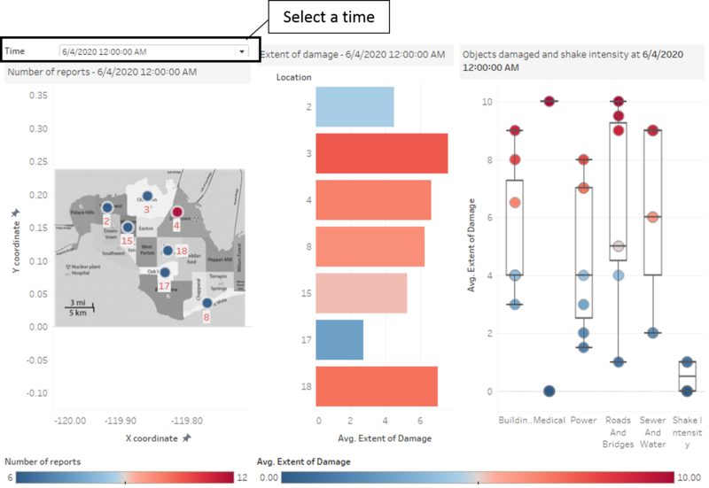
Emergency responders will base their initial response on the earthquake shake map. Use visual analytics to determine how their response should change based on damage reports from citizens on the ground. How would you prioritize neighborhoods for response? Which parts of the city are hardest hit? Limit your response to 1000 words and 10 images.
| Insights | Visualization |
|---|---|
| 1.1 Analysis of damage reports by time and average damage on location
|
|
| 1.2 Analysis of damage reports by average damage of objects
|
|
| 1.3 Analysis of Location with the hardest hit Refer to Fig 2.1, day campers started to enter the reserve at 5am and left the park by 18:00. In terms of camp selection, Fig 2.2 reveals that camp3 and 6 are their most popular choices, possibly because they are located nearer to the entrances. Accessibility could be one of the considerations for the day campers in choosing their campaign locations due to the limited time they have in the park. |
|
| 3.Extended campers
The day for extended campers started a bit later than day campers, from 6am onwards. The time of exit for them also spread over a longer time range (Fig 3.1). Unlike the day campers, they tend to settle down at the more secluded camp sites like camp 5 and camp 8, to enjoy a quiet night of sleep (Fig 3.2). |
|
| 4.Rangers
The day of rangers started from the ranger base and ends there with their first shift started at 6am and the last shift started at 17pm (Fig 4.2). They travelled by long but fixed paths, the reason could be that they are working on routine shifts (Fig 4.1). There are two typical paths adopted by the rangers, the maintenance path and the patrolling path. The maintenance path passed through various restricted gates, which was normally started at 6am,11am and 14pm. The patrolling path covered the entire reserve, started at regular hour intervals. |
|
| 5.Service Trucks
The service trucks are axle-4 and above heavy vehicles which moved around the reserve throughout the day. They seemed to be visiting the reserve at fixed hours daily – majority of them reported to the “most scenic path” at 6am and 15-16pm daily (path 1 in Fig 5) while the others revolved along entrance 1->generalgate7->entrance 3 at 10am & 14pm daily. These are probably service or supplies trucks transporting goods in and out of the reserve. |
|
| 6.Sightseeing coaches
The sightseeing coaches brought guests to the reserves throughout the day, without entering into the camp sites. Majority of the visitors were brought to the “most scenic path” from different entrances (path 1 in Fig 6) while the rest were dropped along the camping path (path 2 in Fig 6) which connected camps 3,4,5. Unlike the truck drivers, the sightseeing coaches used entrance 3 instead. |
Task 2: Use visual analytics to show uncertainty in the data, compare the reliability of neighborhood reports and find out which neighborhoods are providing reliable reports.
Use visual analytics to show uncertainty in the data. Compare the reliability of neighborhood reports. Which neighborhoods are providing reliable reports? Provide a rationale for your response. Limit your response to 1000 words and 10 images.
Task 3: Examine how the conditions, uncertainty in and key changes have changed over time
How do conditions change over time? How does uncertainty in change over time? Describe the key changes you see. Limit your response to 500 words and 8 images.


