Difference between revisions of "IS428 AY2019-20T1 Assign Wendy Ng Sock Ling Dashboard Design"
Wendyng.2015 (talk | contribs) |
Wendyng.2015 (talk | contribs) |
||
| Line 23: | Line 23: | ||
|} | |} | ||
| − | Dashboard link: | + | Dashboard link: |
| − | = | + | <b></b> |
| − | + | <table border='1'> | |
| + | <tr> | ||
| + | <th>Description</th> | ||
| + | <th>Visualization</th> | ||
| + | </tr> | ||
| + | <tr> | ||
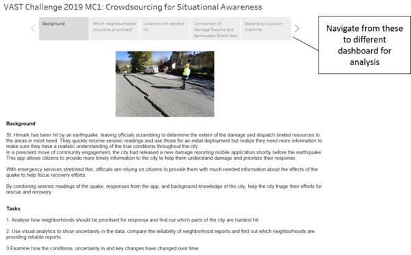
| + | <td><b> 1. Background and Navigation </b> | ||
| + | <br>The first page shows the background and the tasks. In order to navigate to different dashboards for analysis, there are boxes at the top which are used to navigate to each dashboard for analysis. | ||
| + | </td> | ||
| + | <td>[[File: WN_Background.png|center|600px]]</td> | ||
| − | + | </tr> | |
| + | <tr> | ||
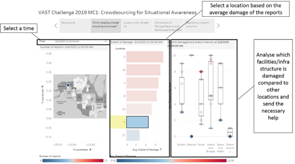
| + | <td><b> 2. Which neighbourhoods should be prioritised? </b> | ||
| + | <br> The objective of this dashboard is to identify which neighborhoods should the emergency responders prioritise given their limited resources. | ||
| + | </td> | ||
| + | <td>[[File:WN_which neighborhoods should be prioritised.png|center|600px]]</td> | ||
| − | + | </tr> | |
| − | + | <tr> | |
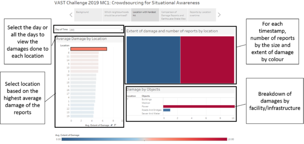
| − | + | <td><b> 3. Location with hardest hit </b> | |
| − | + | <br> The objective of this dashboard is to identify which neighborhoods should the emergency responders prioritise given their limited resources. | |
| − | + | </td> | |
| − | + | <td>[[File:WN_Location with hardest hit.png|center|600px]]</td> | |
| − | + | ||
| − | + | </tr> | |
| − | + | <tr> | |
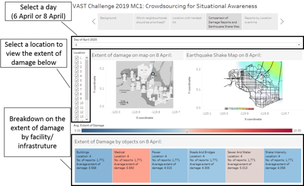
| − | + | <td><b> 4. Comparison of damage reports and earthquake shake map </b> | |
| − | + | <br> The objective of this dashboard is to identify which neighborhoods should the emergency responders prioritise given their limited resources. | |
| − | + | </td> | |
| − | + | <td>[[File:WN_comparison of damage reports and earthquake shake map.png|center|600px]]</td> | |
| − | | | + | </tr> |
| − | | | + | |
| − | + | <tr> | |
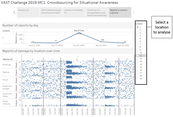
| + | <td><b> 5. Reports by location over time </b> | ||
| + | <br> The objective of this dashboard is to identify which neighborhoods should the emergency responders prioritise given their limited resources. | ||
| + | </td> | ||
| + | <td>[[File:WN_Reports by location over time.png|center|600px]]</td> | ||
| + | </table> | ||
Revision as of 11:40, 13 October 2019
|
|
|
|
|
|
Dashboard link:
| Description | Visualization |
|---|---|
| 1. Background and Navigation
|
|
| 2. Which neighbourhoods should be prioritised?
|
|
| 3. Location with hardest hit
|
|
| 4. Comparison of damage reports and earthquake shake map
|
|
| 5. Reports by location over time
|
