IS428 AY2019-20T1 Assign Kelvin Chia Sen Wei

From Visual Analytics for Business Intelligence
Jump to navigation Jump to search

MC1: Problem & Motivation

St. Himark has been hit by an earthquake, leaving officials scrambling to determine the extent of the damage and dispatch limited resources to the areas in most need. They quickly receive seismic readings and use those for an initial deployment but realize they need more information to make sure they have a realistic understanding of the true conditions throughout the city. In a prescient move of community engagement, the city had released a new damage reporting mobile application shortly before the earthquake. This app allows citizens to provide more timely information to the city to help them understand damage and prioritize their response. In this mini-challenge, use app responses in conjunction with shake maps of the earthquake strength to identify areas of concern and advise emergency planners.

With emergency services stretched thin, officials are relying on citizens to provide them with much needed information about the effects of the quake to help focus recovery efforts.

By combining seismic readings of the quake, responses from the app, and background knowledge of the city, help the city triage their efforts for rescue and recovery.

Tasks and Questions:

  • Emergency responders will base their initial response on the earthquake shake map. Use visual analytics to determine how their response should change based on damage reports from citizens on the ground. How would you prioritize neighborhoods for response? Which parts of the city are hardest hit? Limit your response to 1000 words and 10 images.
  • Use visual analytics to show uncertainty in the data. Compare the reliability of neighborhood reports. Which neighborhoods are providing reliable reports? Provide a rationale for your response. Limit your response to 1000 words and 10 images.
  • How do conditions change over time? How does uncertainty in data change over time? Describe the key changes you see. Limit your response to 500 words and 8 images.

Dataset Analysis & Transformation Process

Some of the data given have to be processed to provide an accurate display of information and analysis.

Data Manipulation for given dataset: mc1-reports-data.csv

Pivoting for damage categories

Issue: The different categories of damage can be aggregated to give a more concise dataset and to be displayed as filters.

Solution: The categories: Medical, Power, Road_And_Bridges, Sewer_And_Water and buildings can be pivoted so that the categories can be filtered on Tableau's Dashboard.

The mentioned categories are pivoted using Tableau Prep Builder and transformed into "Area" for the category and "Area Damage" for the values.

Pivot.png


Binning of Shake Intensity:


Whybin.jpg


Issue: As mentioned in the provided data, the shake intensity are categorised as above and we have to align the data as such.

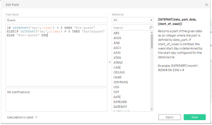
Solution: Through Tableau Prep Builder, we can create a calculation to bin each numerals to their respective categories.

Below is a screenshot of the calculation statement:

Binning.png


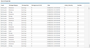
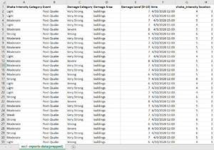
Below is the generated CSV from Tableau Prep Builder after data manipulation:

Output.png


Data Manipulation for given dataset: StHimarkNeighborhoodShapefile/StHimark.shp

In order to overlay the different areas of the neighborhood to display its area outline, I used the shp file that was given in MC2 Challenge.

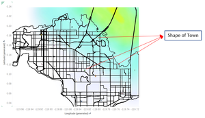
Issue: However after inserting the background overlay from MC2, the polygons transformed into the centroid points.

Small.png

Solution: After much research, I found out that the cause is due to "Tableau just drops each Geometry at the centroid (where the generated lat/lon points would be rendered if you were using a point map instead of a filled map). Since there isn't anything that specifies to Tableau how the polygons rendered by the Geometry are to be scaled they seem to just be defaulting to a small size." Hence, I have to carry out the steps as mentioned in the guide to transform the SHP File to Polygon Coordinates.

  1. Refer to VA Discussion Forum for guide/steps to implement.
  2. Online Link explaining the transformation process: https://community.tableau.com/thread/116369
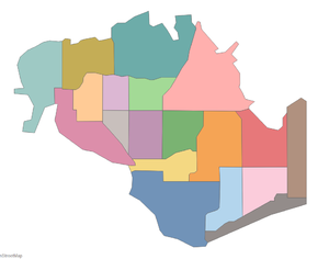
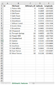
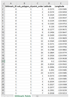
  3. After the transformation into polygon coordinates, StHimark_Features.csv and StHimark_Points.csv are generated and then imported and displayed as such:

Newpoly.png


Dataset Import Structure & Process

With the dataset analysis and transformation phase completed, the following files will have to be imported into Tableau for analysis:

Datac.png

  1. Prepped Data from Tableau Prep Builder
  2. StHimark_Points and StHiMark_Features from polygon transformation
  3. BuildingLatLong (Contains Hospitals and Nuclear Plant Lat Long)


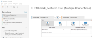
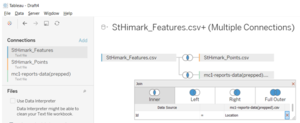
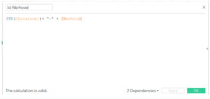
The following relations are formed within the data files:

J1.pngJ2.pngJ3.png

Interactive Visualization

The interactive visualization can be accessed here: https://public.tableau.com/profile/kelvin8400#!/vizhome/AS1-CloroplethWIndows/HomePage?publish=yes

Throughout all the different dashboards, useful guides/tips are provided to help users navigate through the different filters and actions so that their analysis can be performed smoothly. The following interactivity elements are also used throughout all the dashboards to maintain consistency:

Interactive Technique Rationale Brief Implementation Steps
Selecting the day of earthquake
Day.png
To allow analyst to pick the day where they are interested in to analyse.
  1. Add "Time" to the filtered tab.
  2. Filter by the day of Time.
Selecting the area of damage
Area.png
This filter can be used when analyst wants to see the area of damage of their interest.
  1. Add "Area of Damage" to the filtered tab.
  2. Pick the areas that you want to be visible.
Iterating through the time series
Inter.png
Analyst can view the time series by pressing play and visualise the average area damage to each of the neighborhoods.
  1. Add two "Time" fields to the Pages Tab
  2. Filter one by "Hour" and one by "Minute"

The following sections elaborates on other interactivity techniques are integrated into each of the individual dashboard.

Home Dashboard

The following shows the Home Dashboard:

H11.png

The following interactive technique have been employed in this dashboard:

Interactive Technique Rationale Example
Interactive Buttons
Navigation across different dashboards with just a click of a button.
H12.png

Earthquake Damage Dashboard

The following shows the Earthquake Damage Dashboard:

Avg.png

The following interactive visualisations have been employed in this dashboard:

Interactive Visualisations Rationale Example
Displaying of Choropleth Map to depict severity of earthquake damage
Accompanied by the neighborhood names, analyst can clearly see the heavily affected neighborhood at a specific time period to carry out rescue works. With the highly customisable configurations, analyst can also view the different areas of damage (e.g. buildings, medicals).
D11.png
Overview of the frequency of earthquake on a selected day
By providing a consolidated and macro view of the frequency of earthquakes, rescuers can better gauge the resources needed along with the cloropleth visualisation. For example, at one glance, responders will be able to see a high spike in the amount of reports on the main earthquake day.
D12.png

Data Uncertainty Dashboard

The following shows the Data Uncertainty Dashboard:

Data2.png

The following interactive visualisation have been employed in this dashboard:

Interactive Visualisation Rationale Example
Report Frequency Gantt Chart
With the use of the gantt bar to depict the frequency of reports for a selected day, analyst can discover intervals with irregular amounts of reports. The list of neighborhoods have also been sorted in descending order according to the proximity of the earthquake epicentre. These can help analyst in detecting patterns and find out the level of uncertainty of the report data.
D21.png
Comparison between actual and reported readings
In order to verify the accurateness of data provided by the reports, it was compared to the actual readings given by the government. This can provide the analyst with an overview on the level of uncertainty of the report data.
D22.png

Observations

Q1: Emergency responders will base their initial response on the earthquake shake map. Use visual analytics to determine how their response should change based on damage reports from citizens on the ground. How would you prioritize neighborhoods for response? Which parts of the city are hardest hit?

Index Analysis Evidence
1
As Pepper Mill, Old Town and Safe Town were located close to the epicentre of the quake, they were hit the hardest. From the map, it shows high amount of reports on 8th April and most damage reports are coming in from these neighborhoods.
Over2.png
2
Upon further analysis, Old Town received a large amount of reports immediately after the first quake and high intensity of damage across all categories. Responders should prioritise Old Town first before handling other neighborhoods.
Old.png
3
According to the actual readings, Scenic Vista and Broadview should feel the shake lightly as they are further away from the quake epicenter. However, the damage reports in all categories were higher than the neighborhoods around them after the quakes. The damage reports reported higher readings after the first missing data period. The cause of these phenomenons might be due to the elite nature of the residents in Scenic Vista.
Scen.png
4
On 10th April, there is a spike in reports which reported severe power damage with a mean of 9.68 at Old Town neighborhood. This outrage will lead to the loss of information in the subsequent hours.
Power2.png
5
Wilson Forest received the least amount of reports throughout the quake period and it might be due to the low population of the neighborhood.
Wilson.png

Q2: Use visual analytics to show uncertainty in the data. Compare the reliability of neighborhood reports. Which neighborhoods are providing reliable reports? Provide a rationale for your response.

Index Analysis Evidence
1
When the first major quake struck the city on 8th April, the reports were consistent with the shake map, where the north-eastern neighbourhoods felt the shake more strongly than the western neighbourhoods.
D22.png
2
However, when compared to the prequake shake map on 6th April, the reports were not consistent with the shake map, where Old Town reported a weak shake.
B3.png
3
There are two periods of data missing from Old Town after the quakes and it is likely due to the expected power outage from the electrical works. However, the recovery of power takes longer than expected and responders should investigate into this situation.
Ms1.png
4
Moreover, when the power resumes, there is a huge spike in reports from Old Town as the responds are queued during the power outage. This contributes to the unreliability and uncertainty of the data which may provide a false alarm to the responders.
Oldtown2.png
5
There are also multiple missing data from various neighborhoods like Chapparal, Terrapin Springs and Scenic Vista and for a considerable amount of time. Responders might want to investigate into it as there are no known ongoing power works for these neighborhoods.
M2.png
6
The spike in power damage reports before a power outage can serve as a pre-empt for the missing data in the following hours. With that, engineers can prioritise these neighborhoods to restore the power. Hence, these data uncertainties can be eliminated by discovering data patterns.
Power2.png


There is also a conflict of results which increased the uncertainty of the data. Hours after the main quake, some residents at Cheddarford reported that there shaking was not felt, while other residents reported that there was shake felt which was in fact referring to the quake that happened earlier. Hence, the delay in reports should be considered in the analysis of the data.
To conclude, the population size, demographic, socio-economic status and other factors also plays a part in the report frequencies for the different neighborhoods which affects the quality of the data. The reports might also be spammed by some residents. Therefore, more investigations and measures have to be implemented to curb with such cases to decrease data uncertainty.

Q3: How do conditions change over time? How does uncertainty in data change over time? Describe the key changes you see.

Index Analysis
1
The conditions varies significantly throughout the different days. The pre-quakes cultivates a gradual increment of reports among all neighborhoods. After the first major quake on 8th April, there was an immediate spike in reports coming in. The amount of reports then decline as time pass.
2
The uncertainty of data during the pre-quake is relatively low, with a gradual increment of damage reports from all neighborhoods. However, when the major quake happened on 8th April, the uncertainty of data increased significantly with the spike of reports due to power damages. It is accompanied with other reasons which could not be identified that resulted in the loss of data in multiple periods for different neighborhoods. After the quake, the uncertainty of data decreased as reports started to become stable with minimal loss of data due to the recovery of power and repairing of building damages.
3
In some specific neighborhoods, the ratings of some categories from Downtown and Broadview were relatively certain before the pre-quake. However, the reports suggest issues in other categories besides the ongoing road work in both neighborhoods which adds to the uncertainty of the data.

References

Great thanks to the below references to aid in the creation of the visualisations.
https://www.tableau.com/learn/tutorials/on-demand/getting-started-tableau-prep
https://wiki.smu.edu.sg/1617t1IS428g1/IS428_2016-17_Term1_Assign3_Gwendoline_Tan_Wan_Xin#Interactive_Visualization

Comments

Please input your comments here!