From Visual Analytics for Business Intelligence
Jump to navigation
Jump to search
 IS428 VAST 2019 Mini Challenge 1
Interactive Visualization Technique
The interactive visualization can be accessed here: https://public.tableau.com/profile/rachel.chua#!/vizhome/IS428_MiniChallenge1_rachel_chua_2017/HOME
| Technique |
Rationale |
Implementation Steps
|
| Interactive Technique 1: Rank in Tableau |
This technique will allow us to see within each neighborhood, what is the most frequent occurrence of the damage category based on the neighborhood. Similarly, you can do this for the least important or perhaps, top 3 or bottom 3 etc. |
Set damage level to measure(count), quick table calculations to rank and compute using table (across). Next, open up the table calculation and rank them in descending order by competition base on damage category. Lastly, open up the filter and set the range of values to min 1, max 1. This would ensure that the graph would only show the most common damage category.
|
| Interactive Technique 2: Filter dates with the use of time range slider
|
It allows analyst to select the time period they want to take into considerations easily by sliding it to the particular time period. This would be harder to achieve with checkbox/list as checkbox require multiple clicks and list would only allow a specific time at once. As such, a time range slider is preferred. |
Add the time into the filter and select range of dates.
|
| Interactive Technique 3: Filter the damage area by colors
|
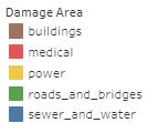
It is easier to differentiate all the different damage area by colour. In addition, special considerations have been given to their assigned colour so as to ensure that they form natural association to its damage area. For instance, red equates to emergency and hence medical, yellow for power, blue for sewage and water, brown for buildings and lastly green for roads and bridges. |
Drag the damage area into color and filter. Right click on the filter, select edit colors and implement the correct colour scheme.
|
| Interactive Technique 4: Filter the damage category and shake intensity category by colors.
|
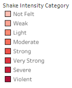
Colors are useful in bringing out meaningful meaning to the visualizations. For instance, if the damage/shake intensity category is extreme, more attention should be paid to those in the extreme category. Hence, the extreme category is in a dark, visible red. On the other hand, for “Not Felt” damage/shake intensity category, the red is in a lighter shade to signifies its lesser importance. |
Drag the damage/shake intensity category into color, select edit color and select the red colour palette. By clicking on assign palette, you assign a color to each damage/shake intensity category.
|
| Interactive Technique 5: Hover
|
When the user is interested in a specific data point, simply place the cursor over the data point to look at the tooltip. Relevant details related to that specific data point would appear. |
Drop the details into tooltips. Alternatively, one may click on the tooltip button and manually add relevant information into the pop up textbox which allows you to edit the tooltip.
|
| Interative Technique 6: Filter the Id-Nbrhood using single selection drop down list.
|
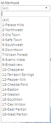
This allows analyst to focus on the data collected from each neighborhood. Since there are various neighborhood, it also keeps the filter interface compact and neat since instead of displaying 19 lines, only 1 line is needed right now. |
Configure the filter selection to a single selection drop down list.
|
