IS428 AY2019-20T1 Assign Chua Xuan Ni, Rachel TASK & QUESTIONS
|
|
|
|
|
|
Contents
Question 1
Emergency responders will base their initial response on the earthquake shake map. Use visual analytics to determine how their response should change based on damage reports from citizens on the ground. How would you prioritize neighborhoods for response? Which parts of the city are hardest hit? Limit your response to 1000 words and 10 images.
How would you prioritize neighborhoods for response?
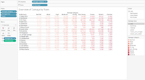
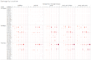
I would prioritize the neighborhood for response based on the different damage category – Buildings, Medical, Power, Roads & Bridges and Sewer & Water. As seen from the image below, it shows the overview of the town’s damage by category based on the specific event – pre-quake, earthquake and post-quake. The values in a darker shades of red represents higher damage and the values in each cell is the count of that particular damage category level felt.
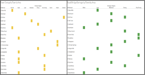
Next, as repair works requires specialized skillsets, I would analyze the neighborhood that requires prioritization based on the damage category. The image below shows the highest count of damage category for that particular neighborhood. For example, for Palace Hills, the highest count for damage category of Power, Building, Medical, Sewer & Water and Roads & Bridges is Not Felt, Weak, Weak, Weak and Light respectively. Hence, for such neighborhood, prioritization tend to be lower. On the other hand, for Old Town, the highest count for damage category of Power, Building, Medical, Sewer & Water and Roads & Bridges is Extreme, Moderate, Very Strong, Strong and Strong respectively. Hence, prioritization tend to be higher.
You may also select a particular damage area for a relevant department to look at the prioritization. For instance, by looking at Power, you can see that Old Town, Chapparal and Terrapin Springs require more prioritization compared to other neighborhood whereas for Roads & Bridges, Scenic Vista, Broadview and Easton require more prioritization as compared to other neighborhood.
Therefore, given this visualization, I would think that the top neighborhoods to prioritize for each damage area are:
• Building: Wilson Forest, Chapparal and Broadview
• Medical: West Parton, Old Town and Safe Town
• Power: Old Town, Chapparal and Terrapin Springs
• Roads and Bridges: Scenic Vista, Broadview and Easton
• Sewer and Water: Wilson Forest, Broadview, Southern, Scenic Vista and Safe Town
Note that while 7-Wilson Forest have very limited data as compared to the rest, since they are relatively close to the earthquake location on the shake map. I have decided to take these limited data into considerations as well.
Which parts of the city are the hardest hit?
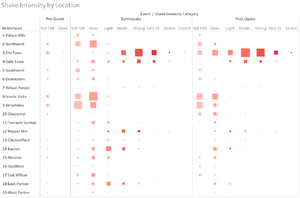
As we know that the earthquake happens on 8 April, my visualization would focus on what happens before, during and after the earthquake. I have categorized them under Pre-Quake, Earthquake and Post-Quake for all data collected before 8 April, on 8 April and after 8 April respectively. This is an overview of the Shake Intensity by Location. The size of the squares refers to the count of shake intensity category whereas the darker the shade of red signifies the higher importance should be given.
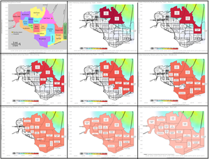
We can see that there is nothing particularly special with the Pre-Quake data since the shake intensity category are low. From this, focusing on the Earthquake and Post-Quake data, we can see that Old Town and Safe Town has been hit the hardest as the squares are huge and dark red. On the other hand, Northwest, Scenic Vista and Broadview seems to be affected the least as the squares are huge for those with lighter shades of red. From the picture below, we can also see that the more severe the shake intensity category, the lesser the affected neighborhoods.
Therefore, to rank the hardest hit city, it would be:
• Old Town, Safe Town; followed by
• Pepper Mill; followed by
• East Parton, Wilson Forest; followed by
• Easton, Cheddarford, Terrapin Springs; followed by
• Weston, West Parton, Chaparral, Broadview, Scenic Vista; followed by
• Northwest, Downtown, Southon, Oak Willow; followed by
• Palace Hills and Southwest
Question 2
Use visual analytics to show uncertainty in the data. Compare the reliability of neighborhood reports. Which neighborhoods are providing reliable reports? Provide a rationale for your response. Limit your response to 1000 words and 10 images.
Uncertainty is when an analyst is unable to tell if the neighborhood is in trouble or not based on the given data or when an analyst is unable to tell how much the place is in trouble.
a. Comparing the shake intensity of Pre-Quake, Earthquake and Post-Quake
We can see from the graph that the data collected is highly likely to be accurate because the shake intensity during pre-quake is low and only consist of intensity category of not felt and weak. However, 4,930 from Old Town and 4,185 people from Safe Town reported feeling weak shake intensity despite no earthquake yet. This can possibly be attributed to tremors felt by those living on the edge of the town on the North-East area before the actual earthquake or even current ongoing power and sewer & water constructions happening in Old Town.
While it may seem fishy as to why some places reported weak intensity when there is no earthquake, it is not much of a concern as these numbers are relatively insignificant compared to those who reported not felt within the neighborhood itself.
From the Earthquake and Post-Quake data, we can see that Old Town, Safe Town and Pepper Mill are possibly hit the hardest and given the high count of those reported shake intensity category, the neighborhood report seems reliable. This is further supported by the fact that these areas are closest to the earthquake location.
In addition, we can also see that the result of the data collected for intensity tend to be clustered together as well. This means that we do not see any neighborhood that has high reports for both low intensity and high intensity as this would mean uncertainty in the data as well.
b. Compare the damage reports of the Pre-Quake, Earthquake and Post-Quake
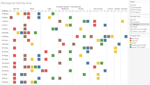
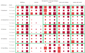
At one glance, the damage report seems pretty reliable as the size of the squares increases and the shade of red gets darker as we move from pre-quake to earthquake to post-quake.
However, upon closer look, there seems to be data reporting higher number of extreme damage during pre-quake period as oppose to earthquake and post-quake. This raises some suspicion as damage are more likely to increase after an earthquake instead of decrease. As the number reported by each person is subjective, I have decided to look at the values by including data from neighboring categories – Very Strong and Violent. This would ensure higher accuracy as compared to solely comparing Extreme across the 3 periods.
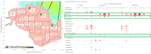
For instance, Southwest have higher damage in all 5 damage area pre-quake as compared to earthquake and post-quake. This is highly suspicious and may indicate uncertainty in the data collected.
Same goes for the other neighborhoods – Cheddarford, Weston, Southon and Oak Wilson identified with the green box below.
c. Compare the damage report together with the intensity
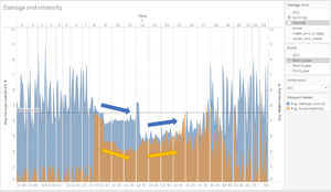
Another way of looking at the reliability of our data was to see how damage level changes with intensity level. In the graph below, we look at the average damage level in blue and the average shake intensity in orange. The graph can be filtered by damage area, event or neighborhood. The following show a comparison between the average damage and shake intensity of building of all neighborhoods during 8 April.
From the graph we can see that they are relatively consistent with one another, which increases the reliability of the data. This is generally true for the data with different damage areas and at different time zone as well. However, the fluctuations for the average damage level and average shake intensity might be a concern when deciding if the data is reliable or certain.
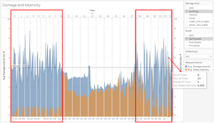
For instance, on the red highlighted part on the left, while there are random spikes in the damage level that varies from 2.83 at its minimum to 8.77 at its maximum, the average shake intensity remains consistent between 0 and 1 without much changes. This might reflect some issues with either one of the data collected.
On the other hand, on the red highlighted part on the right, there seems to be a sudden spike in the intensity level at 20:20, 22:20 and 23:05. This might be explained as the after shock following earthquake but once again, there seems to be not much variation to the average damage level, raising suspicion once again.
In conclusion, by comparing the shake intensity and damage reports of the Pre-Quake, Earthquake and Post-Quake and comparing the damage report together with the intensity, we can better tell if there are uncertainties in the data and whether citizens are generally providing reliable reports.
Question 3
How do conditions change over time? How does uncertainty change over time? Describe the key changes you see. Limit your response to 500 words and 8 image
Shake Intensity Conditions
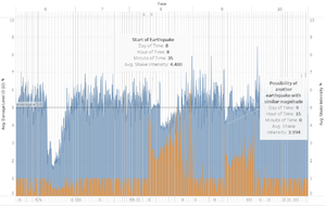
Shake intensity level remain relatively constant from 6-7 April with values ranging between 0 and 1. However, around 8.40am on the 8th April, reports of higher intensity level above 1 came in. The intensity level than fluctuated between 1.961 and 5.0 for most part of 8 April. However, there was a sudden spike in average intensity to 6.0 at 23:05, possibly caused by after quake tremors. On the 9 April, shake intensity remained between 0 and 1 for the most part until a sudden spike to 3.994 15:00. I suspect another earthquake of similar or slightly lesser magnitude. It then remained between 1.261 and 3.285 for the rest of the day. In the early hours of 10 April, at 01:00 there’s a spike to 5.0. In general, the remaining data collected fluctuated between 0 and 1 except a small spike to 1.70 at 05:55 and 4.982 at 12noon of 10 April.
Uncertainty did not change much over time as we can see that the earthquake probably happened around 8.35am on the 8 April. The other spikes and constant fluctuation of shake intensity is probably caused by the after shake tremors that continued to 9 and 10 April. Hence, this data is generally reliable.
Damage Area Conditions
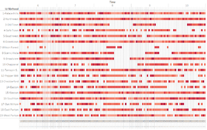
Generally, there seem to be no particular trends that can be observe from the damage area graph here. As average intensity is a continuous data, I have decided to use the value on the 50th percentile to represent the damage level at the specific time and location.
As there are no obvious trends or changes, it is hard to tell if the data reported is accurate or not. However, I did notice that for Old Town, it is supposed to be one of the hardest hit region and we can see that at the specific time where the 2 earthquakes seems to appear, there are no data collected and data collected right after it shows high level of damage. Hence, data collected from Old Town may be reliable because the period where no data was collected might be due to power outages, connectivity issues etc.
