IS428 AY2019-20T1 Assign Ong Qian Ling TASKS & INSIGHTS
|
|
|
|
|
Contents
- 1 Tasks And Insights
- 1.1 Task1:Emergency responders will base their initial response on the earthquake shake map. Use visual analytics to determine how their response should change based on damage reports from citizens on the ground. How would you prioritize neighborhoods for response? Which parts of the city are hardest hit?
- 1.2 Task2:Use visual analytics to show uncertainty in the data. Compare the reliability of neighborhood reports. Which neighborhoods are providing reliable reports? Provide a rationale for your response.
- 1.3 Task 3: How do conditions change over time? How does uncertainty in change over time? Describe the key changes you see.
Tasks And Insights
Task1:Emergency responders will base their initial response on the earthquake shake map. Use visual analytics to determine how their response should change based on damage reports from citizens on the ground. How would you prioritize neighborhoods for response? Which parts of the city are hardest hit?
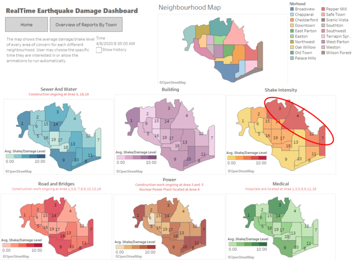
On 8th April when the first major earthquake occurred, it is shown that the north-eastern neighborhoods felt a stronger shake compared to other areas of the neighborhoods at 8.35am. This shows that the information reported by the residents are consistent with the readings on the shake map provided.
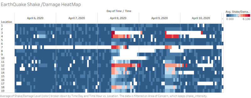
Based on the heat map constructed above, it is shown that 4 neighborhoods namely Old Town #3, Safe Town #4, Wilson Forest#7 and Pepper Mill #12 were hit the hardest from 8am to 9am as shown by the different shades of red. In addition, the mean shake intensity of Old Town #3 was shown to be of a higher certainty as compared to Wilson Forest #7 as the number of reports received from Wilson Forest was relatively smaller as compared to Old Town #3.
In addition, it is also shown that Old Town #3 has a higher average damage/shake value between the timeframe of 8am -9am for all categories of the report, when the earthquake occurred. With the large number of reports received, we can be very certain about the damage level of each area. Therefore, emergency responders should consider prioritising Old Town #3 for rescue first followed by other locations that received the greatest damage like Scenic Vista #8 and Broadview #9.
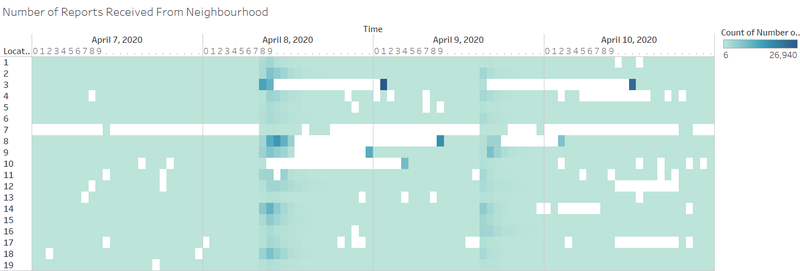
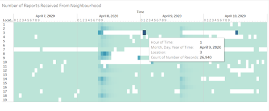
We can also notice that Old Town #3 has two periods of missing data after the earthquake. It is known from the information provided that Old Town is currently working on modernizing the electrical distribution system, which might in turn lead to power outages lasting 30-60 minutes throughout the week. However, the actual duration of missing data was significantly longer than the mentioned outage. As there were a huge amount of missing data from neighborhoods #7 - #10 even though there were no known power works going on, responders should further assess the situation at said areas and find out if the issue was caused by damages from the earthquake.
Task2:Use visual analytics to show uncertainty in the data. Compare the reliability of neighborhood reports. Which neighborhoods are providing reliable reports? Provide a rationale for your response.
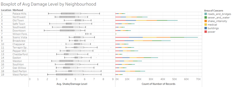
To measure the reliability amongst the neighborhood reports, I filtered the reports to 24 hours after the major earthquake of each neighborhood. From the box plot diagram of overall average damage, it is shown that Scenic Vista#8 had the highest certainty level as it had the lowest variance difference despite having the largest number of reports received. Likewise,Palace Hills #1, Downtown #6 and West Parton #19 has the highest uncertainty level in data as the data varied the most.
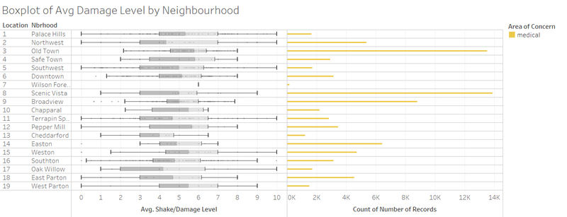
From the boxplot diagram above, we can see that the damage level on medical facilities are widely spread overall. However, there are only a total of 7 hospitals in the whole neighborhood which are in locations 1,3,5,6,9,11,16. For instance at location 8, it has the highest total number of reports regarding medical. However, there isn’t any hospital located in location 8, this points to uncertainty in the information provided by users.
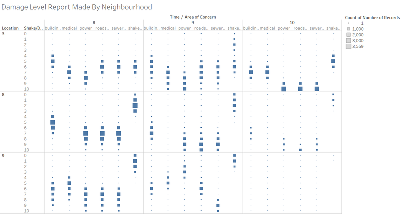
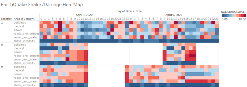
With reference to the graph above, we can identify the certainty in data from the Old Town #3. It has shown that the damage reports are in line with the shaking intensity that was reported. Furthermore, high ranking on areas of concerns (power, roads and bridges & sewer and water) were reported on 10th April which might possibly be due to the repair works that were ongoing observed by the residents.
Apart from the data certainty level proved, we can also notice the data uncertainty on 9th April from neighborhood #8. It is shown that the shaking intensity is ranged between 0-3. With the low shake intensity, it is highly unlikely that the areas of concerns (power and sewer and water) endured such a huge damage with no construction ongoing.
Based on the graph constructed above, we can see a spike in the number of reports received on 9th April after encountering the missing data period at neighborhood #3 on 8th April. This spike in number of reports received could be caused by the delay of data uploading which would have been accumulated during the period prior to the spike. This count is unreliable as it is a cumulative amount instead of a real time count. Hence, we can prove uncertainty in the data at these areas which had seen a significant spike in the number of records received after a period of missing data.
In conclusion, damage reports submitted from users are largely subjective based on personal interpretation of the severity. Furthermore, the reports may also be spammed by user with incorrect value which would result in data uncertainty. Also, the number of reports might not be in correlation with the population size of the neighborhood town due to some factors like age and gender demographics. Therefore, further assessment is needed to ensure that the reports received are certainty in order to make the visual analytics more reliable.
Task 3: How do conditions change over time? How does uncertainty in change over time? Describe the key changes you see.
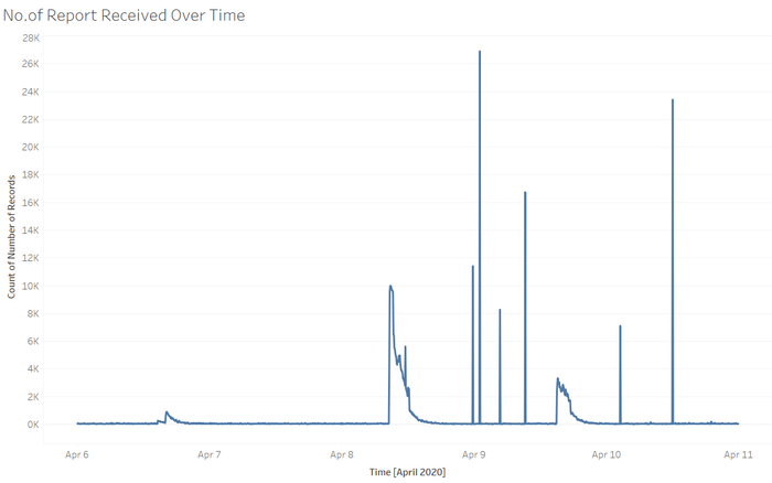
Based on the graph above, it has been shown that over time, reports received have been relatively constant throughout except for certain different time periods from the 8th to 10th of April. The spike on 8th April between 9am – 12pm can be justified as it was due to the occurrence of the earthquake. However, on the 9th and 10th of April, it is questionable if the spike in reports are due to the missing data or power outage due to construction in the area or spammed reports by the users.
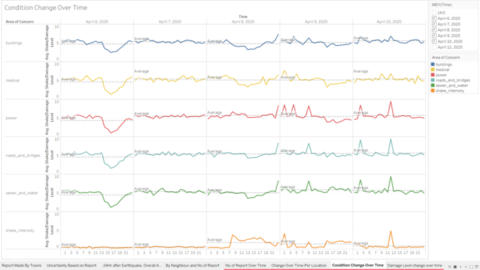
From the graph, we can notice that the change in condition of each area of concerns over time stays along the average line despite the slight fluctuations during certain periods. This tells us that the conditions of each area did not change for the better or worse significantly.
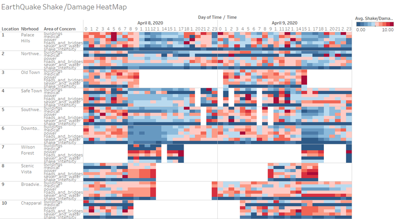
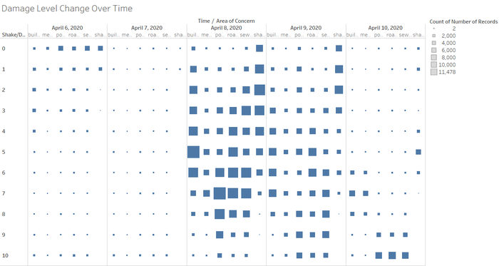
As for the level of uncertainty in the data, we explored via the changes in damage level over time by each neighborhood. For the diagram above, we can clearly notice that the data input by the users remained relatively constant with a good level of certainty from the 6th to 7th of April. On the 8th of April, it is shown that there is an increased number of reports with high damage levels which can be justified by the occurrence of the earthquake. However, after the occurrence of earthquake on 8th April, it is shown that uncertainty is present during certain time periods on the 9th and 10th of April.
In conclusion, the condition and uncertainty did not improve over time. In fact, the data shows that there was a higher level of uncertainty in the data on the 9th and 10th of April where the quake did not reoccur.
