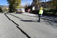
 IS428 Mini-Challenge 1: Crowdsourcing for Situational Awareness
DashBoard & Interactive Visualization
The interactive visualization can be accessed here: https://public.tableau.com/profile/qianling#!/vizhome/Assignment1_OngQianLing/HomePage
Homepage Dashboard
As there is a numerous data chart, it will not be possible to display all the worksheet in a single dashboard. To resolve this issue, a homepage Dashboard is created as to provide the flexibility for users to navigate between different dashboards. Moreover, it allows user to choose the analysis that they are interested to look in.
| Interactive Technique
|
Rationale
|
Brief Implementation Steps
|
| Navigate across dashboards with buttons
|
To provide users the flexibility of moving from one dashboard to the other, with an easy and simple to use interface
|
- Under the object section in Dashboard, drag the button icon into the middle
- Click on the grey arrow down and select edit the Button.
- Change the button style to image button and then choose the image that you will like to display
- Configure the button navigation to the page..
|
| Display tooltips when users hover over each button
|
To provide users with contextual information about the dashboard and the expected charts that they will look at after the button click
|
- Right Click, to edit the Button
- Under the tooltip section, enter the message that will be displayed when user hover over the button.
|
RealTime EarthQuake Dashboard
The dashboard map shows the average damage/shake level of every area of concern for each different neighbourhood. User may choose the specific time they are interested in or allow the animations to run automatically.
| Interactive Technique
|
Rationale
|
Brief Implementation Steps
|
Traverse through an hourly time series by clicking on the arrows
|
To analyze and draw connections between the area of concerns over a series of time
|
- Drag the date/time field into the “Pages” shelf
- Change the field to “Exact Date” to enable the animation that runs on a 5 minutes interval
|
Filter area of concerns using a radio button
|
To allow user to only select a single area of concerns so they can concentrate on the specific data that interests them
|
- Add the Area Of Concerns to the filter column.
- Select Show Filter and click on the arrow down icon (on the top right) to configure the filter selection to be a single value (List).
|
Select the location in the neighborhood map and all other maps will highlighted based on the location selected
|
Allow user to easily view the severity of the damage / shake in each individual area of concerns based on the location they selected
|
- Add the respective maps / charts into the dashboard.
- Go to Dashboard > Actions, add a highlight actions and configure the source sheets ( the place where you select) and target sheet ( the place where the result will appear on)
|
Damage Overview Report By Neighbourhood Dashboard
This dashboard allows the user to have a better view of the damage/shake severity of neighbourhood in a heat map per day by hours. In addition, the user can also see the number of reports received and the damage level input received.
| Interactive Technique
|
Rationale
|
Brief Implementation Steps
|
Filter dates with the use of time range slider
|
To analyze and draw connections between the area of concerns over a series of time
|
- Add the date to the filter column, change the date type to day of time
- Select Show Filter, and click on the arrow down icon (on the top right) to configure the filter selection to multiple value (List)
|
Filter area of concerns using a checkbox
|
To allow user to only select a single area of concerns so they can concentrate on the specific data that interests them
|
- Add the Area Of Concerns to the filter column.
- Select Show Filter and click on the arrow down icon (on the top right) to configure the filter selection to be a multiple value(List).
|
Filter by location using the checkbox
|
To provide flexibility for the user to choose a location that they want to monitor /analyses
|
- Create a calculated field to combine the Id and Nbrhood name (Important note: To convert ID to string in order to concatenate )
- Add the nbrhood ID_name to the filter column. Configure the filter selection to be a multiple list
|
Data Uncertainty Dashboard
This dashboard allows the user to view the average damage level and damage input for each area of concerns, which are factors that contribute to data certainty over a certain time period. User can filter the date/time, location and also areas of concern to their preference.
| Interactive Technique
|
Rationale
|
Brief Implementation Steps
|
Filter dates with the use of time range slider
|
To provide flexibility for the user to choose the time period which they would like to analyze
|
- Add the date to the filter column, change the date type to Hour of Time
- Select Show Filter, and click on the arrow down icon (on the top right) to configure the filter selection to multiple value (List)
|
Filter area of concerns using a checkbox
|
To allow user to only select a single area of concerns so they can concentrate on the specific data that interests them
|
- Add the Area Of Concerns to the filter column.
- Select Show Filter and click on the arrow down icon (on the top right) to configure the filter selection to be a multiple value(List).
|
Filter by location using the checkbox
|
To provide flexibility for the user to choose a location that they want to monitor /analyses
|
- Create a calculated field to combine the Id and Nbrhood name (Important note: To convert ID to string in order to concatenate )
- Add the nbrhood ID_name to the filter column. Configure the filter selection to be a multiple list
|
Change Over Time Dashboard
This dashboard allows the user to view the changes in conditions and damage input received over time. User will have the freedom to select the date and the neighbourhood which they would like to view the trend in.
- Add the date to the filter column, change the date type to Hour of Time
- Select Show Filter, and click on the arrow down icon (on the top right) to configure the filter selection to multiple value (List)
| Interactive Technique
|
Rationale
|
Brief Implementation Steps
|
Filter dates with the use of time range slider
|
To analyze and draw connections between the area of concerns over a series of time
|
- Add the date to the filter column, change the date type to day of time
- Select Show Filter, and click on the arrow down icon (on the top right) to configure the filter selection to multiple value (List)
|
Filter area of concerns using a checkbox
|
To allow user to only select a single area of concerns so they can concentrate on the specific data that interests them
|
- Add the Area Of Concerns to the filter column.
- Select Show Filter and click on the arrow down icon (on the top right) to configure the filter selection to be a multiple value(List).
|
Filter by location using the checkbox
|
To provide flexibility for the user to choose a location that they want to monitor /analyses
|
- Create a calculated field to combine the Id and Nbrhood name (Important note: To convert ID to string in order to concatenate )
- Add the nbrhood ID_name to the filter column. Configure the filter selection to be a multiple list
|
 IS428 Mini-Challenge 1: Crowdsourcing for Situational Awareness


