ISSS608 Assign Pu Yiran-Task 2
|
|
|
|
Task 2 |
|
Contents
Get To Know About Sensors
Where did sensors cover
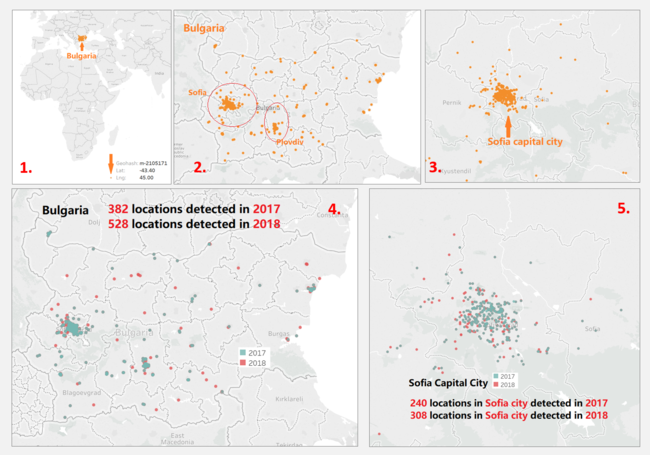
After decoding geohash into corresponding longitude and latitude, we are able to locate all the geohash onto map, each of which represents a sensor’s location. As shown in the first graph, there is one remote point which could be an error and will be excluded in further analysis. In total, there are 538 sensors located across the entire Bulgaria, giving 1,048,574 sensor records of 2017 and 2018.
National-widely, sensors were detecting from 382 locations in 2017 and 528 locations in 2018. In Sofia city, sensors were detecting from 240 locations in 2017 and 308 locations in 2018.
Although the sensors are covering national wide of Bulgaria, most of them are centralized in capital city Sofia, and especially, the central region of Sofia city. A small number of sensors also gathers at Plovdiv, a province near Sofia. At the rest provinces/cities, sensors are evenly distributed.
To perform further analysis on Sofia capital city, a set of all the sensors located in Sofia city is created.
How did sensors work
Although the given time interval of measurement in data is one hour, not all the sensors have been either working well nor giving correct data all the time.
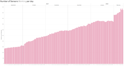
Not all the sensors started working at the beginning — the number of sensors that were working per day was generally increasing during the given time period in data.
Most of the sensors were not working well all the time. As the example given below, even if a sensor was working on a particular day, it might not be working for 24 hours continuously, which makes all the blanks and gaps in the graph.
Even worse, sometimes sensors performed abnormally and gave ridiculous data. Plus, as shown in below, some abnormal status has been lasted for hours and even a few days continuously, which can badly affect some analysis on daily average.
By looking at all the abnormal records, we can find out that most of the error values are the same or in the same range, which can be considered as a systematic breakdown of machines. To make sure the accurate of further analysis, all the error records are excluded.

Analysis of Air Pollutants--PM10 and PM2.5
Insight 1- How severely Sofia has been polluted
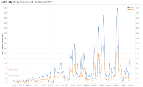
From 6th September 2017 to 13th February 2018, the overall average of PM10 and PM2.5 was 50.5 µg/m3 and 26.7 µg/m3 respectively, both of which has exceeded the EU yearly limits (40 µg/m3 for PM10 and 25 µg/m3 for PM2.5 http://ec.europa.eu/environment/air/quality/standards.htm)
In addition, daily average concentration of pollutant PM10 and PM2.5 in Sophia city has a significant increase from September 2017 to January 2018. Daily averaging concentration of PM10 was always much higher than that of PM2.5.
Based on this result, we can conclude that Sofia city as well as Bulgaria has been suffered from heavy air pollution and its pollution level has exceeded EU limit.
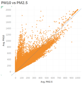
Interestingly, concentration of PM2.5 has been always moving with that of PM10, especially when PM10 increased/decreased tremendously, PM2.5 also increased/decreased almost in the same rate. In some sense, PM10 and PM2.5 are highly positively correlated, which can be seen from scatterplot. Consider the characteristics of these two particle, the cause of this pattern could be that PM2.5 is an appendage of PM10.
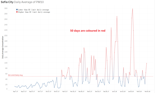
Knowing the EU limit daily average of PM10 is 50 µg/m3, in this visualization, colour of daily average of PM10 is differentiated from blue to red, representing daily average exceeds 50 µg/m3. Therefore, it is can be seen clearly that before November, daily average concentration of PM10 was all below EU limit, but from November onwards, nearly half number of the days had concentration of PM10 exceeding EU limit.
Even worse, most of the days with excessive concentration had critical heavy concentrations, which exceeded EU limit by three times even five times.
A set of days when daily average concentration of PM10 exceeded 50 µg/m3 is created.
Insight 2- Reveal areas with excessive daily PM10
To find out the most PM10 polluted regions in Sofia city, which pulled up the average pollution level of Sofia city, locations had daily PM10 higher than 50 µg/m3 are coloured in red, while others with daily PM10 lower than 50 µg/m3 are coloured in blue. Visualizing in trellis map, some patterns can be observed:
1) North central region and central region are heavily polluted.
2) Certain southern regions have witnessed high PM10 on certain days, but they were in minority.
3) During certain severely polluted days, some southern regions had little pollutants.

Insight 3- Health impact of PM2.5 from different regions
According to scientific research, different PM2.5 levels have different health impacts on human beings, as shown.

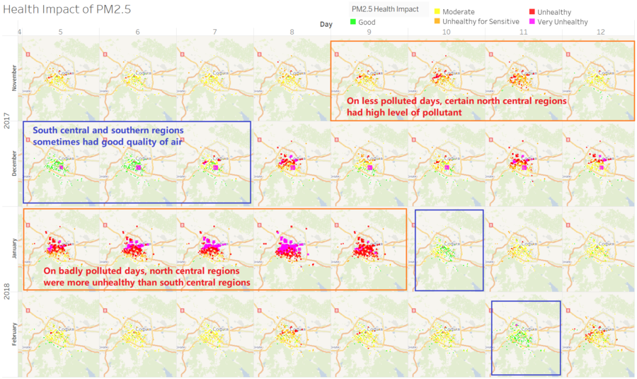
To find out different health impacts at different areas in Sofia city, daily concentration of PM2.5 is differentiated into 5 levels—‘Good’, ’Moderate’, ‘Unhealthy for Sensitive’, ‘Unhealthy’ and ‘Very Unhealthy’. From trellis map, some patterns can be observed:
1) During some extremely badly polluted days, north central regions tend to have highest pollution level, which is very unhealthy for human beings. Some central regions were also severely polluted, where the pollution level tend to be ‘unhealthy’ , which is slightly better than north central regions.
2) During some less polluted days, some of the north central regions had unhealthy air. Although, certain south central regions also measured to have unhealthy air, they were in minority, while most of the north central places were severely polluted.
3) Relatively, south central regions and south regions had better quality of air.
Based on above observation, north central and central regions tend to have unhealthy and even very unhealthy air, whereas north regions and north central regions could be much safer for populations. Therefore, the distribution of PM10 and PM2.5 in Sofia city is time independent, but more determined by locations. Sofia government needs to focus more on north central and central regions and implement policies to improve air quality.
