ISSS608 Assign Pu Yiran-Visualization & Dashboard Design
|
|
Visualization & |
|
|
|
Contents
Task 1 & Task 3
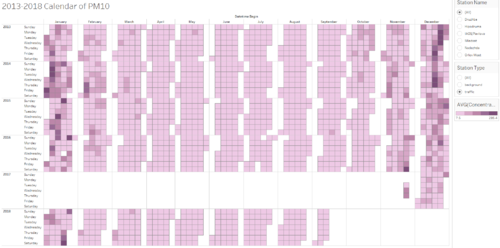
Calendar View
In task 1, daily data from 2013-2017 is given and hourly data of 2018 is given. Calendar can give a general view of daily historical PM10 pollution level in Sofia city.
For task 1, two types of calendars are designed. In the static calendar, depth of colour represents daily concentration of PM10. In the interactive calendar, allowing reader to key in a value of concentration, differentiates days with excessive concentration determined by user, where red colour is the alter of overshooting PM10.

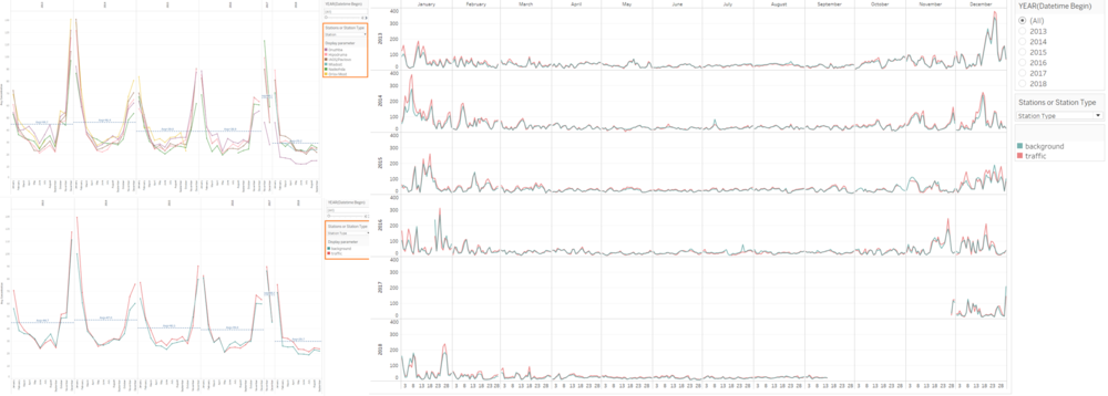
Interactive Monthly Average & Daily Average Time Series
This visualization is to give an intuitive view of PM10 patterns across months and across years. Readers can select to display and highlight by air quality stations or by station types ‘Background’ and ‘Traffic’. Therefore, it also allows to identify differences between stations and station types.

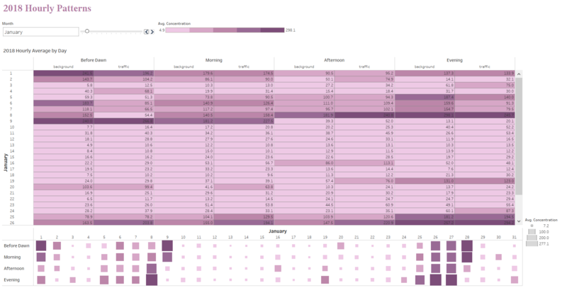
Heatmap of 2018 Hourly Average
As hourly data is given, we are able to view how PM10 was changing during one day at different time period. Mentioned before, 24 hours are grouped into 4 time periods, here, a heatmap is created accordingly. Using with filter, we are able to view PM10 level varying from time periods in different months.


