ISSS608 2017-18 T3 Assign FU CHUANJIE Data Preparation
|
|
|
|
|
The purpose of this section is to highlight the objective/methodology of each dashboard. After which, a video link has been made available to explain how the dashboard design is fit for purpose. There are subtitles available to explain the dashboard designs so please ensure that subtitles are on for the YouTube videos.
How do I access the dashboard?
Click on the following link to access: Fu Chuanjie's Tableau Workbook
Assessment of waterway health by location
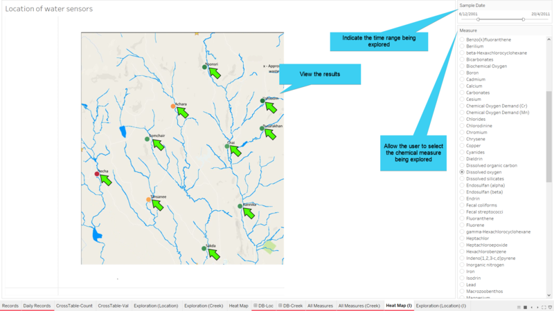
Location of the waterway sensor is key in making sense of the data. Therefore, a heat map has been created demarcating each of the waterway sensor locations. The colour of each waterway sensor is determined by the intensity of the selected reading of the chemical measure.
Current and previous trends across by location and measure
The sampling frequency and intervals for the different measures and locations are different. To analyse the trends of the chemical readings overtime it will be important to understand the number of records collected over the same period. Therefore, a dashboard design displaying only the trends and the heatmap will not be sufficient. There is a need to show the total number of readings taken over the years by chemical measures. In addition, allowing the user to zoom in to understand how a location’s chemical measures has evolved over time. Hence, a dashboard with the following three panes have been designed.
- Average readings by location
- Total number of readings taken over the years
- Location of water sensors
https://www.youtube.com/watch?v=fGGvte7CyIY
Current and previous trends across by waterway and measure
Apart from trend analysis by location, it should also be important to run analysis by waterway. This is because as the water flows downhill the level of contamination should be spread throughout the water system. Hence, for this analysis, a dashboard has been created to look at the waterway chemical measures by waterways/rivers. Boonsri, Kohsoom, Chai, Busarakhan and Kannika belonging to the first waterway. The other three waterways/rivers will be made up by other water sensor locations depending on where the water flows.
A dashboard with the following three panes have been designed.
- Average readings by waterway
- Total number of readings taken over the years
- Location of water sensors
Assessment of frequency of waterway readings
To understand how regularly waterway readings are collected on specific chemical measures, the following dashboard been designed to understand the day of the week and week number that the tests are conducted. For ease of review across years, an animation has been created to run through the visualization for every year.
https://youtu.be/0ovlPP-RpRI
Assessment of sampling methodology
To have a sense of the sampling methodology and number of samples collected by month, location and chemicals, the following dashboard has been created. This allows the user to scroll through the information to check for anomalies in the number of records collected by chemical measures, over the years.
https://youtu.be/hZDZ81BlfC0

