DataPreparation
 ISSS608 Visual Analytics and Applications Assignment
|
|
|
|
|
|
Contents
Data Preparation
Transforming data
After imported the original dataset into JMP, found that two columns are dirty data which need to be cleaned. Splitting the column "Created_at" into two columns, one is "Date" and the other one is "Time". With the same method split the column "location" into "latitude" and "longitude". The step showed as Figure 12.
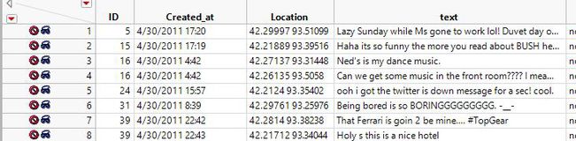
Figure 12: Dirty Data Columns

Key Words Selection
By reading requirement of the assignment, there are lots of the key words. With the function of Text Explorer in JMP, also found that the key words list. The top 5 key words in the list are all related to illness.
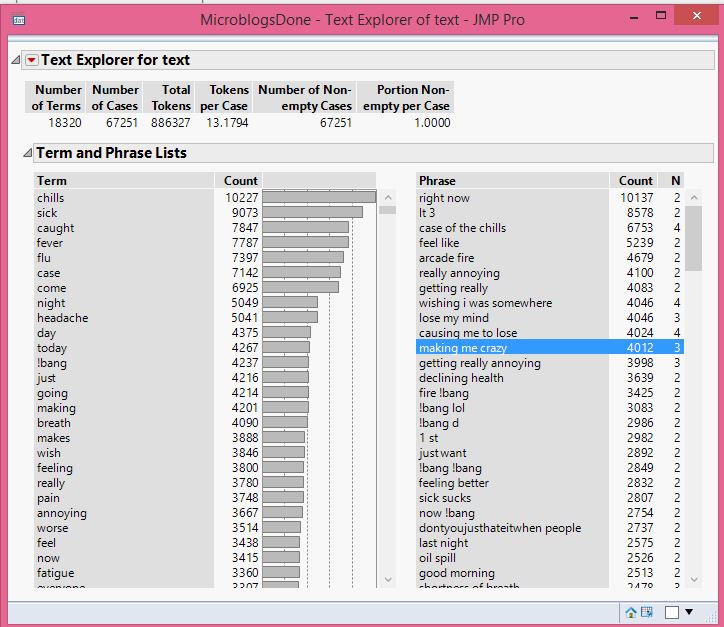
Figure 13: Key Words

Combined all the resources, finally choose 13 key words in the report. Please referred to Figure 13.
Excluding & Hiding Data
After the above steps, choose the key words and label all the rows related to these 13 key words. And then invert selection to exclude and hide the rows which do not include all the key words. Please referred to Figure 14.
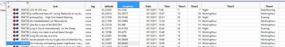
Figure 14: Key Words

Processing Data
Tag the Key Words
In order to tag all the 13 key words, used the formula to tag all the key words and made one new column for the tags. Referred to Figure 15.
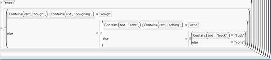
Figure 15: Tag Key Words

After tagged all the key words, there should be a column tag with all the key words. Referred to Figure 16.
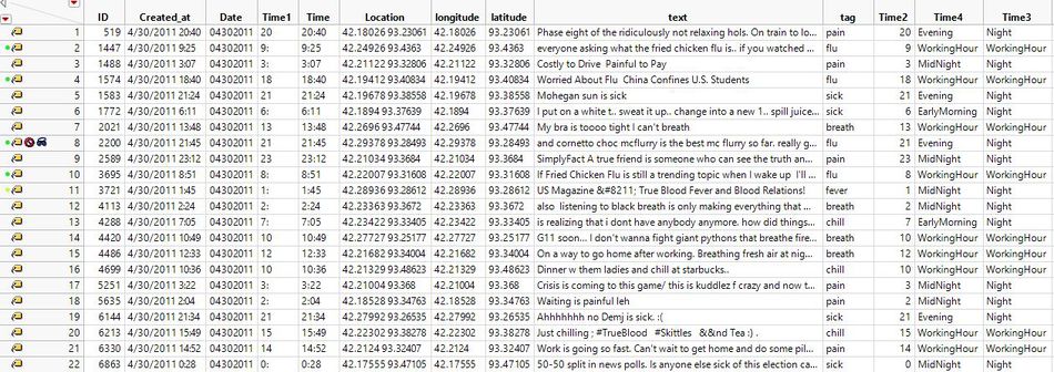
Figure 16: Tag Column

Processing the Time
The time is in the HH:MM format. The format is not good to analyse the final results. Transformed the time into two different formats. One is WorkingHour and night. The other is WorkingHour, Evening, EarlyMorning and Midnight. Referred to Figure 17 & Figure 18.
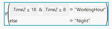
Figure 17: Day & Night
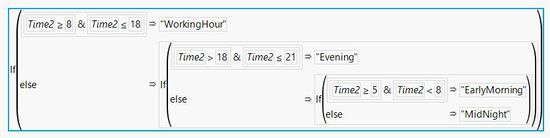
Figure 18: Four Types of Time


Visualing Data in Tableau
After all the steps done, the data cleaning was finished. Then exported the all the data which tagged with key words into excel and imported into Tableau. Then in the tableau plot all the key words in the map via Map(Background Images) function. The scatterplots for the key words can display the trend of the data. And the bar chart for the population shows the population distribution during the day and night time. Referred to Figure 19 & 20.
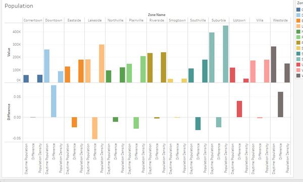
Figure 19: Population Distribution By Time
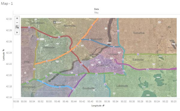
Figure 20: Map


Acknowledge
Great gratitude to:
1. Prof. Kam Tin Seong - Providing the most painful assignment in this term.
2. Visual Analytics and Applications Classmates(discussions during day & night):
- Deng Yuetong
- Fam GuoTeng
Please visit their respective webpages:
- https://wiki.smu.edu.sg/1718t1isss608g1/ISSS608_2017-18_T1_Assign_Fam_Guo_Teng
- https://wiki.smu.edu.sg/1718t1isss608g1/ISSS608_2017-18_T1_Assign_DENG_YUETONG
References
https://www.jmp.com/en_us/home.html https://www.tableau.com/ https://wiki.smu.edu.sg/1718t1isss608g1/Assignments https://www.hindawi.com/journals/apm/2011/124064/
Suggestions&Feedback
For any feedback or comments, please contact me at:
ziwenhe.2016@mitb.smu.edu.sg